Most advice about a YouTube Shorts thumbnail is incomplete. It says thumbnails don’t matter because viewers see Shorts in the swipe feed, then stops there.
That misses where thumbnails actually do the heavy lifting. A Short lives in more places than the feed. It shows up in search, on your channel page, and in recommendation surfaces where a still image decides whether someone taps or keeps scrolling. If you treat the thumbnail as optional, you leave discovery to whatever random frame YouTube pulls from the video.
The second mistake is out-of-date advice about uploading. Custom Shorts thumbnails can now be uploaded in YouTube Studio on a computer, a feature YouTube opened to YouTube Partner Program creators first and is expanding over time (YouTube Blog). Channels that don’t have it yet still need a practical workaround, and most guides skip it.
Table of Contents
- The Case for a Custom Shorts Thumbnail
- Core Principles for Thumbnails That Get Clicks
- A Fast Workflow Using an AI Thumbnail Generator
- How to Add a Custom Thumbnail to Your Short
- Common Shorts Thumbnail Problems and Solutions
- Making Thumbnails Part of Your Shorts Strategy
The Case for a Custom Shorts Thumbnail
A YouTube Shorts thumbnail doesn’t matter much inside the native vertical swipe feed. That part is true. But stopping there leads creators to the wrong conclusion.
In YouTube Search results, Shorts with custom thumbnails and readable text achieved an 85% higher click-through rate than Shorts without custom thumbnails, based on a study of 500 Shorts across 50 channels (~1M impressions) according to Joyspace AI’s Shorts thumbnail test results. That’s the part most creators ignore.
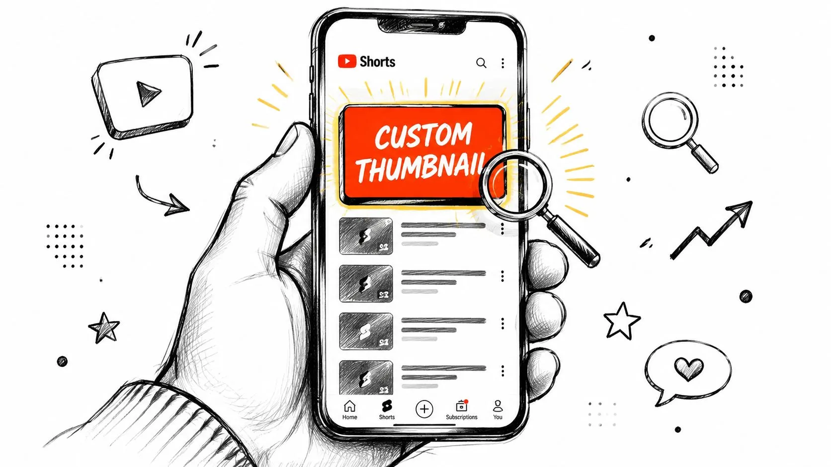
Where Shorts thumbnails actually matter
The thumbnail matters anywhere a viewer has to choose your Short from a list of options. That includes:
- Search results where your title and cover work together
- Your channel page where older Shorts compete with each other
- Suggested surfaces where the video isn’t autoplaying yet
- Subscriber browsing when people scan instead of swipe
That changes the goal. You’re not designing for the swipe feed. You’re packaging for every surface where a still image becomes the first decision point.
Practical rule: If someone can choose your Short before it starts playing, the thumbnail matters.
A random frame rarely does that job well. Mid-speech frames look awkward. Motion blur softens faces. Auto-selected moments often place text or key objects under YouTube’s interface. You may still get feed views, but you lose the clicks that come from search and library-style browsing.
Why this matters for channel growth
A strong Shorts cover helps older videos keep working after the initial feed push fades. That’s where subscribers, repeat viewers, and topic-based discovery often come from.
This is why the best creators use a hybrid approach. They edit the Short for fast mobile consumption, then package it for search with a deliberate title and a clear cover image. That combination turns a disposable clip into an asset with a longer shelf life.
Core Principles for Thumbnails That Get Clicks
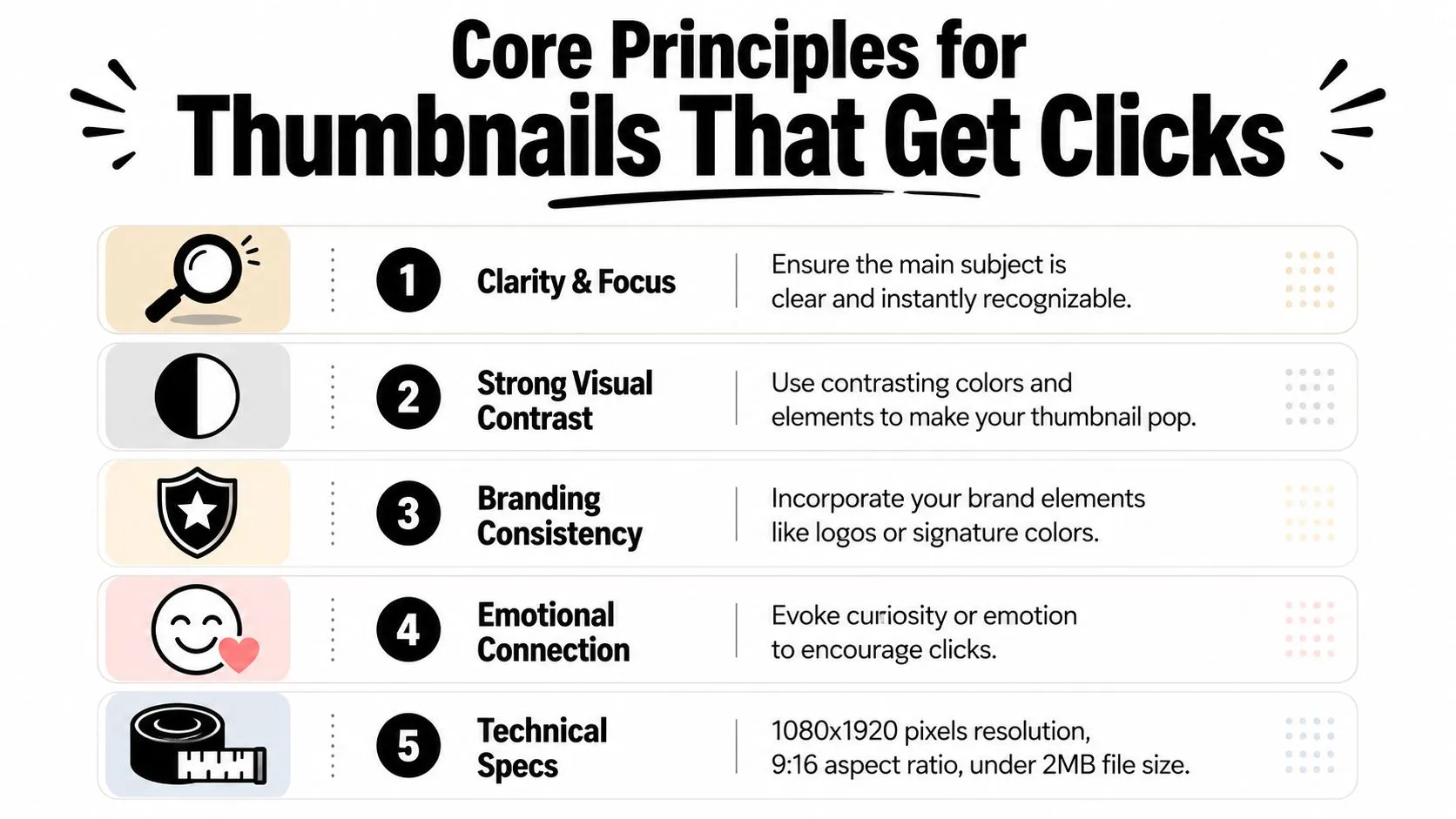
The best YouTube Shorts thumbnail is usually simpler than creators expect. Most underperform because they try to cram too much into a small vertical frame.
The design rules that hold up on mobile
YouTube recommends 2160×3840 pixels for a Shorts thumbnail, in a 9:16 vertical ratio, with a minimum height of 640 pixels, as a JPG or PNG; desktop uploads can be up to 50 MB (YouTube Help). That sounds basic, but technical correctness matters because the layout is already working against you on a phone screen.
The visual side is even more important. Shorts thumbnails that follow a one focal subject rule and use 3 to 4 words maximum in large, high-contrast text achieved 25 - 30% higher CTR than thumbnails using multiple mini-scenes or muddy color treatment, according to Miraflow’s YouTube Shorts thumbnail strategy analysis.
Here’s the practical version of that:
- Use one subject. One face, one product, one object, one result. If there are three points of interest, there is no point of interest.
- Keep text short. Three or four words is enough. The text should sharpen the idea, not explain the whole video.
- Push contrast hard. Dark-on-dark and muted-on-muted disappear into YouTube’s interface.
- Scale for mobile first. If the subject reads only at full size, it won’t work in search.
For inspiration, study examples built around one dominant idea instead of cluttered collage layouts in this set of YouTube thumbnail ideas.
A thumbnail should answer one question instantly: “Why should I tap this instead of the next one?”
Safe zones are not optional
Most creators don’t lose clicks because the artwork is ugly. They lose clicks because the important part sits under the app UI.
Titles, channel names and action buttons sit along the bottom and right edge of a vertical Short, and different surfaces crop the cover differently. Keep faces, objects and text away from the edges, and make the focal subject big enough to recognize at grid-tile size on a phone.
Use this checklist before export:
| Element | Put it where |
|---|---|
| Main face or object | Center third of the frame |
| Text | Upper-middle or center, never hugging edges |
| Logo or small branding | Only if it doesn’t compete with the subject |
| Background detail | Peripheral areas, not where the eye should land |
Do this, not that
-
Do this. Show a close-up reaction face with one bold promise.
-
Not that. Use four screenshots, a tiny arrow, and a sentence.
-
Do this. Pick a bright subject against a darker or cleaner background.
-
Not that. Let the thumbnail blend into YouTube’s dark interface.
-
Do this. Preview the image at postage-stamp size on an actual phone.
-
Not that. Judge it only on a desktop canvas.
A Fast Workflow Using an AI Thumbnail Generator
The fastest way to waste time is to open a design tool before you know the visual angle. A generator is useful only when the idea is already clear.
Start with the idea, not the layout
Before generating anything, define three inputs:
-
The promise
What’s the single outcome or curiosity hook? -
The visual proof
Is that a face, result, object, before-and-after, or dramatic moment? -
The short text
Keep it tight. A few words. Something readable and concrete.
If those aren’t clear, the tool will produce variations of confusion.
A clean AI workflow usually looks like this:
- Draft the title first. The thumbnail should complement the title, not repeat it word for word.
- Choose one primary subject. If the tool offers scene-heavy options, reject them early.
- Generate multiple directions. Don’t look for a final thumbnail in the first batch. Look for a promising composition.
- Edit manually. Tighten text, enlarge the focal subject, simplify color choices.
Generate options, then edit like a human
The best use of AI is speed at the rough-draft stage. It can give you options for composition, text placement, and visual hierarchy much faster than starting from a blank canvas. But creators still need to make the judgment calls.
Look for these signs of a usable output:
- The main subject reads instantly
- The text is large enough to survive mobile scaling
- The background supports the subject instead of fighting it
- The layout leaves room for YouTube’s interface
If your generated thumbnail needs resizing or reformatting for a vertical Shorts canvas, a dedicated YouTube thumbnail resizer makes that last step cleaner.
Don’t approve a thumbnail because it looks polished. Approve it because it’s impossible to misunderstand at a glance.
That difference matters. Polished clutter still loses.
How to Add a Custom Thumbnail to Your Short
Start in YouTube Studio on a computer: open Content, then the Shorts tab, open the Short, and look for Upload file under “Thumbnail”. If it is there, upload your 9:16 image and save (YouTube Help). Custom Shorts thumbnails can’t be uploaded from the mobile app. The full steps, including how to change a cover after publishing, are in the guide on how to add a thumbnail to YouTube Shorts.
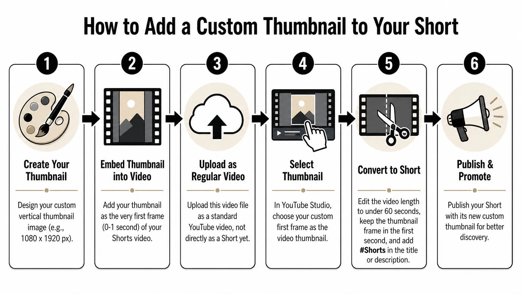
If your channel doesn’t have the upload option yet, the workaround is straightforward once you know it. You place the thumbnail inside the video itself, then select that frame as the cover.
The workaround most guides leave out
For channels without the upload option, the practical method is to embed the design as a brief still at the start or end of the video, then use the mobile app’s frame picker to pin that frame. YouTube confirms you can still pick any frame from the video through the app on mobile (YouTube Blog).
That’s the usable bridge until the upload option reaches your channel.
It matters because an AI-generated thumbnail or designer-made image isn’t useful unless you can either upload it or turn it into a selectable frame inside the video timeline.
A clean step by step workflow
Use any editor that lets you place a still image on the timeline precisely. CapCut, Premiere Pro, Final Cut Pro, and DaVinci Resolve all handle this easily.
-
Create the thumbnail as a vertical image
Build it in the proper Shorts format. If you need a quick reference for the canvas setup, use this YouTube thumbnail size guide. -
Insert the image into the video timeline
Put it at the very beginning or very end. Beginning is easier to manage in most editors because it’s simpler to find while selecting a cover. -
Keep the frame extremely short
The goal is to make it selectable without making it feel like an awkward title card. A very brief duration works best. -
Export the final Short as one file
The thumbnail is now “baked in” as part of the video. -
Upload from the YouTube mobile app
During the upload process, use the cover selector and scrub to the embedded frame. -
Confirm the frame before publishing
Don’t rush this step. If you miss by even a small amount, YouTube may grab a nearby frame instead.
What usually goes wrong
Most failed attempts come from one of these problems:
-
The frame is too short to grab easily
If you can’t land on it in the selector, increase the duration slightly and re-export. -
The embedded image sits in the unsafe UI area
Even if the art looks good in your editor, it can fail once YouTube overlays text and buttons. -
The creator exports the wrong aspect ratio
A vertical thumbnail embedded in a mismatched video file won’t display cleanly. -
The chosen frame isn’t the thumbnail frame Scrub slowly. Mobile frame selection can be touchy.
If the cover selection feels fiddly, that’s normal. The fix usually isn’t a new design. It’s a slightly longer embedded frame and a cleaner safe-zone layout.
This method isn’t glamorous, but it works. More importantly, it gives you control.
Common Shorts Thumbnail Problems and Solutions
A good YouTube Shorts thumbnail can still fail in practice if the implementation is sloppy. Most issues come from selection, rendering, or expectations about what the thumbnail can and can’t influence.
Why the wrong frame keeps showing
If the wrong image appears after upload, check the basics first.
-
App selection error
You may have tapped a nearby frame instead of the embedded thumbnail. Recheck carefully during upload. -
Weak embedded frame
If the image appears for only an instant, it can be hard to select cleanly. A slightly longer insert usually fixes that. -
Bad composition at small size
Some covers look fine in the editor and collapse on mobile. If text is tiny or the subject blends into the background, redesign it for less detail and more separation. -
Platform delay or caching
Sometimes YouTube takes a bit to reflect the selected cover across all surfaces. Give it time before assuming the selection failed.
Can a strong Shorts cover help long form discovery
This is one of the more interesting strategic questions. Most thumbnail advice focuses only on clicks to the Short itself.
MediaCube highlights a broader issue: creators keep asking whether better-performing Shorts covers can influence channel discovery beyond the feed, including suggested pathways that connect Shorts and long-form content, as discussed in MediaCube’s analysis of YouTube Shorts thumbnails. The useful takeaway is qualitative. A strong cover doesn’t just help one asset. It can improve how coherently your channel packages topics across formats.
That means your Shorts cover strategy should support your broader content library. If someone discovers a Short through search or recommendation, the next question is whether the rest of your channel looks worth clicking.
A few operational habits help:
- Match visual themes across formats so Shorts and long-form feel related
- Keep topic language aligned between Short covers and longer videos
- Treat covers as packaging systems instead of one-off decorations
Making Thumbnails Part of Your Shorts Strategy
Creators still treat the YouTube Shorts thumbnail like a minor production detail. That’s the wrong frame of mind.
According to YouTube’s official Creator Academy, 90% of the best-performing videos across the platform use custom thumbnails, as cited in GrowthOS’s review of thumbnail impact. Even though Shorts behave differently in the feed, that pattern tells you something important. Winning videos are usually packaged on purpose.
The practical strategy is simple. Build the Short for speed and retention. Package it for discovery. That means a strong title, a clean cover concept, and a workflow that lets you apply the design: a direct upload in YouTube Studio where your channel has it, frame embedding where it doesn’t.
The creators who benefit most from this aren’t chasing one burst of feed traffic. They want Shorts that keep earning attention when someone searches the topic later, lands on the channel page, or sees the video in a recommendation surface.
Treat the process as three moves:
- Design the cover for mobile clarity
- Embed it into the video file
- Select it carefully during upload
That’s not extra polish. It’s part of making Shorts useful beyond the first viewing window.
If you want to speed up the design side of this workflow, Thumbo AI helps you generate YouTube thumbnail concepts quickly, refine them for vertical layouts, and turn raw video ideas into covers that are easier to use in a real Shorts publishing process.