Every video enters a race it can lose in half a second. YouTube surfaces what people click, and the click decision happens before your editing, your script or your first joke gets a vote - it happens on the thumbnail. Swap the cover on an identical video and CTR can move by multiples, and the effect compounds: more clicks teach the algorithm to hand the video more impressions.
This list is grouped by technique instead of niche, because good thumbnail ideas transfer. A curiosity gap sells gardening exactly the way it sells gaming; a versus split powers a $1-vs-$100 taste test and a budget-airline showdown with the same visual grammar. Skim the section headers, pick the two or three ideas that fit your next upload, and stack them - most high-CTR covers combine one face idea, one text idea and one color idea.
Before you pick, spend ten minutes on research: download the thumbnails of the top ten results for your exact topic, shrink them to phone size, and write down what still reads. The ideas below tell you how to execute what you found - and how to beat it.
Technique 01 · 4 ideas
Faces and emotion
Human brains lock onto faces before anything else in a frame - it is involuntary. A face on the cover previews how the video will feel: shock promises drama, a grin promises fun, a wince promises pain. The detail most creators miss is intensity: an expression that looks natural at full screen reads as flat once it shrinks.
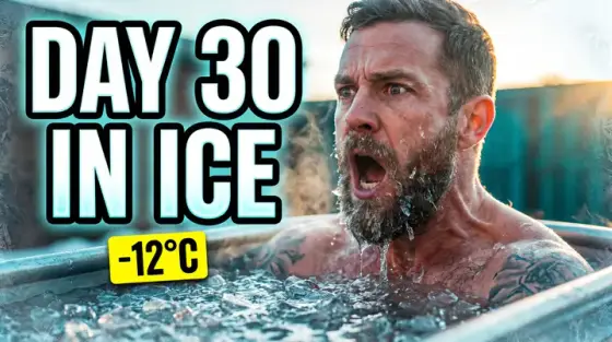
- The peak-emotion freeze. Shoot your reaction as a burst - twenty or thirty frames - pick the single most extreme one, then push it about 20% past what feels natural. The image will render at a couple hundred pixels, and exaggeration is what keeps the emotion legible there. Open mouths beat closed ones; eyebrows do most of the work.
- The mid-action portrait. Capture yourself doing the thing, not posing beside it: hands inside the engine, mid-lift, mid-taste. Motion tells viewers the video shows the process instead of talking about it. Keep your face angled toward the lens even while your body works - the expression still has to read.
- Locked eye contact. Aim your eyes straight into the camera and place them in the upper third of the frame. Direct gaze produces an almost physical stop-scrolling effect and survives shrinking better than any prop. Make the eyes the sharpest element in the image; let background blur eat everything else.
- The corner reaction inset. Show the subject big and add your face in a small circle reacting to it. Keep the inset around a quarter of the frame width and park it in the same corner on every upload so your channel page reads as a series. This is the workhorse layout for reaction, commentary and news formats.
If your face is the brand, consistency across uploads matters as much as the expression - the vlog thumbnail maker and podcast thumbnail maker break down face-led covers for those formats. Running a faceless channel? There is a dedicated list of faceless YouTube thumbnail ideas that solves the same problems without a face.
Technique 02 · 4 ideas
Text that reads at 120 pixels
Most of your impressions happen tiny - sidebar suggestions, mobile feeds, search results on a phone. Text that cannot be read at 120 pixels wide is decoration that costs you contrast. Every idea in this section is one rule wearing different hats: fewer words, set bigger, hit harder.

- The four-word ceiling. Cap on-image text at four words, and make them words that do not appear in your title. The title already renders right next to the thumbnail, so duplicated text wastes the most valuable pixels you own. Treat the image text as a second, shorter hook: the title asks the question, the thumbnail raises the stakes.
- One giant word. A single word - EXPOSED, FINALLY, WRONG - set so large it spans a third of the frame. One word at 200-point survives every size YouTube renders; a sentence at 40-point survives none of them. Pick the word that captures the emotional verdict of the video, not its topic.
- The highlighted keyword. When you genuinely need a phrase, break it into two short lines and paint exactly one word in your accent color, or drop a filled highlight box behind it. Viewers read the colored word first, so give it the one carrying the promise - the number, the verb, the villain.
- Outline-and-shadow armor. White or yellow letters with a thick dark stroke and a soft drop shadow stay readable over any background. Skip thin fonts, scripts and condensed italics - they collapse into noise when scaled down. Zoom your draft out to 20% and squint: if a word smears, thicken it or cut it.
Tutorials and course promos lean on text harder than any other format - the education thumbnail maker shows outcome-first covers built around exactly these rules. A vertical Shorts cover is narrower still, so the words stack instead of spreading out - the YouTube Shorts thumbnail maker covers that layout.
Technique 03 · 3 ideas
Color and contrast
Your thumbnail never appears alone. It sits in a grid of competitors, framed by YouTube’s white or near-black interface. Winning on color means differing from that specific context - the neighbors and the chrome - not from some abstract color-theory ideal.
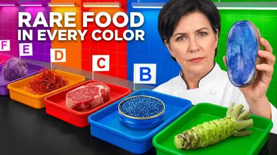
- The complementary collision. Build the frame around one pair of opposing colors - a teal background behind an orange subject, purple behind yellow. Complementary pairs create the strongest edge contrast a screen can display, which is why movie posters have leaned on them for decades. Push saturation a notch past realistic; YouTube’s compression dulls color on upload.
- Dodge the interface colors. Pure red, pure white and near-black are the colors of YouTube itself - the logo, the light theme, the dark theme. Covers dominated by them melt into the UI. Shift reds toward orange or magenta, tint white backgrounds, and rim dark scenes with a glow so the frame separates from dark mode.
- Grayscale plus one. Desaturate the entire image and leave a single element in full color - the product, the door, the red dress. The colored object becomes the automatic focal point, and the frame reads as deliberate and premium. It is also the cheapest rescue for a busy, cluttered screenshot.
Food and beauty live or die on color - see how the cooking thumbnail maker and the makeup thumbnail maker apply these moves to appetite and skin tones.
Technique 04 · 4 ideas
Clickbait thumbnail ideas: the curiosity gap
A curiosity gap opens a question that only the click can close. It is the engine inside every clickbait thumbnail idea that keeps working long term - under one condition: the video pays the question off. Bait that does not deliver gets punished through watch time, and the algorithm notices fast.
- The hidden payoff. Show the setup clearly and physically block the result: a blur over the finished build, a censor bar across the winning number, the reveal cropped just out of frame. The viewer clicks to complete the picture. Hide exactly one thing - hiding everything reads as spam.
- The forbidden stamp. BANNED, DELETED, RECALLED stamped across an otherwise normal image implies knowledge someone tried to suppress. Pair the stamp with a mundane subject for maximum whiplash - a banned toy out-clicks a banned weapon precisely because it is harder to explain.
- Three seconds before. Freeze the instant before something happens: the ladder mid-tip, the wave about to land, the hand reaching for the wrong wire. The viewer’s brain runs the next three seconds automatically and needs to verify the outcome. Aftermath images answer the question; prelude images ask it.
- The claim that looks fake. Put a true-but-implausible claim on the image and let the photo prove half of it - “I bought this house for $1” over you holding real keys on a real porch. The tension between “no way” and visible evidence is the click. Never fake the evidence; your comment section will audit it.
Story-driven channels run almost entirely on this section - the documentary thumbnail maker and the horror thumbnail maker show the restrained, genre-correct versions of the gap.
Technique 05 · 4 ideas
Composition tricks: arrows, circles and zoom
Composition decides the order a viewer’s eye moves through the frame. At thumbnail size you get one glance to spend, so every device here does the same job: force attention onto the one detail that sells the click, and cut everything competing with it.
- The single arrow. One arrow pointing at the detail viewers would otherwise miss - the crack in the wall, the figure in the window. One is the limit: two arrows split attention, three read as a parody. A slightly hand-drawn arrow outperforms clip-art because it feels like a person urging you to look.
- The evidence circle. A red or yellow ring around a small but crucial element turns the cover into a spot-the-detail puzzle. It works best when the circled thing is genuinely small - circling something obvious insults the viewer. Keep the ring thin, the contrast high, and never draw more than one.
- Crop tighter than comfortable. Whatever the subject, crop in until it feels almost too close: head-and-shoulders instead of full body, the dish instead of the table, the button instead of the whole dashboard. Wide shots throw their detail away at small sizes. If context matters, imply it with one background element.
- David-and-Goliath scale. Put something tiny next to something enormous - you at the foot of the dam, a phone beside the truck it controls. Scale contrast communicates stakes without a single word, and it stays legible at any size because it is built from silhouettes, not details.
Gaming covers are a running masterclass in these devices - the gaming thumbnail maker shows arrows, insets and scale used at competitive intensity, and the tech thumbnail maker uses the evidence circle on interfaces: one setting, one button, one line of code.
Technique 06 · 3 ideas
Before/after and versus splits
Transformation and conflict are the two stories a viewer can read in a single glance, which is why the split frame never dies. The grammar is fixed: a hard dividing line, two states, and one variable that changed. Everything else should be identical, because the difference is the message.

- The matched-conditions split. Before on the left, after on the right - same pose, same angle, same lighting. Matching the conditions is what makes the transformation credible; any mismatch reads as a cheat. Shoot the “before” deliberately on day one of a project. Future you will need it.
- The price-tag duel. Two versions of the same thing with price stamps - “$12” against “$1,200” - and your judging face between them if you appear on camera. Price contrast is instantly legible, endlessly rerunnable, and works for gear, food, flights and software alike.
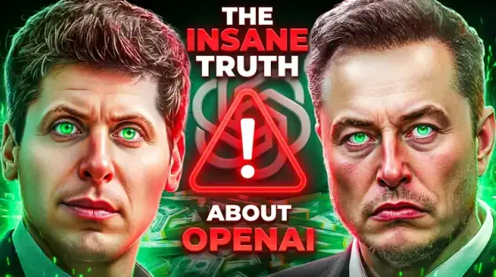
- The rivalry card. Two faces in opposite corners glaring across a diagonal divide, boxing-poster style. It fits creator challenges, product face-offs and prediction videos. Put one short stat under each side instead of a paragraph of setup - the glare carries the drama.
Transformation is the native language of fitness - the workout thumbnail maker covers the credibility details that make before/after covers convert. House flips and remodels run on the same split - see the real estate thumbnail maker.
Technique 07 · 3 ideas
Numbers and stakes
Numbers get processed before words, and they make a promise measurable: a duration, a cost, a count of mistakes. Stakes tell the viewer why the number matters. Combine the two and the thumbnail becomes a bet the viewer wants to watch you win - or lose.

- The countdown stamp. “100 DAYS”, “24 HOURS”, “30 MINUTES LEFT” - a time box turns any project into a story with a deadline. Set the number in the heaviest type on the cover and let the scene show which day you are on: fresh and confident, or wrecked and barely holding it together.
- The stat that sounds wrong. One number so extreme it demands verification: “$0 budget”, “1,000,000 subscribers in a year”, “0 deaths”. Round, huge numbers stop the scroll; oddly specific ones - “$4,217” - build trust. Choose based on whether your video is spectacle or proof.
- The visible wager. Show what is physically at risk: the cash on the table, the keys to the car you might lose, the contract with your signature on it. An object at stake beats an abstract claim because the camera can see it. If the wager is real, your comments will keep the story alive for you.
Two niches built entire formats out of this section: travel’s budget-and-days covers (see the travel thumbnail maker) and Minecraft’s 100-days sagas (see the Minecraft thumbnail maker). Money channels use the oddly specific number as proof rather than spectacle - the finance thumbnail maker and the business thumbnail maker show how to keep it credible.
Technique 08 · 3 ideas
Creative minimalism and negative space
When every neighboring cover screams, the quiet one earns the second look. Minimalism is not low effort - it is aggressive subtraction: one subject, one field of color, maybe one word. It signals confidence, and audiences read confidence as quality.
- One subject, empty field. A single centered object or face on a flat color field, nothing else. The emptiness does the pointing - there is nowhere else to look. This suits reviews, essays and product videos where the subject is instantly recognizable on its own.
- The no-text cover. Skip on-image text entirely and let the photograph carry the promise while the title does the talking. It only works when the image is self-explanatory - an unmistakable moment, expression or object. When it lands, it out-classes text-heavy neighbors instead of out-shouting them.
- The film-still frame. Grade the image like a movie still: muted palette, one light source, honest shadows, restrained type if any. Long-form audiences read the cinematic look as a promise of production quality - exactly the judgment they make before committing forty minutes.
Music releases and video essays lean minimal by nature - the music thumbnail maker shows the album-art end of this spectrum.
Before you upload
Whatever ideas you pick, the file itself has fixed rules: 16:9, as JPG or PNG, 3840×2160 recommended and at least 640 pixels wide (1280×720 is the standard HD size), under 2 MB from the mobile app or 50 MB from desktop. Crop to the exact spec with the free thumbnail resizer and squeeze oversized exports with the 2 MB image compressor - both run in your browser, no signup.
Then treat every cover as a hypothesis: watch CTR in YouTube Studio for the first 48 hours, and if a video sits under your usual baseline, swap in a different technique from this list. All of our free thumbnail tools live in one place when you need them.