You’ve got the video idea. The script is outlined. The hook is solid. Then the whole process slows down on the part that should be simple: the visual assets.
That’s the point where a lot of solo creators lose momentum. You need a thumbnail, a few social graphics, maybe a blog header, maybe a visual for the intro slide. Traditional design tools can do all of it, but they also ask you to switch roles. You stop being a creator and start being a layout technician. If you outsource, you get your time back, but you also add cost, revision loops, and a delay that kills publishing speed.
An AI design tool is useful because it removes that stall. It helps you get from rough idea to workable visual draft fast enough that you can stay in the content flow. If you’re still at the topic stage, a list of video idea prompts for creators can help upstream. But once the idea exists, design is often the next bottleneck, and that’s where AI changes the workflow.
Table of Contents
- The Content Creator’s Design Bottleneck
- What Is an AI Design Tool Really
- How AI Generates Designs From Your Ideas
- The Real Benefits and Limitations for Creators
- How to Choose the Right AI Design Tool
- A Practical Workflow for YouTube Thumbnails with Thumbo AI
- Best Practices for Authentic AI-Powered Design
The Content Creator’s Design Bottleneck
A common creator day looks like this. You finish writing or recording, feel good about the piece, then open your design app and hit friction immediately. Which background works. Which face crop looks right. How big should the text be. Why does everything suddenly look generic.
For solo creators, this problem isn’t really about software skill. It’s about context switching. Writing, filming, editing, publishing, and packaging already pull your attention in different directions. Design is where that load becomes visible because every tiny visual decision asks for taste, speed, and technical control at the same time.
Small teams hit a different version of the same wall. One person owns the content calendar, another edits video, someone else handles socials, and design keeps becoming the final dependency. Nothing is fully blocked, but nothing ships cleanly until the visuals are done. That’s why packaging often gets rushed, even when everyone knows the thumbnail or graphic matters.
Practical rule: The bottleneck usually isn’t the big creative idea. It’s the last-mile visual work that needs to be good enough to publish today.
Traditional options both have trade-offs. Full design software gives you precision, but it also gives you a hundred knobs to turn. Outsourcing gives you polish, but it introduces waiting. In a fast publishing workflow, waiting is often more expensive than people admit.
An AI design tool fits this gap well when you use it for draft generation, iteration, and repetitive production. It gives you something to react to instead of a blank canvas. For creators, that’s often the core benefit. Not perfect design on the first try, but a faster path to a strong second or third draft.
What Is an AI Design Tool Really
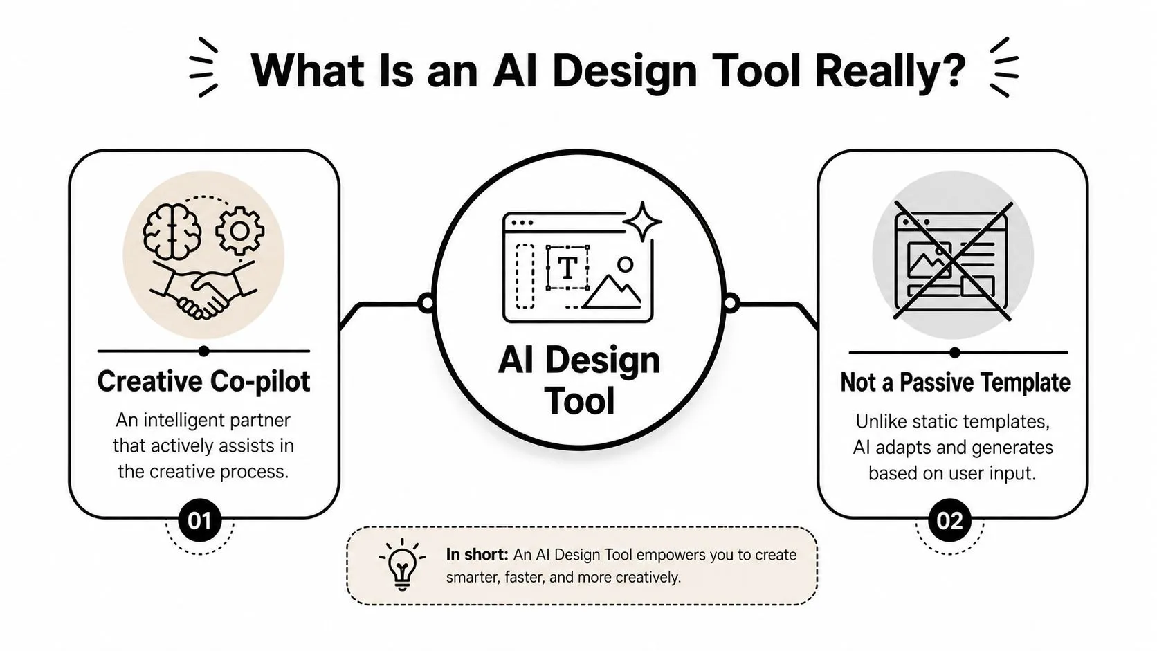
An AI design tool is best understood as a creative co-pilot. It doesn’t sit there like a static template pack waiting for you to drag things around. It responds to instructions, suggests directions, generates options, and helps execute repetitive production work that usually eats your time.
More than a template
Templates are fixed starting points. They help when your need matches the template. They become frustrating when your content doesn’t fit the layout, the mood, or the visual language baked into it.
An AI design tool works differently. You describe the outcome, provide rough inputs, or ask for variations, and the system generates options around that request. In practice, that can mean a few different things:
- Automation help: Auto-resizing, background removal, layout cleanup, and formatting tasks.
- Generative help: New image concepts, alternate compositions, text-based visual ideas, and fresh stylistic directions.
- Iteration help: Producing several routes quickly so you can compare before committing.
This is why the co-pilot analogy holds up. You still decide what the asset should do. The tool helps you move faster from intent to output.
Good use of AI in design feels less like pressing a magic button and more like directing a very fast junior designer that needs clear feedback.
That distinction matters. Creators who expect perfect one-shot results usually get disappointed. Creators who treat AI as a fast draft engine usually get value quickly.
Why this category matters now
This isn’t a side trend anymore. The global AI-powered design tools market is projected to grow from $4.4 billion in 2023 to $26.5 billion by 2033 at a 19.6% CAGR, according to Market.us reporting on the AI-powered design tools market. For creators, that matters less as a business headline and more as a workflow signal. Tools at this scale don’t stay experimental for long. They become normal infrastructure.
For a solo creator, that means design support is getting easier to access without hiring. For a small team, it means fewer hours spent on routine production work. The creative role doesn’t disappear. It shifts upward. You spend less time nudging pixels and more time choosing the direction, mood, and final message.
The best way to think about it is simple. You remain the creative director. The AI handles more of the first-pass execution.
How AI Generates Designs From Your Ideas
A creator usually hits this moment mid-production. The script is done, the video direction is clear, but the visual still exists only as a rough idea in your head. An AI design tool closes that gap by turning loose intent into something you can react to, reject, and refine.
From prompt to visual direction
The process starts with inputs. Those can include a text prompt, a reference image, a title, a color cue, a layout request, or a few style constraints. The model reads those signals, matches them to patterns it has learned, and returns draft visuals based on probability rather than intent. That last part matters. The tool does not know your brand goal unless you state it clearly.
For a YouTuber, the prompt often sounds less like design jargon and more like a production brief: close-up face, dark background, bold text, tension, high contrast, no clutter. That is enough to generate a first round. From there, the actual work starts. You review the outputs, keep the direction that fits the video, and tighten the next prompt.
Prompt quality affects output quality because the model fills in gaps on its own. If the prompt is vague, it invents more. Sometimes that helps. Often it creates extra cleanup.
A practical prompt usually covers four things:
- The subject
- The emotional tone
- The main focal point
- What should not appear
That structure saves time, especially for solo creators who cannot afford ten random generations just to find one usable direction.
Why generative tools feel different
Older AI features handled production chores such as background removal, resizing, or retouching. Generative tools do a different job. They propose visual options that did not exist before. That changes how creators work because the tool is no longer only cleaning up assets. It is contributing first drafts.
The market reflects that shift. The generative AI in design market is projected at USD 993.90 million in 2025 and approximately USD 16,893.37 million by 2035, expanding at a 32.75% CAGR, based on Precedence Research coverage of generative AI in design. For small teams, that growth matters because these tools are getting built into the software stack, not treated as side experiments.
Automation AI behaves more like production support. Generative AI behaves more like an always-available concept artist that produces rough directions fast, but still needs selection and correction from a human editor.
That trade-off is easy to see in real workflows. Generated images can drift from your usual thumbnail style. Faces can look a little too polished. Compositions can miss the one emotion you require. But the upside is speed. You get multiple starting points in minutes, which is useful when you are juggling a publish deadline, a thumbnail, a blog header, and three social assets at the same time.
Some creators also use text-to-image tools for fast concept rounds because each generation gives them options to evaluate instead of a blank canvas. In practice, the technical process matters less than the workflow implication. Every prompt is a bet on direction, every batch needs review, and the best results usually come from two or three feedback rounds rather than one perfect request.
That is why AI-generated design works best inside a clear production process. The tool handles volume and variation. The creator protects tone, taste, and brand consistency.
The Real Benefits and Limitations for Creators
The strongest case for an AI design tool is practical. It helps creators produce more visual work without letting design eat the whole week. The weakest case is magical thinking. AI doesn’t remove taste, strategy, or the need for human review.
Where AI helps immediately
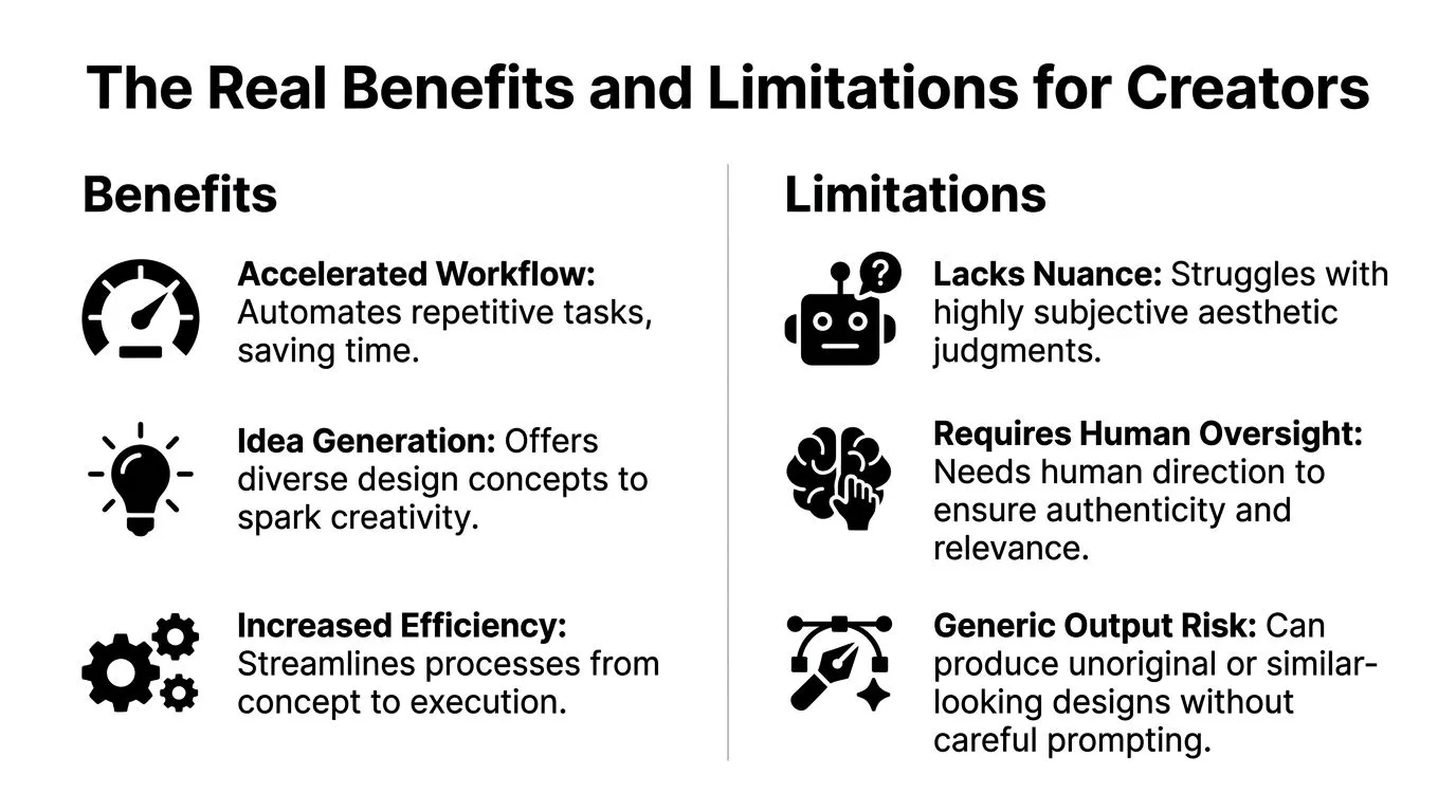
For most creators, the first win is speed. Instead of building every asset from scratch, you start with multiple visual directions. That makes AI especially good for thumbnails, blog graphics, promo cards, and concept art where quantity of drafts improves decision quality.
The second win is momentum. Blank canvas anxiety is real. AI helps because you can react to something concrete. Even when the first output is wrong, it’s often wrong in a useful way. It shows you what to change.
The third win is scale. If you’re repackaging one video into a blog, newsletter image, social snippet, and community post, AI handles the repetitive adaptation work well.
A few benefits show up consistently in creator workflows:
- Faster first drafts: You move from idea to visible concept quickly.
- More variations: Testing different moods and compositions becomes easier.
- Less technical friction: Non-designers can get decent results without mastering a full pro tool stack.
- Better support for repetitive production: Resizing, remixing, and visual adaptation fit AI well.
Where creators still need judgment
The limitations matter just as much. AI is often better at producing plausible design than meaningful design. That’s a big difference. Plausible visuals can look polished while saying very little.
Brand consistency is another weak point. If you rely too heavily on raw AI output, your channel or publication starts to feel visually unstable. One post looks cinematic, the next looks cartoonish, the next looks like a stock ad. Audiences notice that drift even if they can’t name it.
There’s also an authenticity problem. Some creators are leaning into ultra-clean AI visuals that look impressive in isolation but disconnected from the person behind the content. BrandGhost’s guide to AI for content creators makes the same point about writing: edit AI drafts for voice, not just correctness, and ask “does this sound like me?” as its own pass. That doesn’t mean creators should avoid AI. It means audiences still respond to signs of human intent.
Field note: If a visual looks like it could belong to anyone, it usually won’t strengthen your brand.
AI also struggles when the brief is fuzzy. If you don’t know the emotional angle, the audience, or the one thing the image must communicate, the tool can’t fix that uncertainty for you. It will just produce polished confusion faster.
The best outcomes usually come from a split of responsibilities. Let AI explore. Let the creator decide.
How to Choose the Right AI Design Tool
A solo creator usually feels the tool problem on a deadline. The script is done, the upload window is close, and design is now the slowest part of the process. That is the wrong moment to compare fifty features across ten products.
Choose based on the asset that repeatedly slows you down.
Start with the job, not the brand name
A tool that works well for YouTube thumbnails can be a poor fit for blog headers or carousel graphics. Thumbnails need fast concept generation, strong subject separation, bold text handling, and readability on a phone screen. Blog visuals usually need cleaner composition, lighter branding, and export options that fit a CMS. Small teams producing social posts every day often care more about resizing, shared templates, and version control than raw image generation quality.
The fastest way to narrow the field is to look at your weekly output, not the product demo.
| Question | Why it matters |
|---|---|
| What asset do I make most often? | Your highest-frequency task should get the biggest time savings. |
| Do I need generation, editing, or both? | Some tools are better at ideas. Others are better at cleanup and refinement. |
| How much control do I want? | More control usually means more setup and a steeper learning curve. |
| Will non-designers use it? | In a small team, ease of use affects how often the tool gets used. |
That filter removes a lot of noise. If you publish three videos a week, a thumbnail-focused tool with fast iteration can beat a broader platform you only use at 20 percent of its capacity.
Pick the tool that fits your repeatable workflow first. Extra features matter less than consistent output.
Compare pricing against your production rhythm
Pricing only looks simple on the landing page. In practice, it shapes how freely you test ideas.
Usage-based tools can work well if you generate visuals occasionally and already know what you want. They become harder to justify when your process depends on dozens of variations before you find the right direction. Subscription tools cost more upfront, but they often make sense for creators who publish on a schedule and need room to experiment without counting every prompt.
The practical question is not “Which one is cheaper?” It is “Which pricing model matches how I work?”
For evaluation, keep the trade-offs plain:
- Solo creators: Speed, clarity, and a short path from prompt to usable asset usually matter more than advanced controls.
- Small teams: Shared access, comments, templates, and export consistency matter because handoff friction wastes time.
- High-volume publishing: Pricing becomes part of the production system. If every thumbnail needs ten test variations, cost per iteration matters.
- Brand-sensitive work: Style controls, editing precision, and repeatable outputs matter more than novelty.
If your main bottleneck is thumbnails, it makes sense to test a thumbnail-focused AI design workflow instead of forcing a general design suite to do a specialist job.
A good fit should reduce decisions, not add new ones. The right tool saves time, keeps visual quality steady, and still leaves room for the human choices that make the work feel like yours.
A Practical Workflow for YouTube Thumbnails with Thumbo AI
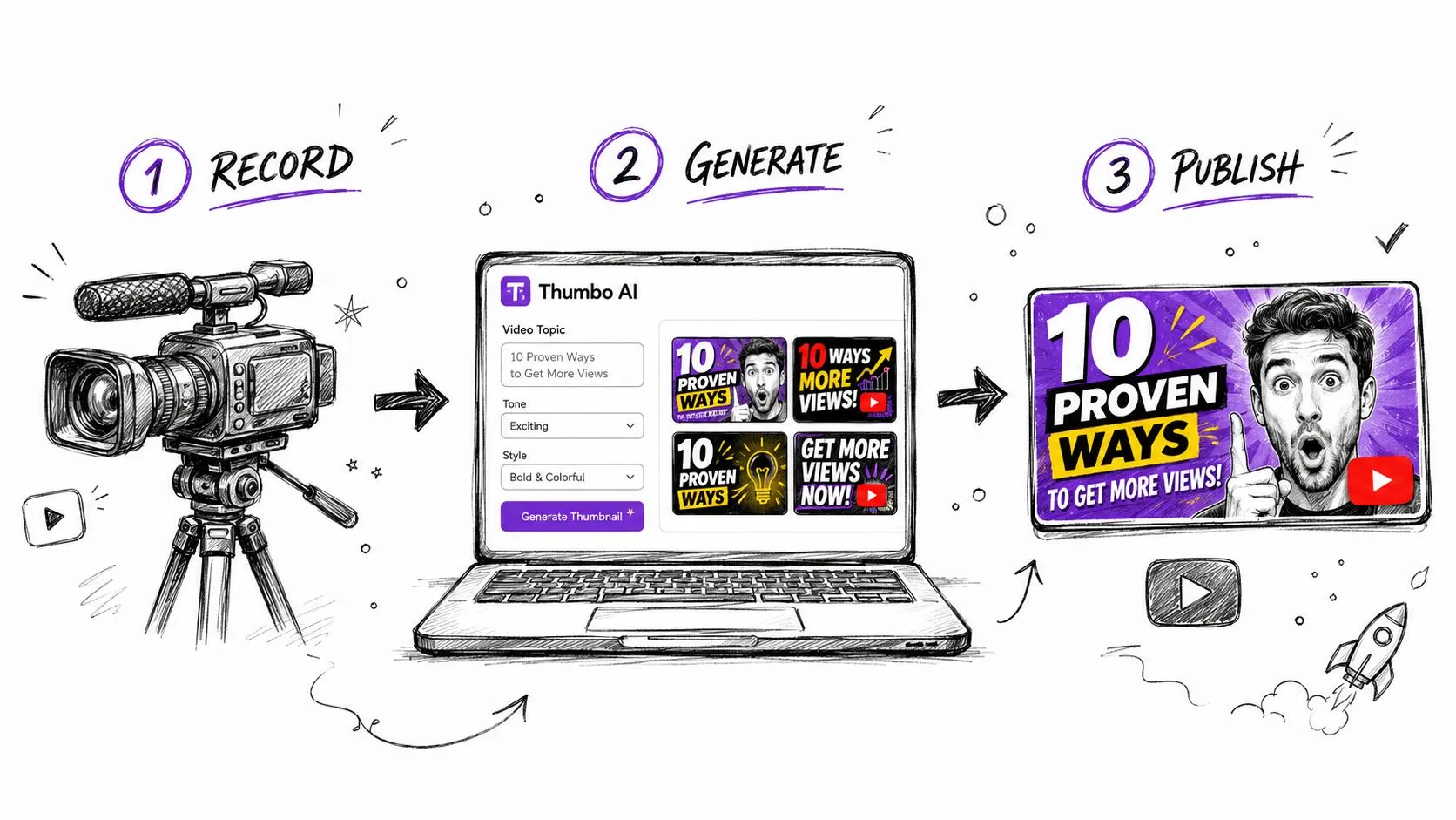
A thumbnail workflow earns its keep on upload day. The title is still in flux, the edit just finished, and there is no time for a two-hour design detour. For solo creators and small teams, that is where AI either saves the schedule or adds another layer of cleanup.
Start with the click promise
Strong thumbnails usually come from a clear promise, not from styling choices. Before generating anything, define what the viewer should understand in one glance. Curiosity, tension, relief, surprise, proof.
Reduce the brief to one plain sentence. If a video is about fixing bad productivity habits, a useful brief is: “Show frustration turning into control.” That gives the design system something concrete to work with.
Three inputs are usually enough to get usable first drafts:
- Working title: Clear topic signal, even if the final wording changes later.
- Visual hook: Face reaction, object, result shot, or before-and-after setup.
- Single message: The one idea the viewer should catch without reading much text.
That structure matters because AI is fast, but it still mirrors the quality of the prompt. A loose prompt produces loose options.
Generate directions, then choose one
The practical mistake is editing the first decent version until it becomes “good enough.” A better process is to generate multiple concepts that solve the packaging problem in different ways, then refine the strongest one.
One concept might rely on facial expression. Another might push contrast and scale. A third might remove text almost entirely and let one object carry the idea. Those are meaningful tests. Tiny font changes are not.
A thumbnail-specific tool usually helps here because the output starts closer to the job you need. A thumbnail AI design tool built for YouTube creators can shorten the path from rough idea to testable concept, especially if your weekly workflow depends on producing several options fast.
Use a quick review pass before polishing:
- Does the idea read on mobile?
- Is the focal point obvious in under a second?
- Does the text add context instead of repeating the image?
- Does the design still feel like the channel?
That last question is where human judgment is essential. If the result looks generic, swap in your own face crop, tighten the text, adjust the framing, or strip out details that make it feel overprocessed.
Build the thumbnail around production reality
This is the part creators skip. A thumbnail is not a standalone asset. It sits inside a publishing workflow that includes scripting, editing, title testing, and often a last-minute change after export.
For solo creators, the useful pattern is simple. Generate 3 to 5 directions after the rough cut is done, pick one, then finish the human edits only after the title is close. That avoids polishing a concept that no longer matches the final angle of the video.
For small teams, the handoff matters more. One person can define the click promise, another can generate options, and the final pass can stay with the editor or channel lead who knows the brand standards. AI speeds up the middle of the process. It should not replace the final taste check.
That balance is the main advantage. You get faster iteration without handing over your channel identity.
Design for viewers who scan, not study
Many thumbnails fail because they ask the viewer to read too much or decode a clever idea too slowly. YouTube browsing is faster than that. The image needs to communicate before the brain decides whether to care.
That usually means simpler composition, stronger contrast, and fewer competing elements. If a concept only works after reading every word, it is fragile. If it works with the text removed, you probably have a stronger thumbnail.
A practical checklist helps:
- Cut text until only the useful words remain
- Use one dominant subject
- Keep contrast high enough for small screens
- Make the emotion or result visible without explanation
- Treat AI output as a draft, not the finished file
The goal is straightforward. Use AI to get to strong options faster, then apply human editing so the final thumbnail still feels authored, specific, and worth clicking.
Best Practices for Authentic AI-Powered Design
The most effective way to use AI is to treat it as a first-draft machine, not a final-authority machine.
Creators get into trouble when they publish outputs that are technically polished but personally empty. Audiences can feel that. A strong workflow keeps the human fingerprints in the final asset. That might mean using your own face crop, sticking to your established type style, adding roughness back into an overly clean draft, or simplifying a generated concept until it feels like something you would make.
The signal to watch is authenticity. As noted earlier, there are situations where AI-looking visuals can underperform. If you want a practical reminder of how packaging affects Shorts too, this guide on YouTube Shorts thumbnail strategy is worth keeping in your workflow notes.
A few habits work well:
- Edit the AI output manually: Don’t ship the raw generation.
- Preserve brand anchors: Keep recurring colors, framing styles, or typography choices.
- Use AI for options, not identity: Let it broaden ideas, not define your voice.
- Remove overproduction: If it looks too glossy, simplify.
The best AI-assisted design still feels like it came from a person with taste, not a machine with range.
AI is at its best when it helps you publish faster without flattening what makes your work recognizable.
If you want a faster way to turn video ideas into clickable packaging, Thumbo AI is built for that exact workflow. It helps creators generate and refine YouTube thumbnails quickly, so you can spend less time fighting the design step and more time publishing.