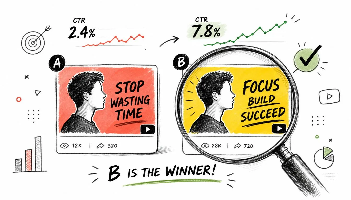
What makes a how-to video worth producing before you press record?
A strong idea does more than teach a task. It gives the viewer a reason to click, a reason to keep watching, and a clear next step once the video ends. That is where many creators miss. They choose a topic, but they do not choose the format, the audience fit, or the packaging.
This article takes a more useful approach. Instead of dumping generic how to video ideas into a list, it sorts them by creator type and treats each one like a production brief. That means every format comes with the parts that shape performance:
- a viral-worthy title angle
- a scroll-stopping hook
- a realistic filming complexity level
- a specific thumbnail concept you can design
That structure matters because the best how-to videos are not interchangeable. A software educator, a maker channel, and a service business should not be publishing the same kind of tutorial just because all three “teach.” Each needs a format that matches its proof, production capacity, and audience intent.
Packaging also affects the practical side of publishing. If a tutorial is built for search, a clear title and thumbnail usually beat clever branding. If it is built for browse, the hook has to carry more weight in the first 30 seconds. If the video includes bonus files, client examples, or behind-the-scenes footage, your publishing choice matters too. Here is a clear breakdown of private vs unlisted YouTube video settings if you need to decide how to share supporting material without making it fully public.
The 10 formats below are built to help you choose faster and produce with more intent. The goal is not more ideas. The goal is better bets.
Table of Contents
- 1. The Mistakes to Avoid Tutorial
- 2. The Ultimate Beginner’s Guide
- 3. The Tool vs. Tool Showdown
- 4. The Process and Workflow Deep Dive
- 5. The Expert Reacts Analysis
- 6. The Advanced Technique Unlocked
- 7. The DIY Build Project
- 8. The 30-Day Challenge How-To
- 9. The System Setup Guide
- 10. The Common Task, Done Better Tutorial
- Comparison of 10 How-To Video Formats
- From Idea to Impact Your Next Step
1. The Mistakes to Avoid Tutorial
Fear is a stronger click trigger than curiosity in a lot of niches. If your audience worries about wasting money, ruining a project, or looking inexperienced, this format works fast.
A cooking creator can do “5 Steak Mistakes That Ruin Dinner.” A YouTube educator can do “7 Thumbnail Mistakes Killing Your Clicks.” A home DIY channel can do “Mistakes to Avoid When Painting Cabinets.” The reason it works is simple. Viewers don’t need to be ambitious to click. They just need to want fewer problems.
Best for creators who teach beginner-sensitive skills
Viral-worthy title: 7 Mistakes Beginners Make When Editing YouTube Videos
Scroll-stopping hook: “If your videos feel slow, messy, or amateur, one of these mistakes is probably the reason.”
Filming complexity: Low to medium. Talking head, screen recording, and a few side-by-side examples.
Thumbnail concept: Your face reacting to a red X over a cluttered timeline, with short text like “STOP THIS.”
The strongest version shows the mistake first, then the fix. Don’t lecture. Demonstrate. If you teach camera settings, show the blown-out image. If you teach productivity, show the chaotic dashboard. If you teach YouTube workflow, show the exact upload choice that causes confusion, like the difference explained in this guide to private vs unlisted YouTube videos.
Practical rule: Mistake videos work when each mistake is visible in under a few seconds. If viewers need a long explanation before they understand the problem, the idea isn’t packaged tightly enough.
Use this format when your audience is early-stage and nervous. Skip it if your niche audience already knows the basics and wants depth instead of warnings.
2. The Ultimate Beginner’s Guide
What makes a beginner guide worth watching all the way through instead of getting abandoned after two minutes?
A good one gets the viewer to a first win fast. That is the job. New viewers are not asking for a full theory lesson. They want a starting setup, a clear order of steps, and enough context to avoid getting stuck.
This format works best for creators who teach a process people want to start today. Photography channels can cover manual mode. 3D printing creators can show how to print a first useful object without burning through filament. Finance creators can walk through a first budget that someone can finish in one sitting.
Best for educators and niche authorities
Viral-worthy title: The Complete Beginner’s Guide to Notion for Creators
Scroll-stopping hook: “If Notion feels powerful but confusing, this setup makes it usable on day one.”
Filming complexity: Medium. Clear chapters, clean screen recordings, and a finished example viewers can copy.
Thumbnail concept: A clean creator dashboard on one side, messy notes on the other, with “BEGINNER SETUP” in large text.
The strategic value is simple. Beginner guides pull in search traffic for months, sometimes years, because the viewer intent stays stable. “How do I start?” does not go out of date as quickly as trend-driven topics do.
That long shelf life only helps if the video is structured well.
Use this production brief:
- Start with the end state. Show the finished workspace, final result, or completed setup in the first 15 seconds. Beginners need proof that the tutorial leads somewhere concrete.
- Build in the order they will use it. Skip history, edge cases, and advanced options until the core setup works.
- Define terms only at the moment they matter. Early explanations should remove confusion, not add vocabulary.
- Cut choices where possible. Too many options create hesitation. Give one recommended path first, then mention alternatives later.
- Design for the first session, not mastery. A beginner guide should help someone get a result today. Advanced nuance can live in separate videos.
For a Notion tutorial, that means opening with a usable creator dashboard, then showing the minimum pages, databases, and views needed to run content planning. It does not mean touring every menu item. Breadth feels helpful to the creator. Sequence is what helps the viewer.
The trade-off is production time. These videos take more planning than a quick tip or reaction format because gaps become obvious fast. If one step is skipped, beginners leave. If the pacing drags, retention collapses. Script tighter than you think you need to.
A strong beginner guide becomes a reliable entry point for the channel. A weak one turns into a long video with no clear payoff.
3. The Tool vs. Tool Showdown
When viewers are stuck between two options, they’re already halfway to clicking. Decision content has built-in tension.
This format is ideal for software channels, gear reviewers, designers, and marketers. “CapCut vs Premiere Pro for Shorts.” “Canva vs Photoshop for Thumbnails.” “Notion vs Trello for Solo Creators.” The audience isn’t looking for inspiration. They want a verdict they can act on today.
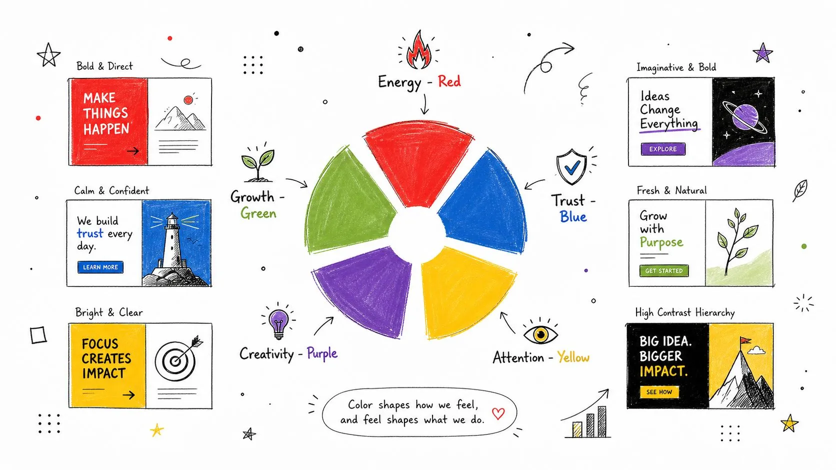
Best for software, gear, and creator-tool channels
Viral-worthy title: Canva vs Photoshop for YouTube Thumbnails. Which One Wins Scroll-stopping hook: “One is faster. One gives you more control. Most creators pick the wrong one for their stage.” Filming complexity: Medium. Screen captures, timed tests, and output comparisons. Thumbnail concept: Split-screen logos with one giant green check and one red question mark.
The mistake here is pretending both tools are equally good at everything. They aren’t. Compare them against clear tasks. Speed, ease of use, flexibility, template quality, and export control are all fair categories. If you’re a designer, use a real thumbnail scenario. Show how each tool handles text hierarchy, facial cutouts, and color contrast.
You don’t need to be neutral. You need to be fair, then specific.
A useful showdown ends with a recommendation by creator type. Beginner, freelancer, agency, mobile-first creator, or long-form editor. That’s what resolves analysis paralysis.
4. The Process and Workflow Deep Dive
What makes a creator look experienced on camera. Better tips, or a process that holds up under deadline?
Workflow videos earn trust because they show how decisions get made. A tutorial can teach one move. A process video shows the sequence, the checkpoints, and the standards behind the final result. That matters for viewers who want repeatable results, not a one-off win.
A video editor can walk through a client edit from ingest to handoff. A product photographer can show how a raw item becomes a listing image that sells. A business creator can map the path from idea capture to script draft to publish day. Each version works for a different creator type, but the strategic value stays the same. You are showing judgment under constraints such as time, file mess, revision risk, and quality control.
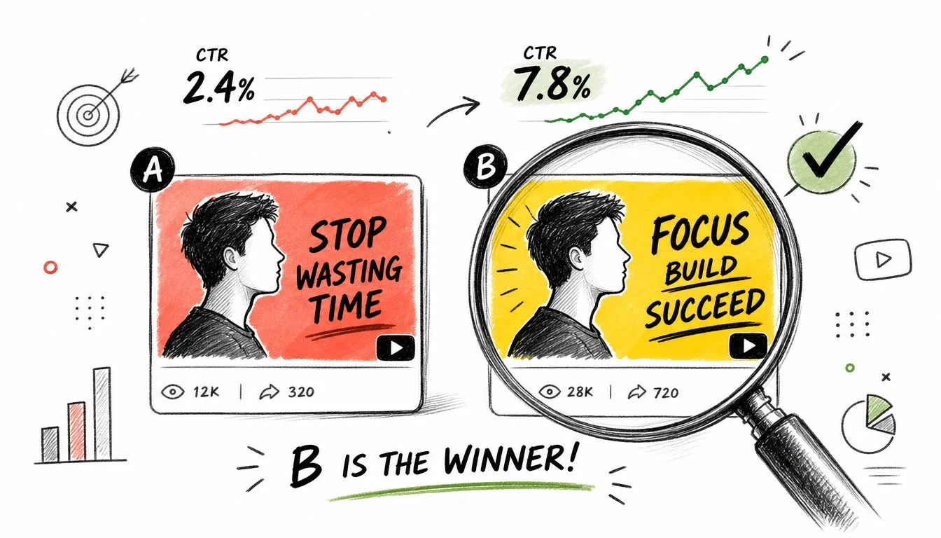
Best for service providers and operators
Viral-worthy title: My Full YouTube Thumbnail Workflow From Idea to Final Export
Scroll-stopping hook: “This is the exact order I use so I don’t waste time polishing weak concepts.”
Filming complexity: Medium to high. Screen recording, B-roll, file structure shots, and examples at each phase.
Thumbnail concept: Folder tree, rough sketch, and final thumbnail stacked left to right with “MY WORKFLOW.”
The strength of this format is specificity. Viewers do not need another vague “behind the scenes” video. They need the production brief. What happens first, what gets checked before you continue, where quality usually drops, and what you refuse to skip even when the deadline is tight.
Use a clear structure:
- Show the starting point. Raw files, blank canvas, messy notes, or an incoming client brief.
- Break the process into phases. Research, draft, revision, approval, export, and delivery are easier to follow than one long screen recording.
- Explain the reason for the order. If concept comes before polish, say why. If naming conventions save hours later, show the payoff.
- Include one real trade-off. Speed versus customization. Template efficiency versus originality. Fast turnaround versus extra review.
- End with the finished output and a checklist. Viewers should leave with a process they can copy, not just admire.
One mistake shows up often. Creators film the workflow as a diary instead of a system. That usually produces long footage and weak retention. Edit around decisions, not around time. “I tested three thumbnail directions and killed two” is stronger than “here’s everything I did for 40 minutes.”
If you want this format to perform, label each phase on screen and make the transitions obvious. Viewers remember processes when they understand why each step exists and what breaks when it gets skipped.
5. The Expert Reacts Analysis
Why do some reaction videos teach for years while others get one quick spike and disappear?
This format works for creators with real pattern recognition. The job is to take a public example, slow it down, and explain the decisions behind the result. A fitness coach can review a deadlift tutorial and point out setup errors that increase injury risk. A cinematographer can examine a commercial and show how lens choice changes mood. A branding strategist can review startup logos and explain what makes one mark feel premium and another feel forgettable.
Best for skilled practitioners with strong opinions
Viral-worthy title: Pro Editor Reacts to Viral YouTube Intros That Work
Scroll-stopping hook: “Some of these intros earn attention in seconds. Others lose the viewer before the first point lands.”
Filming complexity: Low to medium. You need a clean commentary setup, screen capture, and only the reference clips needed to support the lesson.
Thumbnail concept: Your face pointing at a recognizable frame or thumbnail, with a bold label like “WHY THIS WORKS.”
The strategy is simple. Borrow attention from a familiar example, then convert that attention into trust by teaching something specific. Viewers click for the subject they recognize. They stay because you explain what they missed.
A weak reaction video turns into personality commentary. A strong one gives the viewer a framework they can reuse.
Use a structure like this:
- Start with the claim. Say what worked or failed before you press play.
- Pause at the exact moment the lesson appears. Do not wait until the end and summarize broadly.
- Name the principle. Pacing, clarity, framing, hierarchy, tension, proof, or audience fit.
- Show the trade-off. The flashy intro may look polished but delay the value. The simple version may look less impressive but hold retention better.
- Translate it into action. Tell the viewer what to copy, what to avoid, and where this tactic breaks.
Topic choice decides whether this format teaches or rambles. Broad prompts like “branding tips” usually produce vague commentary. Narrow prompts work better because they force a clear thesis. “Why this logo redesign feels cheap” gives you something concrete to prove. “Why this intro loses retention” does the same.
One caution matters here. Pick examples your audience can learn from, not just examples they already have opinions about. Reacting to a famous campaign can drive clicks, but smaller case studies often teach better because the decisions are easier to isolate and the viewer can apply them.
The best expert reaction videos leave the audience with a checklist. They should finish the video able to review their own work with sharper standards, instead of just agreeing with your opinion.
6. The Advanced Technique Unlocked
Beginner content grows reach. Advanced content builds respect. You need both if you want a channel people stay with.
This format works when your audience already knows the basics and wants the next edge. A music producer can teach vocal automation for cleaner mixes. A designer can teach text compression and negative space for better thumbnail hierarchy. A woodworker can teach joinery choices that improve strength and finish quality.
Best for channels with an existing base audience
Viral-worthy title: The Advanced Thumbnail Trick That Makes Busy Designs Click
Scroll-stopping hook: “If your thumbnail has all the right elements and still feels weak, this is usually the missing layer.”
Filming complexity: Medium. You need close examples, annotations, and before-and-after comparisons.
Thumbnail concept: Two nearly identical thumbnails, with one circled detail enlarged and labeled “THE FIX.”
Most creators rush this format too early. Advanced tutorials flop when the audience doesn’t yet trust your basic teaching. But once viewers know you can explain clearly, they’ll follow you into narrower topics.
A good advanced video teaches one hard thing, not five. Keep the promise tight. “How to color grade skin tones under mixed lighting” is strong. “Pro color grading tips” is too broad. The narrower the skill, the easier it is to prove the result visually.
The best advanced videos don’t feel complicated. They make a complicated move feel usable.
7. The DIY Build Project
Transformation drives retention. If viewers can see progress, they’ll stay to see the final result.
That’s why build videos keep working across niches. A maker builds a desk shelf. A beauty creator formulates a custom lip gloss setup. A tech creator assembles a streaming corner on a budget. A food creator recreates a bakery item from scratch. There’s motion, tension, and a visible payoff.
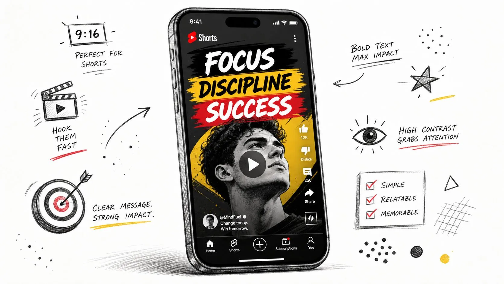
Best for makers, crafters, and visual teachers
Viral-worthy title: I Built a Clean YouTube Filming Setup in One Weekend
Scroll-stopping hook: “My old setup slowed everything down, so I rebuilt the whole space around speed and lighting.”
Filming complexity: High. You need planning shots, progress stages, failures, and a clean reveal.
Thumbnail concept: Before-and-after workspace with a dramatic lighting contrast and short text like “DIY SETUP.”
This format gets stronger when you leave in the problems. Bent wood, bad paint coverage, a wrong cable choice, a cut piece that doesn’t fit. Those moments make the project believable and teach more than a polished montage.
Use chapter points around milestones, not tools. “Frame built,” “lighting test,” “cable cleanup,” and “final reveal” are better than listing every material in sequence. The audience wants momentum.
If your niche isn’t physical, think of “build” more broadly. Build a website homepage. Build an automation. Build a content system. The same transformation principle still applies.
8. The 30-Day Challenge How-To
Can you prove your advice works when repetition, bad days, and plateaus show up?
That is why the 30-day challenge format works. It turns a tutorial into evidence. Viewers watch a real process under pressure, which makes the lesson more credible than a one-off demo.
A beginner guitarist learns one song in 30 days. A shy creator publishes Shorts for a month. A runner trains for a first 5K. A designer rebuilds one thumbnail every day. The appeal is simple. The audience gets a method they can copy and a story they want to finish.
Best for personality-led channels and documented learning
Viral-worthy title: I Practiced Thumbnail Design for 30 Days. Here’s What Improved Scroll-stopping hook: “I used the same thumbnail process every day, tracked what changed, and found the few fixes that improved clicks.” Filming complexity: High. You need daily or weekly check-ins, on-screen timestamps, saved drafts, and honest commentary when progress stalls. Thumbnail concept: Day 1 and Day 30 side by side, with a clear quality gap and bold text like “30 DAYS.”
The strategic value is accountability. A challenge gives the viewer a reason to return because progress is serialized. It also forces specificity. If the creator cannot explain the routine, the experiment falls apart on camera.
The weak version is a highlight reel. The stronger version works like a production brief:
- Set one measurable target. Better thumbnails, faster editing, cleaner push-up form, stronger color grading.
- Use one repeatable method. Viewers need a framework they can test, not a new tactic every day.
- Track visible checkpoints. Show drafts, reps, timed sessions, side-by-side comparisons, or audience feedback.
- Keep the setbacks in. Missed days, wrong assumptions, and stalled results make the lesson useful.
- End with a verdict. State what improved, what did not, and who should try the same process.
Platform choice matters here. A 30-day challenge often creates short-form moments, but the long-form video is where the teaching and payoff live. Creators who want this format to support revenue should build it around topics with lasting search demand and a clear path to deeper education. That matters even more if the channel is trying to grow into monetization through the YouTube Partner Program and its long-form revenue model.
Treat the challenge as proof. Treat the framework as the product.
9. The System Setup Guide
This format attracts viewers who are tired of chaos. They don’t just want a trick. They want an environment that makes good behavior easier.
That could mean a Notion dashboard for freelancers, a camera bag setup for event shooters, a smart home routine, a meal-prep fridge layout, or a YouTube business backend. These videos perform well because organization is visual and aspirational. People click for control.
Best for productivity, business, and creator-ops channels
Viral-worthy title: How I Set Up a Simple YouTube Business System That Saves Time Every Week
Scroll-stopping hook: “Most creator systems are overbuilt. This one handles planning, uploads, sponsors, and revenue tracking without becoming a second job.”
Filming complexity: Medium. Screen recording, overhead shots, and a tight walkthrough.
Thumbnail concept: Messy desktop or whiteboard on one side, clean organized dashboard on the other with “MY SYSTEM.”
Creators in growth mode benefit from simple setup videos because specific questions often outperform broad topics. Once the viewer has solved the system issue, they’re more likely to keep watching related operational content. If your channel also teaches monetization, connect the setup to the bigger journey, such as understanding what the YouTube Partner Program is and how your content workflow supports it.
Use this format to remove hidden friction. Folder naming, upload defaults, recurring task templates, and approval pipelines may sound boring in abstract. On camera, they become relief.
A setup guide wins when the viewer can copy the skeleton in one sitting.
10. The Common Task, Done Better Tutorial
This is one of the smartest how to video ideas in saturated niches because it doesn’t ask the audience to care about something new. It improves something they already do.
A food creator can make “How to Meal Prep Without Dry Chicken.” A writer can make “How to Outline Faster Without Writing a Mess.” A YouTube creator can make “How to Make Better Thumbnails Without Starting From Scratch.” The task is familiar. Your job is to introduce a better method.
Best for creators in crowded niches
Viral-worthy title: How to Make Better YouTube Thumbnails Without Spending Hours on Design
Scroll-stopping hook: “If your thumbnail process starts from a blank canvas every time, that’s the bottleneck.”
Filming complexity: Low to medium. Screen recording, a reusable template, and before-and-after examples.
Thumbnail concept: One weak thumbnail crossed out beside a cleaner, higher-contrast version with text like “DO THIS.”
This format depends on contrast. You need to show the old method and the improved one side by side. Faster versus slower. Cleaner versus cluttered. Better for mobile versus unreadable on mobile. If the difference is subtle, the click will be weak and the lesson will feel small.
A practical way to strengthen the packaging is to build around visual options before filming. Looking through strong YouTube thumbnail ideas for different styles and niches can help you define the exact improvement you’re teaching, whether that’s clearer text, stronger color contrast, or a simpler focal point.
The best version of this video leaves the viewer thinking, “I can fix that today.”
Comparison of 10 How-To Video Formats
Picking the right how-to format changes the whole production brief. It affects the title angle, the hook, the thumbnail, the shoot, and the kind of viewer who clicks.
Use this table to match the format to your creator type, production capacity, and growth goal.
| Format | Implementation Complexity | Resource Requirements | Expected Outcomes | Ideal Use Cases | Key Advantages |
|---|---|---|---|---|---|
| The “Mistakes to Avoid” Tutorial | Easy | Low, simple examples and light editing | Strong CTR and shares | Quick audience growth, beginner funnels | Uses loss aversion to drive clicks fast |
| The “Ultimate Beginner’s Guide” | Medium | Medium, research and a structured script | Evergreen traffic and authority over time | SEO cornerstone content, new-audience onboarding | A complete resource that builds trust and watch time |
| The “Tool vs. Tool” Showdown | Medium | Medium, testing and side-by-side assets | Strong consideration-stage engagement and conversions | Viewers comparing products or tools, affiliate content | Clears decision paralysis and matches strong search intent |
| The “Process & Workflow” Deep Dive | Medium | Medium, screen recordings and step capture | Higher retention and stronger credibility | Creators teaching unique systems or case studies | Shows the reasoning behind a repeatable method |
| The “Expert Reacts” Analysis | Easy | Low, reaction setup and clip selection | Fast engagement tied to existing audience interest | Trending topics, authority building, commentary-led teaching | Quick to produce and easy to package around recognizable examples |
| The “Advanced Technique” Unlocked | Hard | High, demo prep and polished production | High perceived value and stronger audience loyalty | Monetization, advanced followers, course leads | Positions the creator as a specialist and supports premium offers |
| The “DIY / Build” Project | Hard | High, materials, workspace and editing time | Strong watch time and visual satisfaction | Hands-on niches, maker audiences, product showcases | Delivers a clear before-and-after payoff |
| The “30-Day Challenge” How-To | Hard | High, long-term filming, edits and progress updates | Strong emotional engagement and shareability | Story-driven growth, serial content, proof-focused teaching | Blends narrative with visible progress and results |
| The “System Setup” Guide | Medium | Medium, staged before-and-after visuals and walkthroughs | Practical impact and repeat views | Productivity, organization, tool setup tutorials | Promises efficiency gains with a visible transformation |
| The “Common Task, Done Better” Tutorial | Easy | Low, focused demo and concise editing | Immediate usefulness and high saves or bookmarks | Everyday optimizations, broad audience retention | Gives viewers a fast win they can apply right away |
A few patterns matter here.
Easy formats usually win on speed. They are useful when a creator needs more upload volume, faster testing, or simpler production briefs. Harder formats usually win on depth, proof, and perceived value, but they cost more time, planning, and edit energy.
The trade-off is straightforward:
- Choose “Mistakes to Avoid” or “Common Task, Done Better” if the goal is quick packaging and broad appeal.
- Choose “Beginner’s Guide” or “System Setup” if the goal is search traffic and repeat utility.
- Choose “Tool vs. Tool” if the viewer is close to a decision and wants help choosing.
- Choose “Process & Workflow” or “Advanced Technique” if the creator’s edge is expertise.
- Choose “DIY / Build” or “30-Day Challenge” if the payoff needs visible proof on camera.
- Choose “Expert Reacts” if speed to publish matters and the creator can add real analysis, not surface commentary.
For most creators, the best format is not the most impressive one. It is the one they can package clearly, produce consistently, and support with a strong hook and thumbnail.
From Idea to Impact Your Next Step
What turns a decent how-to idea into a video people click and finish?
Usually, it is not the topic alone. It is the fit between the viewer, the format, and the production brief behind it.
Creators who get repeat results treat format selection like strategy, not inspiration. A beginner guide serves a different job than a tool comparison. A workflow analysis builds authority in a different way than a 30-day challenge that shows proof on camera. If the format matches the viewer’s intent, the title, hook, thumbnail, and structure get easier to build. If the format is wrong, production gets heavier and the promise gets harder to communicate.
That is the next step. Pick the idea category that fits your creator type, then build a brief before you film.
Use this checklist:
- Creator type: beginner educator, reviewer, operator, builder, or personality-led expert
- Working title: clear outcome, specific audience, one promised result
- Opening hook: the problem, what changes, and why this version is better
- Filming complexity: low, medium, or high based on setup, proof, and edit load
- Thumbnail concept: one visual contrast, one object, one short phrase
- Viewer payoff: what the viewer can do, choose, fix, or avoid after watching
This approach saves time in production because it forces the hard decisions early. I have seen strong creators waste a full shoot day on videos that were never packaged clearly enough to earn the click. Editing rarely fixes a weak promise.
A few rules help here:
- Write the title before the outline. If the title feels broad, the video usually is.
- Build the hook before you gather footage. The first lines should state the problem and the outcome fast.
- Choose thumbnail contrast on purpose. Before versus after, wrong versus right, tool A versus tool B. Viewers need an instant read.
- Match proof to promise. If you promise a better workflow, show the workflow. If you promise results, show the evidence on screen.
- Scale complexity to your publishing pace. A high-proof challenge video can outperform a simple tutorial, but it also takes more planning, shooting, and edit time.
There is also a gap many creators miss. Topic gaps matter, but format gaps often produce faster wins. A question that already exists in your niche can still become a strong video if you package it in a format competitors have not handled well. A generic blog answer can become a strong “mistakes to avoid” tutorial. A scattered forum question can become a tight system setup guide. A boring feature explanation can become a tool showdown with a clear recommendation.
Pick one format from this list and turn it into a real production brief today. Write a title someone would click. Write a hook that earns the first 15 seconds. Sketch a thumbnail before the camera comes out. If those three pieces are weak, the video is still an idea.
If you want your next how-to video to get the click it deserves, try Thumbo AI. It helps bloggers, creators, YouTubers, and influencers generate sharper thumbnail concepts fast, so you can test stronger visual angles before you publish instead of guessing after the upload is live.