
What makes a great travel thumbnail
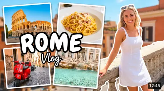
Travel is a saturated niche with an unusual property: the destination itself is a search term. People type "3 days in Rome" and "Bali on a budget" - so the thumbnail’s job is to prove your video answers exactly that query better than the ten next to it. Recognizable landmark, human presence, and one concrete promise (a price, a day count, a warning) is the pattern that wins.
Thumbo generates that pattern on demand: describe the destination and the angle ("Positano cliffside at sunset, me looking at the price menu in shock, ‘$23 A DAY’ text"), and it renders a cover with editorial-postcard polish. Your face stays consistent across every country via the persona feature - the channel becomes a recognizable series.
Travel thumbnail ideas
- The budget shock. "$50 a day in Tokyo", "cheapest country in Europe" - a big price over a beautiful scene. Money hooks travel better than beauty alone, because beauty is everywhere here.
- X days in Y. The itinerary format: day count + landmark + you mid-stride. Searchable, repeatable across every destination - the closest thing travel has to a series template.
- The tourist-trap warning. "DON’T do this in Paris" - you facing the camera with a warning gesture, landmark behind. Negative framing consistently out-clicks recommendations.
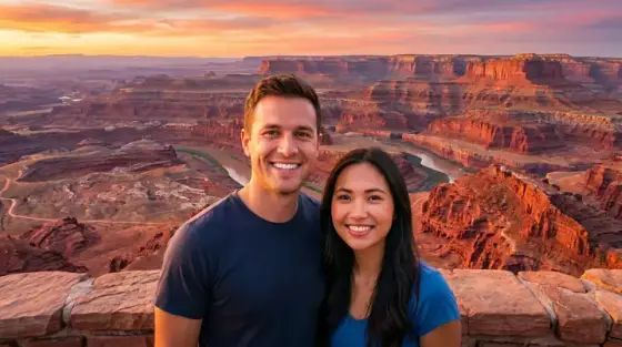
- Hidden-gem reveal. A jaw-dropping location with "no tourists know this place" energy - you small in a vast scene. Scale contrast makes the discovery feel real.
- Van life / sleeper train interior. Transport-as-accommodation content: cozy lit interior at night, window scenery rushing past. Interiors promise the practical details viewers actually came for.
- The visa/border drama. "They almost didn’t let me in" - passport, stamp, your stressed face at a counter. Bureaucratic drama is an underused hook with zero thumbnail competition.
Travel thumbnail background and text tips
Backgrounds: pick the one landmark silhouette that says the destination at 168 pixels - Eiffel, Fuji, Colosseum - and let it anchor the frame even slightly stylized. Saturate skies 15% past reality; travel viewers expect the postcard grade.
Text: day counts and dollar amounts in a clean bold sans; keep place names out of the image (the title covers them). Position text in the sky or water areas where it costs nothing. You in the front third with readable emotion completes the formula.
Prefer to do it by hand?
All the manual steps are covered by our free browser tools: study what already works with the YouTube thumbnail downloader, crop your image to the exact 1280×720 with the thumbnail resizer, and squeeze it under YouTube’s upload limit with the 2 MB compressor. No signup, nothing leaves your browser.