You’ve finished the video, the title is decent, and now the thumbnail has to do the hardest job in the whole upload. In the YouTube sidebar, it’s not competing against your other idea, it’s competing against every other creator trying to steal the same click. That’s why a free AI thumbnail maker matters now, not as a novelty, but as a practical way to generate, compare, and refine multiple thumbnail directions before you ever publish.
Table of Contents
- Why Creators Are Switching to AI Thumbnail Generation
- Getting Started with Your First AI Thumbnail Prompt
- Design Principles That Drive Thumbnail Clicks
- Export Settings and Platform Optimization
- Building a Repeatable Thumbnail Workflow
- Common Mistakes and How to Fix Them
Why Creators Are Switching to AI Thumbnail Generation
You open a blank canvas, drop in your face, add a title, and it still looks flat. That’s the moment most creators realize the problem isn’t effort, it’s speed of iteration. A free AI thumbnail maker changes the workflow by giving you multiple starting points fast, so you’re not polishing one weak idea for an hour when you should be comparing several.
The shift from design project to production habit
YouTube’s scale explains why this shift happened. Its own press page puts the numbers plainly: over 20 million videos uploaded daily, billions of monthly logged-in users, and Shorts alone averaging over 200 billion daily views (YouTube press). That volume makes thumbnails a discovery layer, not decoration, and it’s why browser-based AI thumbnail tools have moved into everyday creator workflows rather than staying in specialist design lanes. Canva’s AI thumbnail maker is a good marker of that normalization, because mainstream tools now treat thumbnail generation as a standard feature, not an advanced add-on.
A useful way to think about it is this. Manual design asks you to commit to one direction early, while AI-assisted creation gives you multiple directions before commitment. That’s the key advantage for solo creators, small teams, and bloggers repurposing content into video.
Practical rule: don’t ask one thumbnail to be perfect on the first try. Ask it to be good enough to test, then improve it against a second and third version.
The workflow shift also shows up in mainstream editors. Adobe Express now offers AI thumbnail generation inside its browser-based experience, and its tool returns four results shortly after a prompt is entered. That’s not just convenience, it’s a sign that thumbnail work has become variant-driven. Adobe Express AI thumbnail generator is built around prompt, output, edit, repeat, which matches how real creators think when they’re chasing clicks instead of polishing one hero image.
The other reason creators switch is cost control. A designer can be the right answer for a brand channel, but for a small channel with frequent uploads, a freemium tool is often enough to keep production moving. That’s why the category has expanded so quickly, from a fringe shortcut into a normal part of the upload routine, with free and freemium tiers now standard across mainstream editors and dedicated thumbnail tools alike.
See how AI design tools fit into a broader creator stack
Getting Started with Your First AI Thumbnail Prompt
Weak prompts usually produce generic thumbnails because the model has too little direction. A strong prompt gives the tool four things at once, subject, style, mood, and composition. Leave one out, and the result often looks like stock art with a title pasted on top.
Build the prompt around the click, not the topic
Start with the subject you want viewers to notice first, then add the visual tone and the camera behavior you want the image to suggest. “A creator pointing at a laptop screen, high contrast, urgent mood, tight crop, space for short title text” gives the model a clear target. “YouTube thumbnail about editing” does not.
That distinction matters even more once you decide between text-heavy and text-light thumbnails. If your thumbnail depends on readable words, pick a model with stronger text rendering, such as GPT Image 2, which currently leads the field for legible text rendered inside the image. If the image needs a dramatic scene or a stylized subject, models like Flux 2, Seedream 4.5, or Nano Banana 2 fit better on the visual side, especially when the text overlay stays minimal. Any tool that lets you switch models per thumbnail makes that trade-off visible, which is rare and useful.
A simple prompt structure works better than a long, messy paragraph:
- Subject: who or what is in the frame
- Action: what’s happening
- Mood: urgent, curious, confident, dramatic
- Composition: close-up, side angle, centered, negative space
- Text intent: large title, short hook, no text, or minimal text
“Short prompts fail when they leave the model guessing about the hook.”
For a tutorial video, test prompts like, “host holding a phone, shocked reaction, blue and yellow contrast, tight crop, large empty space on the right for a bold title.” For a comparison video, try, “split-screen laptop setup, one side clean and one side messy, sharp contrast, neutral background, room for two-word title.” Both prompts give the model a visible decision inside the frame, which matters more than a polished sentence about the topic.
Generate variants before you judge the result
Do not stop at the first usable image. The point of a free AI thumbnail maker is rapid variation, so make several versions that differ in crop, expression, and text density. One version should be safer and clearer. One should be more dramatic. One should push contrast harder than you would normally choose on your own.
That is how creators find the thumbnail that earns the click, not the one that merely looks finished. A practical workflow also means testing font choices early, since title style can change how the whole frame reads. If you want a tighter starting point, use this guide to the best fonts for YouTube thumbnails and match the type to the image instead of forcing the image to carry weak text.
Generating three or four options is not busywork. It gives you a small testing set, and that makes it easier to spot which idea has a stronger hook, cleaner hierarchy, or better contrast before you spend time polishing the wrong version.
Design Principles That Drive Thumbnail Clicks
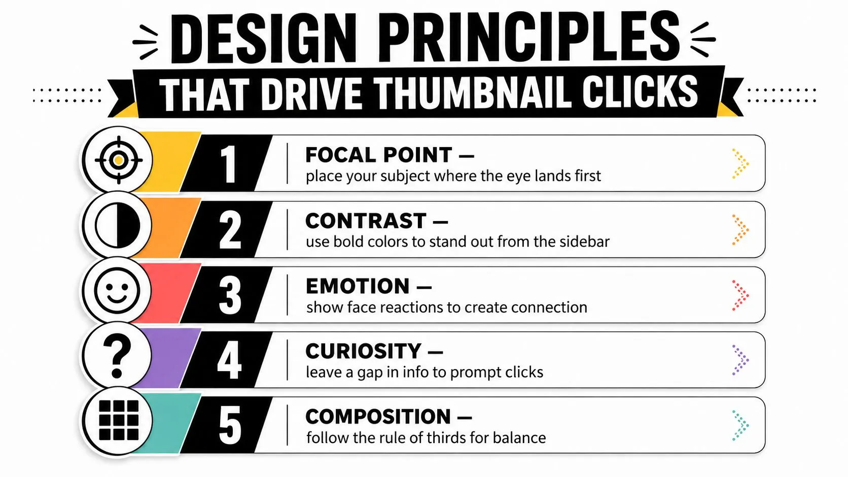
AI can draw the picture, but it can’t decide what viewers notice first. The difference between a thumbnail people tap and one they scroll past usually comes down to a few design basics that still matter on every platform. If the AI output ignores those basics, you’re just polishing noise.
Readability beats decoration every time
Text needs to be large enough to survive mobile screens and still make sense in a split second. If the words are small, overly stylized, or sitting on a noisy background, the thumbnail loses its job before the viewer even processes the subject. That’s why the three-second rule matters, the image should communicate the topic almost immediately.
Face direction matters too. When the subject is a person, the eyes and expression pull attention to the hook, the object, or the tension point in the frame. A flat smile rarely works as well as a sharper reaction when the video promise is about surprise, conflict, or a strong result.
Use contrast aggressively. Bright subject against dark background, or dark subject against bright background, usually reads faster than a balanced but dull palette. That contrast has to work against both light and dark YouTube interfaces, because thumbnails live in more than one visual environment.
Edit the AI output with a human eye
The fastest fix is often not a full redesign, just a tighter crop or a better text block. If the face is too small, crop in. If the title blends into the background, move it to a cleaner zone. If the frame has too many objects, remove one.
The guide to fonts also matters when the image already has a lot going on, so pairing your prompt work with the right type treatment can save a weak thumbnail. Best fonts for YouTube thumbnails is a useful companion reference when the AI gets the layout right but the text still feels off.
Practical rule: if a thumbnail still makes sense when you shrink it, you’re closer to a click-worthy image. If it turns into visual mush, the edit isn’t done.
A final check helps more than people admit. Cover the title for a second and ask whether the image still communicates the promise. If the answer is no, the thumbnail depends too much on the headline, and that usually weakens the whole package.
Export Settings and Platform Optimization
A thumbnail can look strong in a design tool and still upload badly. Blurry edges, wrong dimensions, or the wrong file format ruin a thumbnail faster than a bad idea does. The technical part isn’t glamorous, but it’s where a lot of AI-generated work falls apart.
Use the platform spec, not a guess
YouTube changed its documented spec in March 2026, so the numbers most guides still repeat are no longer the target. 1280 x 720 is the minimum, YouTube now recommends 3840 x 2160, the width must never drop below 640 px, and the file cap depends on where you upload from: 2 MB on mobile, 50 MB on desktop. The ratio is still 16:9, and the accepted formats are still JPG, GIF, and PNG (YouTube Help). Thumbo’s YouTube thumbnail size guide covers what changed and why it matters most on TV screens.
The file format choice matters too. PNG usually holds up better when the thumbnail contains sharp text or graphic elements, while JPG can be smarter when you want a smaller file with acceptable quality. If the thumbnail will be shown on larger screens or TVs, crisp rendering matters more, because softness becomes visible fast at distance.
Here’s a simple checklist to run before publishing:
- Resolution: treat 1280 x 720 as the floor and export at 3840 x 2160 when the tool allows it
- Aspect ratio: keep it at 16:9 so YouTube displays it cleanly
- File type: choose PNG for crisp detail or JPG for lighter files
- File weight: under 2 MB if you upload from a phone, up to 50 MB from desktop
- Preview: check how the thumbnail looks on mobile and desktop before upload
Why export discipline saves rework later
Most creators only notice export mistakes after the video is live. At that point, the thumbnail may already have done the damage. A clean export process avoids that problem and keeps the visual promise intact across devices.
The practical move is to render once, inspect once, and upload once. If the image is soft at 100 percent zoom or the text breaks into jagged edges, fix the source design before you export again. That’s faster than trying to salvage a bad file after it’s already attached to the video.
Building a Repeatable Thumbnail Workflow
Consistency beats inspiration. The creators who stay ahead do not rely on a single lucky thumbnail, they build a workflow that turns every upload into a repeatable process.
Turn your best videos into a prompt library
Start with your strongest uploads and pull out the visual patterns that did the work. Note subject placement, background color, face angle, and how much text each thumbnail carried. Those notes become your prompt library, so you are not guessing from scratch every time.
Build a small template set after that. Keep one template for reaction faces, one for product or screen shots, and one for cleaner, text-light visuals. That gives you a starting point that matches your channel style before you open a free AI thumbnail maker or any other tool.
Batching makes the system more useful. If you publish often, generate several thumbnail options for multiple uploads in one session, then sort them by hook strength and readability. That keeps your judgment consistent and makes your thumbnails feel connected instead of like separate one-off experiments.
Test before you lock the final version
The first AI output is rarely the final answer. The value comes from the comparison set, because side-by-side variants show you which version reads fastest and which one supports the title without repeating it. If your channel already uses YouTube’s thumbnail testing features, use them to see which visual cue wins when two versions are close.
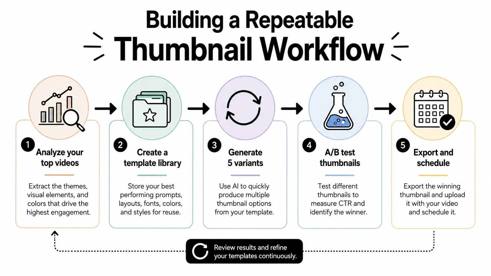
A workable workflow looks like this:
- Analyze your top videos and note the recurring visual pattern.
- Build a template library with saved prompts and brand settings.
- Generate several variants so you can compare composition, face angle, and text density.
- Test the thumbnails against each other when the platform allows it.
- Export and schedule the final image with the upload.
That process is where tools like Thumbo AI fit naturally, because they turn a video idea into ready-to-post thumbnail variants without forcing you to treat every cover like a one-off design project. It reduces the friction between concept and testing, which matters more than chasing a single polished image.
Common Mistakes and How to Fix Them
The biggest mistake is trusting the AI output too much because it looks polished. A thumbnail can be visually clean and still fail its real job if the text is unreadable, the hook is vague, or the image promises something the video doesn’t deliver.
The usual failures come from workflow, not talent
One common problem is choosing a model that makes beautiful images but weak text. That gives you something stylish that won’t communicate fast enough on a small screen. The fix is simple, use a text-optimized model for title-heavy thumbnails, then switch to a more stylized option only when the composition doesn’t rely on much copy.
Another mistake is skipping human edits. AI can assemble the first draft, but it still needs a real creator to tighten the crop, simplify the background, and push the subject into the most readable part of the frame. If you don’t do that final pass, the thumbnail often feels almost right, which is worse than obviously wrong because it tempts you to publish too early.
A third mistake is ignoring mobile preview. The thumbnail might look strong on a desktop editor and fall apart on a phone, where tiny text and thin borders vanish. Check it small before you upload, not after.
Keep the promise honest
Misleading thumbnails can create a short click, then hurt the video once viewers realize the cover oversold the content. The better move is to make the thumbnail sharp and intriguing without promising something the video won’t deliver. That way, the image helps both clickability and viewer trust.
The free tier problem is different. Some tools bottleneck through credits or queue time, so the workflow feels slow only when you start iterating seriously. If that happens, switch to a tool that gives you quicker drafts, or narrow your prompt so each generation is closer to usable.
If the same problem keeps showing up, the issue is usually the prompt, the model choice, or the export, not the category itself.
When outputs consistently miss the mark, change one variable at a time. Don’t rewrite the whole prompt, swap the layout, and change the style pack all at once. You won’t know what fixed it, and you’ll repeat the same mistake next upload.
Use Thumbo AI when you want a straightforward way to turn one video idea into several thumbnail variants without building each cover by hand. It fits the same iterative workflow covered above, which means you can generate options, pick the clearest hook, and keep publishing without slowing your schedule down.