What makes a great music thumbnail
Music on YouTube splits into two thumbnail languages. Releases and visualizers borrow from album art - mood, typography, iconography. Everything else (sessions, breakdowns, type beats, reactions) plays by YouTube rules: faces, emotion, a claim. Most artists get this backwards, putting moody art on content videos and losing clicks to reactors with expressive faces.
Thumbo covers both languages. Describe the drop ("neon-lit portrait, rain, my artist name in chrome type") for release covers, or the content angle ("me hearing the beat switch for the first time, studio background") for everything else. Your artist persona - your actual face and aesthetic - stays consistent across the whole catalog.
Music thumbnail ideas
- The beat-switch face. Sessions and reactions: the exact facial moment the beat hits, headphones on, hands up. Musical emotion made visible is the niche’s most reliable click.
- Chrome-type release card. Single drops: artist portrait, track title in chrome or graffiti type, one strong color wash. Album-art energy that still reads at thumbnail size.
- The producer challenge. "Making a beat with only my voice", "flip this 1960s sample" - show the constraint as an object next to your reaction. Constraint formats port perfectly from gaming.
- Type beat mood board. Type beats are search-driven: the referenced artist’s aesthetic (not their face - trademark trouble) plus mood lighting and the vibe word. Consistency across uploads builds the brand.
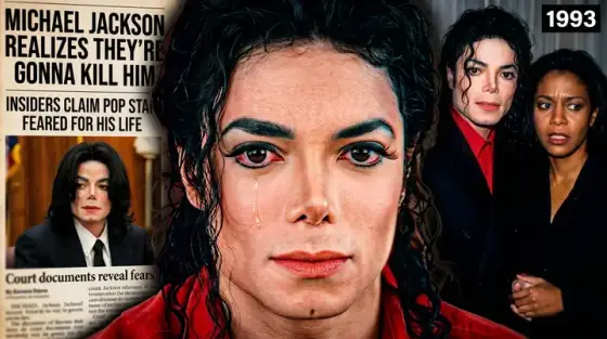
- Before-the-fame archive. Music-story content: a grainy archival-feeling frame of the subject’s early days. Story thumbnails like the Michael Jackson example above pull documentary-level watch time.
- The gear flex autopsy. "$200 setup vs $20,000 studio" - split frame, price tags on gear. Gear content clicks on the money contrast, not the equipment list.
Music thumbnail background and text tips
Backgrounds: commit to one palette per era - artists build recognition like brands, and a consistent wash across covers makes your channel page look like a discography. Stage lighting (one hard color key + haze) photographs mood better than busy studio scenes.
Text: this is the one niche where stylized display type belongs - chrome, graffiti, y2k metal. Keep it to the track title or one vibe word, and keep it huge. For reactions and sessions, switch to a plain bold sans; content videos follow YouTube rules, not album rules.
Prefer to do it by hand?
All the manual steps are covered by our free browser tools: study what already works with the YouTube thumbnail downloader, crop your image to the exact 1280×720 with the thumbnail resizer, and squeeze it under YouTube’s upload limit with the 2 MB compressor. No signup, nothing leaves your browser.