The popular advice is to create one “perfect” YouTube thumbnail and use it everywhere. That’s the wrong target. YouTube doesn’t show every impression in the same context, so a thumbnail built for Search may lose attention on the homepage, while a bold Browse design may hide the exact information a searcher needs.
The practical job of an AI thumbnail maker for YouTube is to produce useful variants quickly, then let performance data decide which concept deserves more distribution. Thumbnail studies associate a single dominant face with a clear emotional expression with roughly 18 - 32% higher CTR than neutral or no-face designs, while high-contrast overlays containing 3 - 5 words have been associated with 11 - 22% higher CTR in search traffic. Those findings come from the thumbnail CTR patterns study, and they point to a broader lesson: the strongest design depends on where viewers encounter the video.
Table of Contents
- Why One Perfect Thumbnail Is the Wrong Goal
- Setting Up Thumbo AI and Writing Prompts That Actually Convert
- The Four Traits of High-CTR Thumbnails and How to Prompt Them
- Editing AI Outputs Without Ruining What Made Them Work
- Running Real A/B Tests Inside YouTube Studio
- Reading CTR Benchmarks by Traffic Source and Channel Tier
- Building a Repeatable Thumbnail Workflow That Compounds
Why One Perfect Thumbnail Is the Wrong Goal
A searcher is asking a question. A Browse viewer is scanning a feed. A Suggested viewer is deciding whether your video deserves attention beside the one they’re already watching. Those viewers may see the same video, but they’re bringing different intent to the impression.
That’s why generating two or three purposeful thumbnail variants beats spending an hour polishing one image. The Search version can reinforce the query with concise, readable text. The Browse version can lead with one large face, a sharp expression, and strong separation from the background. The Suggested version can create a curiosity gap without becoming vague or misleading.
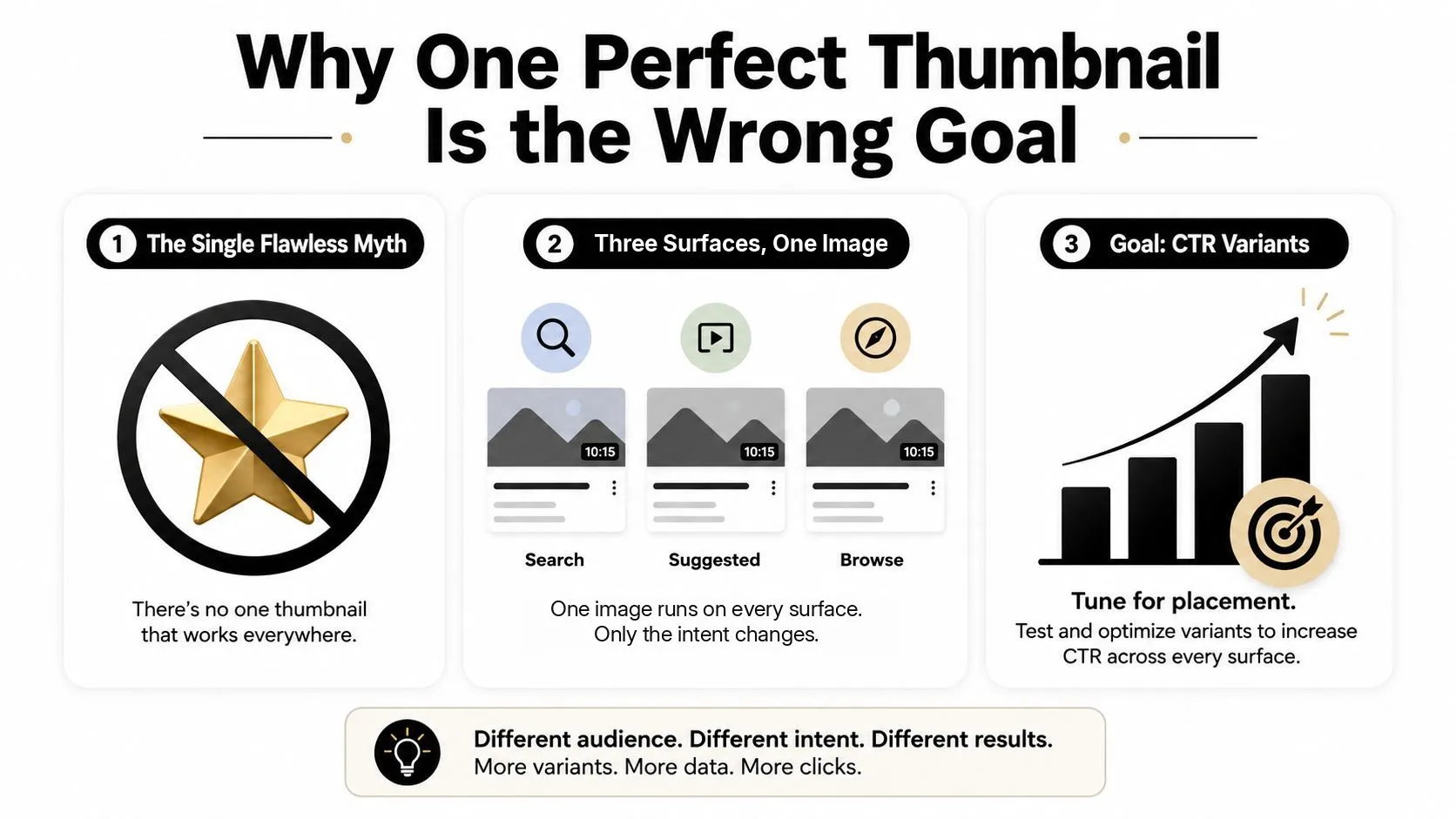
Optimize for placement, not personal taste
A thumbnail can look excellent in a design editor and still fail at the size viewers see on a phone. It can also win a team review because it explains the video clearly, yet attract fewer clicks than a simpler composition with one obvious subject.
The benchmark discussion on YouTube CTR places typical performance around 4 - 6%, with 8 - 10% described as strong and 12% or higher as elite. The same page puts a channel under 1,000 subscribers nearer 2 - 4% while the algorithm is still learning who to show it to. Those are benchmarks, not promises. Your own audience, topic, channel history, and traffic mix matter more than a universal target.
Practical rule: Treat every upload as a small experiment. Your first thumbnail is a hypothesis, not a verdict.
The AI tool earns its place by shortening the distance between idea and test. Generate a Search concept, a Browse concept, and a Suggested concept. Keep the video promise consistent, change the visual strategy, and use YouTube’s results to identify which signal your audience responds to.
Setting Up Thumbo AI and Writing Prompts That Actually Convert
A useful setup starts with organization, not generation. Create an account and settle on a naming convention for the channel or series you’re working on before you generate anything. Keeping outputs grouped by upload makes it easier to compare prompts, preserve winning patterns, and avoid reusing the wrong visual language on unrelated videos.
Thumbo AI can generate thumbnail variants from a video idea, style selection, and prompt. The interface matters less than the information you provide. A long prompt full of decorative adjectives usually performs worse than a short prompt that defines topic, traffic surface, subject, emotion, palette, and one composition constraint.
A prompt structure that gives the model a job
For a tutorial video, start with the viewer’s problem and the intended placement. For example:
“YouTube thumbnail for a 12-minute tutorial on organizing a home studio desk, designed for YouTube Search. Show one creator looking directly at a dramatically clean desk setup, focused and relieved expression, warm orange light against a deep charcoal background, readable text ‘DESK RESET’, subject on the right third, uncluttered composition, strong mobile legibility.”
That prompt gives the generator a clear hierarchy. It says what the video teaches, where the impression should work, what the viewer should notice first, and what the image must avoid.
If the first outputs miss, don’t rewrite everything at once. Diagnose the failure:
- The subject feels weak: Replace “creator” with a specific action, such as “hands removing tangled cables from the desk.”
- The palette disappears: Name the background and lighting relationship, such as “bright warm subject against a dark charcoal background.”
- The face looks small: Add “tight close-up, face occupying the visual focus, shoulders cropped.”
- The text becomes decorative: Reduce the wording and specify “large bold sans-serif text with a clean outline.”
For prompt examples and more detailed prompt construction, use this YouTube thumbnail generator prompt guide. Export the final candidate at 1280×720, keep the file under 2MB, and use sRGB so the thumbnail won’t need a last-minute rebuild before upload.
The Four Traits of High-CTR Thumbnails and How to Prompt Them
High-performing thumbnails tend to communicate a visual decision immediately. The four traits below aren’t a universal formula, but they’re reliable controls to test when an AI output looks polished yet feels inert.
Four CTR Traits Mapped to AI Prompt Clauses
| CTR Trait | What It Controls | Prompt Clause to Use | Failure Without It |
|---|---|---|---|
| Dominant subject | Where the eye lands first | “One face or object filling the frame, tight crop, gaze toward the headline” | The viewer can’t identify the story quickly |
| Contrast bias | Separation between subject and background | “Dark background, bright subject, directional key light from the left” | The image blends into the feed |
| Readable text | Whether the promise survives mobile viewing | “Three to five words, heavy sans-serif, high-contrast outline” | Text becomes decoration or visual noise |
| Emotional specificity | The reason to care now | “Raised brow and tense jaw, focused concern” | A generic smile or neutral face creates no tension |
A weak prompt says, “Make an exciting thumbnail about camera settings.” The upgraded version says, “One creator in a tight face crop, raised brow and wide eyes, looking toward a camera with a glowing settings screen, deep blue background, bright yellow subject lighting, text ‘FIX BLURRY VIDEO’, subject on the right, empty left side for text.”
The second prompt forces a subject, an expression, a visual contrast, and a text zone. It also gives the model fewer opportunities to fill the canvas with unrelated props.
The difference between expressive and merely dramatic
“Shocked face” is a weak instruction because it doesn’t tell the model what kind of tension the video contains. A raised brow suggests discovery. A clenched jaw suggests difficulty. Wide eyes can signal surprise, but they can also look artificial if every upload uses the same expression.
The same applies to objects. “A laptop” is generic. “A laptop displaying a red error message beside a hand reaching for the power button” creates a readable action. Prompt the micro-expression or action, not just the category.
Text needs restraint. Three to five words can support a promise, but they can’t summarize an entire tutorial. Use the title and thumbnail together. The title explains; the thumbnail interrupts scrolling and gives the viewer a reason to investigate.
Editing AI Outputs Without Ruining What Made Them Work
Generation is only the first pass. The editing stage decides whether the concept remains clear after cropping, compression, and feed-size viewing.
Start by checking the canvas at 1280×720. Lock the main subject’s gaze and expression before adjusting decoration. If the face becomes softer, happier, or less specific during retouching, the image may lose the tension that made it noticeable.
A practical editing pass
Work through the candidate in this order:
- Crop the focal subject. Make the face or key object large enough to read without zooming.
- Strengthen separation. Darken or simplify the background behind the text and subject.
- Normalize the variants. Keep saturation and color temperature comparable across candidates.
- Rebuild the wording. Replace distorted generated text with clean, manually typed text when needed.
- Check the smallest preview. Review it in a YouTube feed-style context, not only on a full-size canvas.
- Export as PNG. Preserve clean edges and confirm the file meets the upload limit.
A thumbnail that starts near 4% CTR and reaches 8% CTR after editing would represent a meaningful improvement, but that outcome can’t be promised from a particular crop or filter. The important lesson is to make edits that clarify the existing idea, not edits that turn one candidate into an entirely different concept.
Don’t redesign the composition during the finishing pass. If you change the face, background, text position, and color treatment together, you’re no longer testing the generated idea.
Avoid soft beauty filters, inconsistent color grades, and extra objects added just to fill empty space. A clean empty area can be useful because it protects the headline. Use the same editing standards across every candidate so the test compares thumbnail concepts rather than editing quality.
For foundational guidance on hierarchy, contrast, and readable composition, this graphic design fundamentals resource is a useful reference.
Running Real A/B Tests Inside YouTube Studio
Your judgment is useful for rejecting misleading or broken thumbnails. It isn’t reliable for picking the winner between two competent options. YouTube’s official workflow lets eligible creators test the title only, thumbnail only, or both, with up to three variations per test, as described in YouTube Studio’s A/B testing instructions.
Isolate the variable first
Before uploading candidates, decide what question you’re asking. Good tests compare a controlled difference:
- Expression versus expression: Keep the subject, background, text, and crop consistent.
- Background versus background: Keep the face and headline fixed while changing contrast or color.
- Text versus no text: Preserve the composition and test whether the headline helps.
- Single subject versus multiple subjects: Use this when the video supports both interpretations.
Testing a manually designed thumbnail against an AI-generated thumbnail is fine only if you know what changed. If the AI version also uses a different face, palette, crop, and headline, the result won’t tell you which change mattered.
Use the test window as a learning period
Upload the strongest three candidates available, not every idea you generated. If one version is clearly off-brand, difficult to read, or inaccurate, remove it before the test begins. The platform’s limit means selection is part of the work.
Give the test time to produce a meaningful comparison. YouTube’s workflow runs a test until it can call a result, typically a few days and up to two weeks, and the result should be read alongside impressions, traffic source, and audience response rather than as an isolated score.
When a winner emerges, save the prompt and the reason it won. Archive the losing prompts too, but label the failure precisely. “Too much text” is more useful than “didn’t work.” Over several uploads, your prompt library becomes a record of audience preferences instead of a folder of attractive images.
Reading CTR Benchmarks by Traffic Source and Channel Tier
A single channel-wide CTR target can send your thumbnail strategy in the wrong direction. Reference points differ sharply by surface: traffic-source CTR data puts YouTube Search near 12.5%, Suggested near 9.5%, Browse near 3.5%, and External sources near 2.8%. The thumbnail CTR patterns study makes the same argument from the design side, reporting that text overlays need separate strategies by traffic source and putting typical CTR for established channels at 3 - 8%. Treat these as separate environments, not interchangeable grades. Search viewers often arrive with a defined need. Browse viewers are weighing several options without entering a specific query.
Build the thumbnail around that intent. Search often rewards a clear phrase that confirms relevance. Browse needs a stronger interruption, such as a dominant face, unusual contrast, or an honest visual question. Suggested sits between them, so continuity with the surrounding videos matters as much as standalone appeal.
Channel size changes the comparison too, though the figures that circulate for it deserve scrutiny. One widely shared benchmark study has since been withdrawn by its own publisher, which could not trace its sample sizes and performance lifts to a reproducible dataset and pulled the article rather than leave them standing as fact. The tiers that do hold up are simpler: a channel under 1,000 subscribers commonly sits near 2 - 4% while the algorithm is still learning, an established channel nearer 5 - 8%, and 12% or more is top-decile territory. For a fuller explanation of what counts as a good result, use this guide to what is a good click-through rate on YouTube, then compare the result with your own history.
A context-first comparison
| Traffic Source | Small Channel (<10K subs) | Mid Channel (10K-100K subs) | Large Channel (100K+ subs) |
|---|---|---|---|
| Search | Compare against your own Search baseline | Separate branded and non-branded queries | Watch query relevance as reach broadens |
| Suggested | Prioritize viewer continuity and clear topic connection | Compare by neighboring video category | Check whether cold viewers understand the premise |
| Browse | Test stronger interruption and simpler layouts | Segment by returning and new viewers | Expect wider audience variation across impressions |
The table provides a comparison method, not fixed thresholds for every tier. Record CTR by source, match each upload with similar videos on your channel, and check whether the thumbnail attracted qualified viewing rather than only low-intent clicks.
A low Browse result may reflect broad exposure, not a failed design. A strong Search result does not make the same thumbnail suitable for the homepage. Generate variants for the traffic source you expect, then judge each one against that context and use the pattern to shape the next prompt.
Building a Repeatable Thumbnail Workflow That Compounds
A thumbnail system should run on a cadence, not on last-minute inspiration. Start each topic by reviewing three competing videos and logging the promise, subject, emotional cue, color treatment, and text density. Don’t copy their artwork. Use the exercise to identify what viewers in that topic are being asked to notice.
A weekly operating loop
Monday: Define the video promise and identify whether the first priority is Search, Browse, or Suggested traffic.
Tuesday: Generate four variants. Make at least one query-led design, one face-led design, and one curiosity-led design. Keep the subject and promise accurate.
Wednesday: Remove candidates with weak readability, cluttered focal points, or misleading expressions. Prepare the strongest three for testing.
Thursday: Launch the YouTube Studio experiment, changing only the variable you’ve chosen to study.
Friday: Review early signals without declaring a winner too quickly. If a thumbnail is clearly below your channel’s normal performance, document the failure and prepare a replacement concept for future uploads.
Weekend: Add the result to a prompt library. Record the traffic source, visual pattern, reason for the decision, and whether the thumbnail made the video promise clearer.
Polished AI output can still underperform when creators reuse the same face crop across every upload, rely on generic stock-photo lighting, push text into the right third where interface elements compete for attention, or skip a mobile readability check. Consistency helps viewers recognize a channel, but repetition without variation teaches them to ignore the pattern.
The compounding advantage isn’t one remarkable generation. It’s the speed at which you learn from losing thumbnails. A prompt that produced a weak result can still improve the next upload if you know whether the problem was scale, expression, contrast, text, or traffic context.
Thumbo AI lets you turn a video idea into YouTube thumbnail variants, work from a prompt and a Style Pack, and upload your own logo or reference image when the design calls for it. Visit Thumbo AI to build context-specific candidates and start testing thumbnails based on viewer behavior instead of visual instinct.