You’re staring at a video you know is good. The edit is tight, the topic is strong, and the upload is already live, but the homepage is barely touching it. The usual culprit isn’t the idea, it’s the thumbnail, because on YouTube the thumbnail is the first pitch, the first promise, and often the whole reason someone clicks.
That’s why graphic design fundamentals matter so much for thumbnails. Not as abstract art rules, but as practical tools for making a tiny image do a very big job. If a viewer can’t understand the message in a split second on a phone screen, the video loses before the title even gets a chance.
Table of Contents
- Your Thumbnail Is the Only Thing Viewers See
- Why Principles Matter More Than Fancy Tools
- The Five Fundamentals of High-CTR Thumbnails
- Real-World Thumbnail Deconstructions
- Common Thumbnail Design Mistakes to Avoid
- A Quick Checklist for Your Next Thumbnail
Your Thumbnail Is the Only Thing Viewers See
A creator can spend days scripting, filming, and editing a strong video, then watch it stall because the thumbnail looks crowded, vague, or forgettable. That is a hard part of YouTube, but it also shows exactly where the click is being lost.
On a busy homepage, the thumbnail has one job, get the viewer to stop scrolling. The image has to work as a fast sales pitch, because viewers do not study it, they skim it. If the layout feels slow on a phone screen, the click is already gone.
Practical rule: if the message can’t be read at a glance, it’s not a thumbnail yet. It’s just a tiny poster.
The smartest thumbnail thinkers treat the image like a headline with pictures, not like a mini collage. They choose one idea, one focal point, and one reason to click. Everything else is noise unless it helps that promise land faster.
Why Principles Matter More Than Fancy Tools
A creator can open Photoshop, Figma, Canva, or an AI-assisted design tool and still end up with a thumbnail that gets ignored. The software can speed up production, but it cannot decide what should be seen first. Graphic design fundamentals do that job.
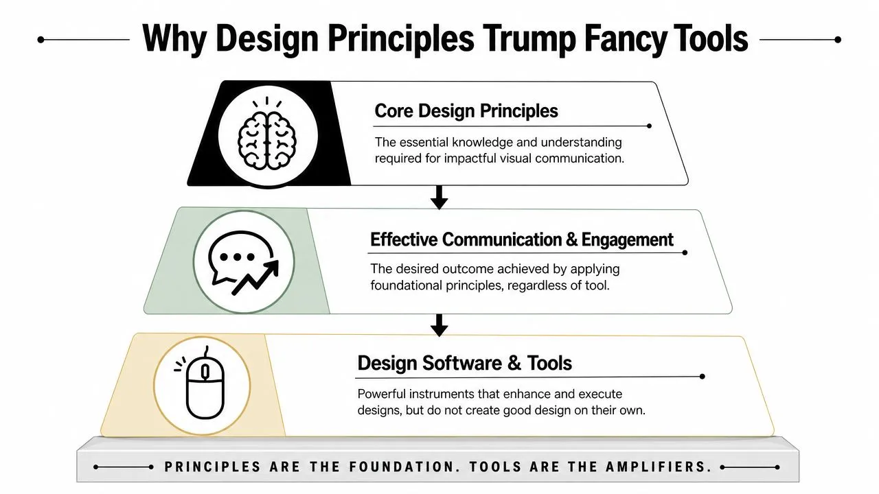
A thumbnail is a split-second communication test. Research on simplicity, chunking information into digestible units, and grouping related elements shows that people process cleaner layouts with less fatigue, while hierarchy can be built with fonts and colors to guide attention (peer-reviewed paper on graphic design fundamentals). That matches how viewers behave on YouTube. They skim, decide fast, and click only if the image makes the promise obvious.
A flashy template can still bury the point. A plain layout can still win if the hierarchy is clear, the contrast is strong, and the main idea reads instantly on a phone screen. That is the trade-off creators face every day. More decoration can mean more friction. More restraint usually means more clicks.
The same logic applies if you use an AI design tool. It can generate options quickly, but speed does not fix a thumbnail that has too many ideas, weak contrast, or text that fights the image. The tool helps you work faster. The fundamentals decide whether the thumbnail earns the click.
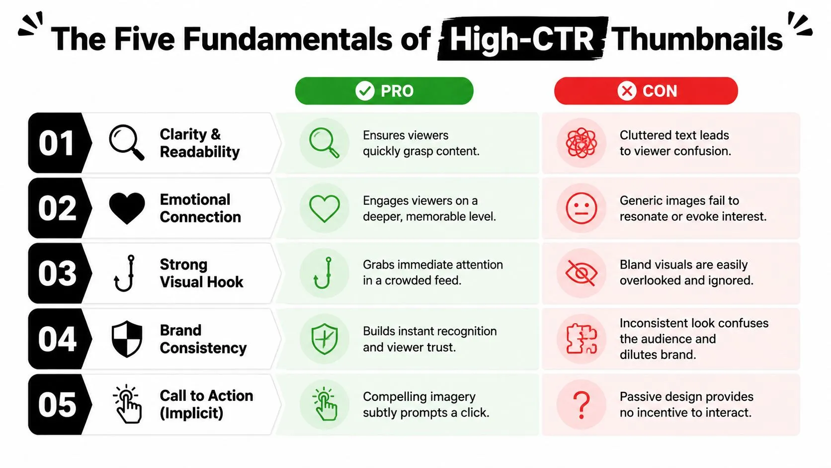
The Five Fundamentals of High-CTR Thumbnails
Visual Hierarchy
A thumbnail has to answer one question fast, what should the viewer look at first? Visual hierarchy decides that order. The strongest thumbnail gives one subject, one face, or one action the clearest position, then supports it with everything else instead of letting every element fight for attention.
A movie poster does this well when the eye goes straight to the star. If every part of the frame has the same weight, the image stalls. On YouTube, that usually means the subject should be larger, brighter, or more central than the rest of the design.
Do this: make the main subject dominate the frame, place it where the eye lands first, and use contrast to make it obvious.
Don’t do this: give three objects equal visual weight, add a text block, and expect the viewer to sort it out.
For click-through rate, the image usually carries the headline, not the title text. A broken camera, a shocked expression, or a stark before-and-after change can work because the viewer knows the point immediately. That instant read is what gets the click started.
Contrast
Contrast is what makes a thumbnail stand out in a crowded feed. It can come from light and dark, large and small, warm and cool, or dense and empty. Without enough difference, the thumbnail blends into the rest of the page.
Strong contrast makes the message easier to read fast.
Creators often add more colors than they need. That usually creates noise, not energy. A dark background with one bright subject, or a light background with a bold dark text block, usually performs better than a layout full of competing colors.
Do this: separate text from the background clearly, and use one accent color to direct the eye.
Don’t do this: use pale text on a pale field, then add more colors because the design feels too empty.
Contrast also helps the emotion hit faster. A surprised face against a simple background reads in a split second. A bright object on a muted field does the same job. The viewer should not have to search for the point.
Simplicity and Clarity
Simple thumbnails usually win because they reduce the work the viewer has to do. Clean grouping and fewer moving parts make the promise easier to understand, and that matters more than clever styling. A peer-reviewed paper on graphic design fundamentals makes the same basic point about clear grouping and easier comprehension (peer-reviewed paper on graphic design fundamentals).
One thumbnail should usually sell one idea. If the video is about a mistake, show the mistake. If it is about a result, show the result. If it is about a comparison, make the difference obvious before the title is even read.
Do this: use short text, one subject, and one clear emotional cue.
Don’t do this: cram in logos, subtitles, multiple faces, a screenshot, and a slogan at the same time.
Clarity matters because viewers are not opening the thumbnail to study the composition. They are deciding whether the video is worth a click. If the design needs decoding, it has already lost speed, and speed is what YouTube rewards.
Repetition
Repetition makes a channel easier to recognize. In thumbnail design, that can mean repeating a color, a shape, a font, or a framing style so the viewer sees a pattern instead of a random mix of parts. It also helps the channel feel consistent across uploads.
That does not mean every thumbnail should look identical. It means reusing a small set of visual cues so the audience can spot the channel fast. A repeated border style, the same text treatment, or a familiar accent color can do that without making the thumbnails feel copied.
Do this: repeat one or two design choices across a series, like the same bold type style or the same accent color.
Don’t do this: change everything every upload, which makes the channel look unstable and harder to remember.
This matters most when a creator posts often. A returning viewer should recognize the style before reading the title. That familiarity lowers friction and makes the click feel safer.
Alignment
Alignment keeps a thumbnail from feeling messy. When elements share a line or grid, the layout feels deliberate and easier to scan. Aligning elements to a common edge, center, or baseline creates order and visual connection, which is a basic principle behind good layout work, as shown in Figma design principles.
Poor alignment does the opposite. Even with strong colors and an interesting subject, a floating or skewed layout can make the thumbnail feel off. That shows up even more on small screens, where small spacing mistakes turn into clutter.
Do this: align text with the subject or the edge of a strong visual block, and keep spacing consistent.
Don’t do this: scatter elements randomly just because they fit inside the canvas.
Alignment gives the eye a path. Elements that share position feel related, and that makes the thumbnail faster to read. For YouTube, faster to read usually means better odds of the click.
Real-World Thumbnail Deconstructions
The best thumbnails from big creators usually aren’t complicated. They’re disciplined. A MrBeast-style thumbnail often leans on a single oversized subject, strong contrast, and one instantly readable action, which keeps the viewer’s eye from wandering. That’s hierarchy doing the heavy lifting.
A tech creator’s thumbnail for a product comparison often works for a different reason. The layout may split two devices cleanly, use opposing colors, and keep text extremely short. The viewer understands the comparison before reading the title, and that quick understanding is exactly what the click depends on.
Gaming and commentary channels often use facial expression as the focal point, then support it with one visual clue that explains the situation. The face creates emotion, the object creates context, and the rest of the design stays out of the way. That is simple, but it’s not accidental.
If you want concrete starting points for your own niche, browse these thumbnail idea examples for YouTube creators and study how each one holds a single focal point.
When these thumbnails fail, it’s usually because they add too much. Extra text, busy backgrounds, or too many competing symbols flatten the entire image. When they succeed, they do something more disciplined, they remove every element that doesn’t help the click.
What top thumbnails share: one clear idea, one visual winner, and almost no dead space fighting for attention.
That same logic applies whether the channel is educational, entertainment, or review-based. The style changes, but the decision-making stays the same. The thumbnail must answer one question fast, why should this viewer stop here?
Common Thumbnail Design Mistakes to Avoid
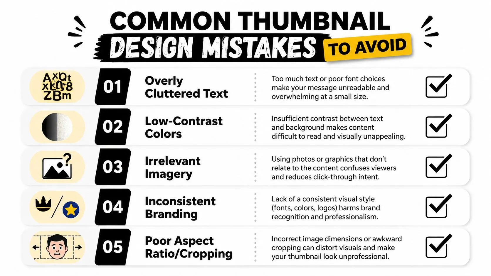
A thumbnail can look “designed” and still perform badly. That usually happens when one of the basics gets ignored, especially on mobile where creators often design on a large monitor and forget how small the final image really is. Design guidance keeps stressing the same point: graphics have to be optimized for mobile viewing and tested across screen sizes (graphic design fundamentals guidance). For thumbnails in practice that means oversized type and a simplified palette, because anything subtle disappears at feed size.
Text That Shrinks Into Mush
Tiny text is one of the fastest ways to kill curiosity. If a viewer can’t read it instantly, they won’t pause to zoom in. The fix is simple, use fewer words and make them bigger.
Weak Color Separation
Low contrast makes the thumbnail melt into the feed. The image may look tasteful in a design file, but taste doesn’t matter if the message disappears. Strong separation between foreground and background is the fundamental objective.
Too Many Focal Points
Three subjects, two captions, and a background full of detail create confusion. The viewer doesn’t know where to start, so they keep scrolling. One focal point usually beats a crowded composition.
Inconsistent Visual Identity
If every upload uses a different font, different palette, and different spacing logic, the channel feels unstable. Recognition drops. A repeatable style gives the audience something familiar to latch onto.
Bad Cropping and Framing
A face cut off at the wrong point or an object cropped without intention can make the thumbnail feel awkward. Framing should support the message, not fight it. Tight crops can create urgency, but only when they still leave the viewer oriented.
The bigger mistake is designing for the canvas instead of the feed. YouTube thumbnails live inside a crowded interface, not inside a portfolio review. That means each choice has to survive compression, distraction, and fast scrolling.
A Quick Checklist for Your Next Thumbnail
Before publishing, check whether the thumbnail passes the click test. If the answer is no to even one of these, the design probably needs another pass.
- One clear focal point? The viewer should know what matters first without hunting for it.
- Readable on a phone? If the text or subject breaks down at small size, simplify it.
- Strong contrast? The main subject needs to separate cleanly from the background.
- Simple enough to scan fast? Remove anything that doesn’t help the click.
- Consistent with the channel style? Repetition makes the thumbnail easier to recognize.
- Aligned and orderly? Grid-based spacing reduces visual noise and keeps the image unified, which is why alignment matters so much in fast-scanning layouts (Figma design principles).
- Sized for the viewing platform? Use the right thumbnail dimensions so the image holds up where viewers engage with it, not just in a design file (YouTube thumbnail size guide).
- Does the image answer the click question? A viewer should understand why the video matters before reading the title.
That checklist is the whole game in miniature. You don’t need more decoration, you need better decisions.
If you want these fundamentals applied for you instead of fighting them in a design app, Thumbo AI generates thumbnail concepts with a clear focal point, strong contrast, and readable text baked in, so you can go from idea to a click-worthy thumbnail in minutes.