An expressive human face can do more for clicks than a polished edit, and 80% of high-CTR thumbnails share the same four ingredients, a face, high-contrast colors, 3 to 5 words of text, and one clear focal point. That’s why create a thumbnail work is never just decoration, it’s the first filter between your video and the viewer’s attention.
Table of Contents
- Why Your Thumbnail Decides the Click Before the Viewer Sees Your Video
- Planning Your Thumbnail Before Opening Any Design Tool
- Composition Rules That Survive the Mobile Test
- Typography, Color, and Readability That Works
- Sourcing Images and Editing Workflows That Scale
- YouTube Size Requirements, File Formats, and Export Settings
- Testing, Iterating, and Building a Repeatable Thumbnail Workflow
Why Your Thumbnail Decides the Click Before the Viewer Sees Your Video
Most creators overestimate the video and underestimate the thumbnail. The viewer doesn’t experience your editing, your pacing, or your sound design first. They see a tiny image, and that image has to earn the click before anything else has a chance.
Practical rule: if the thumbnail doesn’t communicate the idea in a second, the video is already fighting uphill.
The strongest thumbnails don’t try to explain everything. They reduce the promise to a face, a feeling, and one readable cue. One breakdown of 25 top-performing thumbnails found a human face in 84% of them, and concluded that 80% of high-CTR thumbnails share the same four elements: an expressive face, high-contrast colors, minimal text of three to five words, and one clear focal point. Custom thumbnails carry that weight because roughly 90% of top-performing videos use one instead of an auto-generated frame. Those patterns matter because the thumbnail’s job is to win the first click, not to reward close reading on a phone-sized screen.
That’s why treating thumbnail creation as a performance task changes the whole workflow. You stop asking, “Does this look nice?” and start asking, “What can a viewer read instantly, and what would make them care?” Once that shift happens, every upload becomes a testable asset, not a guess.
Planning Your Thumbnail Before Opening Any Design Tool
A usable thumbnail starts before design software ever opens. The most reliable creators answer three questions first, who is this for, what emotion or idea should land immediately, and what does the video deliver? If those answers aren’t clear, the design stage turns into decoration, and decoration is expensive when every revision adds time without improving the click.
A real planning session usually looks plain on paper. A creator making a video about fixing a dead upload might write one sentence, “This video helps small creators recover clicks after a weak launch,” then strip that down to a visual hook. That sentence becomes the anchor for every choice that follows, from background mood to text length to whether a face should look relieved, surprised, or frustrated.
A simple pre-production filter
Before picking colors or fonts, run the idea through a few checks:
- Audience first: who is expected to recognize the problem immediately?
- Promise second: what does the video solve or reveal?
- Hook last: what single visual cue makes that promise believable?
Don’t design the thumbnail you like. Design the thumbnail the viewer needs to trust the click.
The practical payoff is fewer dead-end drafts. Creators routinely burn an hour on three layouts when the real problem is message clarity, not spacing or color. If the sentence behind the thumbnail is fuzzy, the image will be fuzzy too, no matter how clean the composition looks.
A planning pass also keeps your visuals honest. If the video is a tutorial, the thumbnail should usually feel direct and useful. If it’s a story, the thumbnail should carry tension or surprise. That single alignment between audience, promise, and hook does more for consistency than any template ever will.
Composition Rules That Survive the Mobile Test
The thumbnail that looks strong on a desktop canvas can collapse on a phone. That’s the trap. You need a composition that still makes sense when it’s tiny, compressed, and surrounded by other thumbnails competing for the same split-second glance.
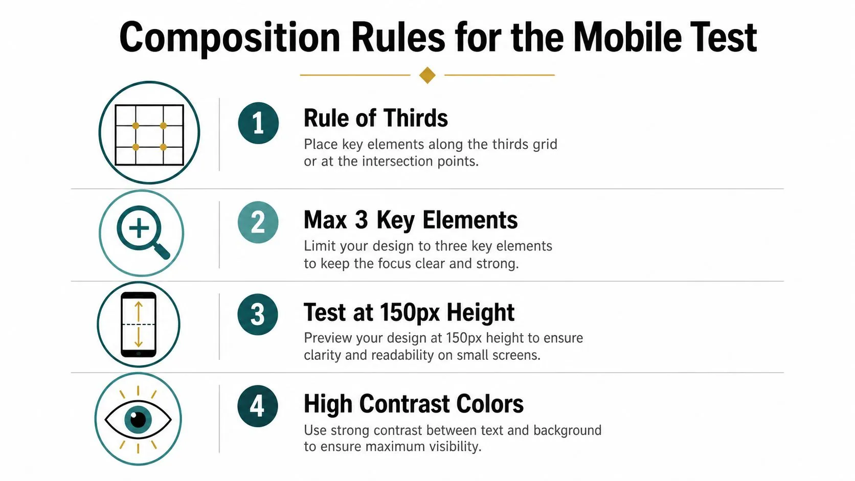
A good starting point is the face-and-focal-point pattern that shows up repeatedly in high-performing thumbnails, which is why the graphic design fundamentals guide matters less for aesthetics than for legibility. The subject should usually be large enough to own the frame, often around 40 to 60 percent of it, so the viewer’s eye doesn’t have to search for the point.
Build the frame around one subject
Start with a contextual or blurred background, then isolate the subject so it’s visibly dominant. After that, push separation with contrast, saturation adjustments, outlines, or a glow effect, but only as much as needed. The goal is not to make the thumbnail busy, it’s to make one message pop fast.
Use the mobile test before export
Shrink the design to roughly 120 to 160 pixels wide and ask one question, does the topic still land instantly? If it doesn’t, the thumbnail is too complex. That test is the most honest quality check you can run, because YouTube browsing happens at tiny sizes where detail disappears and only hierarchy survives.
Avoid the bottom-right corner for important detail when you can. UI overlays and cropping can hide the very thing you wanted people to notice. Keep critical faces, text, and symbols out of risky areas, and keep the message chest-up or larger so it survives compression.
Typography, Color, and Readability That Works
Text on a thumbnail isn’t a headline. It’s a label, and it has to be read in a glance. That is why 3 to 5 words is usually the ceiling, not the target, and why bold sans-serif type tends to outperform decorative fonts that may look interesting but fall apart at phone size.
The first question is whether the text can survive a crowded feed, not which font looks attractive. Contrast is what decides that. WCAG sets a minimum contrast ratio of 4.5 to 1 for normal text and 3 to 1 for large text, which is directly relevant when creators use small, dense thumbnail copy. That standard is not just about accessibility, it helps every viewer who is scrolling quickly, including people in dark mode and viewers with low vision. If you want a faster way to narrow font choices, this guide to the best fonts for YouTube thumbnails is a useful starting point.
Treat type and color as one system
Color should support the message, not distract from it. Warm tones can push urgency or energy, while cooler tones often feel calmer or more analytical. High saturation helps a subject stand out, but too much saturation everywhere flattens the hierarchy and makes the thumbnail feel loud instead of readable.
The practical sequence is simple. Choose a background that will not compete with the subject, isolate the subject, increase contrast, then place text where the eye lands naturally. If the type sits in a low-contrast area or fights with a face, the thumbnail loses the click before the viewer reads a single word.
Keep text honest and minimal
A thumbnail that says too much usually says too little. Short phrasing forces clarity, and clarity performs better than cleverness when the image is the size of a postage stamp. If a phrase needs a second read, it is already too long for the job.
Text choices also need restraint because mobile viewers do not pause to decode a design. Thumbnails with clever copy routinely lose to simpler ones because the simple version can be read without effort. That trade-off matters more than polish. A clean word mark in a strong color can beat a more artistic layout if the artistic layout slows comprehension.
Rule of thumb: if the thumbnail text would need a subtitle, it’s already broken.
Sourcing Images and Editing Workflows That Scale
The image source matters because the best thumbnail is only as strong as the assets behind it. Some creators lean on original photography, some use stock, and some build from AI outputs, but each path changes the speed, control, and consistency of the final result.
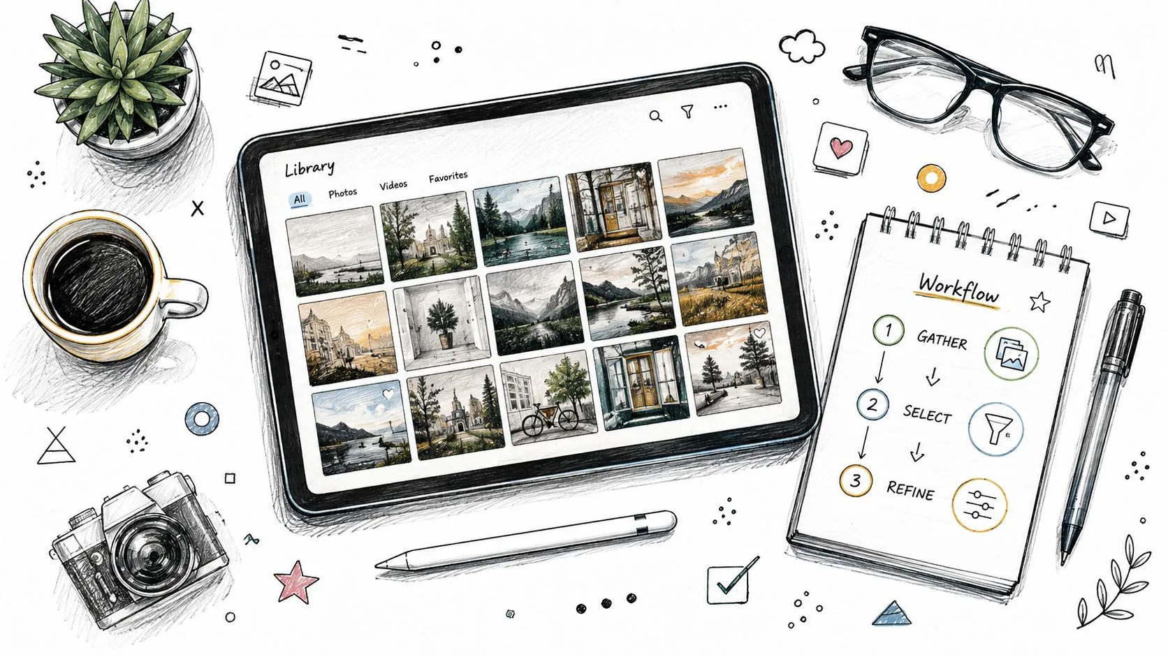
A practical workflow usually starts with a 16:9 canvas at 3840 × 2160, a strong base image, then short bold text layered on top, followed by a mobile readability check before export. That sequence keeps the design grounded in the platform’s real display environment instead of in a mockup that only looks good on a large monitor. For creators who want to understand the size workflow in more detail, this thumbnail sizing guide is a useful reference point.
Manual, stock, and AI all solve different problems
Original photography gives you the most control over expression and framing, which matters when the face or gesture has to carry the idea. Stock imagery is faster when you need a clean background or a generic scene. AI-generated assets can be useful when the concept is unusual or when you need rapid variations, but they still need direction and cleanup.
AI thumbnailing is a workflow, not a shortcut
AI generation now fits into a multi-step process rather than a one-click finish. Adobe Express says each generation costs 1 generative credit, returns four results per prompt, and can be steered by uploading reference images, one to guide the style and another to inform the layout, then edited further afterwards. YouTube has moved the same idea in-platform: Ask Studio reads a video’s transcript and themes, generates thumbnail suggestions from a prompt as plain as “Create a thumbnail”, and takes follow-up prompts such as making the text larger. That means the hard part is no longer getting an image, it’s deciding when a generated image is worth using.
The trade-off is brand consistency. AI can save time on exploration, but it can also drift away from a channel’s visual identity if you don’t control the output tightly. Manual design takes more effort, but it usually gives stronger repeatability when your channel depends on a recognizable look.
YouTube Size Requirements, File Formats, and Export Settings
Technical specs sound boring until a thumbnail uploads badly or loses quality. Then they matter a lot. YouTube’s own thumbnail guidance recommends a resolution of 3840 × 2160 pixels with a minimum width of 640 pixels, a 16:9 aspect ratio, and files in JPG, GIF, or PNG. File size limits depend on where you upload from: 2 MB from mobile and 50 MB from desktop, with 10 MB for podcast covers.
The familiar 1280 × 720 number is still worth knowing, but it is the practical floor rather than the recommendation, and it has been since the recommended resolution was raised in March 2026. Our full YouTube thumbnail size guide tracks every surface if you need the rest of them. Design at the larger size and let YouTube do the downscaling, because a file that starts small only gets softer once compression lands on the text and the face.
YouTube Thumbnail Specifications at a Glance
| Spec | Requirement | Notes |
|---|---|---|
| Recommended resolution | 3840 × 2160 px | Raised from 1280 × 720 in March 2026 |
| Minimum resolution | 1280 × 720 px | Width must never drop below 640 px |
| Aspect ratio | 16:9 | Most used across YouTube players and previews |
| File size | 2 MB mobile, 50 MB desktop | 10 MB for podcast covers |
| Formats | JPG, PNG, static GIF | No animation |
Resolution matters again at test time. If any thumbnail entered into YouTube’s A/B test is below 720p, every thumbnail in that experiment gets downscaled to 480p, so one weak export drags the whole test down.
Upload mechanics are the easy half. No file limit says anything about accessibility or small-screen legibility, which leaves creators responsible for the real-world readability work, and that is where design judgment still beats automation.
Testing, Iterating, and Building a Repeatable Thumbnail Workflow
A thumbnail shouldn’t be judged by taste alone. It should be judged by what viewers do after they see it. That means the best workflow is a loop, publish, measure, compare, and only then decide whether the design direction is worth repeating.
YouTube Studio’s A/B feature is the cleanest starting point because it removes some of the guesswork. You can test up to 3 thumbnails on a video from YouTube Studio on desktop, once advanced features are enabled on your channel. The part worth internalizing is how the winner is picked: when the test ends, the option with the highest watch time is the one shown to all viewers. Clicks alone do not decide it, which is exactly why a misleading thumbnail can win the click and still lose the test.
YouTube also holds back a small share of traffic as a control group that only ever sees the default thumbnail, and excludes that group from the experiment’s numbers. So impressions are not simply split evenly between your variants, and the dashboard is not a clean head-to-head count.
Let the test finish on YouTube’s clock
The test runs on YouTube’s schedule, not yours. It can take a few days up to two weeks to complete, depending on impressions and how recently the video was published, and variants that look too similar make it run longer because there isn’t enough difference to declare a winner. Changing the title or thumbnail mid-test stops the test outright and forces a restart. The practical implication is the opposite of impatience: design variants that differ in one obvious way, then leave them alone until YouTube calls it.
If A/B testing isn’t available on your channel, the manual read is YouTube Analytics under the Reach tab, where impressions click-through rate is reported per video.
Build a repeatable review loop
After the test window, compare the winning thumbnail against the others and write down what changed. Was it the face, the contrast, the text length, or the emotional tone? That pattern is more useful than the design itself, because it tells you what to repeat on the next upload.
A sustainable workflow does not need heroics. It needs consistency. Pick a base structure, test one major variable at a time, and keep a record of what made viewers click. Over time, that process turns thumbnail work into a system instead of a weekly guessing game.
If you want a faster way to turn a video idea into a thumbnail, Thumbo AI can generate ready-to-post thumbnail variants from your input and help you iterate without rebuilding each design from scratch. Visit Thumbo AI if you want a thumbnail workflow that fits into the same testing mindset covered here.