
You can build a clean thumbnail in Photoshop, export it, upload it, and still watch YouTube crop the edges in a way that makes the text feel cramped and the subject look off-center. That’s the frustrating part of video thumbnail size: the file can be technically valid and still fail in the feed. A good thumbnail isn’t just “the right dimensions,” it’s the right shape, the right density of detail, and the right safe-area decisions for where it’ll be seen.
Table of Contents
- Introduction to Video Thumbnails
- Understanding Key Concepts
- YouTube Specifications
- TikTok Specifications
- Instagram Specifications
- Facebook Specifications
- X Twitter Specifications
- LinkedIn Specifications
- Cross-Platform Comparison
- Safe Area and Mobile Crop Guidance
- Export Settings and Retina Scaling
- Quick Reference Cheat Sheet
Introduction to Video Thumbnails
A creator publishes a new video, opens the draft on a phone, and finds that the thumbnail crops off the headline. The artwork looked clean in the design file, but the mobile preview tells a different story. That is the cost of ignoring platform-specific thumbnail sizing. Brand consistency slips, and the click decision gets harder.
For YouTube’s standard video thumbnail, the practical baseline is 1280 × 720 px at a 16:9 aspect ratio, with a minimum width of 640 px and a 2 MB file-size cap (TechSmith). That format became the baseline because it fits widescreen video cleanly and scales down well across devices - though since March 2026 YouTube treats 1280 × 720 as the minimum and recommends up to 3840 × 2160 (4K), and the 2 MB cap now applies to mobile uploads only, with 50 MB allowed from desktop; the full current spec lives in our YouTube thumbnail size guide.
The catch is that one size no longer solves every placement. A thumbnail that works on a desktop watch page can break on a phone, and a layout that feels balanced in a long-form video feed can look crowded in a Shorts-style surface or a podcast cover. YouTube Shorts thumbnail design illustrates the problem well, because small-screen framing and fast swipe behavior punish designs that depend on edge-to-edge detail. The practical workflow is to design for the actual viewing context, not only the export dialog.
This guide keeps the specs grounded, but it also focuses on the trade-offs that cause real production mistakes: compression, small-screen legibility, auto-cropping, and retina scaling. If an image meets the size requirement and still underperforms, the issue usually sits in those details.
Understanding Key Concepts
Aspect ratio and display context
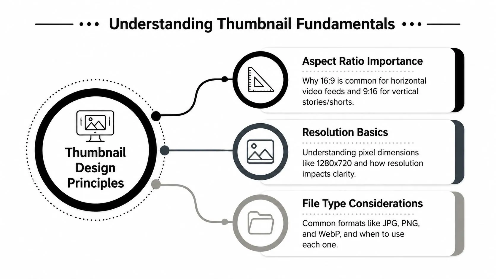
Aspect ratio decides how much of your composition survives the platform’s layout rules. A 16:9 thumbnail fits horizontal video feeds well, while 9:16 is built for vertical surfaces, and a 1:1 frame makes sense where square previews dominate. The shape matters because platforms don’t just resize thumbnails, they often recrop them to fit different surfaces.
File type and compression trade-offs
Most platforms accept common formats like JPG, PNG, and sometimes GIF, but each format has a different job. JPG usually keeps file sizes manageable, PNG preserves crisp edges and text better, and GIF is only practical in limited cases. A smaller file uploads faster, but aggressive compression can blur text and soften facial detail, which is why a thumbnail should be judged by clarity, not just compliance.
Practical rule: if the thumbnail’s message depends on tiny lettering, it’s probably too text-heavy for modern feeds.
Readability beats nominal resolution
A technically important constraint is that thumbnail performance depends less on the canvas size than on readability at small display sizes. Expert guidance consistently recommends high contrast, large typography, and minimal text so the image remains legible on phones (Sendible). That’s the same reason a design system for thumbnails should be treated more like micro-graphic production than poster layout.
If you’re building a repeatable workflow, a design fundamentals guide such as Thumbo AI’s graphic design fundamentals is useful as a companion reference for composition and visual hierarchy.
YouTube Specifications
The baseline most creators still need
A YouTube thumbnail usually starts with 1280 × 720 px in a 16:9 aspect ratio - the platform minimum, with up to 4K recommended - a minimum width of 640 px and a 2 MB file-size cap for mobile uploads (desktop allows 50 MB). That gives you room to work with a clean master file, but it also means the design has to survive compression, resizing, and the small-card views people see. Accepted formats include JPG, GIF, and PNG. The custom artwork is worth the effort, too: YouTube has shared that 90% of the best-performing videos on the platform use custom thumbnails rather than auto-generated stills (Lemonlight).
The practical choice is not just about what uploads. It is about what still reads clearly after YouTube compresses the file and scales it down across home, search, suggested videos, and mobile surfaces. A thumbnail that looks polished at full size can still fail if the text is thin, the subject is too small, or the contrast disappears on a phone screen.
What works in real YouTube browsing
The thumbnail is usually seen at reduced size, not as a full-frame image. On mobile especially, the safe area is tighter than creators expect, so faces, logos, and any text near the edges can get crowded or cropped in a way that weakens the message. A centered subject helps, but the composition still needs breathing room so it does not feel stiff.
Sharp contrast and a clear focal point matter more than decorative detail. If the image feels busy in the source file, it usually gets harder to read once YouTube renders it into smaller cards.
A good export habit is to treat 1280 × 720 as the floor for the master file, not the ceiling - work at the highest resolution you have. That keeps the image flexible for later crops and resizes without forcing you to start from a tiny asset that is already soft. For mobile-first framing and safe-area checks across YouTube Shorts-style placements, Thumbo AI’s YouTube Shorts thumbnail workflow is a useful reference point.
Keep the critical subject centered enough to survive small previews, but not so centered that the composition feels static.
A practical export and check process
If a thumbnail keeps failing at upload or looks muddy in the feed, the problem is usually in the export chain, not the idea. Start with a clean PNG when text and sharp edges matter, then compare it against a JPG export if file size starts to get in the way. That trade-off matters more on thumbnails with bold lettering, logos, or graphic shapes that need crisp edges.
The safest workflow is to test the file at the size people see. View it on a phone, then look again at card scale and on a retina display, where soft edges and weak type become easier to spot. If the source asset was undersized or over-compressed before upload, stretching it into the 1280 × 720 frame will not fix it.
TikTok Specifications
Vertical-first by default
TikTok lives in a vertical environment, so thumbnail design needs to respect the full-height frame rather than force a horizontal composition into it. The practical standard is a 9:16 layout, typically 1080 × 1920 px, with JPG and PNG commonly used for static assets. That shape matches the app’s viewing behavior and gives enough room for face, motion cue, and text without making any one element too tiny. To study how other creators handle it, you can save the cover of any public TikTok.
The biggest trap is edge dependence. Text or faces placed too close to the sides can feel clipped once the app’s own UI and feed behavior take over. A clean center-weighted composition usually holds up better than a poster-like frame with content spread into the corners.
Design for the feed, not just the file
TikTok thumbnails should read fast in a scrolling context. That means one subject, one point of tension, and one clear message. If a thumbnail needs a long sentence to explain itself, it’s already too busy for the way the app presents content.
For creators who publish across several YouTube-like and vertical placements, a separate vertical master file saves time. It’s common to build one vertical version for the feed preview and then adapt it into other formats for embeds or repurposed social assets.
The safest move on TikTok is to design for the phone screen first, then work backward to the editing canvas.
Instagram Specifications
Feed, Stories, and Reels each need a different frame
Instagram doesn’t behave like a single thumbnail system. Feed posts, Stories, and Reels all use different display habits, so the same creative can look polished in one place and awkward in another. Square feed thumbnails still matter in some layouts, while Stories and Reels are built around 9:16 vertical framing, typically 1080 × 1920 px.
The practical difference is how much of the image the user sees without extra scrolling or profile-grid cropping. Feed content often tolerates more variation, but vertical placements demand tighter control over text placement and subject positioning. That’s why a one-export workflow usually ends up producing compromises.
What to prioritize visually
Instagram thumbnails need strong contrast and simple hierarchy. Small text, thin fonts, and detailed backgrounds disappear quickly in mobile browsing, especially if the image is compressed after upload. Clean brand colors and one strong visual anchor usually do more work than a dense collage.
The grid view also matters because many users judge content before opening it. A thumbnail that looks elegant in the feed can still feel broken if the composition relies on elements that get cut off in the profile grid. That’s a strong argument for designing with the final placement in mind, not just the in-app editor.
A useful habit is to check whether the main subject still makes sense when the image is reduced. If the message only appears once the user taps in, the thumbnail isn’t doing its job.
Facebook Specifications
Organic posts and ads don’t share the same logic
Facebook is a mixed-environment platform, which makes thumbnail work more fragile. Feed previews, link cards, and ad placements can behave differently, and the crop that looks fine in one surface may not survive another. For video-style visuals, a frame with a wider aspect is still a common starting point, but the primary objective is to keep the composition usable in compressed previews.
The key trade-off here is between breadth and clarity. Wider compositions can feel cinematic, but they also increase the chance that the subject gets pushed into a low-visibility zone when Facebook adjusts the crop. A tighter crop with a clear focal point often reads better in the feed.
Keep text lean and contrast high
Facebook compresses aggressively enough that delicate typography becomes risky. Bold text, thicker shapes, and a simple subject-background relationship generally hold up better than complex design systems. If your creative relies on tiny decorative text, it’s probably too detailed for the platform’s preview behavior.
For ad units, designers often create separate variants rather than forcing one thumbnail to do every job. That’s the cleaner route because it avoids last-minute cropping in the ad manager and reduces the risk of a headline being obscured by interface elements.
A practical workflow is to export a wide-format version for feed use and a second variant for any placement that expects a different crop behavior. That keeps the thumbnail honest in context instead of relying on the platform to preserve every detail.
X Twitter Specifications
Fast-moving feeds need simple thumbnails
On X, video previews sit inside a stream that rewards instant recognition. The useful reference point for in-stream visuals is a 16:9 frame, and the platform’s supported formats commonly include JPG, PNG, and GIF for image assets. Header images use a different canvas altogether, so don’t confuse profile branding with video preview design.
The important thing is centering. A subject or logo that sits too close to the edges can get visually crowded by the timeline layout and device-specific cropping. In practice, thumbnails on X do better when the composition feels balanced even after the app shrinks the image.
Design for partial attention
X users scan quickly, so thumbnails need to communicate in a split second. That usually means one clear focal point, minimal text, and no visual clutter in the corners. If the creative depends on a long caption inside the image, it’s doing work that the feed won’t reward.
Mobile and desktop also present slightly different spatial pressure. A thumbnail that feels clean on a wide monitor may still read awkwardly on a phone if the focal point is too low or too close to the edge. The safest strategy is to keep the subject dominant and let the background support the message rather than compete with it.
LinkedIn Specifications
Professional context changes the design brief
LinkedIn thumbnails need to look credible before they need to look flashy. The platform is built around professional browsing, so clarity, restrained branding, and readable type usually beat dramatic visual tricks. For post previews, 1200 × 627 px is a common practical target, and JPG or PNG are the normal file choices.
The design problem on LinkedIn isn’t just compression. It’s also tone. If the thumbnail looks too much like a generic entertainment asset, it can feel out of place in a professional feed. A cleaner hierarchy and stronger branding cues usually work better than aggressive clickbait styling.
Keep overlays in mind
LinkedIn layouts can place text and interactive elements over or near the visual, so critical copy shouldn’t sit where it can be obscured. A headline locked into the upper third of the image often survives better than one stretched across the lower edge. That isn’t a hard rule for every post, but it’s a useful default when you need the asset to hold up in different placements.
If your brand uses templates, this is the place to tighten them. A thumbnail that looks polished in a company workflow but turns muddy after upload is usually too complex, too thin in type weight, or too close to the edges. LinkedIn rewards restraint more than novelty.
Cross-Platform Comparison
One spec doesn’t fit every surface
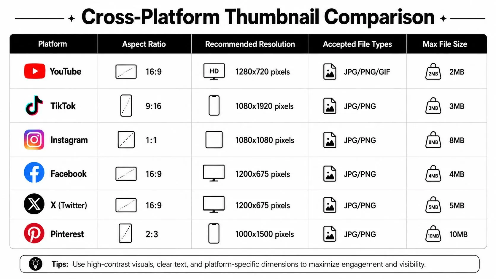
The sharpest contrast across platforms is between horizontal and vertical behavior. YouTube leans on 16:9, TikTok and Instagram Stories lean on 9:16, LinkedIn often works best in a wider card format, and even inside YouTube the classic long-form spec no longer covers everything: podcast playlist covers use a square 1:1 frame at 1280 × 1280 px with their own 10 MB cap (Mediacube), and Shorts favor vertical, small-screen framing. That’s why a single master file is rarely enough anymore.
What to standardize first
The easiest workflow win is to standardize your source composition, then derive platform variants from it. Build the subject, type hierarchy, and brand colors in one master, then adapt the crop and spacing for each platform’s safe area. That reduces rework without pretending every surface shares the same rules.
A simple comparison table inside your design system helps here, especially for teams that produce thumbnails every week. Once the crop logic is consistent, the rest of the process becomes a controlled export task instead of a guessing game.
Safe Area and Mobile Crop Guidance
Keep the core message out of the danger zones
A thumbnail can be technically correct and still lose its message because the app cropped the important part of the frame. That’s why safe area thinking matters. Keep the face, subject, and headline inside the central zone, and don’t trust the corners to stay visible on every surface.
A practical habit is to preview the thumbnail at the small card size mobile feeds actually render, and to keep overlay text to a few bold words. That’s a useful benchmark because it forces you to judge the thumbnail at the size most viewers experience first.
Common mistakes that look small in the file and big in the feed
The most common failure is placing a face, logo, or headline near the bottom-right corner, where interface overlays can get in the way. Another is using a full-width text block that reads well on a design monitor but becomes mush on a phone. Both problems are avoidable if you preview the thumbnail at reduced size before export.
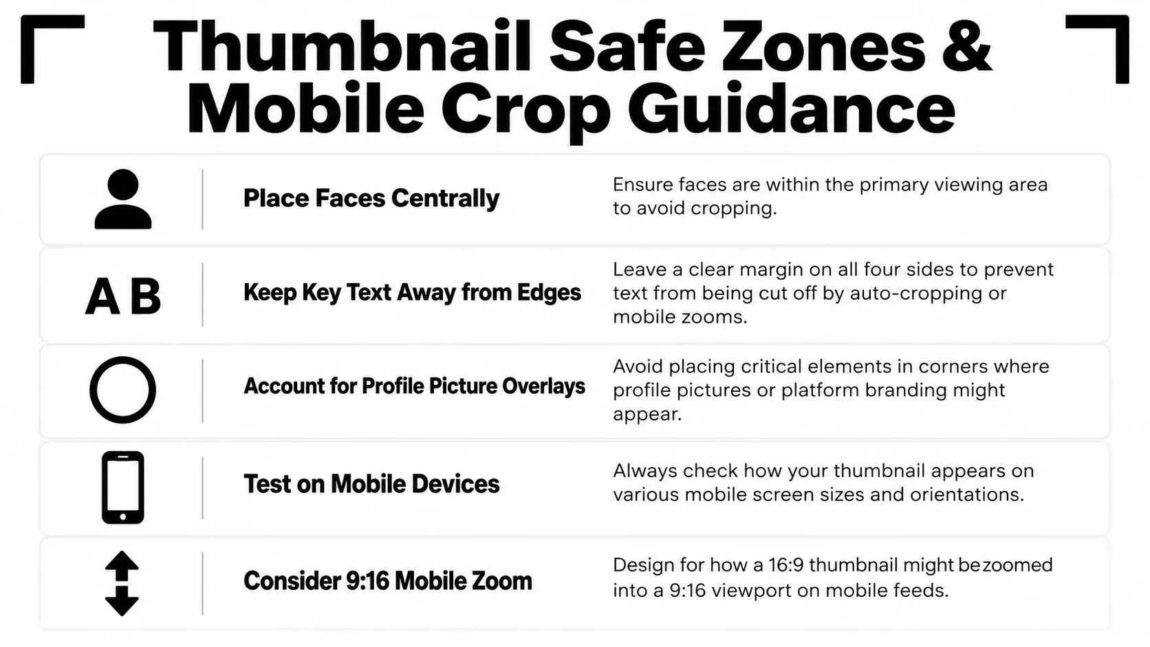
A safer approach is to think in layers. The center carries the message, the mid-frame carries the visual support, and the edges are decorative only if they survive cropping. That mindset is especially helpful for teams that reuse one layout across multiple apps.
Export Settings and Retina Scaling
Export for sharpness, not just for upload
A thumbnail should look clean on a low-end laptop and still hold its edges on a high-DPI phone or TV. That means exporting with a retina-ready mindset, not a one-off screenshot mindset. The easiest way to lose quality is to build at a small size and then scale up later.
Color management matters too. Keep exports in sRGB so the image behaves more predictably across browsers and apps. If the file is intended to carry text, logos, or sharp icons, PNG often gives you a cleaner result than a heavily compressed JPG.
Use the right tool for the final file
A practical export workflow is to make a clean master, then generate platform-specific outputs from it. That can happen in Photoshop, Figma, or a lightweight compressor, depending on how many variants you need. If you’re shrinking a file to fit platform limits, Thumbo AI’s image compression tool can be part of the export path as long as you still inspect the result for readability.
A thumbnail that compresses well but loses edge clarity isn’t actually ready.
For retina scaling, work backward from the target display. If the asset needs to be crisp on higher-density screens, the source file should preserve enough detail in type and facial features before compression removes the margins. That’s the difference between a thumbnail that just fits and one that still looks intentional after upload.
Quick Reference Cheat Sheet
Save this as your working baseline
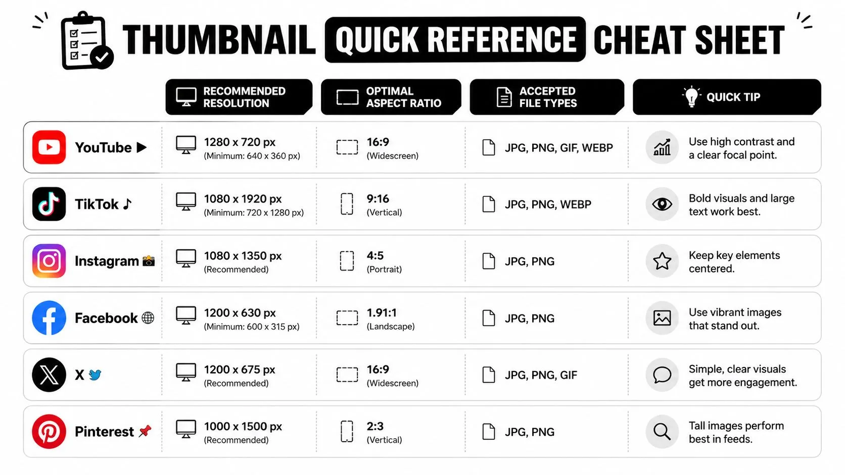
Use this as the default starting point when you’re building from scratch:
| Platform | Recommended Resolution | Optimal Aspect Ratio | Accepted File Types | Quick Tip |
|---|---|---|---|---|
| YouTube | 1280 × 720 px minimum, up to 3840 × 2160 recommended | 16:9 | JPG, GIF, PNG | Keep text minimal and center the subject. |
| TikTok | 1080 × 1920 px | 9:16 | JPG, PNG | Design vertical first and leave room for app UI. |
| 1080 × 1080 px or 1080 × 1920 px depending on placement | 1:1 or 9:16 | JPG, PNG | Check feed, grid, Stories, and Reels separately. | |
| 1280 × 720 px works well for preview cards | 16:9 | JPG, PNG | Watch for compression and crop drift. | |
| X Twitter | 1280 × 720 px | 16:9 | JPG, PNG, GIF | Keep the composition simple for fast scrolling. |
| 1200 × 627 px | Widescreen card format | JPG, PNG | Favor clean branding and readable text. |
The fastest production shortcut is to build one master composition, then test it at small size before exporting any variants. If it fails at thumbnail scale, it will usually fail in the feed too. Keep safe areas conservative, because mobile crops often trim edges more aggressively than desktop previews. Bold typography and a clear focal point hold up better after compression and resizing.
A thumbnail that looks fine in the design file can still fall apart on a high-density phone if the type is too thin or the subject sits too close to the edge. Design for the smallest screen first, then check how the same file reads on retina displays and cropped previews. That approach reduces surprises after upload.
If you want a faster way to build and resize thumbnails without reopening the same design in three different tools, try Thumbo AI and use it to generate a cleaner starting point for your next upload.