You’ve spent an evening building a dramatic Minecraft scene, added a Nether portal, a creeper, enchanted gear, glowing particles, and a title that looks perfect on your monitor. Then the video goes live, and the thumbnail appears as a tiny rectangle in a crowded mobile feed. The portal becomes a purple blur, the text is unreadable, and viewers can’t tell what the video is about quickly enough to stop scrolling.
Learning how to make a Minecraft thumbnail that gets clicks isn’t mainly about making the most detailed screenshot. It’s about deciding which visual information survives compression, small-screen viewing, and competition from dozens of other videos. A strong thumbnail gives viewers one clear subject, one understandable promise, and enough contrast to make both visible instantly.
Table of Contents
- Understanding the Technical Foundation
- What the Data Shows About High-Performing Thumbnails
- Gathering and Organizing Your Assets
- Composing for Mobile-First Legibility
- Editing Techniques That Make Thumbnails Pop
- When Minimalism Beats Visual Complexity
- Export Settings and Performance Validation
Understanding the Technical Foundation
Before choosing fonts or adding effects, set the canvas correctly. 1280×720 pixels at a 16:9 aspect ratio is the floor rather than the target: it is the minimum resolution a thumbnail should ship at, and the width must never drop below 640 pixels, as covered in this YouTube thumbnail specification guide. YouTube’s own thumbnail documentation now recommends 3840×2160 pixels for video thumbnails, and sets the file-size cap by device: 2MB when you upload from mobile, 50MB from desktop. YouTube names JPG and PNG as the formats to use, and the one you pick still affects sharpness, transparency, and compression.
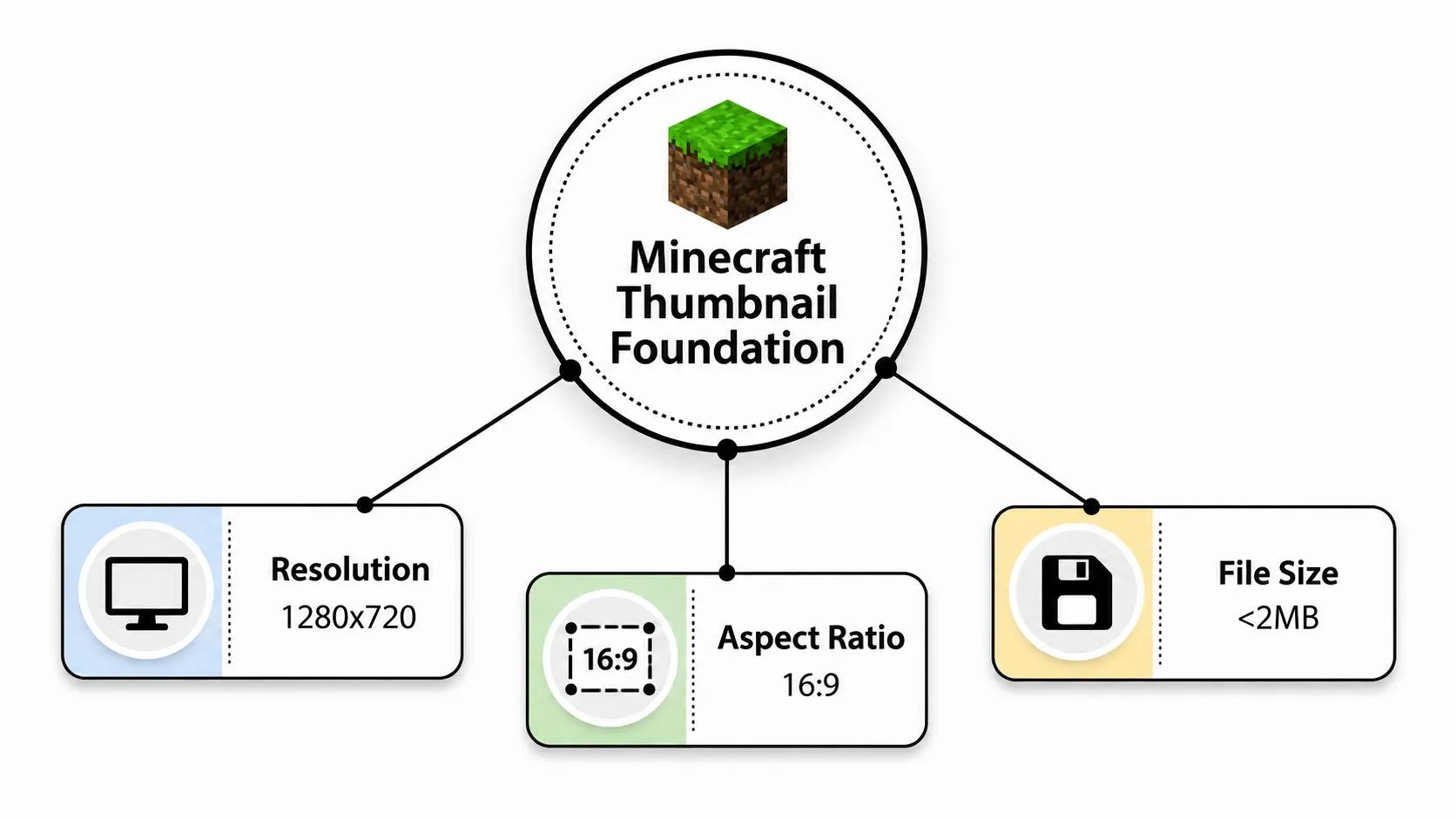
The numbers above are the baseline every thumbnail has to clear, not a ceiling worth designing down to. The 16:9 frame shapes your composition from the start. A character, item, build, or mob needs enough room around it to remain recognizable after YouTube reduces the image for mobile, desktop, and television displays. Design at the full canvas size, then inspect the result much smaller. Details that look impressive at full resolution often disappear completely in the recommendation feed.
Build around the frame
Leave breathing room around important elements. Keep faces, tools, text, and key blocks away from the edges so platform controls and cropping don’t interfere with them. YouTube’s official thumbnail guidance recommends making thumbnails as large as possible, keeping text easy to read, avoiding excessive complexity, and using the rule of thirds.
Rendering your Minecraft scene at a larger working resolution is what the current recommendation asks for, and it also preserves clean edges while you position assets. Don’t treat file size as an afterthought. A file that exceeds the cap for the device you upload from may force you to re-export quickly, often with softer text and muddier textures.
Practical rule: The thumbnail has to work at its final viewing size, not just on your editing canvas.
What the Data Shows About High-Performing Thumbnails
The clearest lesson from thumbnail research is that viewers respond to simple visual hierarchy. A crowded image asks the eye to solve too many problems at once. A focused image gives the viewer a subject, an emotion, and an outcome before they’ve read every detail.
A 2026 study of YouTube click-through patterns associated bright, saturated backgrounds with about 8 - 14% higher CTR than muted or dark backgrounds, according to the thumbnail CTR patterns study. The same research found that a single dominant face with a clear emotional expression generally performed better than a neutral face or no face across the niches examined.
A separate analysis of 1,000 thumbnails across ten niches reported an average 6.8% CTR for thumbnails with a human face versus 4.1% without one, a relative difference of roughly 66%. Those figures don’t mean every Minecraft video needs a creator face. They do support a practical choice: if your channel has a recognizable host, a tight reaction crop can communicate stakes faster than a distant avatar.
| Visual Element | What the Data Shows | Best Use Case |
|---|---|---|
| Bright, saturated background | About 8 - 14% versus muted or dark backgrounds | Challenges, danger, discoveries, and high-energy moments |
| Human face | 6.8% average CTR versus 4.1% without one | Reaction-led videos and creator-focused channels |
| Single dominant subject | Higher performance associated with simpler designs | Builds, mobs, rare items, and challenge outcomes |
| Concise outcome-based text | Common feature among high-CTR gaming thumbnails | Explaining the result without repeating the title |
Use Minecraft’s visual language deliberately. Diamond-blue against lava-orange creates immediate separation, while earthy browns and greens can blend together unless you add lighting or a contrasting subject. Recognizable objects such as a Nether portal, an enchanted table, a village, or a distinctive build usually explain the setting faster than an abstract scene.
Gathering and Organizing Your Assets
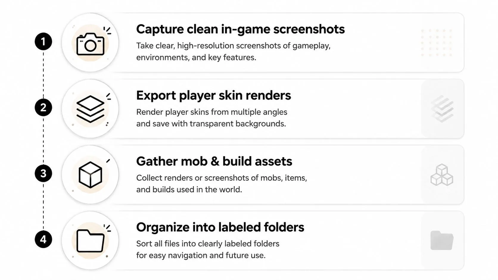
A polished thumbnail usually comes from several prepared assets rather than one unedited screenshot. Capture the main Minecraft scene separately from the player skin, mob, item, face reaction, and text so you can test different arrangements without rebuilding the entire image.
Start with a clean in-game capture. Hide the HUD where possible, choose a camera angle that supports the video’s premise, and capture several poses instead of settling for the first frame. F5’s third-person view works for straightforward character shots, while Replay Mod can provide camera positions and movement that are difficult to capture during ordinary gameplay.
Prepare the asset library
Export player skins as transparent PNG cutouts when you need to place a character over a new background. Capture mobs facing the camera, item renders with enough space around them, and builds from an angle that makes their silhouette obvious. If the video centers on your reaction, take a separate face photo with lighting that matches the intended mood.
Use folders that match the way you edit.
- Raw captures: Keep untouched screenshots and screen recordings here.
- Cutouts: Store transparent player, mob, item, and face assets separately.
- Background plates: Save blurred scenes, gradients, skies, and build interiors.
- Text and exports: Keep working files apart from final uploads so you don’t overwrite a version you may want to test.
Name files descriptively, such as nether_portal_wide, creeper_closeup, or diamond_sword_cutout. That small habit saves time when a thumbnail needs a fast revision.
If you want to assemble a concept from an idea or screenshot, Thumbo AI’s Minecraft Thumbnail Maker is one option for generating a Minecraft-focused cover before refining it manually.
Composing for Mobile-First Legibility
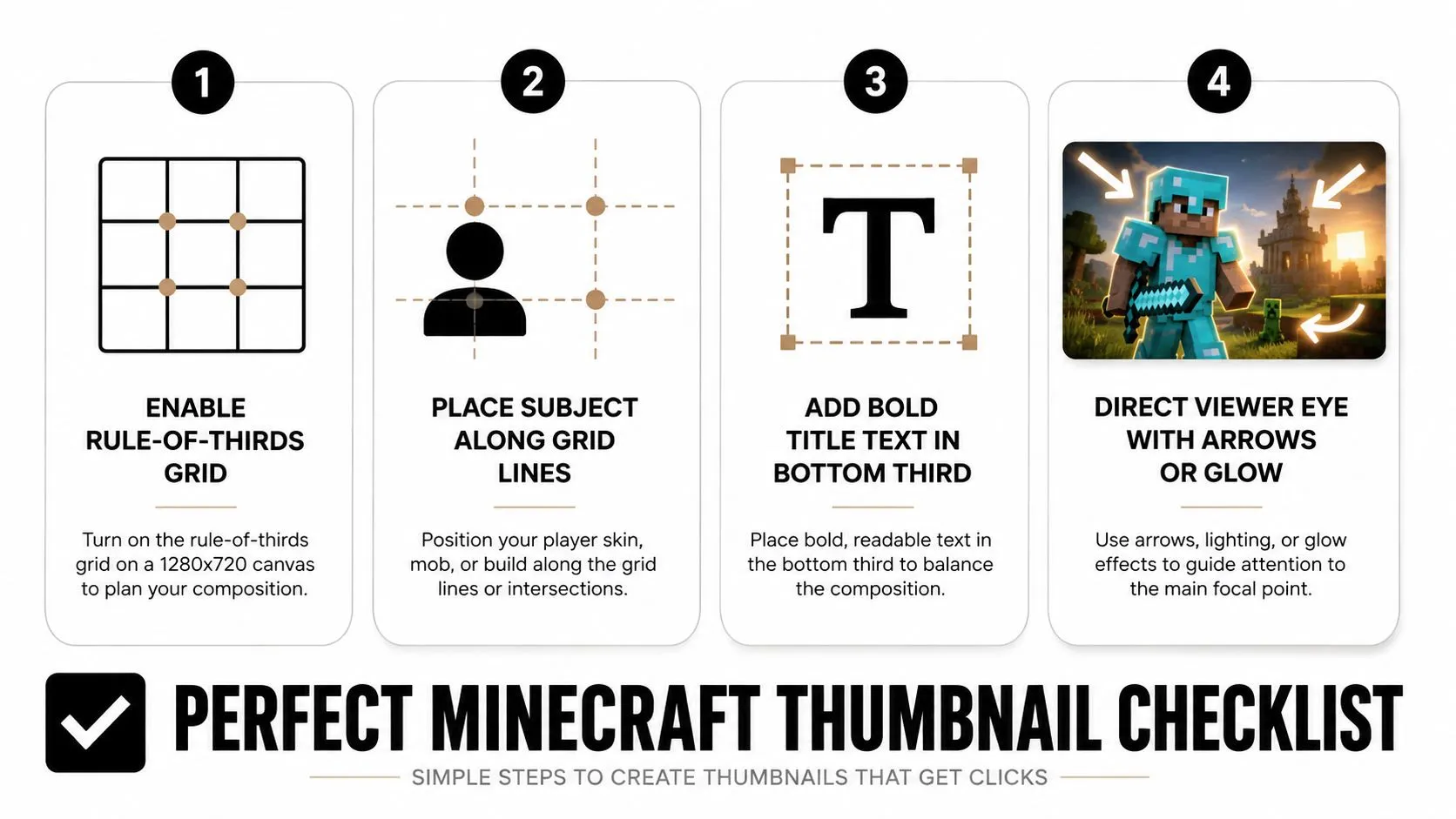
Create a 1280×720 canvas and enable a rule-of-thirds grid before placing anything. Put the main subject on the left or right third rather than automatically centering it. The unused side becomes valuable negative space for a short hook, a contrasting object, or a directional cue.
The composition should have a clear reading order:
- Foreground: A player skin, mob, face, or item that carries the story.
- Midground: One supporting detail, such as a portal, build, trap, or enemy.
- Background: A simplified environment, gradient, or softened scene that establishes context without competing.
Check the thumbnail at a very small zoom while you work. If the viewer can’t identify the main subject at that size, the design isn’t ready. Don’t try to rescue an unclear composition with more outlines, arrows, or particles. Remove distractions first.
Make room for interface elements
Place text in open space, often along the lower-left or upper third, depending on the image. Keep it short and specific. A phrase such as “100 days trapped in the Nether” communicates more than a vague line such as “You won’t believe this.”
Keep important details comfortably inside the edges. YouTube displays thumbnails differently across devices, and the timestamp overlay can interfere with the lower-right corner. Check the text against both the background and the subject, then test the complete image as a tiny feed preview.
For typography ideas, compare readable typefaces in this guide to the best fonts for YouTube thumbnails. Choose a heavy sans-serif with distinctive letter shapes, then use contrast rather than decorative styling to make it visible.
Editing Techniques That Make Thumbnails Pop
Minecraft’s block-based graphics can look flat when a screenshot contains evenly lit terrain and similar colors. Start with tonal separation. A curves adjustment that deepens the darkest areas while lifting the midtones can give the scene more depth, but keep the shadows open enough that the subject doesn’t turn into a black shape.
Color grading should guide attention, not make every pixel compete. Increase saturation on the focal element, then reduce visual intensity in the background. A warm lava scene can support a cool-blue diamond or cyan armor, while a green forest may need a warmer character outline or text treatment to create separation.
Use effects with restraint
A subtle glow around a player, mob, or item can separate it from a busy environment. Keep the glow soft and controlled. Heavy neon outlines, lens flares, and particle layers often collapse into muddy artifacts after compression, especially when they overlap text or small block details.
Text needs a dependable contrast system. White lettering with a dark stroke works well over varied Minecraft scenes, while a hard drop shadow can prevent letters from disappearing against bright blocks. Don’t use multiple display fonts in the same thumbnail. One strong typeface with a clear hierarchy is easier to read than a collection of stylized options.
Finish with a light sharpening pass after resizing or exporting. The purpose is to restore edge clarity around blocky assets and lettering, not to create halos. Inspect the reduced preview again after sharpening, because artifacts that are invisible on the full canvas can dominate a small feed image.
Editing test: Turn the thumbnail into grayscale. If the subject and text merge together, color alone isn’t providing enough structure.
When Minimalism Beats Visual Complexity
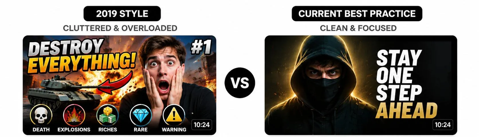
More elements don’t automatically create more excitement. A thumbnail with a character, a portal, an explosion, several mobs, multiple arrows, and a long title may contain the entire story, but viewers won’t know where to look first.
Recent thumbnail coverage points toward high contrast, clear focal points, and simpler compositions. A 2026 analysis of niche-channel thumbnails found that background color moved CTR the most, followed by facial expression and then text changes, while small layout edits barely registered. That’s a useful correction for Minecraft creators who keep rearranging layers while ignoring the stronger variables.
Remove before adding
Try deleting one visual element from every draft. If the thumbnail becomes easier to understand without losing the promise of the video, leave that element out. A single player holding an enchanted item against a clean, contrasting background can explain a challenge faster than a detailed scene with several competing subjects.
Minimalism doesn’t mean every thumbnail should look empty. A mega-build reveal may need the structure, the player for scale, and a visual cue that communicates the transformation. A mod showcase may need one unusual mob or item. The rule is to match the number of elements to the story, not to fill unused space because it feels unfinished.
Design decision: Keep an element only if it explains the video, strengthens emotion, or directs attention to the result.
Export Settings and Performance Validation
Export the finished image at 1280×720 pixels or larger and keep the file inside YouTube’s upload cap for the device you publish from, using the recommended video thumbnail size guidance as a final format check. PNG preserves crisp text and transparent cutouts well, while JPG can be useful when a detailed scene needs a smaller file. Whichever format you choose, inspect the exported file rather than assuming it matches the editor preview.
Use the following checklist before uploading:
| Setting or Metric | Recommended Value | Notes |
|---|---|---|
| Canvas size | 1280×720 pixels minimum | 3840×2160 is YouTube’s current recommendation |
| Aspect ratio | 16:9 | Anything else gets letterboxed or cropped |
| Minimum width | 640 pixels | Narrower images fall below the stated minimum |
| File size | Under 2MB from mobile, 50MB from desktop | The cap depends on where you upload from |
| File formats | JPG or PNG | The two formats YouTube names for thumbnails |
| Early review | Home and Suggested CTR in the first 24 hours | YouTube Help recommends checking these surfaces |
YouTube Help specifically recommends checking CTR on Home and Suggested during the first 24 hours, rather than relying only on a long-term channel average. Treat that early review as diagnosis. If viewers see the impression but don’t click, compare the thumbnail promise with the title and test a cleaner version.
Change one meaningful variable at a time. Swap the face expression, background color, or text placement, but don’t change all three together if you want to understand what affected the result. Record the winning choices in a swipe file, including the subject type, background treatment, text length, and whether the thumbnail still worked at a small preview size.
The final question is simple: can a mobile viewer identify the subject, understand the outcome, and read the hook without zooming? If not, simplify the image before publishing.
Thumbo AI can help you turn a Minecraft idea or screenshot into a ready-to-post thumbnail concept, with support for the 1280×720 format used in this workflow. Visit Thumbo AI to create a starting design, then refine its subject, text, contrast, and mobile readability before uploading.