
You’ve got the video edited, the title feels solid, and the thumbnail has already burned an evening in Photoshop or Canva. Then the upload goes live, you open YouTube Studio the next morning, and the click-through rate barely moved. The thumbnail looked “good” in isolation, but it never got treated like what it really is, a variable inside an analytics loop.
That shift in mindset matters. How to make YouTube thumbnails isn’t just about design polish, it’s about building something small enough to read on mobile, clear enough to survive feed browsing, and testable enough to improve after publish. YouTube’s own workflow makes that possible through documented thumbnail specs, YouTube Studio analytics, and built-in A/B testing for titles and thumbnails, so the job is learning how to use those tools without guessing.
Table of Contents
- Why Most Thumbnails Fail Before Anyone Sees Them
- The 2026 Thumbnail Specs You Need to Export
- Composition Rules That Survive a 1-Second Glance
- Choosing Your Creation Path from Canva to AI Generators
- Exporting and Uploading Without Hitting Upload Errors
- How Long to Wait Before You Judge a Thumbnail
- A Repeatable Thumbnail Checklist You Can Run Today
Why Most Thumbnails Fail Before Anyone Sees Them
A creator can spend hours making a thumbnail look clean, balanced, and on-brand, then watch it stall because viewers never read it fast enough to click. That failure is usually about the thumbnail being treated like a finished graphic instead of a live decision that has to survive a feed, a phone screen, and YouTube’s own analytics.
The problem is usually comprehension, not beauty
A thumbnail can be polished and still lose. Bright colors do little if the subject is buried, and a sharp font does little if the text needs a second pass to understand. In browsing, viewers make fast judgments, so the thumbnail has to communicate instantly or it gets skipped.
YouTube’s own thumbnail system reinforces that reality. Custom thumbnails should use a 16:9 frame, be as large as possible (YouTube recommends 3840×2160, with width never dropping below 640 pixels), and upload as JPG, GIF, or PNG per YouTube’s help. That baseline exists because the image has to stay legible across devices and surfaces, not just look good in a design file. It is also why custom thumbnails are worth the effort at all: YouTube states plainly that 90% of the best-performing videos have custom thumbnails in its own thumbnail and title guidance.
Practical rule: if the concept only makes sense when zoomed in, it is not ready for YouTube.
A second check helps before publish. Zoom the design out until it feels uncomfortably small, then ask whether the subject, emotion, and any text still read at a glance. If they do not, the thumbnail is asking viewers to work too hard, and YouTube’s feed will not help carry it.
The better way to think about a thumbnail
The most useful shift is to stop asking whether a thumbnail is “nice” and start asking whether it is testable. A good thumbnail is one you can publish, measure in YouTube Studio analytics, and improve based on impressions click-through rate (CTR) after real viewers see it. That is why thumbnail work feels repetitive at a high level. The repetition is the point.
Creators who get better at this usually stop trusting first impressions alone. They make a version, publish it, read the numbers, and change the next one based on what the audience did. That turns thumbnail design into a feedback loop, not a one-time art project. It also leaves room for trade-offs. A thumbnail that looks more polished can lose trust if it feels overproduced for the video, while a rougher one can outperform because it looks direct and believable.
If you want a baseline before testing, start from the current YouTube thumbnail size spec, then judge the image by how it behaves in the feed, not by how it looks on your desktop.
The 2026 Thumbnail Specs You Need to Export
A thumbnail can look finished in your editor and still come out soft, oddly cropped, or rejected once it reaches YouTube. The current baseline is 1280×720 pixels as the minimum at a 16:9 ratio, with 3840×2160 as YouTube’s recommended resolution since March 2026 and a hard floor of 640 pixels wide. File types are JPG, GIF, or PNG, and the size ceiling depends on where you upload from: 2 MB from the mobile app, 50 MB from desktop, and 10 MB for podcast covers. YouTube’s thumbnail help lays out those limits, and the practical habit is simple, export to spec before you spend time judging the design by feel.
What each export setting actually changes
The old advice to export at exactly 1280×720 is the floor, not the target. YouTube asks for the image to be as large as possible because the same file is reused as the preview in the embedded player and on TV screens, where more than half of watch time now happens. At feed size, a sharp 1280×720 file and a 4K file look identical, so nothing about your workflow has to change if your audience is mostly on phones, but exporting bigger costs nothing.
A PNG usually keeps text edges and flat shapes cleaner, which helps if your thumbnail has bold typography or simple graphics, but that extra clarity can push the file size up quickly. JPG is easier to keep light, so it often makes more sense for photo-based thumbnails or designs that do not need transparency. GIF is accepted as a still image, not as animation, so there is no motion to gain from it.
The useful habit is to export once, check the file size against the limit for the device you upload from, then simplify the design if compression starts to chew up the image. If the concept only works with a lot of tiny detail, it is probably too fragile for the feed. You can compare your own export against the full YouTube thumbnail size guide before uploading.
A simple export preset that won’t fight you
Use this as a working preset in Photoshop, Canva, Figma, or whichever editor you already trust:
- Canvas: 16:9, at least 1280×720, ideally 3840×2160 when you export from desktop
- Format: JPG first, PNG only if the design needs it
- File size: under 2 MB if you will upload from your phone, under 50 MB from desktop
- Readability check: zoom out until the thumbnail still reads clearly
Design for the small view first. If the thumbnail still makes sense when reduced, it usually holds up in the feed. If it falls apart at that size, export settings will not rescue it. Sharpness helps, but only after the composition survives the shrink.
Composition Rules That Survive a 1-Second Glance
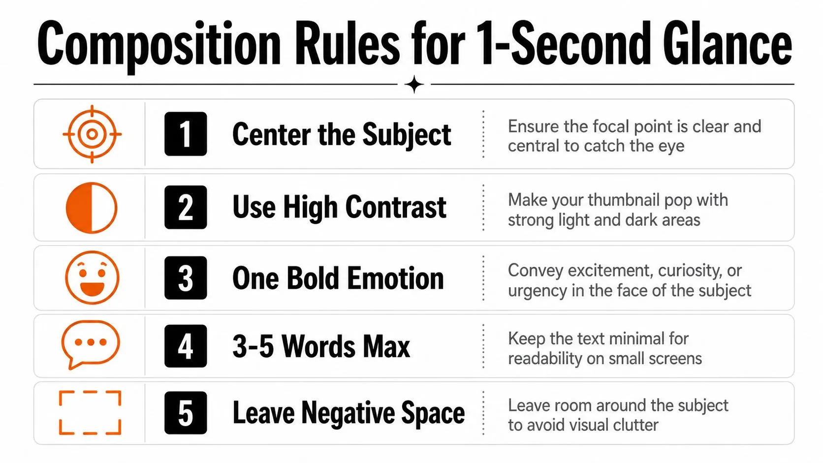
Composition is where most thumbnails win or lose. The file can meet every spec and still fail if the viewer does not know where to look first. On a phone the thumbnail renders at roughly 160 px wide, which is the size one CTR-focused design guide uses as its pre-publish test: is the subject still obvious at phone size? The design has to survive that tiny view without turning into visual noise.
Keep the frame brutally simple
The strongest thumbnails usually follow a 1 subject, 1 short hook, minimal clutter pattern. That does not mean they are empty. It means every element has to earn space. A face or object becomes the anchor, the text gives a fast hook, and the background supports the idea without competing for attention.
The same logic applies to text. 2 to 4 words is the practical cap in the same design guide, whose pre-publish question is whether the text is four words or fewer and still legible over the background. More than that creates a reading problem on a tiny screen. If the words are doing the work of the title, the thumbnail is probably already too crowded.
Place the important stuff where YouTube won’t fight you
The bottom-right corner is risky because the timestamp badge lives there. Put key visual elements elsewhere. Keep strong contrast between subject and background, and do not let the text blend into whatever color sits behind it. If the subject’s face or object disappears when the thumbnail is shrunk, the composition needs another pass.
A cluttered thumbnail tells the viewer too much and too little at the same time.
A useful check is to look at two versions side by side. One version might have six elements, multiple text blocks, decorative shapes, and a busy background. The cleaner version might use one face, one short phrase, and a color that separates the subject from the frame. The second one usually wins because the eye finds a single place to land.
For design structure beyond thumbnails, Thumbo’s graphic design guide is worth revisiting if your layouts keep feeling overloaded.
Choosing Your Creation Path from Canva to AI Generators
There isn’t one correct way to make thumbnails. The right path depends on how often you publish, how much control you need, and whether the channel depends on a real face, a consistent brand, or fast output. The trade-off is simple. More control usually takes more time, and more automation usually gives up some precision.
Manual design gives control, but it asks for time
Canva, Figma, and Photoshop are still the cleanest options when the thumbnail needs exact alignment, brand consistency, or careful retouching. You decide every pixel, which is useful if the visual identity has to stay tight from one upload to the next. The downside is obvious. Every new thumbnail can turn into a fresh build instead of a repeatable system.
That works for creators who like precision and don’t mind spending more time per upload. It’s less friendly to channels that need a quick turnaround after recording. Manual design is also the easiest place to overwork a thumbnail, because more control can tempt you to add one more shape, one more glow, one more layer.
Templates and AI speed things up for the right channels
Template-based workflows reduce the blank-page problem. They help creators keep a familiar structure while swapping the subject, text, or color treatment. AI generators take that further by drafting concepts from a prompt or a video frame, which can be useful when the goal is speed and iteration instead of handcrafted detail. YouTube now ships one of its own: Ask Studio analyzes a video’s transcript and themes and suggests thumbnails from a prompt inside the publishing workflow, with follow-up prompts for changes like making the text larger per YouTube’s help.
Thumbo AI fits into that latter category as one option, since it generates a YouTube thumbnail from a video idea and can also match a channel’s look by pasting a channel URL. That’s useful when a creator wants fast drafts without starting from zero every time.
| Thumbnail creation paths compared | Time per thumbnail | Control | Best fit |
|---|---|---|---|
| Canva, Figma, Photoshop | Slower, manual build | High | Brand-heavy channels, careful visual control |
| Templates and stock-based workflows | Moderate | Medium | Repeatable channels that value speed |
| AI generators | Fast draft creation | Varies | High-output creators who need concepts quickly |
The primary decision rule is trust fit. A faceless tutorial channel can usually lean harder on templates or AI drafts. A personality-driven vlog often needs a thumbnail that feels closer to the creator’s actual expression and style, because audiences notice when packaging feels too synthetic. The tool matters less than whether the output matches the channel’s promise.
Exporting and Uploading Without Hitting Upload Errors
A thumbnail can be finished and still fail at the last step because of format, size, or the wrong upload path in YouTube Studio. The cleanest workflow is to export the image, confirm the file size, and then upload it intentionally instead of letting YouTube grab a random frame. That keeps the packaging under your control.
Choose the format before you name the file
Use JPG when you want lighter files and don’t need transparency. Use PNG when the design depends on crisp edges or elements that compress badly. Keep the file naming simple enough that you can tell versions apart later, because once you’ve made ten thumbnails, vague names become a problem.
The upload location matters too. The documented path is YouTube Studio, then Content in the left menu, then the video you want to edit, where you either pick an auto-generated option or click Upload thumbnail and Save. Custom thumbnails also require a verified account. If you skip that step, YouTube may auto-pick a frame that’s technically acceptable but visually weak. Note that changes can take time to appear across YouTube, so a thumbnail that still looks old an hour later is usually propagation, not a failed upload.
Don’t let the mobile size limit catch you
One especially annoying failure mode is finishing a thumbnail on a phone and then trying to upload a file that’s too heavy. The limit is not one number, it depends on the device you upload from: 2 MB from mobile against 50 MB from desktop. That gap is exactly why an export that uploads fine at your desk gets rejected from your phone, and it catches people who assume the old 2 MB ceiling applies everywhere.
If you’re using your phone as the last editing stop, pause before publish and check the file size against the mobile limit, or move the upload to desktop. Mobile shortcuts are convenient, but they’re also where oversized exports and rushed uploads slip through.
Keep one export preset and use it every time. Inconsistent settings create inconsistent results.
A good habit is to keep a short pre-publish checklist next to your monitor, then reuse it every upload. Confirm the ratio, confirm the file type, confirm the file size, and confirm that the custom thumbnail is attached in Studio. That’s dull work, but dull work prevents the kind of silent failure that wastes an upload.
How Long to Wait Before You Judge a Thumbnail
A thumbnail becomes “good” when viewers respond to it, not when it looks strong in a design file. The temptation is to open YouTube Studio the next morning and make a call, and that is the one thing worth resisting. In the first 24 hours YouTube pushes a new video mostly to subscribers and people with notifications on, and that warmer audience clicks at rates a broad audience never will. Creator analytics guidance is direct about it: ignore the first 24 to 48 hours, wait for at least 500 to 1,000 impressions per variant before drawing a conclusion, and give a manual thumbnail swap 7 to 14 days to settle.
Read the click, then check the downstream behavior
A thumbnail that gets clicks but hurts retention is a weak result. High CTR paired with low average view duration usually means the packaging won a click the video did not earn, and YouTube reads that short visit as a signal the video wasn’t satisfying. That mistake shows up often. Creators celebrate the click and ignore what happened after the click.
The other half of that pattern is more useful than it sounds. Low CTR with solid average view duration points at the thumbnail rather than the video, and that is the clearest case for replacing the image on a video that is otherwise working.
Compare the thumbnail against your own channel pattern, not someone else’s channel, and break CTR out by traffic source rather than reading one blended number. Search traffic arrives with intent and clicks harder than the home feed does, so the same percentage means different things depending on where the impressions came from. A thumbnail can improve your audience response even if it would not matter in another niche.
Test one variable at a time
YouTube will run the comparison for you. Its built-in A/B testing (the tool creators still call Test & Compare) lets you test up to 3 titles, thumbnails, or combinations, and at the end of the test the option with the highest watch time is shown to all viewers per YouTube’s help. A step-by-step walkthrough of the feature shows what a finished test looks like, with one thumbnail taking 84.4% against 15.6% for the runner-up.
Two things are worth knowing before you plan around it. It is desktop only, it requires advanced features enabled on your account, and Shorts, scheduled lives, and Premieres are not eligible. And you do not control the clock: a test takes a few days up to 2 weeks to complete, so it is not something you read the morning after publishing.
The catch after that is simple, isolate the change. If you alter the crop, the text, the color, and the expression all at once, you will not know what moved the result.
Rule of thumb: one test, one main hypothesis.
The best tests are usually the ones you can describe in plain language. “Face plus short hook.” “No face, stronger contrast.” “Same layout, different emotional expression.” Clear tests produce clear lessons, and clear lessons build on each upload. For a practical CTR reference point, what counts as a good click-through rate on YouTube is a useful companion when you are reading your own numbers.
A Repeatable Thumbnail Checklist You Can Run Today
A thumbnail workflow gets easier when it stops being a mood and starts being a checklist. Export at the right size, keep the frame simple, upload the custom image in Studio, then give the numbers time to settle before you read them. If the thumbnail feels trustworthy but underperforms, test a new version. If it drives clicks but hurts retention, the packaging needs a different promise.
A few rule-bends are valid. Some explainer channels work better with stock imagery than a face. Some markets need more text than a U.S.-centric guide would suggest. And some personality-driven creators lose trust when the thumbnail looks too AI-polished or too generic, even if it’s technically cleaner.
- Export cleanly: 16:9, 1280×720 at minimum and 3840×2160 if you can, inside the size limit for the device you upload from.
- Design for the feed: one subject, one hook, minimal clutter, four words or fewer.
- Upload intentionally: attach the custom thumbnail in YouTube Studio instead of leaving the frame choice to chance.
- Review patiently: skip the first 24 to 48 hours, wait for 500 to 1,000 impressions, and read CTR by traffic source.
- Test smarter: change one thing at a time, not five.
If you’re publishing tonight, draft two or three versions and put them into YouTube’s A/B testing tool, then let it run its few days to two weeks before you call a winner. That habit beats another hour of second-guessing the design.
Thumbo AI helps creators turn a video idea into a ready-to-post thumbnail, match a channel’s look from a channel URL, and generate concepts fast enough to keep a real testing workflow supplied with variants. If you want a quicker way to draft and iterate on thumbnails for your next upload, visit Thumbo AI and see how it fits into your own process.