Most advice about how to resize to thumbnail starts with the wrong question. The issue isn’t whether you can force an image into 1280 × 720. It’s whether the thumbnail still communicates when YouTube has shrunk it into a tiny feed card, where faces, text, and contrast either survive or disappear.
A thumbnail is a reduced-size preview, not just a smaller file. That distinction matters because thumbnailing is meant to create something that loads fast, uses less bandwidth, and stays recognizable at a glance, while a simple resize only changes dimensions (reelmind.ai). On YouTube, the recommended thumbnail format is 1280 × 720 pixels at a 16:9 aspect ratio, but that spec is only the starting line, not the finish.
The working mindset is simple. Design for the upload spec, then judge the result at the size viewers see.
Table of Contents
- Why Most Resize to Thumbnail Workflows Fail
- Target Dimensions and Aspect Ratio That Actually Matter
- Cropping and Composition for Small-Screen Legibility
- File Format and Compression Without the Guesswork
- Batch and Automated Resize Workflows
- Accessibility, Testing, and Final Upload Checklist
Why Most Resize to Thumbnail Workflows Fail
Most creators resize to the spec, export, upload, and then wonder why the result looks soft on a phone. The mistake is treating 1280 × 720 as the actual target when it is only the delivery format. The test is whether the image still reads when it’s compressed into a feed tile, because that’s where people decide whether to click.
YouTube’s thumbnail standard still anchors the workflow around a platform-defined frame, not an arbitrary image size. That can make the job feel finished the moment the export matches the upload spec. ReelMind’s thumbnail and resize overview points to the same trap, a file can meet the requirement and still fail if the subject is too small, the text is too delicate, or the crop leaves the focal point fighting background clutter.
The hidden mismatch
The gap is between upload size and viewed size. A creator may work at full resolution, but the viewer often sees the thumbnail at a much smaller size than the file that was uploaded. That is why a clean export can still feel illegible in the feed.
Practical rule: resize for the platform, but evaluate for the feed.
A good workflow starts by asking what survives when the frame is reduced. If the face still pops, the text still reads, and the color contrast still separates subject from background, the resize worked. If not, the problem isn’t the pixel count. It’s the composition.
The working constraint is simple. A thumbnail has to survive the first glance, then survive the smaller preview that follows. A frame that looks polished in an editor can still miss the job if the eye has to hunt for the subject.
What to stop doing
- Stop assuming larger source files solve everything. More pixels cannot rescue weak hierarchy.
- Stop placing important details near the edges. Crops get harsher at small sizes.
- Stop judging only on a desktop canvas. Desktop preview can flatter designs that collapse on mobile.
A better practical check is to test the image at the size people will encounter. If it reads there, the resize did its job. If it does not, the issue is usually the layout, the crop, or the text treatment, not the export command.
The better mental model is this. Resize to thumbnail is really a legibility problem disguised as a file-size problem. The image has to function as a tiny decision cue, not just a neat-looking asset.
Target Dimensions and Aspect Ratio That Actually Matter
Lock the target before you touch the crop tool. For YouTube, the operational standard is 1280 × 720 px at a 16:9 aspect ratio, with a minimum width of 640 px and a maximum file size of 2 MB (YouTube thumbnail resizing guidance). If your source file doesn’t fit those constraints cleanly, the resize itself isn’t the hard part. Choosing how to handle the extra space is.
Pick the right aspect-ratio mode
There are three practical ways to adapt a source image:
- Fill/crop. Best when the source is already close to 16:9 and the subject can lose a little edge space.
- Fit with blur. Useful when you need to preserve the full image without awkward empty margins, especially for square or vertical sources.
- Fit with border. Works when the whole source must stay visible and the border itself can be designed as part of the thumbnail.
Each mode solves a different problem. Fill protects the frame’s visual energy, but it can cut off hands, text, or a face. Fit protects the whole source, but it can create weak side bars or padded areas that pull attention away from the subject. The right choice depends on what matters more, the complete source image or the strongest possible click signal.
| Platform | Recommended Size | Aspect Ratio | Max File Size |
|---|---|---|---|
| YouTube | 1280 × 720 px | 16:9 | 2 MB |
When the source is square or portrait, don’t force a generic resize and hope for the best. Recompose for the frame. That may mean tightening the crop, moving the subject off-center, or turning the empty area into a controlled design field instead of letting it become dead space.
A useful reference point for broader thumbnail size planning is this video thumbnail size guide, especially if you’re managing assets across multiple platforms. The core idea doesn’t change, though. The file must meet the upload spec and still hold its shape after it’s displayed much smaller than the exported canvas.
Cropping and Composition for Small-Screen Legibility
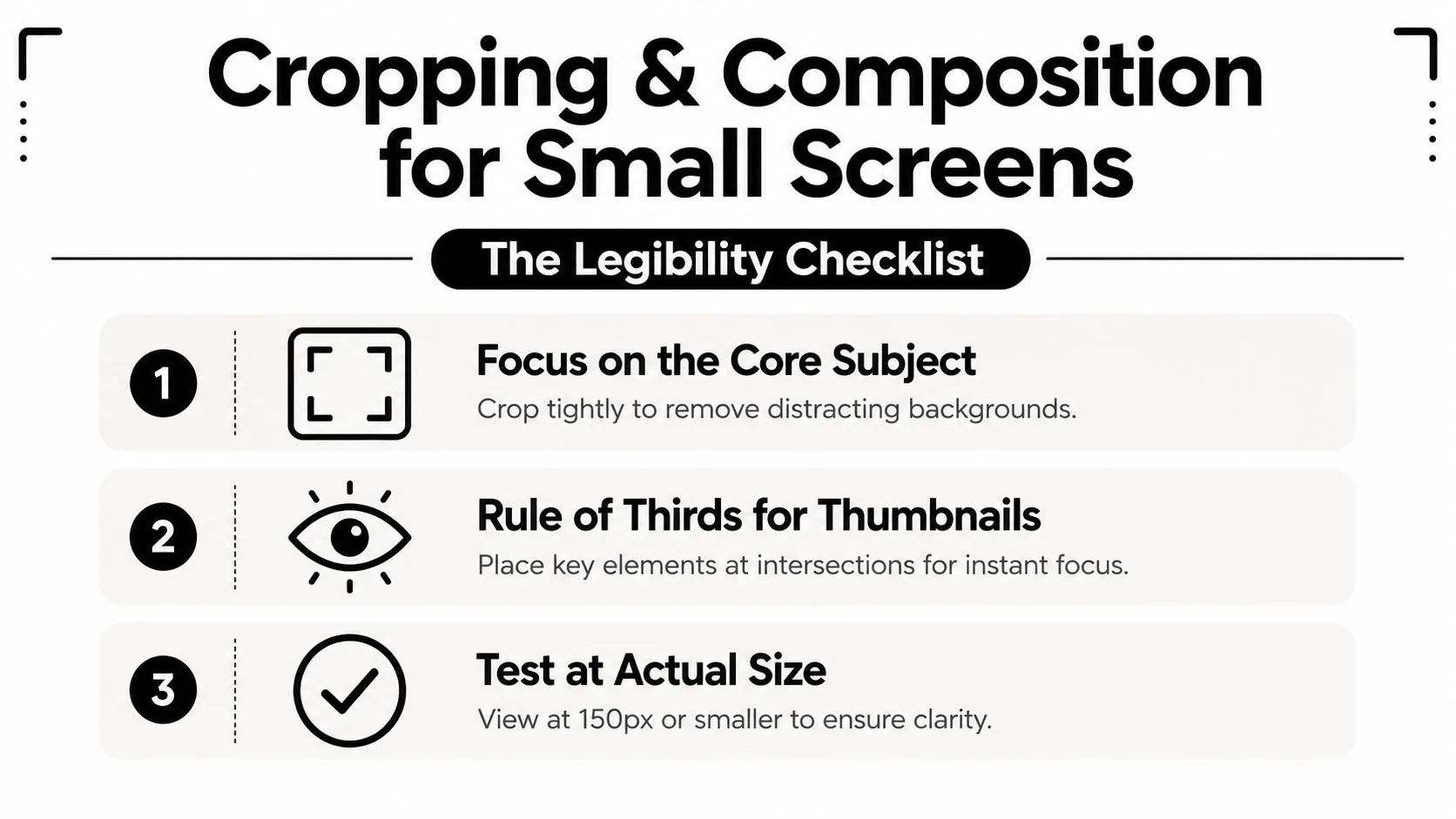
Most thumbnail work is won or lost. A thumbnail that looks sharp in Photoshop can still fail if the subject placement, text size, or contrast doesn’t survive shrinkage. Industry guidance recommends shrinking designs to roughly 120 to 160 pixels wide before upload to confirm readability, because that’s close to the size where feed behavior starts to expose weak composition.
Compose for the tiny view, not the full canvas
Design at full size, then check the result at a very small display size. If the subject becomes hard to identify, the thumbnail is too busy. If the text turns into texture, it’s too thin or too long.
A face usually needs room to breathe, and it shouldn’t hug the edge of the frame. When the crop gets tighter on mobile, edge placement becomes risky fast. The same is true for logos, captions, and any object that acts as the visual hook.
Direct test: if the thumbnail works only when you zoom in, it doesn’t work.
Use contrast as a structural tool
Thin shadows often disappear after downscaling. Bright outlines, bolder type, and stronger background separation tend to survive better because they create clearer shape boundaries. That’s not about style, it’s about visibility.
A simple workflow helps:
- Place the core subject first. Crop around the face, object, or action you want viewers to notice.
- Reserve text for open space. Don’t force words into a cluttered area.
- Preview at tiny size. Check whether the image still says one thing instantly.
For design basics that hold up beyond thumbnails, this graphic design fundamentals resource is a useful companion. The underlying principle is unchanged, though. At small sizes, clarity beats detail every time.
File Format and Compression Without the Guesswork
Format choice is where people usually overcorrect. They export huge files to protect quality, then waste time and sometimes run into upload friction. Or they compress too hard and end up with a thumbnail that looks washed out or old before it ever reaches the feed.
Match the format to the content
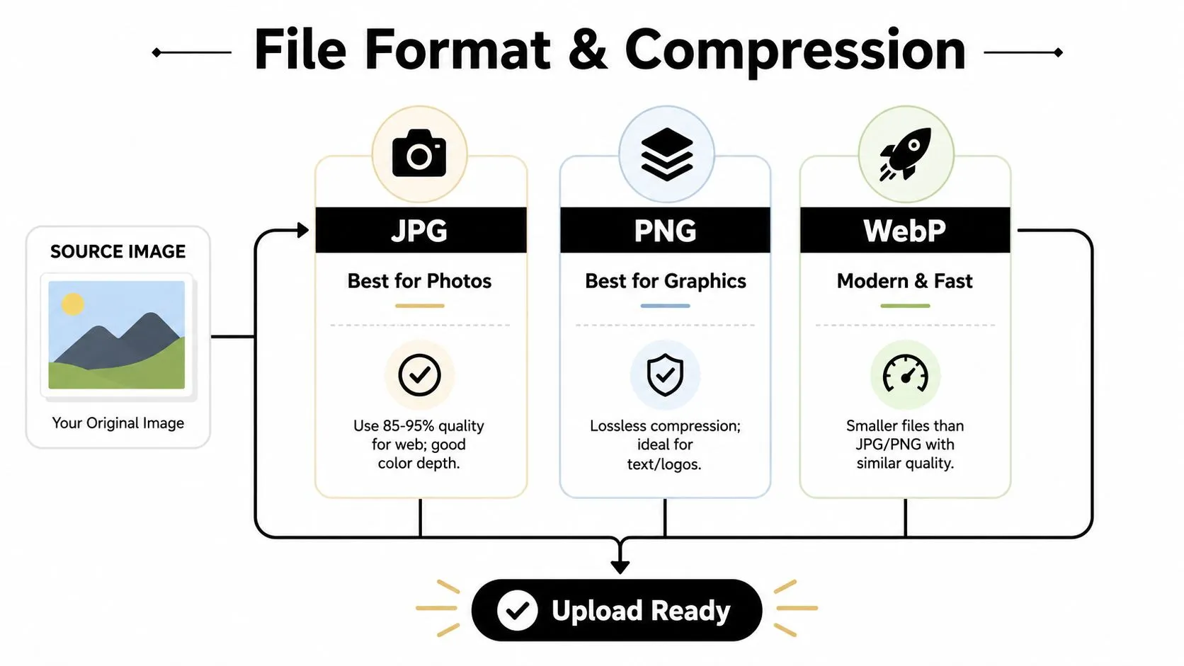
For photo-heavy thumbnails, JPG is usually the practical choice because it handles rich color well and stays relatively compact. For graphic-heavy thumbnails with crisp text, icons, or flat shapes, PNG often preserves edges more cleanly. WebP is useful when you want a modern format that can stay smaller while keeping similar visual quality.
That decision matters because a thumbnail isn’t judged in isolation. It has to survive upload, storage, and repeated use across versions. If you’re exporting dozens of assets, file discipline becomes a workflow issue, not just a technical preference.
A useful compression checkpoint is this 2 MB image compression tool, especially when you’re trying to stay inside platform limits without babysitting every export.
Strip the waste before you resize
Metadata can add unnecessary weight, and high-volume workflows feel that cost fast. ImageMagick’s -thumbnail operator is built for efficient shrinking, first stripping metadata, then using -sample to reduce the image to about 5× the final height, and then applying a normal -resize (ImageMagick resize docs). That pipeline is efficient because it avoids doing expensive work on the full-size image longer than necessary.
ImageMagick also warns that aggressive shrinking can damage thin lines and small text. That’s why text-heavy thumbnails often need stronger contrast before export, not after. If the type already looks fragile at source size, downscaling will only make it worse.
Working rule: protect readability before compression, not after it.
The clean export path is boring in the best way. Choose the right format, remove unnecessary metadata, and make sure the thumbnail still looks intentional when the file is light enough to move quickly.
Batch and Automated Resize Workflows
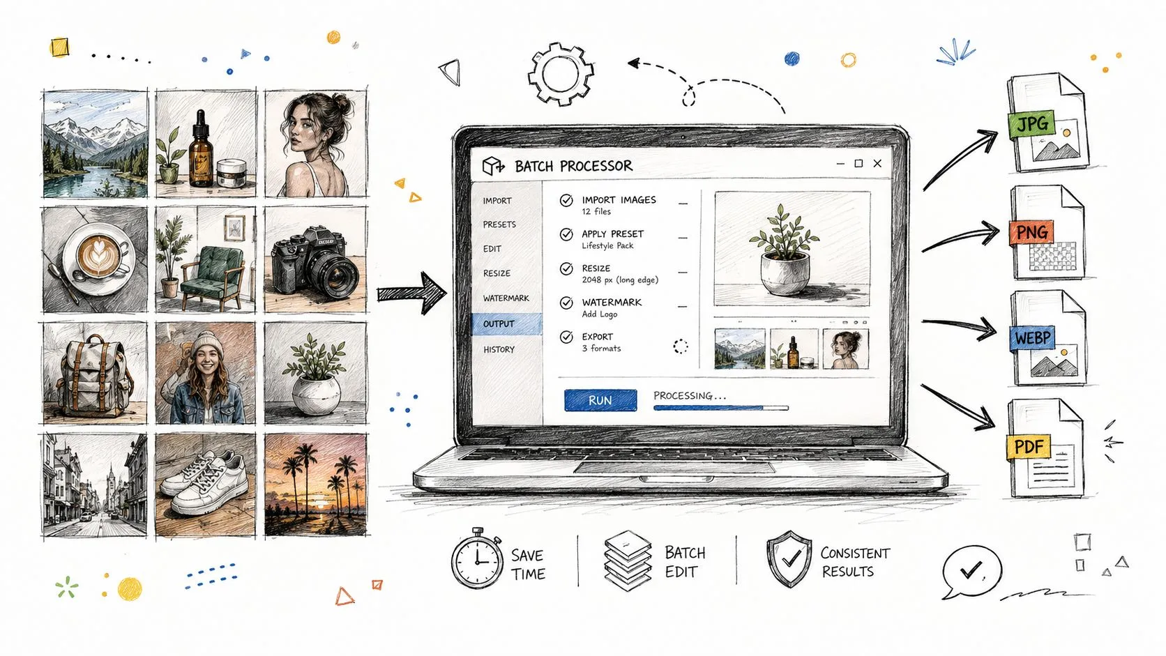
One thumbnail is easy. Fifty are not. Once you’re resizing a back catalog, client set, or multi-platform content library, the problem becomes repeatability. The human should make the creative call. The machine should handle the mechanical part.
Use scripts when the rules are stable
If your thumbnails follow a tight brand system, a batch resize pipeline is efficient. ImageMagick is strong here because it’s built for fast processing of large files and can handle repetitive conversion without dragging the whole workflow into a manual editor. That makes sense when the crop logic, aspect ratio, and export format stay consistent.
Photoshop actions and droplets work well too, especially when you need a visual editing environment but still want a repeatable process. They’re handy if your thumbnails depend on layer styles, type treatments, or subtle composition shifts that a pure script won’t understand.
Use an automated generator when the layout needs judgment
AI-assisted tools are useful when the resize isn’t just a resize. If the subject needs to be re-centered, the crop should change, or different platforms need different variants, a generator can handle the first pass much faster than rebuilding every frame by hand. That’s especially helpful when you’re starting from a large backlog and need a practical system, not a perfect one.
The best workflow is often hybrid:
- Batch the exports for consistent source sets.
- Review the strongest candidates manually before publishing.
- Keep a template library so the machine doesn’t invent new design logic every time.
Don’t automate the wrong part
Automation is great at repetition. It’s bad at taste. If the subject gets clipped, the text lands in dead space, or the crop turns the thumbnail into visual mush, no batch tool will save it.
So let the tool handle scale, not judgment. The moment composition needs interpretation, a human has to step back in.
Accessibility, Testing, and Final Upload Checklist
Accessibility is part of performance, not a separate box to tick. A thumbnail with weak contrast, tiny type, or a misleading crop can be hard to read and hard to trust. If the image promises one thing and shows another, the viewer notices, even if they can’t articulate why.
Test the thumbnail where people actually see it
YouTube Studio supports A/B testing for titles and thumbnails, where creators can upload up to 3 variations, run tests for up to 2 weeks, and let YouTube choose a winner automatically based on watch time, not just clicks. That turns thumbnail choice into an evidence-based process instead of a guess. You can compare options, keep the strongest one, and build repeatable patterns from the versions that hold attention.
The practical part is checking the image at the size viewers will experience. Desktop can make a weak design look acceptable. A phone can expose every problem immediately, especially if the subject is too small, the contrast is soft, or the crop drifts away from the point of the video.
Preview at the smallest realistic size, then ask whether the subject still reads in one glance.
Run the final pass
- Check contrast. Text and icons need enough separation from the background to stay readable.
- Inspect the crop. Make sure nothing important disappears at small size.
- Verify the file. Confirm the exported image meets the platform spec and isn’t bloated for no reason.
- Review for trust. If the thumbnail is heavily edited or AI-assisted, make sure the image still matches the video accurately.
There’s one more nuance that’s easy to miss. Resizing an AI-assisted or heavily edited image doesn’t change what it depicts. As synthetic visuals become more common, trust and disclosure expectations matter more, not less.
If you want a faster way to turn that final pass into a repeatable workflow, use Thumbo AI to generate cleaner thumbnail variants, then keep the human review step in place before you publish.