Why do some polished videos disappear in the feed while simpler ones earn the click? The gap often starts before the video plays. A YouTube thumbnail is the viewer’s first impression, and it has to communicate relevance, emotion, and value while competing with a dense stream of other images.
Thumbnail design became a distinct strategic discipline after YouTube introduced custom thumbnails for Partner Channels in December 2010. Before that change, creators relied on automatically selected video frames, which offered little control over composition or visual packaging. The rollout turned the thumbnail into a separate design asset and helped establish the practices creators still use today, including composition, text hierarchy, contrast, and face placement. This thumbnail design history explains why custom imagery became central to creator strategy.
The strongest YouTube thumbnail design ideas aren’t decoration applied at the end of production. They translate the video’s promise into a visual that viewers can understand at a glance. The ten approaches below pair each concept with niche-specific examples, production decisions, and practical ways to use Thumbo AI in the workflow.
Table of Contents
- 1. High-Contrast Color Blocking
- 2. Emotional Face Expressions With Close-Up Shots
- 3. Bold Typography With Strong Shadows
- 4. Arrow and Pointing Elements
- 5. Before and After Split-Screen Design
- 6. Number-Based Listicle Format
- 7. Surprising or Unusual Central Image
- 8. Minimalist Design With Maximum Contrast
- 9. Animated or Motion Element Preview
- 10. Brand Consistency With Logo and Color System
- 10 YouTube Thumbnail Design Ideas Comparison
- Next Steps Design Thumbnails That Convert
1. High-Contrast Color Blocking
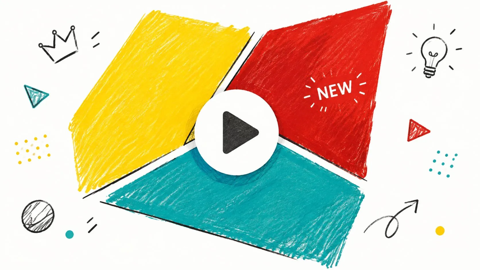
Color blocking gives every important element its own visual territory. Divide the frame into bold sections, then place the face, product, number, or text against a color that separates it immediately from the surrounding area. The design should feel intentional, not like several unrelated graphics placed side by side.
A challenge creator might place a subject in a vivid yellow section against a red panel containing the challenge result. A tech reviewer could isolate a silver smartphone on a deep blue field, while a productivity channel might use a bright green workspace against a dark charcoal block. The familiar visual energy of MrBeast’s yellow and red thumbnails, Marques Brownlee’s restrained high-contrast compositions, and Linus Tech Tips’ bold color separations shows how different niches can use the same underlying principle.
Practical rule: Color should separate the story’s elements before it tries to express the channel’s personality.
Keep the palette controlled. Three dominant colors are usually enough for clear hierarchy, especially when the thumbnail will be viewed small. Check the design at roughly 200 pixels wide before publishing, because fine distinctions that look obvious on a large canvas can collapse in a feed. An online contrast checker can also reveal when text technically sits on a different color but still lacks practical readability.
Thumbo AI can help generate color directions before you commit to a layout. Use its suggestions as a starting point, then adjust the palette around your niche, skin tones, product colors, and channel identity. For more guidance on choosing a palette, see this breakdown of the best color for YouTube thumbnails.
2. Emotional Face Expressions With Close-Up Shots
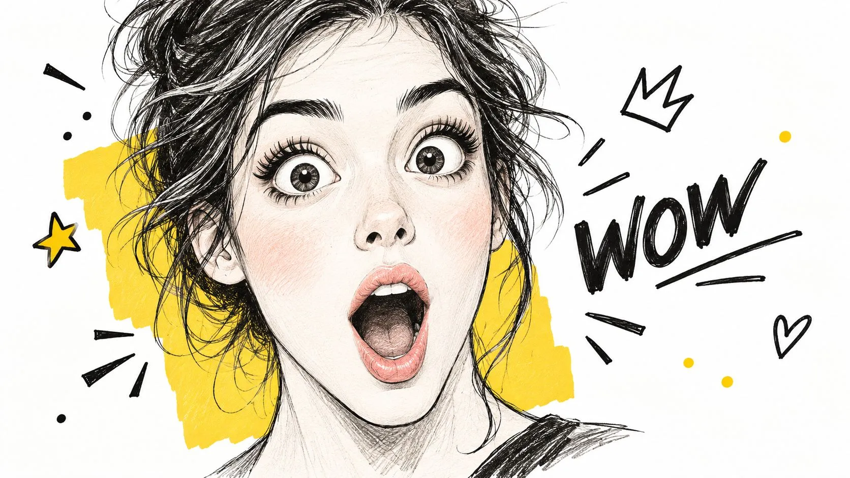
A close-up face can communicate the video’s emotional temperature faster than a paragraph of text. Surprise suits an experiment reveal, concern fits a financial warning, and excitement works for a travel discovery or gaming win. The expression has to match the subject, though. A forced reaction may earn attention while weakening trust once viewers realize the image exaggerates the actual video.
For reaction channels, the face can carry most of the frame while a single contextual object explains the cause. A gaming creator might pair a tight crop of genuine disbelief with a damaged in-game structure. A beauty creator could show focused concentration beside the final makeup result. A commentary channel might use a skeptical expression next to the headline or event being analyzed.
A 2026 analysis of 1,000 YouTube thumbnails reported that thumbnails with a human face averaged 6.8% CTR, compared with 4.1% for thumbnails without a face. The same analysis identified a tight crop, a clearly legible expression, a high-contrast background, and short outcome-focused text as recurring characteristics of stronger thumbnails.
Make the emotion readable at feed size
Shoot with consistent key, fill, and back lighting so the eyes and mouth remain clear after cropping. Keep the face large enough to preserve micro-expression, but leave room for the object or text that gives the reaction context. A plain or strongly contrasting background usually works better than a detailed room competing with the subject.
The 2026 thumbnail CTR patterns study reported that a single dominant face with a clear emotional expression outperformed neutral-face or no-face thumbnails by 18 - 32% CTR across most niches studied. Use that finding as a design direction, not a reason to force a face into every thumbnail. For a nature documentary or product comparison, the subject itself may create a stronger focal point.
3. Bold Typography With Strong Shadows
Text-led thumbnails work when the words deliver a specific promise that the image can support. A restoration video might use WORTH SAVING? beside a damaged backpack. A science channel could place WHY IT FLOATS over a clear image of the experiment. An educational creator might use a question that creates a knowledge gap without repeating the full video title.
Use short copy, usually no more than 3 - 5 words, and make the most important word visually dominant. A thick outline or restrained shadow can preserve separation when the background contains texture, but heavy effects quickly make the design feel dated. Strong typography doesn’t mean adding every effect available. It means creating a reliable reading order.
Vsauce’s question-based packaging, TED-Ed’s emphasis on the lesson topic, and Kurzgesagt’s clean typographic treatment offer useful references for different educational styles. A personal-finance thumbnail might use a large outcome such as DEBT FREE?, while a cooking channel could use CRISPY EVERY TIME beside the finished dish.
Text should add the missing context, not transcribe the title.
Align type to a grid and keep sufficient space around each word. Avoid placing important letters near the edges, where mobile crops or interface overlays can reduce clarity. Test the design on a phone at roughly 200 pixels wide, then remove any word that no longer contributes meaningfully.
Thumbo AI can speed up early variations, especially when you want to compare a question, an outcome phrase, and a short quote from the video. Use the best fonts for YouTube thumbnails as a practical reference, then check every generated version for spacing, capitalization, and legibility. AI can suggest a hierarchy, but the final copy still needs human editing.
4. Arrow and Pointing Elements
Arrows and circles are useful when the viewer needs help locating the important detail. A technology channel could point from a laptop to a hidden setting on its screen. A plant-care creator might circle a yellow leaf while the subject holds the pot. A reaction channel can use one directional element to connect the creator’s expression with the clip or object causing it.
These cues work as visual instructions, but they lose force when every object receives one. Limit the design to one or two primary indicators. A single curved arrow leading toward a cracked phone screen creates a clear path. Several arrows crossing the frame make the viewer decode the decoration instead of the story.
Use an arrow color that contrasts with both the background and the target. Red can work against pale surfaces, while yellow or white may read better on a dark cinematic frame. Give the arrow a clean edge and enough thickness to survive reduction. A tiny, detailed pointer won’t help if the viewer can’t distinguish it from the background.
Direct attention without manufacturing mystery
The target should be relevant to the video. Pointing at an ordinary detail and presenting it as shocking may produce a misleading click, especially for tutorials and reviews where viewers expect accuracy. For a data-analysis video, an arrow should identify the chart pattern being discussed. For a home renovation video, it might point to the structural issue that explains the project.
Thumbo AI can produce alternate layouts with different focal paths. Generate one version with an arrow, one with a circle, and one without either. Compare whether the cue clarifies the subject or merely increases visual noise. The strongest version is the one that lets a viewer understand the thumbnail faster, not the one with the most graphic energy.
5. Before and After Split-Screen Design
A before-and-after thumbnail tells a complete visual story in a single frame. The left side establishes the problem, and the right side displays the promised result. This structure suits home improvement, makeup, restoration, gardening, fitness, room organization, and game-graphics comparison videos because viewers can identify the transformation without reading much text.
A renovation channel might show a dark, unfinished kitchen beside its bright remodeled version. A sneaker-restoration creator could place a stained shoe next to the cleaned result. A gaming channel might compare default graphics with a custom visual overhaul. The two images need enough difference to create a meaningful contrast, but they should still show the same subject from a comparable angle.
Keep lighting and camera perspective consistent whenever possible. Otherwise, viewers may attribute the change to photography rather than the work shown in the video. A simple vertical divider is clear and dependable. A diagonal divider can add movement, but it also makes alignment harder, especially when faces, products, or architectural lines need to match.
Make the result easy to decode
Labels such as BEFORE and AFTER can help, particularly when the visual difference is subtle. Keep them short and place them near the relevant side without covering the transformation. For a cooking tutorial, labels might be unnecessary if the raw ingredients and finished dish are unmistakable. For a design comparison, concise labels can prevent confusion between the original and revised version.
Thumbo AI can help explore different split treatments quickly. Ask for a clean comparison, a dramatic diagonal division, and a version with minimal labels. Then inspect each at small size. If the “after” result doesn’t dominate visually, adjust the crop, background, or subject scale rather than adding more text.
The format fails when the two halves show unrelated scenes or when the result is too small to recognize. A transformation should feel immediate. Give the viewer one problem, one result, and one reason to care.
6. Number-Based Listicle Format
Numbers promise structure. A large numeral can tell viewers that the video contains a ranking, a sequence, or a defined set of recommendations before they read the title. This makes the format a natural fit for business advice, travel guides, software roundups, history explainers, cooking mistakes, and gaming lists.
For a finance channel, a large 10 beside a relevant chart or object can frame the video as a practical list. A travel creator might pair 5 with a recognizable destination image. A gaming channel could use TOP 10 with one character or item rather than attempting to display every entry. WatchMojo’s ranking format and Business Insider’s list-oriented packaging demonstrate how the number can act as the primary anchor.
The number should be substantially larger than supporting text, but scale isn’t enough on its own. Give it strong color separation and enough empty space to remain legible. A numeral partially hidden behind an image can look dynamic at full size and become unreadable in the feed.
Design decision: The number should explain the format in an instant, while the image explains why this particular list matters.
Use one supporting visual rather than a collage of every item. A “best microphones” video needs one clear microphone and a large number, not ten tiny products. A “mistakes to avoid” video might use a recognizable warning symbol or a creator’s concerned expression to add emotional context.
Thumbo AI can generate variations where the number leads, the image leads, or both share equal weight. Test those roles against the video’s hook. If the list itself is the attraction, emphasize the number. If viewers care more about the outcome, make the result or subject larger and let the numeral function as secondary context.
7. Surprising or Unusual Central Image
An unusual central image creates a question before the viewer knows the answer. A science creator could place an everyday object in an unexpected environment. A DIY channel might show a bizarre failed construction beside the final concept. A food creator could feature an ingredient being used in a way that challenges ordinary expectations.
The surprise has to connect directly to the video. A strange object that has no role in the story may win a glance but create a poor match between expectation and experience. The thumbnail should make viewers wonder why the object appears, not wonder whether the creator chose it randomly.
5-Minute Crafts often uses unusual DIY visuals to make ordinary materials feel unfamiliar. Vsauce builds curiosity through surreal imagery, while Dope or Nope can turn a strange product into the central event. Those examples differ in tone, but each uses one unexpected subject rather than a crowded collection of unrelated oddities.
Make novelty look deliberate
Choose a high-quality image with a clean silhouette. An unusual object becomes harder to understand when it blends into a busy background, so isolate it with lighting, color, or negative space. A vivid accent can create a pattern interrupt without forcing the entire thumbnail into a loud palette.
For a travel channel, an upside-down landmark or an unexpected local detail may be more compelling than a generic scenic image. For a business channel, an unfamiliar object can represent a surprising cost, process, or mistake. The visual metaphor should remain understandable once the title supplies context.
Thumbo AI is useful for exploring several visual metaphors from the same video idea. Generate direct, humorous, and surreal directions, then reject any concept that promises a story the video doesn’t deliver. AI can expand the search space, but editorial judgment decides whether the surprise feels relevant or manipulative.
8. Minimalist Design With Maximum Contrast
Minimalist thumbnails remove competing signals so one subject can carry the message. A clean tech review might show one device against a near-black background with a single accent color. A documentary creator could place one face or object in a wide field of negative space. An editorial channel might use a restrained headline and one carefully cropped image.
Marques Brownlee’s clean tech packaging, Apple’s product-focused visual language, and The Verge’s editorial approach show how minimalism can feel intentional rather than empty. The difference lies in the quality of the focal image and the precision of spacing. Removing elements won’t rescue a weak subject.
Minimalism carries a real cost, and it is worth naming. Outlier-thumbnail research published in 2026 reports the opposite of a minimalist trend: the clean aesthetic that peaked around 2023 and 2024 has been losing click-through rate in most niches to high-contrast, high-emotion designs, because feeds are denser and most viewing is now on phones, where subtle detail disappears. The practical reading is that restraint has to buy something. Keep the composition clean, but pair it with one uncompromising signal, such as a vivid accent against a near-black background or a tight crop on a clearly readable expression.
Choose what stays
Start with the subject, then remove anything that doesn’t clarify the video’s promise. Keep one accent color, one type treatment, and one supporting cue at most. A background can remain almost empty while still contributing atmosphere through texture, lighting, or a subtle gradient.
Thumbo AI can quickly create clean variants from the same concept. Use its outputs to compare an image-only version with a restrained text-led version, then refine the strongest composition manually. The graphic design fundamentals guide offers useful principles for balance, hierarchy, contrast, and spacing.
Minimalism isn’t a quota for empty space. Treat space as a tool, not a target percentage. A cooking thumbnail may need the dish, a hand, and one ingredient to communicate the idea. A software review may need only the product interface and a short outcome phrase.
9. Animated or Motion Element Preview
A static thumbnail can imply movement through pose, direction, and visual rhythm. Motion lines, speed indicators, sequential frames, and tilted compositions tell the viewer that the video contains action even before playback begins. This suits gaming, sports analysis, action tutorials, product demonstrations, and transformation videos.
A gaming creator might show a character lunging toward a target with a small set of directional streaks. A sports analyst could freeze a player at the decisive moment and use a clean line to show the intended movement. A tutorial creator might place two stages of a drawing or build process along one diagonal path.
Motion graphics need restraint. Two or three lines can suggest speed; a dense cluster can obscure the subject. Align the direction with the action and with the natural path through the composition. If the player looks left but every graphic points right, the thumbnail feels visually disjointed.
Suggest movement without faking the result
Use action photography or a genuine frame from the video whenever possible. The motion cue should reinforce what happens in the content, not invent an event that never appears. A sports thumbnail showing a real play can use a line to explain the analysis. A tutorial thumbnail can use sequential positions to show progress without implying animation that the viewer won’t see.
Thumbo AI can create motion-focused concepts from a simple prompt, particularly when you specify the subject, direction, and visual style. Generate one version with motion lines and another using only pose and composition. If the second version communicates movement just as clearly, it will often look more credible and less cluttered.
Check the design at mobile size. Thin streaks, small frame sequences, and subtle speed effects disappear quickly. The subject must remain clear even after the motion treatment is removed.
10. Brand Consistency With Logo and Color System
A channel becomes easier to recognize when its thumbnails share a visual system. Recurring colors, fonts, framing choices, and logo placement can help viewers identify a creator while scrolling through unrelated videos. Consistency doesn’t mean every thumbnail looks identical. It means the designs share enough structure to feel connected.
Linus Tech Tips uses recognizable branding and energetic composition. Kurzgesagt connects its thumbnails to a broader illustration language, while TED-Ed uses a consistent educational visual system. A small business channel might use a navy background, a warm accent, and one fixed headline position. A beauty creator could repeat a portrait crop, soft background, and brand color while changing the featured product.
Build a system that leaves room for variation
Create a short thumbnail guideline covering palette, type hierarchy, subject placement, logo treatment, and safe areas. Keep the logo away from the primary face, product, or headline. If branding occupies the most valuable space, it becomes an obstacle rather than a recognition cue.
Review the system regularly, but don’t change every visual element at once. Updating the accent color or layout can refresh a channel while preserving the features viewers already associate with it. Competitor review can reveal common patterns, but copying a recognizable creator’s exact composition will make your channel less distinct.
Thumbo AI supports repeatable production through Style Packs and personas rather than fixed layouts. Reuse the same Style Pack and the same persona built from your uploaded photos, then vary the subject, hook, and supporting color while the look stays recognizable. This approach is especially useful for interview series, weekly tutorials, and recurring review formats. Consistency should reduce production friction without turning every upload into the same visual.
10 YouTube Thumbnail Design Ideas Comparison
| Style | Implementation Complexity | Resource Requirements & Speed | Expected Outcomes | Ideal Use Cases | Key Advantages |
|---|---|---|---|---|---|
| High-Contrast Color Blocking | Moderate, needs color theory and deliberate layout | Low, fast in design tools; few assets | High, strong visibility, excellent on mobile | Thumbnails for mobile-first audiences, promos, product reveals | Stands out in feeds; modern aesthetic; mobile-friendly |
| Emotional Face Expressions with Close-Up Shots | Moderate, staging and direction required | Medium - High, camera, lighting, talent | Very High, highest CTR and emotional engagement | Vlogs, reactions, challenges, personality-driven content | Immediate emotional connection; broad category effectiveness |
| Bold Typography with Strong Shadows | Low, straightforward typographic treatment | Low, quick to produce with editors | High, improves readability, SEO, and CTR for info content | Educational videos, titles, question-based thumbnails | Readable at small sizes; clear messaging; easy to iterate |
| Arrow and Pointing Elements | Low - Moderate, careful placement needed | Low, simple graphic elements; fast | Moderate, focuses attention on the detail that matters | Comparison, reaction, tutorial highlights | Guides eye movement; emphasizes key details |
| Before & After Split-Screen Design | Moderate, requires matched composition | Medium, two quality images and editing | High, instant transformation narrative, strong conversions | Makeovers, renovations, product demos, comparisons | Clear story in one frame; immediately communicates benefit |
| Number-Based Listicle Format | Low, simple layout with bold numerals | Low, quick to assemble | High, creates curiosity and scannability, good algorithm fit | Top X lists, countdowns, curated recommendations | Scannable structure; drives FOMO and click intent |
| Surprising or Unusual Central Image | High, strong ideation and concepting | Medium - High, image creation or sourcing | High, high novelty and memorability; risk of clickbait | Curiosity-driven, viral experiments, entertainment | Dramatically stands out; creates memorable associations |
| Minimalist Design with Maximum Contrast | High, demands refined design skills | Low - Medium, fewer assets but careful craft | Moderate, builds premium brand perception over time | Tech reviews, premium brands, editorial channels | Timeless, distinctive, projects professionalism |
| Animated or Motion Element Preview | Moderate, design motion cues effectively | Medium, needs compositing skill but few assets | Moderate, conveys action and production value | Gaming, sports, tutorials, action-oriented content | Suggests movement; differentiates from static thumbnails |
| Brand Consistency with Logo and Color System | High upfront, requires brand guidelines | Medium, templates speed up production later | High, long-term recognition, increased loyalty | Channels aiming for subscriber growth and series formats | Builds recognition, streamlines production, increases trust |
Next Steps Design Thumbnails That Convert
The best YouTube thumbnail design ideas solve a specific communication problem. Color blocking separates competing elements. Faces carry emotion. Typography states an outcome. Arrows clarify attention. Split screens show transformation. Numbers frame structure. Unusual images create curiosity. Minimalist layouts protect the focal point. Motion cues suggest energy, and brand systems make a channel recognizable.
Start with the video’s strongest promise, not with a favorite visual effect. A renovation video may naturally call for a before-and-after layout, while a software review may work better with one product image and a short outcome phrase. A reaction channel can use a close-up expression, but the face should still connect to the event or object that caused the reaction. The thumbnail and title should complement each other rather than repeat the same words.
Create more than one direction when the concept is uncertain. Compare a face-led version with a subject-led version, or a text-heavy layout with a cleaner image-only treatment. The 2026 research cited by Tube Analytics found that 3 - 5-word high-contrast text overlays lifted CTR by 11 - 22% in search-driven content but underperformed by about 4% in browse contexts, showing why discovery surface matters when selecting a format. The study’s traffic-source findings support a modular workflow rather than one universal template.
Use a repeatable review process
Before publishing, check the thumbnail against a short set of practical questions:
- Focal point: Can you identify the main subject immediately?
- Mobile clarity: Does the face, product, number, or headline survive a small preview?
- Title partnership: Does the image add context instead of copying the title?
- Promise accuracy: Will the video deliver what the thumbnail implies?
- Brand fit: Does the design feel connected to the rest of the channel?
- Feed contrast: Does it separate itself from both bright and dark neighboring thumbnails?
Thumbo AI can shorten the first-draft stage by turning a video idea into ready-to-post thumbnail directions in a chosen Style Pack. Use it to explore layouts, color systems, facial-expression treatments, and niche-specific concepts, then apply human judgment to cropping, wording, accuracy, and brand fit. The tool should accelerate decisions, not replace them.
Your thumbnail earns its opportunity before the viewer hears your first sentence. Design for the actual viewing environment, remove anything that competes with the promise, and keep refining the visual language that makes your channel recognizable. The strongest result won’t always be the loudest design. It will be the one that communicates a clear reason to click while staying faithful to the video.
Use Thumbo AI to turn your video idea into thumbnail concepts, test face-led, text-led, contrast, and curiosity-based directions, and keep a consistent look across uploads with Style Packs and personas. Visit the tool, create a few variations for your next upload, and compare each design at mobile size before publishing.