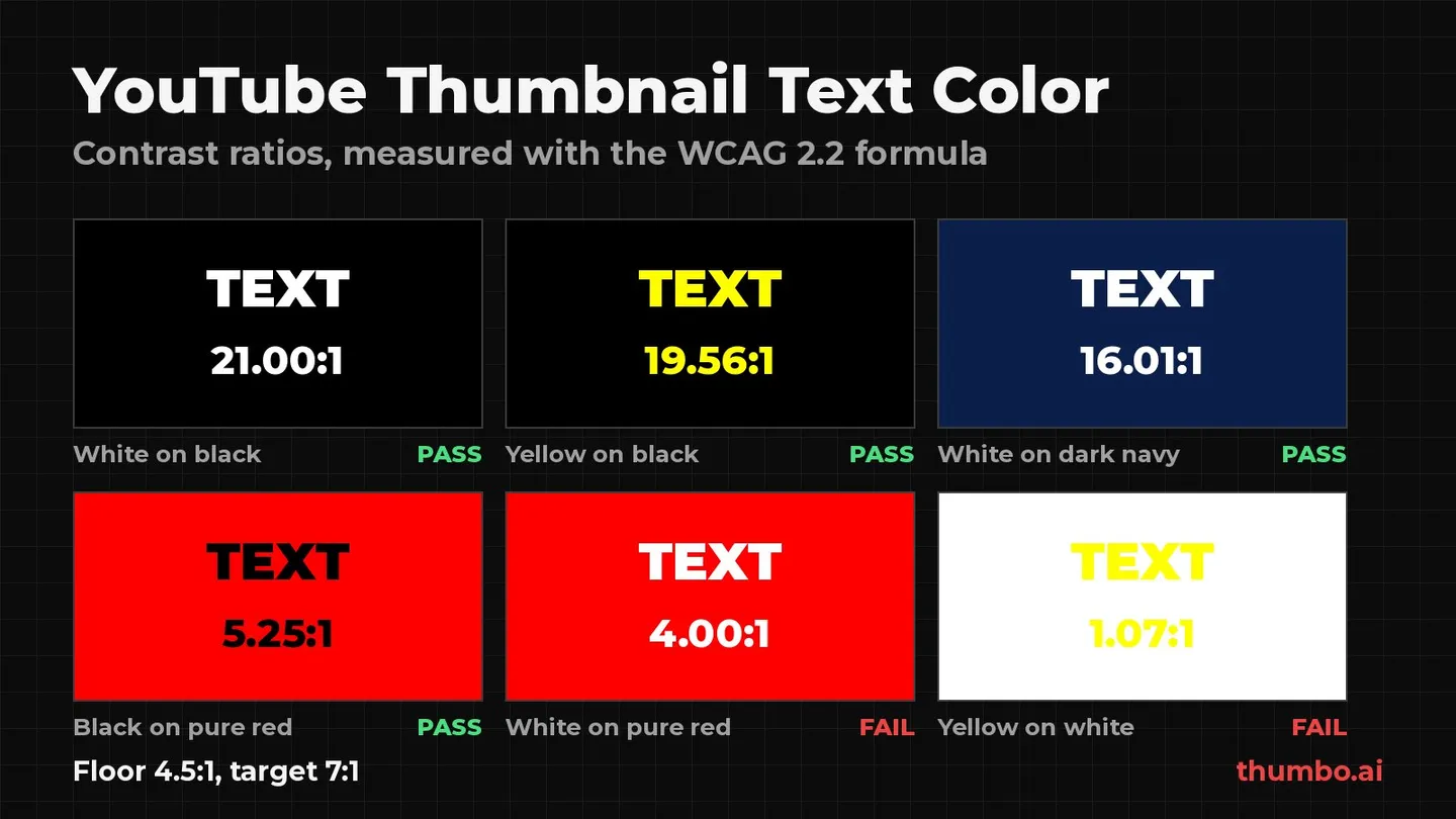
The best YouTube thumbnail text color is not a single hue. It is whichever color sits far enough from its background in brightness that the words still read when the thumbnail shrinks to a phone tile. White, yellow and black win so often because they make that gap easy, not because viewers prefer them. This guide measures that gap for 16 common pairs with the same contrast formula the web accessibility standard uses, shows which “bold” pairs quietly fail (white on pure red is one of them), and gives a repeatable way to pick text and background colors and test them on your own audience.
Table of Contents
- Text Color Is a Contrast Decision
- How to Measure Thumbnail Text Contrast
- Text Color Pairs, Measured
- Best Text Colors for Dark, Light and Busy Backgrounds
- Outlines, Shadows and Text Boxes
- Building the Palette Around the Text
- Matching Colors to Your Niche and Brand
- Testing Text Colors With YouTube’s A/B Test
- Action Plan: Pick a Text Color in Six Steps
- FAQ
Text Color Is a Contrast Decision
YouTube’s own advice on thumbnails is short on color rules. Its thumbnail and title tips say: “If you add text, make sure to use a font that’s easy to read,” and warn that “Dynamic use of color and composition can help catch the eye, but too much can overwhelm it.” Both lines point at the same thing. Text color is judged by whether the words survive, not by which hue is fashionable.
Why no single hue wins
The same yellow that reads instantly on black disappears on white. The same white that is crisp on navy goes soft on bright red. A color only has a contrast value relative to what is behind it, so “the best text color” is always a pair, chosen together. That is why lists that recommend red backgrounds and white text separately miss that white on pure red is one of the weaker common pairings.
Brightness does the heavy lifting
There are three kinds of separation a thumbnail can use:
- Luminance contrast: light against dark, such as yellow on charcoal.
- Hue contrast: different color families, such as blue against orange.
- Saturation contrast: a vivid element against muted surroundings.
For text, luminance is the one that matters most. Two colors from opposite sides of the color wheel can still have nearly the same brightness, and then the letters blur into the background at small sizes. A useful check: convert the thumbnail to grayscale. If the title is still easy to read in black and white, the color choice is doing its job. If it fades, a different hue will not fix it. A different brightness will.
How to Measure Thumbnail Text Contrast
Eyeballing contrast at full size is unreliable, because almost anything reads on a big screen. The web accessibility standard, WCAG, measures it precisely.
WCAG defines relative luminance as “the relative brightness of any point in a colorspace, normalized to 0 for darkest black and 1 for lightest white,” with a fixed formula for sRGB colors (the WCAG 2.2 glossary weights green most heavily, then red, then blue). The contrast ratio between two colors is (L1 + 0.05) / (L2 + 0.05), where L1 is the lighter color. In WCAG’s words, “Contrast ratios can range from 1 to 21 (commonly written 1:1 to 21:1).” Pure white on pure black is 21:1. A color against itself is 1:1.
The 4.5:1 floor and the 7:1 target
WCAG’s minimum contrast criterion asks for “a contrast ratio of at least 4.5:1” for text, with 3:1 allowed for large text, defined as “at least 18 point or 14 point bold.” The stricter Level AAA criterion in WCAG 2.2 asks for “a contrast ratio of at least 7:1.” The W3C explains that 4.5:1 “was chosen for level AA because it compensated for the loss in contrast sensitivity” some readers have.
Thumbnail text is large when you design it and small when a viewer sees it in a phone feed or the sidebar. So treat the large-text allowance as off the table:
- 4.5:1 is the floor. Below it, the words start to depend on size and luck.
- 7:1 is the target for the main title, especially if it has more than two or three words.
- 3:1 is enough only for decoration, such as an accent shape or border that does not carry meaning.
These are accessibility thresholds, not click-through guarantees: they tell you whether text can be read at all.
A 30-second contrast check
- Use the eyedropper in your editor to read the hex code of the text and of the background directly behind it. On a photo, sample the lightest patch behind a light title, or the darkest patch behind a dark one.
- Put both codes into any WCAG contrast checker (most design tools and browser developer tools include one).
- If the result is under 4.5:1, change brightness first: darken the background, lighten the text, or add an outline (see below).
- Convert the thumbnail to grayscale as a final sanity check.
Text Color Pairs, Measured
Every ratio below was calculated with the WCAG 2.2 relative luminance formula and contrast ratio, using the exact hex values listed. “Pass” means at least 4.5:1.
| Text on background | Hex values | Contrast ratio | Verdict |
|---|---|---|---|
| White on black | #FFFFFF on #000000 | 21.00:1 | Pass, maximum possible |
| Yellow on black | #FFFF00 on #000000 | 19.56:1 | Pass |
| Black on yellow | #000000 on #FFFF00 | 19.56:1 | Pass |
| White on dark navy | #FFFFFF on #0B1F4B | 16.01:1 | Pass |
| Gold on dark navy | #FFD400 on #0B1F4B | 11.18:1 | Pass |
| White on pure blue | #FFFFFF on #0000FF | 8.59:1 | Pass |
| White on deep red | #FFFFFF on #C00000 | 6.48:1 | Pass |
| Black on pure red | #000000 on #FF0000 | 5.25:1 | Pass |
| Red on black | #FF0000 on #000000 | 5.25:1 | Pass, below the 7:1 target |
| White on pure red | #FFFFFF on #FF0000 | 4.00:1 | Fail |
| White on mid gray | #FFFFFF on #808080 | 3.95:1 | Fail |
| Yellow on pure red | #FFFF00 on #FF0000 | 3.72:1 | Fail |
| Orange on red | #FF8000 on #FF0000 | 1.59:1 | Fail |
| Lime on white | #00FF00 on #FFFFFF | 1.37:1 | Fail |
| Blue on purple | #0000FF on #800080 | 1.10:1 | Fail |
| Yellow on white | #FFFF00 on #FFFFFF | 1.07:1 | Fail |
Yellow and black is nearly as strong as white and black, dark navy behaves almost like black while looking less harsh, and the pairs that fail are often the ones that look loud in an editor.
The pure red trap
Pure red (#FF0000) is a mid-brightness color. White text on it measures 4.00:1, under the floor, and yellow on it measures 3.72:1. Black text on the same red measures 5.25:1, which surprises most people because red and black feel “dark” together.
If a red background is part of the brand, there are two clean fixes. Deepen the red: white on #C00000 measures 6.48:1. Or keep the bright red and put the white text inside a black outline or a dark box, so the letters never touch the red directly.
Pairs that look bold and still fail
Orange on red (1.59:1) and blue on purple (1.10:1) are vivid but almost identical in brightness, so at feed size they merge. Lime and yellow on white fail because both are very light colors. White on mid gray (3.95:1) is the quiet failure of minimalist designs and desaturated photos.
Best Text Colors for Dark, Light and Busy Backgrounds
Dark backgrounds
On black, charcoal, deep navy or a darkened photo, white and yellow are the strongest choices, with gold and light cyan close behind. Pick one for the main word and use the other, sparingly, for a single highlighted word. Red text on black passes the floor (5.25:1) but misses the 7:1 target, so keep red for one short word or a number rather than a whole headline.
Light backgrounds
On white, cream or a pale sky, use black, dark navy or a deep color such as dark red or dark green. Avoid yellow, lime and light pastels; a light brand color belongs on a dark text box.
Photos and busy backgrounds
A photo is many backgrounds at once. A white title can measure 15:1 over a dark jacket and under 2:1 over a bright window two letters later. Three options, in order of preference:
- Move the text to the calmest, most uniform area of the frame.
- Calm the area behind the text with blur, darkening or a gradient fade. Our guide to YouTube thumbnail backgrounds has 25 background ideas, including blurred frames and darkened photos that keep the scene recognizable behind a title.
- Give the text its own edge with an outline, shadow or box, covered next.
Outlines, Shadows and Text Boxes
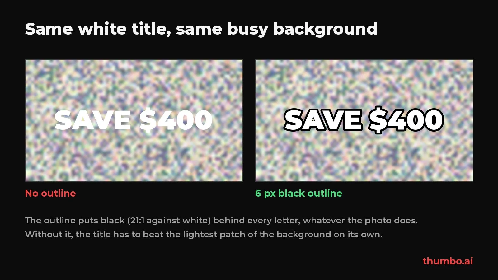
An outline changes what the text is measured against. Without one, a white title has to beat the lightest patch of the photo behind it. With a solid black outline, every letter sits on black, and white against black is 21:1 whatever the photo does.
When each fix works
| Fix | What it does | Best for | Watch out for |
|---|---|---|---|
| Solid outline (stroke) | Puts a fixed color edge around every letter | White or yellow text on photos and mixed backgrounds | Thin outlines vanish at feed size; small letter gaps can fill in |
| Drop shadow | Darkens the area just behind and below the letters | Light text on mostly light or uneven areas | Soft, offset shadows read as blur on a phone |
| Solid or translucent box | Gives the whole phrase one uniform background | Long phrases, numbers, brand-color text | Covers part of the image; keep it tight to the words |
| Background darkening or blur | Lowers the brightness of the area behind the text | Photos where the subject must stay visible | Overdone, it looks like a filter mistake |
Use one of these, not all of them: stacked effects make letters heavier, not clearer. The free YouTube thumbnail fonts tool shows a title in 12 fonts with outline, shadow and caps toggles, which is a quick way to see how much outline a given typeface needs before you commit.
Building the Palette Around the Text
Once the text pair is settled, the rest of the palette should support it rather than compete with it.
Use three functional colors
- Background: usually dark, neutral or a controlled cool tone.
- Text color: the highest-contrast color against that background.
- One accent: a single vivid color for an arrow, a circled detail or one highlighted word.
A photo brings its own colors; the designed elements should still follow this hierarchy. Research on visual attention gives a reason to keep the accent set narrow: an EEG study in the Journal of Neuroscience found that attending to a color boosted its signal in early visual cortex, and that the boost was smaller when viewers attended to a broad range of colors than a narrow one. One accent gives the eye a sharper target than four.
Warm and cool palettes
| Color family | Common association | Fits well with | Text color that usually works |
|---|---|---|---|
| Warm reds, oranges, yellows | Urgency, energy, appetite | News, food, challenges, deals | Black or white on deep red; black on yellow |
| Cool blues, teals, greens | Calm, trust, progress | Finance, tech, tutorials, education | White or yellow on dark blue |
| Saturated brights | Excitement, novelty | Entertainment, reactions, lifestyle | White or black inside an outline |
| Muted neutrals | Restraint, authority | Documentary, commentary, essays | White on charcoal, plus one warm accent |
The associations are conventions, not laws: follow them to signal a category fast, break them on purpose to stand out.
Matching Colors to Your Niche and Brand
A recognizable channel usually repeats the same background tone and text color across uploads and changes only the accent and the image. Choose in this order: readability (the pair passes 4.5:1, ideally 7:1), brand consistency (you can repeat it every upload), topic signal (the accent fits this video’s mood) and feed separation (it does not look like its neighbors).
A finance channel can use pink and a horror channel pale blue, as long as the contrast holds and the choice is deliberate. For hierarchy, spacing and emphasis beyond color, the graphic design fundamentals guide is a useful checklist, and the YouTube thumbnail text guide covers what the words themselves should say.
Testing Text Colors With YouTube’s A/B Test
Contrast tells you whether text can be read. Only your audience can tell you which readable version gets watched. YouTube Studio has a built-in way to find out: per YouTube’s A/B testing help page, “Creators can test and compare up to 3 different titles and thumbnails.”
The test has limits worth knowing before you plan around it. It is “Desktop only,” you “need to enable advanced features to be eligible,” and you “are not able to A/B test Shorts, Scheduled Lives, and Premiere videos at this time.”
Change one color at a time
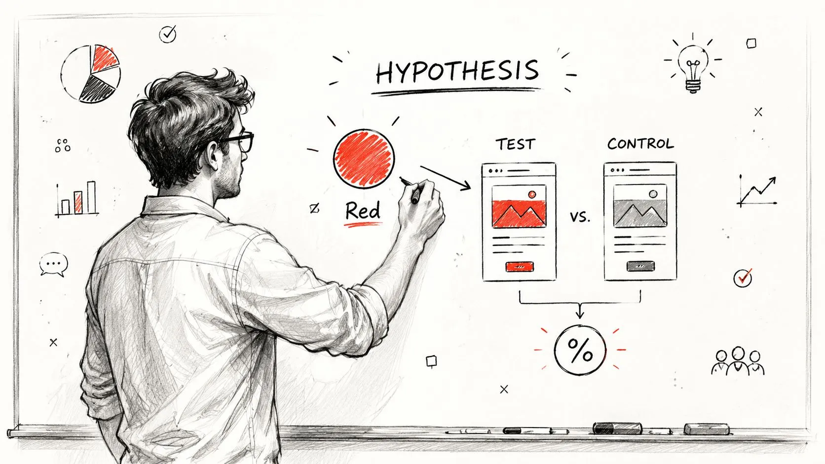
Write the hypothesis first, for example: “Yellow text with a black outline will beat white text on the same red background.” Keep the image, layout, wording and crop identical and change only the text color, or a win tells you nothing about color.
Do not make the variants too subtle either. YouTube warns that “Testing titles and thumbnails that are too similar to each other can cause tests to run for longer.” Two shades of white will not produce a verdict. White versus yellow can. Export every variant at full resolution, since “If the resolution of any thumbnail is lower than 720p (1280 x 720), all experiment thumbnails will be downscaled to 480p (854 x 480).” YouTube’s custom thumbnail guide recommends “a resolution of 3840 x 2160 pixels for videos,” and our YouTube thumbnail size page lists the rest of the limits.
Read the result the way YouTube scores it
YouTube does not pick the winner on clicks. When the test ends, “the option with the highest watch time will be shown to all viewers,” and the help page explains that tests are optimized “for overall watch time over other metrics, like click-through-rate.” A test “can take a few days or up to 2 weeks to complete.” If there is no clear winner, YouTube keeps the first option you uploaded.
So a winning text color is one that brought in viewers who kept watching. Log each test and look for a pattern across several videos before changing your channel default. For what a normal click-through rate looks like while you compare, see what a good YouTube CTR is.
Action Plan: Pick a Text Color in Six Steps
- Pick the background first. Decide whether the area behind the text is dark, light or a photo.
- Choose the text pair from the measured table. Dark background: white or yellow. Light background: black or dark navy. Bright red: black text, or white inside an outline or on a deeper red.
- Measure it. Eyedropper both colors and confirm at least 4.5:1, ideally 7:1, against the worst patch behind the text.
- Add one fix only if needed. Outline for photos, box for long phrases, darkening for scenes that must stay visible.
- Check it small. Load it into the free YouTube thumbnail previewer, which shows the thumbnail next to other videos in home, search, sidebar and mobile layouts, in dark or light mode. If you need to fit an image to 16:9 first, the thumbnail resizer does it in the browser.
- Test the runner-up. Upload your best two text colors to YouTube’s A/B test and let watch time decide.
If you would rather start from a finished design, Thumbo builds a 16:9 thumbnail from your video idea, and you can ask for changes in plain words, such as “make the title yellow with a thick black outline,” then run the same contrast check on the result.
FAQ
What is the best text color for a YouTube thumbnail?
White or yellow on a dark background, or black on a light or bright one. Measured with the WCAG formula, white on black is 21:1, yellow on black and black on yellow are both 19.56:1, and white on dark navy is 16.01:1. Any of these clears the 7:1 target with room to spare.
Is white text on a red background readable?
Less than it looks. White on pure red (#FF0000) measures 4.00:1, below the 4.5:1 floor. Black on the same red measures 5.25:1. To keep white text, deepen the red (white on #C00000 is 6.48:1) or give the letters a black outline.
Should thumbnail text have an outline?
On photos and mixed backgrounds, usually yes: a solid black outline keeps white or yellow letters on black whatever the photo does. On a plain dark background it adds little. Make it thick enough to survive at phone size.
What contrast ratio should thumbnail text have?
Aim for at least 4.5:1, the WCAG minimum for normal text, and 7:1 for the main title where you can. WCAG lets large text drop to 3:1, but thumbnail text is only large on your screen. In a phone feed or the sidebar it is small, so the stricter numbers are the safer target.
Do certain colors get more clicks on YouTube?
No color reliably wins on its own, and YouTube’s own A/B test scores variants on watch time, not clicks. Readable contrast is the precondition for any color working. Pick readable pairs, then test two of them on your own videos.
Readable text comes from the pair, not the hue. When you want a starting design to measure, Thumbo AI generates ready-to-publish thumbnails from a video idea or a pasted YouTube link.