You can spend an hour polishing a thumbnail, feel good about the contrast, the crop, the text, then upload it and watch the click behavior disappoint anyway. That usually means the design was tested in a vacuum, not in the places people see it, inside Home, Search, Suggested, subscriptions, and on a phone where the thumbnail gets judged in a split second. A YouTube thumbnail previewer closes that gap before you publish, which is the difference between guessing and validating.
Table of Contents
- Why Most Thumbnails Fail Before They Are Even Uploaded
- Previewing Across the Discovery Contexts
- The Technical Preflight Before You Hit Publish
- Why a Single-Card Preview Is Not Enough
- Running an A/B Test After You Publish
- Common Preview Mistakes That Still Cost You Clicks
- Your Repeatable Thumbnail Validation Workflow
Why Most Thumbnails Fail Before They Are Even Uploaded
Plenty of creators spend two hours on a thumbnail that looks sharp on a laptop, only to watch it stumble the moment it enters the platform. That failure usually isn’t about effort. It’s about context. YouTube counts an impression when your thumbnail is shown for more than one second with at least half of it visible on screen, and it counts those impressions on the homepage, Search, “Up Next” recommendations, feeds like subscriptions and Watch Later, and playlists, according to YouTube’s own guidance on impressions and click-through rate. CTR is simply how often viewers watched after seeing that thumbnail.
That matters because a thumbnail isn’t decoration, it’s the entry point that turns exposure into clicks. If the design doesn’t win attention inside the feed, the video never gets a fair shot, no matter how much work went into the edit or title. A youtube thumbnail previewer exists to simulate those display contexts before the upload locks the creative into YouTube’s impression-based system.
The laptop test lies more often than you think
Desktop design tools can make weak thumbnails look acceptable. Text that feels readable on a 27-inch monitor can blur into noise on a phone, and a face crop that feels dramatic in a full-size canvas can look awkward when the card is compressed next to competing videos. That’s why previewing is a pre-publish discipline, not a finishing touch.
Creator-analytics guidance tends to treat CTR as a band rather than a single target, with the platform-wide average landing around 4% to 5% and roughly 4% to 10% commonly treated as good. The more useful point is that the band moves with traffic source: Search impressions arrive with intent and often run far higher than Home and Browse impressions, where viewers are scrolling and deciding in a split second. A blended channel number hides that difference, which is why it makes a poor trigger for a redesign.
Practical rule: if the thumbnail doesn’t hold up in the previewer, it’s not ready for the upload button.
That mindset changes the workflow. Instead of asking, “Does this look good?”, the better question is, “Does this still work where YouTube will show it?”
Previewing Across the Discovery Contexts
A thumbnail doesn’t have one audience, it has several viewing contexts that each compress the design differently. A youtube thumbnail previewer is only useful if it lets you stress-test the same asset in multiple environments, because a card that looks premium in one placement can disappear in another. One free preview workflow checks five YouTube layouts, the Home Feed, Search Results, Suggested Sidebar, Mobile Feed, and Shorts shelf, and adds a dark and light toggle on top of them, as described in this YouTube thumbnail preview tool. That list is a good template because each layout renders the same file at a different size and proportion.
Home Feed
Home is where thumbnails compete hardest against adjacent cards. The design needs one strong focal point, because the eye is comparing your video with several others at once. If the image relies on subtlety, it usually gets ignored.
Search Results
Search has stronger intent, so viewers scan for relevance faster. Here, the thumbnail has to support the promise in the title instead of repeating it blindly. Tight framing and clear subject matter usually win.
Sidebar & Suggested Panels
Sidebar and suggested placements compress the thumbnail into a narrow visual strip, and the same preview guidance calls the sidebar the smallest YouTube layout of all. That makes it the real legibility test: if the overlay text can’t be read at sidebar size, it is too small. Busy backgrounds and thin type fall apart here, so the best designs use fewer elements and stronger separation between subject and background.
Mobile App
Mobile deserves its own pass for the opposite reason. The same guidance points out that a phone actually renders the thumbnail nearly full width, larger relative to the screen than desktop, but shows the title in a smaller font with fewer visible characters before it truncates. Since over 70% of YouTube views come from mobile devices, the question here isn’t whether the image survives shrinking, it’s whether the image plus a truncated title still tells a compelling story on its own.
Shorts Shelf
The Shorts shelf crops to a vertical frame, so a 16:9 design built around edge-to-edge composition can lose its subject entirely. If the channel publishes Shorts alongside long-form video, previewing this layout catches framing that works everywhere else and fails only here.
Dark Mode
Dark mode is a display toggle rather than a placement, but it changes perceived contrast around the frame, and a significant share of viewers browse with it enabled. A thumbnail that pops on a white canvas can feel muddy against darker UI chrome. That’s where saturated highlights, controlled shadows, and clean edges matter more than flashy effects.
Use this check: home, search, suggested sidebar, mobile, Shorts shelf, then flip to dark mode. If the thumbnail only wins in one of them, it’s not finished.
Our free YouTube thumbnail previewer runs the four 16:9 checks (home, search, up next sidebar and mobile) in dark and light, with your title under the image and other videos around it. The image stays in your browser.
Run the preview with one question in mind, which context exposes the weakest part of the design fastest? Start there, fix that first, then recheck the rest.
The Technical Preflight Before You Hit Publish
The visual test is only half the job. The file still has to meet the platform’s specs, or a clean-looking design can get awkward during upload. Run the technical pass before judging the composition at all, because it removes preventable failures early.
| Constraint | Value | Why it matters |
|---|---|---|
| Resolution | 3840×2160 recommended, 1280×720 minimum, 640-pixel width floor | Keeps the export sharp enough for scaling and platform reuse |
| Aspect ratio | 16:9 | Matches the player and standard thumbnail frame |
| Formats | JPG, PNG, static GIF | Keeps the upload compatible with standard thumbnail handling |
| File size | 2 MB mobile, 50 MB desktop | Prevents upload friction across surfaces |
| Title length | Check title-thumbnail balance | A crowded title can make the thumbnail harder to read in feed contexts |
The current spec is laid out in full on this YouTube thumbnail size reference, which also carries a resizer you can run on the page. If an export blows past the mobile limit, there is no point asking the preview tool to forgive it. Re-export with cleaner compression, simpler gradients, or less noise in the background.
The title check matters just as much. A thumbnail with a dense title beside it can feel overloaded, especially in feed placements where both elements compete for attention. A previewer earns its place by showing whether the image still reads when the title runs long, because that pairing is what viewers actually experience.
The rule: fix file size and dimensions first, then judge the design. Otherwise you may be optimizing a thumbnail that shouldn’t have shipped in the first place.
This is the part of the workflow that saves time later. A file that passes the preflight is easier to compare, easier to test, and less likely to create a false result after publish.
Why a Single-Card Preview Is Not Enough
A lot of preview tools show one thumbnail on a blank canvas. That’s useful, but it’s incomplete. Discovery on YouTube is largely feed-driven, and the question isn’t whether your thumbnail looks good by itself, it’s whether it still stands out when viewers are scanning neighboring videos. Pew Research Center found that 81% of YouTube users at least occasionally watch the videos the platform suggests, with 15% doing it regularly, which makes the surrounding grid part of the test rather than a side issue.
Isolated previewing versus competitive previewing
An isolated card preview tells you whether the crop works, whether the text fits, and whether the colors are balanced. It won’t tell you whether your image blends into the surrounding grid. A competition-aware preview, by contrast, lets you compare against live neighboring results, shuffled competitor grids, or nearby thumbnails that mimic the way people skim the feed.
That shift matters because small differences in contrast and salience can decide whether a viewer stops scrolling. Three questions are worth asking of any thumbnail seen in context. Does the subject pop against adjacent cards, does the title-thumbnail pairing make immediate sense, and does the design still feel distinct when surrounded by similar topics?
The rare tools that test against real competitive context are more valuable than the ones that only show a pretty mockup. If a youtube thumbnail previewer can’t show you the thumbnail next to competitor-style results, it’s mostly a sizing checker. Useful, yes. Enough, no.
If you’re choosing one, prioritize tools that let you simulate the feed, not just the frame. The thumbnail has to win the click in a crowd, not in a vacuum.
Running an A/B Test After You Publish
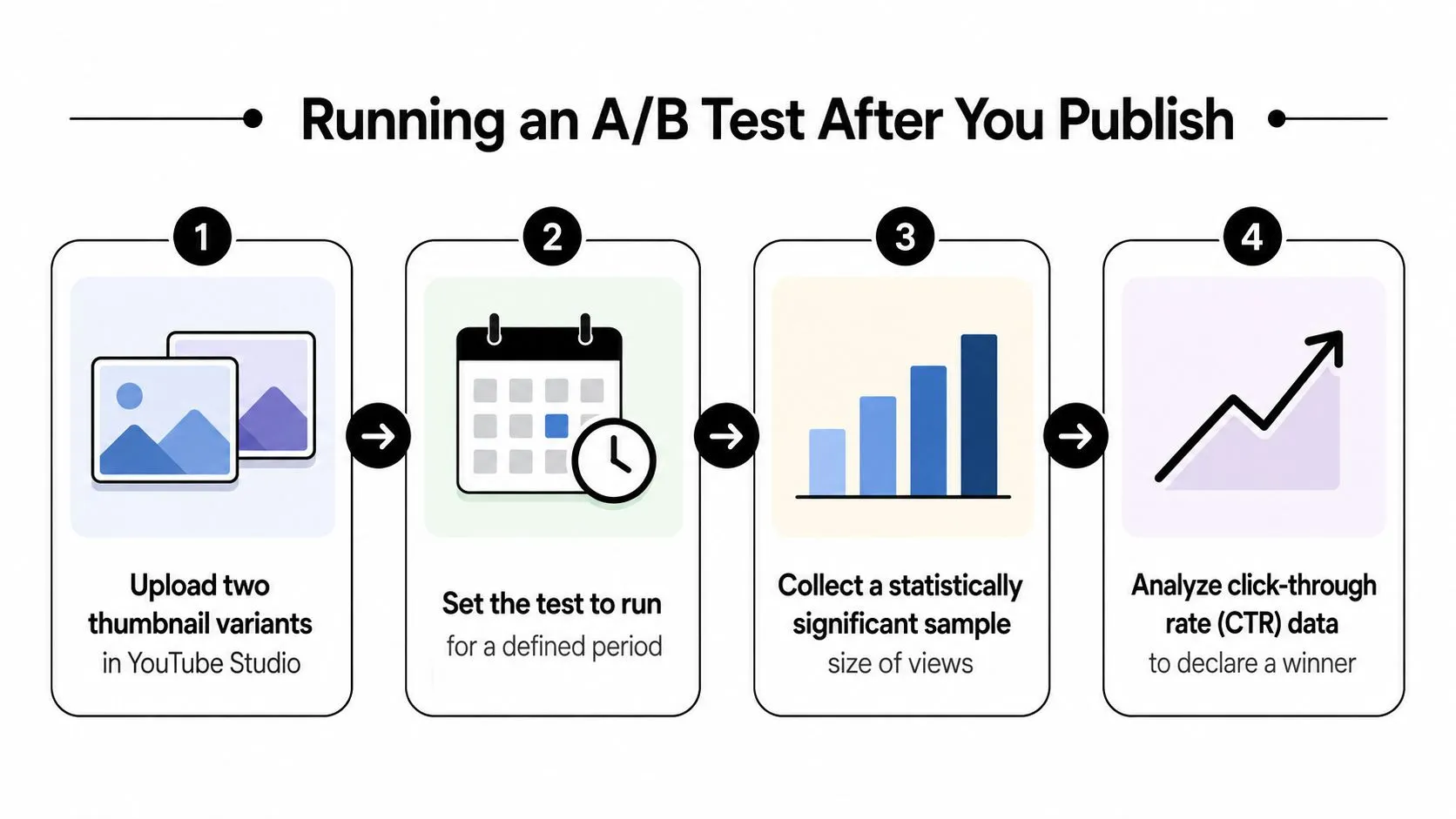
Previewing gets you to a better first version. YouTube Studio gets you to the version that performs. The post-publish habit worth keeping is a simple A/B loop, because a thumbnail can win clicks and still fail the video if viewers leave quickly after the click. Independent analytics guidance recommends judging a thumbnail on impressions, CTR, traffic-source CTR, average view duration, watch time, and early retention, waiting for at least 500 to 1,000 impressions before making a call, and checking performance at 24 hours, 7 days, and 28 days to smooth out noise.
What to watch first
CTR is the front-door metric, but it doesn’t get the whole verdict. If the thumbnail produces clicks and the retention curve drops right away, the design may be attracting the wrong expectation. CTR and early retention are best read as a pair.
How to read the test
Upload two variants in Studio, let the test run long enough to collect a usable sample, then look for the version that holds attention, not just the version that gets curiosity clicks. A variant that wins CTR but loses watch time isn’t a win, it’s a mismatched promise.
Short version: the thumbnail starts the conversation, the first 30 seconds decide whether the promise was real.
For a deeper benchmark conversation on CTR framing, this overview on what counts as a good YouTube click-through rate is a useful companion. The important part is staying disciplined enough to let the sample speak before you redraw the asset.
The best workflow is continuous. Preview first, publish second, then let Studio confirm whether the design was persuasive in the actual feed.
Common Preview Mistakes That Still Cost You Clicks
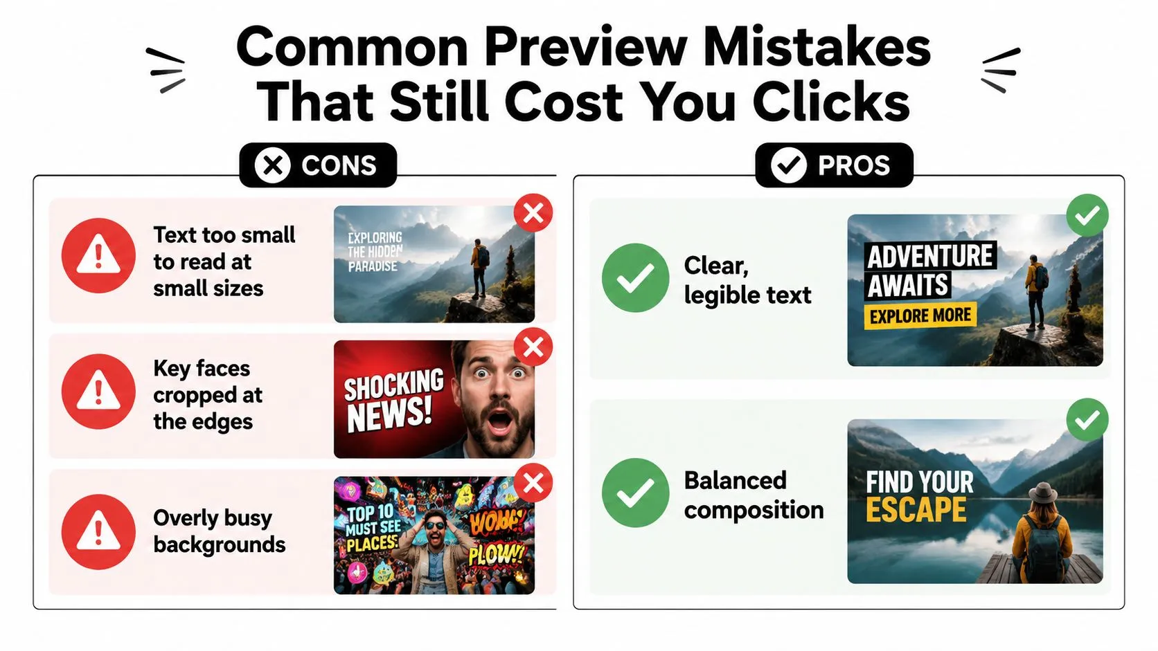
The biggest preview mistake is thinking that a thumbnail that survives export has already passed the test. It hasn’t. Many failures are perceptual, not technical, and they only show up when the image sits beside real competition or shrinks into a tiny card.
The mistakes that show up most often
- Text that only reads at full size. It looks strong in the editor, then turns into a blur on mobile. The fix is simple, use fewer words and make the lettering heavier.
- Faces cut off at the edge. Dramatic crops can backfire when the frame gets compressed in feed layouts. Pull the subject inward so the expression survives the smaller view.
- Busy backgrounds that swallow the subject. A textured scene may look cinematic, but it often loses to cleaner neighboring cards. Reduce visual noise and protect separation.
The mistakes that happen after the preview
Some thumbnails pass the visual test but fail the promise test. The title says one thing, the thumbnail suggests another, and the viewer feels friction before the click. That mismatch can weaken curiosity or create the wrong expectation entirely.
- Overly clever composition. If the message takes a second to decode, the feed may move on before the viewer does.
- Weak title-thumbnail pairing. The image and title should reinforce the same idea, not compete for attention.
For practical composition fixes, this thumbnail-making guide is a useful reference point. The edit loop itself should stay simple. Test in the previewer, tighten the crop, raise contrast where needed, then recheck the image in a small card before publishing.
A strong preview is not a guarantee. It’s only proof that the design survived the first round of scrutiny.
Your Repeatable Thumbnail Validation Workflow
A thumbnail workflow gets easier once it becomes a routine. Keep it simple enough to run every week, because consistency beats last-minute improvisation. The goal is to move from design to validation to publish without skipping the checks that catch obvious misses.
The loop worth screenshotting
- Design the thumbnail, then export it at the correct size and format.
- Run the five-context preview, with special attention on mobile and dark mode.
- Fix anything that fails, especially text legibility, crop safety, and visual separation from neighboring videos.
- Publish, then start the A/B test in YouTube Studio.
- Review at the first meaningful sample point, then check again at the later review windows if the numbers are still settling.
That loop keeps the work honest. Previewing catches what breaks before upload, A/B testing confirms what works after upload, and Studio shows whether the click translated into real viewing behavior. Used well, a YouTube thumbnail previewer judges more than size, it shows whether the thumbnail can hold its own against the cards beside it in the feed.
Save this rule: if the thumbnail doesn’t pass preflight, it doesn’t publish. If it passes preflight but underperforms in Studio, it gets revised.
The loop still starts with a thumbnail worth previewing. Thumbo AI generates YouTube-ready thumbnails from a plain description or a reference image and exports them at full resolution, so the file clears the technical preflight before you ever open a preview tool. Build the next one there, then run it through the five layouts and let Studio settle the rest.