The most common thumbnail advice is also the least useful one: put a face on it, make the text big, and call it optimized. That shortcut breaks down fast once you compare a reaction video, a tutorial, a faceless explainer, and a listicle, because each one asks for a different visual promise and a different kind of viewer intent. YouTube thumbnail templates work best when they function as decision tools, not decorative frames.
A good template helps a viewer answer one question quickly, and that question changes by format. Reaction content needs emotion or conflict. Tutorials need clarity. Faceless education needs a strong object, symbol, or diagram. Listicles need a compact hierarchy that makes the sequence feel easy to parse.
What most creators want isn’t more design freedom. They want a template system that removes bad choices without flattening the channel’s identity. That means choosing layouts that fit the video before worrying about style polish.
Table of Contents
- Why One Thumbnail Template Does Not Fit Every Video
- The Anatomy of a High-Performing YouTube Thumbnail Template
- Template Types and Which Video Formats They Serve Best
- How to Select and Customize a Template for Maximum CTR
- A Quick AI-Powered Thumbnail Workflow Using Thumbo AI
- Technical Specs and Compression Tips Every Creator Should Know
- Real-World Template Examples and Common Creator Questions
Why One Thumbnail Template Does Not Fit Every Video
A universal thumbnail formula sounds efficient until you use it across different video types. A face-forward layout can work beautifully for commentary or reaction content, but the same layout can feel noisy on a tutorial where the viewer wants a result, not a personality cue. A single template can also mismatch audience intent, which is how channels end up with thumbnails that look “good” but still fail to earn the click.
Template choice is really intent matching
The strongest thumbnail templates do one job well, they make the video’s promise visible in a split second. That promise changes depending on whether the audience is looking for entertainment, instruction, proof, or comparison. A listicle viewer often wants scanning speed. A tutorial viewer wants confidence that the steps are clear. A faceless education viewer often responds better to a symbol, object, or before-and-after setup than to a portrait.
Practical rule: choose the template after you define the viewer’s expectation, not before.
That is why generic best-practice advice often disappoints. “Bold text” is not a strategy by itself. Neither is “use a face.” A template is closer to a packaging decision than a style choice, because it tells the viewer what kind of content sits behind the click.
Why template libraries need use-case logic
Creator-focused template catalogs increasingly separate layouts by use case because the same shape won’t solve every format. Reaction, tutorial, faceless, before-and-after, and statistics-led thumbnails all communicate differently, even when they share the same channel branding. That distinction matters more than a lot of creators admit, especially when a channel publishes mixed formats and needs each upload to feel native.
The 2020 analysis of the 740 most popular YouTube videos found that 72% of thumbnails featured a human face, 88% were colorful, and 70% contained a title or explanatory text, which shows how standardized the dominant thumbnail pattern has become MarketingProfs chart. That pattern is common, but common doesn’t mean universally correct. If the topic itself is the hook, forcing a face into the frame can weaken the message instead of strengthening it.
The Anatomy of a High-Performing YouTube Thumbnail Template
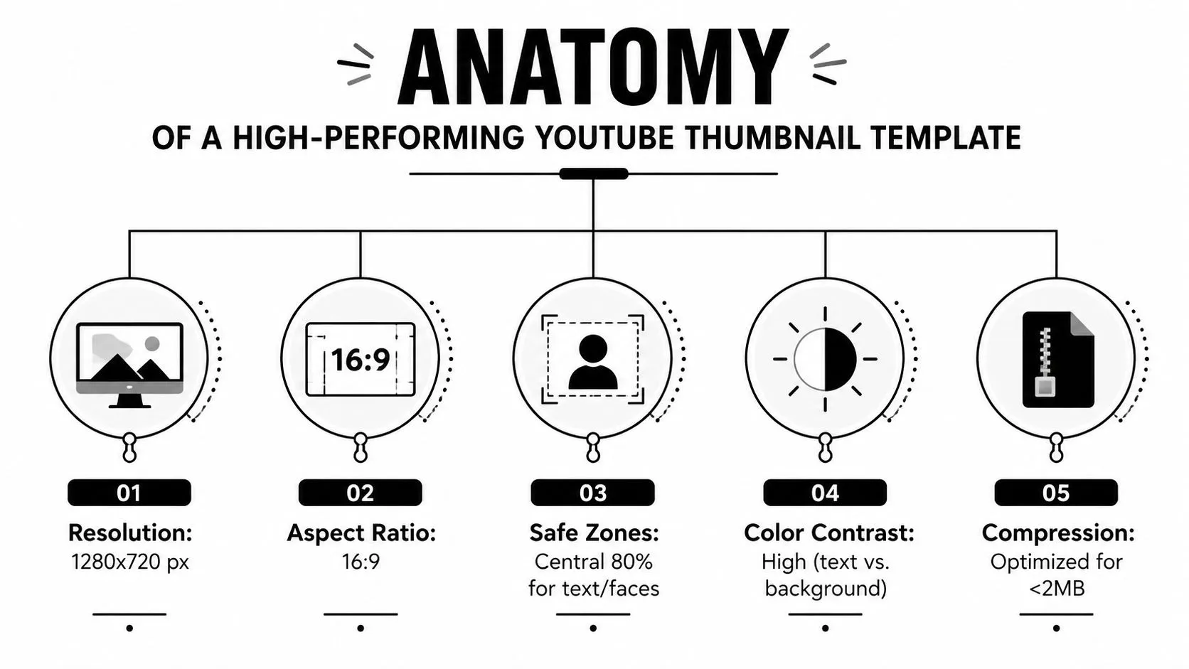
A thumbnail template has to work in two places at once. It needs to look organized inside the editor, and it still has to read clearly after YouTube compresses it and shrinks it across devices. The templates that hold up best are built around composition, contrast, and scalability.
Resolution and framing come first
1280 × 720 pixels in a 16:9 aspect ratio is the size most templates are still built at, but treat it as the floor rather than the target. YouTube’s own guidance is a recommended resolution of 3840 × 2160, a minimum width of 640 px, formats of JPG, GIF, or PNG, and upload limits of 2 MB from mobile or 50 MB from desktop (YouTube Help). The current YouTube thumbnail size spec has the full breakdown. Resolution is only the starting point, though, because the design gets rendered far smaller than it was drawn: mobile placements show thumbnails at roughly 120 to 320 pixels wide, which is why it is worth checking a template at 120 to 160 pixels before you upload it.
That makes template structure matter. If the layout only works at full size, it fails where viewers see it. Keep the focal point large, reserve space for a readable headline block, and skip tiny decorative details that collapse when the thumbnail is shown at postage-stamp size. For a typography reference that stays readable under that pressure, use best fonts for YouTube thumbnails.
The thumbnail is not a poster. It’s a tiny sales card that has to read instantly.
Color and compression shape the final design
Popular thumbnails are heavily colorful, and that is not an accident. Strong color contrast helps viewers separate the subject, background, and text block fast enough to understand the idea before the eye moves on MarketingProfs chart. Compression matters too. YouTube accepts JPG, PNG, and GIF, and creators often work under the 2 MB upload ceiling, so the template has to hold together after compression Snappa thumbnail size guide.
Photo-heavy layouts usually hold up better as JPEG, while sharp text, flat colors, and icons often stay cleaner in PNG because the edges remain crisp. The trade-off is straightforward. Fine detail disappears early, and aggressive compression can leave halos or blocky artifacts that make small text harder to read.
Template Types and Which Video Formats They Serve Best
The smartest way to think about YouTube thumbnail templates is by format, not by style trend. A creator doesn’t need one “winning” template. They need a small set of templates that map cleanly to the kinds of videos they publish most often.
Matching template type to video intent
Reaction thumbnails work because they foreground emotion, surprise, or disagreement. They’re a natural fit for commentary, hot takes, audience-response content, and anything built around a strong opinion. Before-and-after templates are better when the value comes from transformation, whether that’s editing, fitness, design, or business results. Statistics-led templates suit videos that use numbers as the hook, especially when the promise is proof or comparison rather than personality.
Faceless or object-led templates belong in tutorials, screen-recorded education, documentary-style videos, and AI-driven explainers where the topic itself carries the click. Listicle templates work when the viewer wants structure, such as ranked items, top tools, or quick picks. They should feel organized at a glance, not crowded with too many competing shapes.
A practical comparison of template fit
| Template Type | Best For | Key Design Elements |
|---|---|---|
| Face-forward | Commentary, personal brand videos, opinion-led content | Large face crop, expressive eyes, short headline block |
| Reaction | Drama, response videos, controversial takes | Strong emotion, clear focal point, minimal background clutter |
| Before/after | Tutorials, transformations, makeovers, process videos | Split-frame contrast, obvious visual change, simple labels |
| Statistics-led | Data stories, comparisons, proof-driven videos | Big number treatment, clean hierarchy, limited copy |
| Faceless object-led | Screen recordings, education, software, AI, explainers | Object or symbol as hook, high contrast, roomy composition |
| Listicle | Rankings, tools, quick roundup videos | Number cue, structured layout, readable sequence logic |
The pattern here matters more than the category name. If the topic is the story, don’t force a portrait into the frame. If the creator’s face is the story, don’t hide it behind a generic object. That’s why published template catalogs now routinely ship a faceless or mystery layout and a number-led layout next to the usual reaction and before-and-after formulas, instead of treating the face as mandatory in every case.
How to Select and Customize a Template for Maximum CTR
Picking a template is a filtering exercise, not a creativity contest. The job is to keep the structure that already works, then make the promise sharp enough that the right viewer stops scrolling.
Start with the video’s emotional center
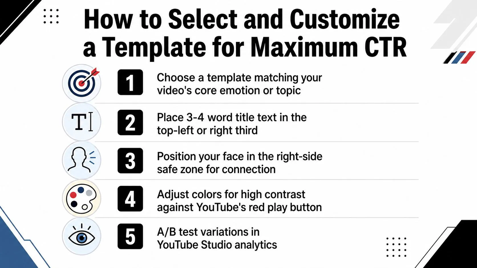
Tutorials need clarity. Reaction videos need tension. Listicles need order. Faceless explainers need an object or symbol that can carry the idea on its own. Once you know which of those jobs the thumbnail has to do, template selection becomes much easier, because you are matching layout to viewer intent instead of guessing at style.
The hook should stay short. 3 - 4 words works well, and 3 - 5 words is usually the upper bound, because thumbnail text has to survive mobile viewing and tiny search placements. Use the copy as a hook, not a summary. If the template needs a paragraph to explain itself, it is already doing too much.
Rule of thumb: the thumbnail should raise the question, not answer every detail.
Customize without breaking the structure
The fastest way to weaken a good template is to over-customize it. Shift the focal point off-balance, shrink the text so it has to carry too much, or add decorative shapes that compete with the subject, and the design gets harder to read at small sizes. A strong template leaves room for edits, but those edits need to stay inside the layout’s original hierarchy.
One practical approach is to change only one major variable at a time. Swap the subject. Change the headline. Adjust the background color. Then compare the new version against the earlier one in YouTube Studio after the video goes live. That habit keeps the channel visually consistent while still letting each upload carry its own angle. It also makes it easier to spot which change helped.
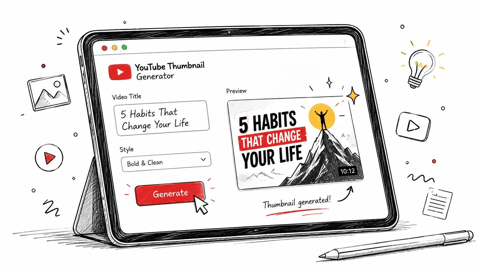
Creators who want a faster editing loop can use a generator for the first draft and reserve their attention for the message. A practical example is Thumbo AI, which starts from a ready-made style pack instead of a blank canvas and lets you refine the text and imagery with plain-English edits before export; the AI thumbnail maker guide walks through the same workflow in more depth. That workflow fits best when the video hook is already clear and you need a usable draft quickly. It is weaker when the video idea itself is still unsettled, because the tool can only refine a direction you have already chosen.
A Quick AI-Powered Thumbnail Workflow Using Thumbo AI
Speed matters when you publish often. A thumbnail process that takes hours usually gets simplified, and simplification often means weaker visual thinking, not better design. AI helps most when it reduces setup work so you can spend more time judging the promise of the image itself.
A usable workflow from idea to upload
Start with the video concept, not the thumbnail. Write the core promise in one sentence, then decide whether the thumbnail should feel like a reaction, tutorial, transformation, or faceless explanation. After that, choose a template style that matches the promise, because the generator should be solving layout work, not defining strategy for you.
Then add the subject image or the reference frame, tighten the headline to a short hook, and check the composition at small size before export. That last step matters more than creators expect. A thumbnail can look polished inside a generator and still fail once it’s reduced to the tiny sizes YouTube uses in practice.
Where the tool fits, and where it doesn’t
Thumbo AI is useful when you want a fast template-based draft from a photo or a video description, especially if you’re testing multiple video concepts in a week. It can also handle reference-driven generation, which is useful when you already have a thumbnail style in mind and want to adapt it rather than start from a blank canvas. The strength of that approach is speed with structure, not automatic creative judgment.
The tool can’t decide what the viewer cares about. You still have to choose the emotional angle, the dominant object, and the text hook that matches the audience. If those choices are weak, the thumbnail will still look weak, just faster.
Technical Specs and Compression Tips Every Creator Should Know
The technical side of thumbnail creation is where a lot of otherwise strong designs fail. Creators usually blame the concept, but the problem is export settings, over-compression, or text that looked clear in the editor and then broke down in YouTube’s delivery pipeline.
Build for the platform, not just the editor
Start with a canvas of at least 1280×720 px, or 3840×2160 to match YouTube’s current recommendation, and keep the layout locked to 16:9 so the composition holds on upload. If the thumbnail is photo-heavy, JPEG usually keeps the file lighter. If the design depends on crisp text, icons, or hard-edged shapes, PNG usually holds those edges better.
Compression is a trade-off, not a switch you flip once. More compression lowers file size, but it also brings blocking and edge artifacts. Less compression keeps detail intact, but the file can become heavier and less efficient. The practical target is a thumbnail that still reads after YouTube processes it, not a file that only looks clean inside the editor.
Export for the smallest version first
YouTube serves multiple thumbnail sizes, so a design that looks fine at full resolution still has to work when it shrinks down. The templates that survive that shrink rely on oversized subjects, thick type, and a simple hierarchy. If the layout only works because of tiny background details, it is fragile.
The YouTube thumbnail size guide makes the same practical point from an upload standpoint, and the takeaway is straightforward. Build for the version that loses the most detail, because that is the version most likely to expose weak composition. If the thumbnail still reads there, it will usually hold up everywhere else too.
Keep the thumbnail legible when half the detail disappears. If it still reads then, it will usually read everywhere else too.
Real-World Template Examples and Common Creator Questions
A gaming channel might use a reaction template when the video is about a shocking in-game moment, then switch to a listicle layout for “best loadouts” or “top settings.” An education channel may use a faceless object-led template for software tutorials, then a before-and-after layout for a workflow makeover. A vlog channel often does better with a face-forward template because the creator’s identity is the hook, while a faceless channel usually needs stronger symbols, screens, or objects to carry the click.
Common questions creators keep asking
Should every thumbnail include a face? No. If the topic is the hero, a face can get in the way. Do templates hurt branding? Not when they’re used consistently. A good template system improves recognition because it gives the channel a repeatable visual grammar.
What about text in multiple languages? Keep the copy even shorter than usual, because every extra word adds risk when the thumbnail shrinks. And if the channel mixes formats, use separate templates for separate intents. One template for commentary. Another for tutorials. Another for faceless explainers.
A mistake is treating templates like shortcuts. They’re faster than building every design from zero, but they still need judgment. The channels that use them well keep the structure stable and change the hook, not the core logic.
If you want a faster way to turn a video idea into a template that fits the format, Thumbo AI gives creators a template-based thumbnail workflow for uploads, references, and quick edits. Use it when you need speed, but still want the layout to match the viewer’s intent instead of forcing a one-size-fits-all design.