The popular advice is simple: keep your YouTube thumbnail text short, bold, and punchy. That’s useful, but incomplete. The same phrase can help a video discovered through search and hurt one competing in browse or suggested feeds, because viewers encounter those surfaces with different levels of intent. Thumbnail text isn’t decoration, and it isn’t a miniature title. It’s a performance variable that must match the way viewers find the video.
Table of Contents
- Why Most Thumbnail Text Advice Is Wrong
- Writing Thumbnail Copy That Actually Gets Clicks
- Choosing Fonts and Building Visual Hierarchy
- Mastering Placement, Contrast, and Readability
- Adapting Text Strategy to Traffic Sources
- Testing and Iterating Your Thumbnail Text
Why Most Thumbnail Text Advice Is Wrong
“Use less text” is a good starting point, not a complete strategy. A thumbnail that explains a search answer may give a viewer enough context to click, while the same explanatory treatment can slow down a viewer scrolling through a recommendation feed. The decisive question isn’t only how many words appear on the image, but where those words appear in the viewer’s decision journey.
A 2026 thumbnail CTR study analyzing videos with at least 10,000 impressions found that thumbnails using three to five words of large, high-contrast text outperformed text-free thumbnails in search-driven content by 11% to 22% CTR, while the same text style performed about 4% worse in browse and suggested-video contexts (TubeAnalytics’ thumbnail CTR patterns study). That’s a meaningful trade-off. It means “text always helps” and “text always hurts” are both bad rules.
Search viewers need context
Search viewers have already expressed a problem, question, or intent. They’re scanning results to decide which answer seems most relevant. A concise phrase such as “Fix Slow Wi-Fi” or “Best Budget Camera” can clarify the promise without forcing the viewer to infer it from the image alone.
Browse and suggested viewers behave differently. They may not have asked for the topic, so the thumbnail has to interrupt passive scrolling quickly. Dense copy makes the viewer process a sentence before deciding whether the visual is interesting. The same study found that dense text and full-sentence overlays underperformed across most niches, especially when the thumbnail competed in discovery surfaces where scan speed matters (TubeAnalytics’ 2025 - 2026 neutral CTR study).
Practical rule: Match text density to traffic source, not to a universal thumbnail formula.
Text must add information
The strongest thumbnail copy usually contributes something the title doesn’t. A title might establish the subject, while the image adds an outcome, tension, warning, comparison, or emotional cue. Repeating the title word for word wastes the small amount of visual space available.
A 2024 study of thumbnail visual elements surveyed 100 viewers on designed thumbnail variants and found that highly legible sans-serif type was preferred over serif, and that a layout of background plus typography alone scored higher satisfaction than the same layout with an unfamiliar presenter added (KCI thumbnail design research). Legibility and restraint carry the design. The useful distinction is not “text versus no text.” It’s useful text versus redundant text.
That distinction should guide every design decision that follows. Before choosing a font or color, identify the surface that supplies most of your impressions and decide whether the viewer needs explanation or interruption.
Writing Thumbnail Copy That Actually Gets Clicks
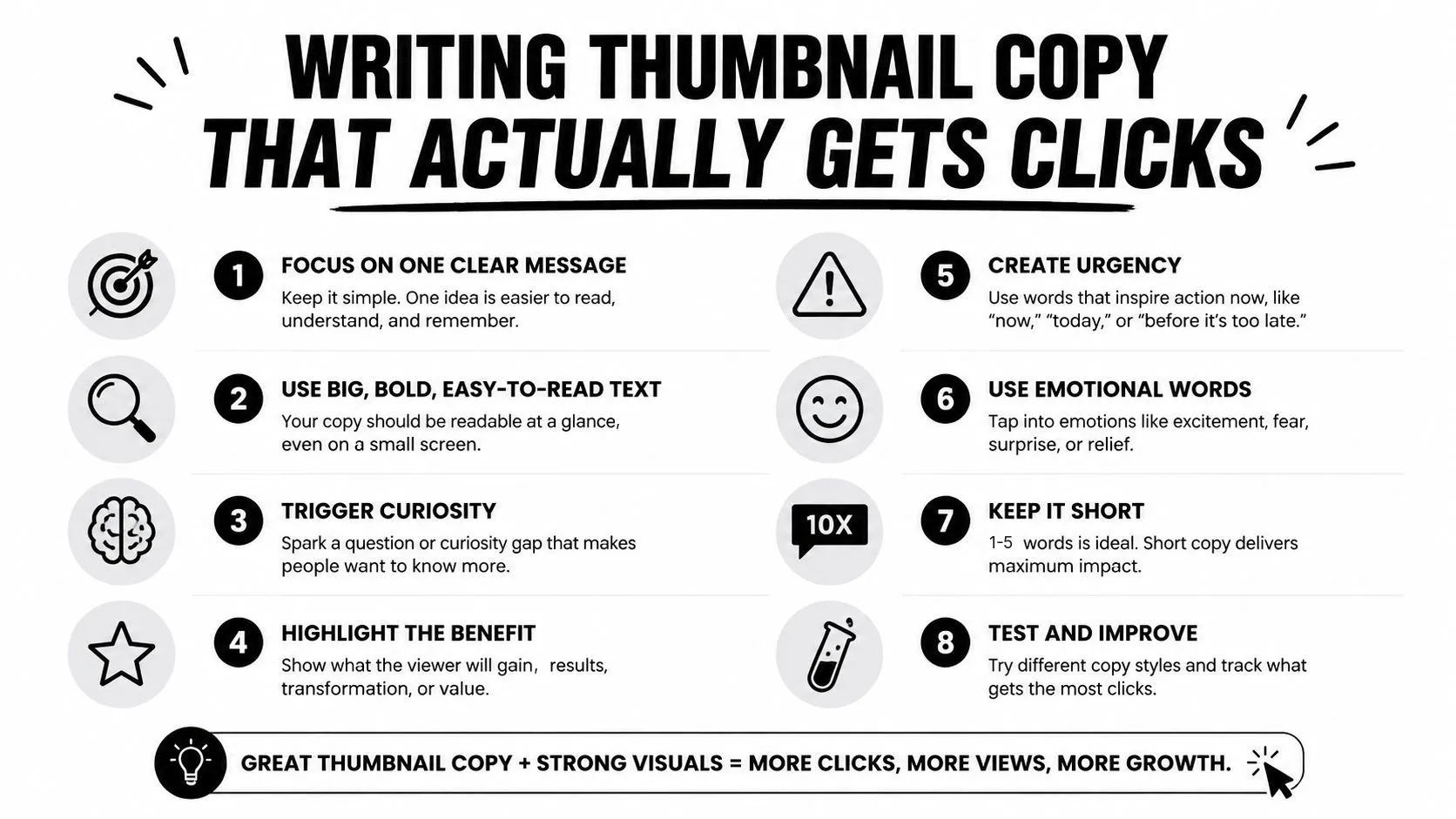
Good thumbnail copy earns its space by making the click decision easier. It should clarify the promise, sharpen curiosity, or introduce a specific outcome. If it merely repeats the title, it adds visual weight without adding a reason to watch.
Start with the title, then write the thumbnail words afterward. This order prevents the common mistake of designing one sentence twice. If the title is “How to Build a Home Studio for Less”, a weak overlay would be “How to Build a Home Studio.” It repeats the subject. A stronger option is “Soundproof It” or “Pro Sound, Small Room,” because each adds a distinct angle.
Compress one idea
The practical target is one outcome-oriented phrase, usually within one to five words. A study of 1,000 thumbnails across 10 niches reported an average CTR of 7.2% for one to five words, compared with 4.1% for 11 or more words and 4.3% for no text. The same analysis reported that short, specific hook text outperformed vague wording by a 53% relative difference, while one to five words versus 11 or more words produced a 75% relative CTR gap.
Use the range as a compression constraint, not a promise of identical results on every channel. Draft freely, then remove every word that doesn’t change the viewer’s interpretation.
- For tutorials: State the result, such as “Fix It Fast” or “No More Lag.”
- For reviews: Name the decision, such as “Skip This One” or “Worth It?”
- For explainers: Surface the tension, such as “The Hidden Cost” or “Why It Fails.”
- For transformations: Show the contrast, such as “Before the Upgrade” or “From Mess to Pro.”
Specificity beats empty excitement. “Huge Secret” could fit almost any niche, so it gives the viewer little useful information. “Remove Room Echo” tells the viewer exactly what problem the video addresses and works with a visual showing a microphone or recording space.
Make the words and visual cooperate
Text shouldn’t compete with the focal point. If the image shows a surprised face, the copy can provide the reason for the reaction. If the image shows a product, the words can frame the verdict. If the text already explains the entire story, the image has less work to do and the click may lose its curiosity gap.
Read the finished thumbnail at a small display size before publishing. If you need to zoom in to understand the phrase, the viewer will probably miss it while scrolling. Also check whether the wording remains clear for multilingual audiences. A short phrase can improve scan speed, but an overly compressed idiom may become confusing when viewers aren’t fluent in the language.
Choosing Fonts and Building Visual Hierarchy
Font selection fails when creators choose a typeface for personality before checking legibility. A decorative font may look distinctive in the editor and become an unreadable blur once the thumbnail appears beside competing images. You need a typeface with clear letter shapes, strong weight, and enough spacing to survive compression and small-screen viewing.
Choose readable families first
Bold sans-serif fonts are dependable because their forms remain clear at a glance. Common practical choices include Anton, Bebas Neue, Montserrat ExtraBold, Impact, Oswald, and League Spartan. These fonts can support different channel identities, but the useful trait is shared: large, sturdy letterforms that don’t rely on fine strokes or elaborate details.
Use display fonts selectively. A handwritten or condensed style can work for a single emphasis word, but it becomes risky when applied to a long phrase. Avoid thin weights, narrow letter spacing, and fonts with similar-looking characters. The viewer shouldn’t have to decode whether a letter is an “I,” “l,” or “1.”
For a visual reference, compare these font recommendations for YouTube thumbnails against your own thumbnail at the size viewers will see.
Build a clear reading order
A thumbnail can contain a main phrase and a small supporting label, but both shouldn’t demand equal attention. Make the central promise larger and heavier. Use the secondary element to identify a category, comparison, or context.
A practical hierarchy might look like this:
- Primary hook: The largest text, such as “STOP WASTING TIME.”
- Supporting context: A smaller label, such as “Notion Workflow.”
- Visual subject: The face, object, or result that makes the statement concrete.
Keep the main phrase visually close to the element it describes. If “Before” sits near one image and “After” sits near another, the viewer understands the comparison without reading a paragraph. If all text has the same size, color, and weight, the eye has no clear starting point.
Readability beats novelty. A familiar bold font that registers instantly is more useful than a distinctive font that viewers must decipher.
Use capitalization with restraint. All caps can create impact for very short words, but a longer all-caps phrase often loses the natural differences between letter shapes. Mixed case can improve word recognition, especially when the phrase contains several words.
Mastering Placement, Contrast, and Readability
A strong phrase can still fail if it sits over a busy face, blends into the background, or gets pushed too close to an edge. Thumbnail text needs a protected area where it remains readable when the image is reduced, compressed, or viewed against different interface backgrounds.
Keep important copy away from the extreme edges and from areas likely to be visually crowded by platform elements. A simple rule-of-thirds layout often works because it places the text and subject in separate zones rather than forcing them into the same center point. Don’t cover the most expressive part of a face or the defining feature of a product unless the obstruction is intentional.
Create contrast without visual noise
White text on a dark background and yellow text over a deep black or navy area are straightforward combinations because the letterforms separate clearly from their surroundings. The exact palette should match the image, but the principle stays constant: the text and background need different visual values.
When the background can’t provide enough separation, add a controlled outline, shadow, or translucent shape behind the words. A thick stroke can help white letters survive a detailed image, while a dark shadow can separate bright text from a light background. Don’t stack multiple effects just because the editor makes them available. Heavy outlines, glows, and drop shadows can make the design look noisy and reduce the clarity they’re meant to protect.
Test for small-screen reading
Viewing conditions vary. A thumbnail may appear on a phone, a television interface, a desktop search result, or a crowded recommendation panel. Trend coverage on thumbnail design notes that mobile, Shorts shelves, and TV interfaces make tiny-size readability a practical constraint, and that one to three words of oversized text is now outperforming five or more words across most niches tracked.
Check three things before upload:
- Distance: Can you identify the phrase without opening the full-size file?
- Contrast: Does the copy remain clear against both light and dark sections?
- Language: Do translated or mixed-language words fit without shrinking the type?
You can also convert the image to grayscale temporarily. If the text disappears, the design may rely too heavily on color rather than contrast. For accessibility, avoid using color alone to communicate meaning. Pair a color distinction with position, shape, or a clear label.
For a broader foundation in spacing, balance, and contrast, use these graphic design fundamentals as a checklist before finalizing the thumbnail.
Adapting Text Strategy to Traffic Sources
Traffic source should determine whether your words explain or interrupt. Start in YouTube Analytics by identifying whether a video gets most of its discovery from search, browse features, or suggested videos. Then design the text around the viewer’s likely state of mind rather than applying the same template to every upload.
| Traffic Source | Text Length | Style | Expected CTR Impact |
|---|---|---|---|
| Search | Three to five words can work well | Specific, explanatory, outcome-led | A 2026 study reported 11% to 22% higher CTR than text-free thumbnails in search-driven content (TubeAnalytics research) |
| Browse | Keep the phrase very short | Emotional, intriguing, visually dominant | The same study reported text-heavy variants performing about 4% worse than the comparison approach in browse contexts (TubeAnalytics research) |
| Suggested | Minimal copy, often a label or hook | Fast-scanning and complementary to the title | Dense text and full sentences tend to create friction in recommendation environments (TubeAnalytics research) |
Search is the place for useful clarification. A video targeting a practical query might use “Fix iPhone Storage” while the title explains the method in more detail. The overlay helps the viewer confirm relevance before opening the result.
Browse needs stronger visual interruption. A phrase such as “I Regret This” can work when the image shows the decision or consequence, but it should still connect directly to the video. Suggested traffic sits between the two. Viewers may recognize the topic from the video they’re already watching, so the thumbnail can use a short contrast or unresolved question rather than restating the subject.
Treat thumbnail text as a scan-speed cue, not a mini-title.
The traffic mix can change by video. A tutorial may attract search viewers while a personality-led upload relies more heavily on browse and suggested recommendations. Create the initial design for the dominant source, then test whether a more explanatory or more minimal variant performs better without changing the video’s promise.
Testing and Iterating Your Thumbnail Text
Thumbnail judgment becomes unreliable after you’ve stared at the design for too long. Testing gives you a way to replace personal preference with audience behavior, but only if you isolate the variable you’re evaluating.
Begin with a clear comparison. Keep the main image, layout, and color treatment consistent while changing only the text. For example, compare “Fix Room Echo” with “Clearer Audio”. If you change the phrase, face, background, and font at the same time, you won’t know which decision influenced the result.
Use a controlled testing routine
YouTube’s Test & Compare feature can evaluate multiple thumbnail variations on a video, while third-party tools can help with previews and visual checks. A preview tool such as Thumbo AI’s YouTube thumbnail previewer can show whether your chosen phrase remains legible in a realistic thumbnail context before you publish.
Track more than CTR. Watch time, audience retention, impressions, and the traffic source breakdown help explain whether a higher click rate brought viewers who stayed for the video. A thumbnail that attracts curiosity but creates a mismatch with the opening may produce clicks without improving the overall viewing outcome.
Turn each result into a design lesson
Write down the hypothesis before the test. You might expect a specific outcome phrase to work better in search, or a shorter emotional hook to suit browse traffic. After the test, record what changed, which source supplied the impressions, and whether viewing quality moved with CTR.
Avoid changing the thumbnail repeatedly based on a small early swing. Let the comparison gather enough relevant exposure to produce a useful directional result, then apply the lesson to a future upload. The goal isn’t to find one permanent formula. It’s to build a channel-specific library of evidence about which wording, hierarchy, and text density fit each traffic source.
Test the decision, not your taste.
Use the winning pattern as a starting point, not a permanent rule. Audience expectations shift by topic, format, and distribution surface, so keep testing title-thumbnail combinations that make different contributions instead of cloning the same phrase on every video.
Thumbo AI can help you explore thumbnail text by composing your chosen wording into generated layouts and letting you refine the result with plain-English changes. Visit Thumbo AI to create thumbnail concepts, compare readable text treatments, and turn stronger copy decisions into publishable designs.