What makes a great MrBeast-style thumbnail
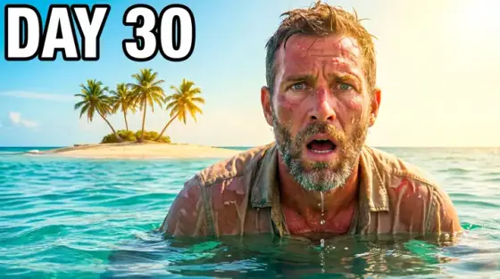
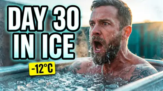
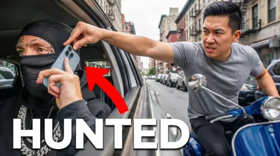
The thumbnails on the biggest challenge channel on YouTube look simple, and that is the point. Most of them carry one face with one extreme expression, one object or number that states the stakes ($1 vs $1,000,000, 100 people, 7 days), colors pushed far past realistic, and very little text - often none, rarely more than three words. Everything that does not help a viewer understand the challenge in under a second is removed. People search for "MrBeast thumbnails" because the look works far outside his niche: survival, food, travel, money and fitness videos all borrow it.
Copying the look does not mean copying the man. Thumbo makes the cover around your face (from a persona of 1 to 3 photos you add once) or with no people at all, and the button on this page preselects a survival-challenge Style Pack with the same loud palette and close crop. Describe your challenge, put the stake in the caption, and the AI composes the scene. Thumbo is not affiliated with MrBeast or his company. Use your own face or a generic one: the image model refuses requests for real famous people, so asking for his face will not work.
MrBeast-style thumbnail ideas
- The cheap vs expensive split. Left half the $1 version, right half the $100,000 version, your face reacting in the middle. The price gap is the whole story, so the numbers should be the largest thing on the cover.
- The day counter. "DAY 30" over a single image of you at your worst: sunburned, frozen, exhausted. A counter plus one desperate face promises a whole arc without a single extra word.
- The crowd number. 100 people, 1,000 balloons, 50 cars - show the crowd or the pile so it fills the frame, then put the count in huge type. Scale is a stake viewers understand instantly.
- The impossible prize. An island, a stack of cash, a car with a bow, held out to the viewer or sitting behind you. Make the prize physically big in the frame; a small prize reads as a small video.
- The last one standing. One person left in an empty arena, a red line on the floor, a timer. Elimination formats work best with a single clear survivor and lots of empty space around them.
- The face that sells the outcome. No text at all: just an enormous, readable expression and the thing that caused it. Fear, joy and disbelief all work, as long as the face is big enough to read at sidebar size.
MrBeast-style thumbnail background and text tips
Backgrounds: bright, simple and saturated - deep blue sky, turquoise water, a clean red or yellow studio wall. The look depends on colors that pop on a dark interface, so avoid muddy browns and busy textures. Keep the background behind your face plain enough that the outline of your head stays crisp.
Text: zero to three words. When you use them, make them a number or a stake ("$1 VS $1,000,000", "7 DAYS"), never a summary of the title. Big, heavy, bright, with a dark outline. If the image already explains the challenge, leave the text out entirely and give the space to the face.
Faces: one expression, exaggerated but real. Mouth open, eyes wide, the head turned slightly toward the stakes. Add a few photos of yourself once and Thumbo keeps that face consistent across every cover, which matters for a challenge series where viewers should recognize you in the grid.
Prefer to do it by hand?
All the manual steps are covered by our free browser tools: study what already works with the YouTube thumbnail downloader, crop your image to the exact 1280×720 with the thumbnail resizer, and squeeze it under YouTube’s upload limit with the 2 MB compressor. No signup, nothing leaves your browser.