A thumbnail with a human face averaged 6.8% click-through rate, compared with 4.1% without a face, in an independent study of 1,000 thumbnails across 10 niches, a 66% relative lift. That result changes how you should view an AI YouTube thumbnail maker. It isn’t a decoration tool or a shortcut to attractive graphics. It’s an experimentation engine for testing faces, expressions, text, contrast, and composition against real audience behavior.
The creators who get consistent results don’t ask AI to “make something viral.” They give it a precise visual brief, generate controlled variations, test one change at a time in YouTube Studio, and check whether the extra clicks turn into meaningful viewing. This guide gives you that operating system.
Table of Contents
- Why Thumbnail Performance Is Worth Optimizing in 2026
- Setting Up Your AI YouTube Thumbnail Maker
- Writing Prompts That Produce Clickable Thumbnails
- Design Principles That Actually Move CTR
- A/B Testing Thumbnails With YouTube Studio
- Export Settings, File Size, and Platform Tips
- Beyond CTR and Your First 30-Day Action Plan
Why Thumbnail Performance Is Worth Optimizing in 2026
YouTube defines click-through rate as the percentage of impressions that become views. Independent benchmark reporting places typical CTR for established channels between 3% and 8% across most niches, with outliers above 10% on highly optimized channels, drawn from videos with at least 10,000 impressions so the percentages rest on a stable sample. (The benchmark study on thumbnail CTR patterns)
That spread is wide enough to make thumbnail work one of the most impactful activities in a channel workflow. A video can have a strong script, clean editing, and useful information, yet lose distribution because viewers don’t understand its promise quickly enough in the browse feed. The thumbnail earns the first decision. The title and opening seconds then have to justify it.
Those bands also move with context rather than sitting still. The same benchmark work finds that thumbnail text pays off differently by traffic source, with short high-contrast overlays helping in search-driven categories while dense text underperforms in browse and suggested-video contexts. That is what makes thumbnail optimization closer to operating infrastructure than to cosmetic polish: the same design decision carries a different value depending on where the impressions come from.
CTR benchmarks by channel tier
The table below applies the published benchmark bands collected in our YouTube click-through-rate guide to 500,000 impressions, while the final column shows what adding 1.5 percentage points is worth at any tier.
| Channel Tier | Avg CTR | Views per 500K Impressions | Lift from +1.5 CTR |
|---|---|---|---|
| Under 1,000 subscribers | 2% - 4% | 10,000 - 20,000 | 7,500 additional views |
| Platform average | 4% - 6% | 20,000 - 30,000 | 7,500 additional views |
| Strong for an established channel | 8% - 10% | 40,000 - 50,000 | 7,500 additional views |
An AI maker helps only when it makes this improvement loop faster: create several deliberate concepts, isolate the variable that changed, and keep the winner that attracts qualified clicks, not merely more clicks.
Read those tiers as starting points rather than as targets, then judge progress against your own traffic sources and past uploads. Search, browse, and suggested traffic can respond differently to the same design.
Setting Up Your AI YouTube Thumbnail Maker
Don’t start with prompts. Start with a production system.
Choose a tool that gives you three essentials: locked 16:9 control, batch variation generation, and editable text layers. YouTube thumbnails need a 1280×720 minimum canvas, and a generator that produces inconsistent proportions will create avoidable rework. Text must remain editable because AI-generated lettering can look convincing at full size and become unreadable after compression.
Create one workspace per video ID, not one folder per date. Store the source prompt, reference images, generated concepts, final exports, and test results together. A structure such as video-ID/source, video-ID/variants, and video-ID/results makes a winning design traceable months later.
Build the brand preset before the first prompt
Your preset should define the boundaries AI shouldn’t cross:
- Face crop: Decide whether your channel uses close portraits, half-body framing, or object-led compositions.
- Color system: Keep two approved palettes ready. One can support urgency, the other education or authority.
- Typography: Select font pairings that remain readable in a small feed. Use bold sans-serif text for short hooks.
- Banned elements: Exclude watermarks, unnecessary logos, cluttered backgrounds, fake interface elements, and decorative objects with no role.
- Reference board: Add three to five strong past thumbnails so the maker sees your actual visual baseline rather than inventing a style.
Use a tool that accepts a video idea and style direction, then produces ready-to-publish variants. Thumbo AI is one option in that category, and it also provides a resize and crop workflow for the exact YouTube thumbnail canvas.
Practical rule: Your reference board should show what already earns attention from your audience, not what looks impressive in a design gallery.
Name every export with the video ID and variant letter. Keep the prompt beside the image. When a test produces a useful result, you want to know whether the gain came from the face, the wording, the palette, or the composition. A tool subscription becomes useful only when the workflow removes friction between idea, export, upload, and measurement.
Writing Prompts That Produce Clickable Thumbnails
Most bad AI thumbnails fail before the image model generates anything. The prompt describes a topic, but not a composition. “Make a thumbnail about productivity” gives the system too much freedom, so it fills the frame with generic office imagery, weak emotion, and text that needs to be rebuilt manually.
Use five fields in every prompt:
- Subject: Name the person, object, or scene that must appear.
- Emotion: Specify the expression, such as open-mouth shock, narrowed-eye suspicion, relieved laughter, or focused concern.
- Focal point: State where the eyes, object, or strongest contrast should pull attention.
- Text overlay: Give the exact hook, placement, color, and treatment. Keep it to 3 to 5 words, the band the benchmark study above associates with stronger performance in search-driven content.
- Palette: Supply two or three concrete colors, ideally with hex codes.
A weak prompt sounds like this:
“Man at laptop, surprised face, bright blue text TOP LEFT, warm orange background.”
It identifies the ingredients but not the visual intent. Try this instead:
“Mid-30s creator mid-laugh with one hand on his forehead, eyes looking toward the upper right, tight face crop, bold sans-serif text ‘YOU WERE RIGHT’ in white with a red stroke in the upper right, navy-to-magenta gradient background, clean negative space around the text, strong separation between subject and background.”
The second version controls the subject’s posture, expression, gaze, crop, text, palette, and spacing. That gives the generator a composition to execute rather than a topic to illustrate.
Use negative prompts to remove predictable failures
Add exclusions for extra fingers, warped lettering, generic stock-photo smiles, blown highlights, busy backgrounds, duplicate objects, and unreadable text. Don’t assume the model will understand that a clean thumbnail needs fewer elements. Say what must stay out.
Run the prompt in two passes. In the first pass, judge composition only. In the second, lock the expression, simplify the background, and inspect the text at a mobile-sized crop. For channel-specific prompt examples and ideation workflows, use this guide to ChatGPT for YouTube.
The prompt should produce options, not a final answer. Generate variations that preserve the subject and promise while changing one deliberate feature. That makes the next stage measurable.
Design Principles That Actually Move CTR
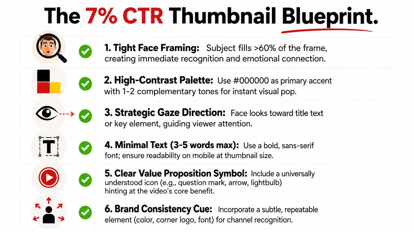
A thumbnail earns attention through a small set of visible signals. The strongest evidence points to face framing, emotional intensity, short text, contrast, and simplicity, not decorative complexity.
Give the viewer one thing to recognize
Faces work because viewers can identify them quickly. The independent thumbnail study found that designs with a human face averaged 6.8% CTR, versus 4.1% without one, and separate benchmark work finds that a single dominant face carrying a clear emotional expression outperforms neutral or no-face designs by 18% to 32%. (The benchmark study on thumbnail CTR patterns)
Use a close crop when the person’s reaction is part of the video’s promise. Ask the AI maker for a specific expression, not “friendly” or “excited.” “Open-mouth shock with raised eyebrows” gives the model a visual target. “Happy creator” produces a stock-photo smile.
Text needs the same discipline. Short, high-contrast overlays of 3 to 5 words lifted CTR by 11% to 22% in search traffic in that same benchmark work, while dense text underperformed in browse and suggested-video contexts. Keep the title and thumbnail from saying the same sentence. Let the title explain, and let the thumbnail provoke a clear question or emotional response.
Audit the image at actual viewing size
The mobile feed exposes clutter immediately. Current trend coverage points the same way: fewer elements, one clear focal point, and very short text, because small-screen viewing punishes dense layouts.
Before exporting, run four audits:
- Recognition audit: Can you identify the face or object instantly?
- Emotion audit: Is the expression strong enough to read without context?
- Text audit: Can you read every word at a small crop?
- Competition audit: Does the focal point separate from a dark or busy YouTube feed?
Use the design fundamentals in this graphic design guide for thumbnails to tighten hierarchy, spacing, and contrast. Don’t add an icon, arrow, glow, or extra phrase unless it helps the viewer understand the promise. More visual information usually creates more decisions, and more decisions slow recognition.
A/B Testing Thumbnails With YouTube Studio
The AI tool creates hypotheses. YouTube Studio decides whether those hypotheses work.
Open the video in YouTube Studio, go to the thumbnail controls, and use the Test and Compare flow when it’s available for your channel and video. Upload the existing thumbnail and a new variant, then launch the comparison. The exact interface can change, but the operating rule doesn’t: preserve the video, title, and audience conditions while changing one thumbnail variable.
Test one variable, then record the result
Change the face expression, the overlay text, or the palette. Don’t change two at once. If the new design wins, you need to know why. A test that changes the face, wording, color, and background can produce a result, but it can’t teach you what to repeat.
Run each variant until it has gathered enough impressions to read as a stable number rather than as noise. The benchmark research cited above draws only on videos with at least 10,000 impressions for exactly that reason. The variable most worth testing first is expression intensity: in the 1,000-thumbnail study, extreme expressions averaged 7.9% CTR against 4.2% for neutral ones, an 88% relative gap, and a neutral face gave almost no advantage over no face at all.
Don’t stop at the first apparent lead. A variant can look dominant early because the initial viewers came from a narrow traffic source. Browse behavior and search behavior can also reward different compositions.
Keep a test log that supports decisions
Record the hypothesis, variable changed, impressions per variant, CTR, traffic source, and average view duration. You don’t need a complicated spreadsheet. You need enough context to distinguish a repeatable pattern from a lucky result.
Testing discipline: If you can’t describe the single change between variants, you haven’t designed a clean test.
Read the Results tab after the test has accumulated enough exposure, then compare the winner with the control across both click and viewing behavior. A thumbnail that earns the click but creates a mismatch with the video’s opening can become a poor long-term choice. Testing isn’t a contest for the prettiest image. It’s a controlled way to improve the promise you make before the viewer presses play.
Export Settings, File Size, and Platform Tips
A strong concept can still fail at export. YouTube recompresses uploaded images, and a thumbnail that looks sharp in your AI maker may lose edge definition, text clarity, or facial detail after processing.
Keep the canvas at 16:9. 1280×720 is the floor rather than the target: YouTube recommends uploading at 3840×2160 and never accepts a width below 640 px (YouTube Help). Export at 4K where the artwork carries that much detail, but don’t let oversized files slow the testing loop. Use PNG for graphic-heavy layouts with flat colors and typography. Use a high-quality JPEG for photo-led designs when the file remains within the relevant upload limit.
| Setting | Recommended | Floor or limit | Use Case |
|---|---|---|---|
| Aspect ratio | 16:9 | 16:9 | Standard YouTube thumbnail display |
| Resolution | 3840×2160 | 1280×720 floor, never below 640 px wide | YouTube’s recommended upload, above the baseline |
| Format | PNG or high-quality JPEG | - | Graphics versus photo-led designs |
| File size | Under 2 MB | 2 MB from mobile, 50 MB from desktop | The upload path decides the ceiling |
Use a naming convention that preserves test history: 2026-03-14_vid4821_B.png. The date, video ID, and variant letter tell you what the file represents without opening it. Keep the filename neutral and avoid putting spoilers in names or associated text because custom thumbnails are public assets.
Check three viewing contexts
Preview the final file at a small mobile crop, a mid-size card, and a large-screen view. YouTube re-serves every uploaded thumbnail as a set of fixed renditions, including 120 × 90, 320 × 180, and 640 × 480 files, so those are the sizes the image actually has to survive. At the smallest view, inspect recognition and text. At the largest, inspect awkward AI details, soft edges, and background artifacts.
Don’t trust a full-size editor preview. YouTube viewers usually encounter the image surrounded by competing thumbnails, interface text, and dark backgrounds. The export is ready only when the promise survives all three scales.
Beyond CTR and Your First 30-Day Action Plan
CTR is useful, but it isn’t the finish line. A thumbnail can win the click by promising something the video doesn’t deliver, then lose the viewer quickly. That trade can damage the quality of the audience entering the video, which is why average view duration belongs in the thumbnail decision.
Use a simple retention rule: if a thumbnail winner increases CTR but reduces average view duration by more than 8% relative to the control, retire it. That number is an operating guardrail rather than a YouTube rule, so set a threshold your own channel can defend and then hold to it. The broader principle is more important than the exact cutoff: keep the highest CTR that survives a viewing-quality check.
Recent analysis makes the same contrarian point. This YouTube thumbnail strategy analysis argues that creators should evaluate downstream viewing behavior rather than assume the highest-CTR design is automatically best, and describes a high-CTR thumbnail paired with weak average view duration as a net negative signal, because the platform reads the gap as an overpromise.
Use the first 30 days as a controlled rollout
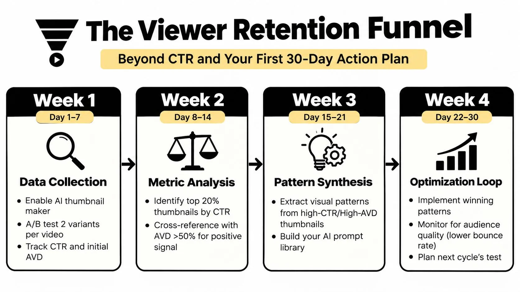
Days 1 to 7: Connect the AI thumbnail workflow, choose three older videos with weak packaging, and create replacement concepts. Establish a baseline for CTR and average view duration before making changes.
Days 8 to 14: Run two single-variable thumbnail tests. Log impressions, CTR, traffic source, and viewing duration. Don’t judge a result from the first few hundred impressions.
Days 15 to 21: Compare high-CTR thumbnails with their retention behavior. Extract repeatable prompt ingredients, such as close face framing, a specific expression, short text, or a restrained background.
Days 22 to 30: Apply the strongest patterns to new uploads, then start the next test cycle. Keep the prompt library organized by audience promise, not merely by visual style.
Print this checklist:
- Set the baseline: Record CTR and average view duration.
- Create controlled variants: Change one visual variable.
- Reach a useful sample: Let each variant gather 1,000 to 2,000 impressions.
- Check qualified clicks: Compare CTR with average view duration.
- Document the pattern: Save the prompt, export, result, and next hypothesis.
- Repeat deliberately: Build a library of proven compositions instead of collecting random AI images.
Stop chasing clicks in isolation. Chase clicks from viewers who understand the promise, start the video, and keep watching.
Use Thumbo AI to turn a video idea and selected style into ready-to-publish thumbnail variants, then resize and prepare them for the YouTube canvas. Build your first controlled test today, log the result in YouTube Studio, and use the winning pattern to improve the next prompt.