
The most popular advice about YouTube thumbnails is also the least useful: “Make it eye-catching.” That instruction produces attractive images, not reliable clicks. A thumbnail earns its place through a measurable outcome, impressions click-through rate, or CTR, the percentage of viewers who watch after seeing the thumbnail in YouTube Studio’s Reach analytics. YouTube thumbnail CTR research puts the typical benchmark for established channels between 3% and 8% across most niches, with outliers above 10% on highly optimized channels.
So, how do I create a thumbnail for YouTube that gets clicks? Treat every thumbnail as a testable promise. The image must make the subject instantly clear, create a reason to care, survive a small mobile display, and match what the video delivers. Design helps, but the workflow matters more than the template.
Table of Contents
- The Honest Truth About Why Most Thumbnails Fail
- YouTube Thumbnail Specs You Need to Get Right First
- What Top Thumbnails Have in Common and Why
- Building a Thumbnail With an AI Thumbnail Maker
- AI Thumbnail Maker vs Traditional Design Tools
- Export Settings and Upload Habits That Protect Quality
- Testing Your Thumbnail the Way Top Creators Do
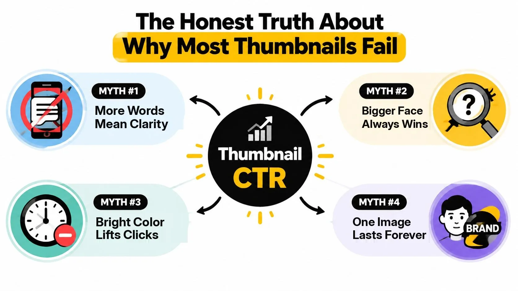
The Honest Truth About Why Most Thumbnails Fail
Most weak thumbnails fail before anyone opens Photoshop, Canva, or an AI thumbnail maker. Creators begin with assumptions that sound sensible but break down in the YouTube feed.
Myth one, more words create more clarity. They don’t. Three lines of text may explain the video on a desktop monitor, but they turn into a gray block on a phone. A short phrase such as “I Tried It” or “Worth It?” gives the viewer a direction without forcing them to read a paragraph. Dense text repeatedly underperforms readable, high-contrast composition. In published thumbnail research, images carrying eleven or more words average below the sample mean, while one-to-five-word overlays sit well above it.
Myth two, a larger face always wins. A face helps only when the expression supports the video’s promise. A huge neutral face beside an unrelated title creates visual noise. The 2026 thumbnail CTR patterns study found that a single dominant face showing a clear emotional expression, meaning surprise, excitement, or concern, outperformed neutral or no-face thumbnails by 18% to 32% in CTR. The effect was strongest in education, lifestyle, and reaction content and weakest in product reviews and tutorials, where object-focused images did just as well. Relevance matters more than facial area.
Color and novelty don’t rescue a confused idea
Myth three, any bright color lifts performance. Brightness helps only when the subject remains distinct from the background and YouTube’s surrounding interface. A neon background behind a neon subject produces no hierarchy. Bright, saturated backgrounds correlated with an 8% to 14% CTR lift over muted or dark ones in the same patterns study, but saturation isn’t a substitute for contrast or meaning. A separate analysis of 1,000 thumbnails ranked it the other way, with solid dark backgrounds beating busy photographic ones by a wide margin. What both results share is subject separation, not a particular hue.
Myth four, one perfect image can carry a video forever. Viewer context changes. A thumbnail that worked beside yesterday’s recommendations may disappear among today’s competing topics. On real channels, a swap often reveals that the original image wasn’t “bad.” It had stopped making the clearest promise in the current feed.
Practical rule: Don’t copy a competitor’s composition. Build a version that makes your own video’s conflict, outcome, or curiosity visible in one glance.
The repeatable process is simple: define the promise, build a focused image, inspect it at phone size, and compare it with a real variant. The specifications, design rules, AI workflow, and testing method below turn thumbnail creation from a one-time design task into an ongoing CTR experiment.
YouTube Thumbnail Specs You Need to Get Right First
A thumbnail can look polished and still lose clicks because the file is wrong, the subject sits under an overlay, or the design collapses on a phone. Set the canvas and delivery limits before refining the visual idea.
Work in a 16:9 frame. YouTube recommends 3840 by 2160 pixels and will not accept a width below 640 pixels, which leaves 1280 by 720 as the floor worth shipping rather than the target. The ratio is what keeps the composition consistent across search, recommendations, and embedded placements. An unusually narrow or tall image may still display, but it will not receive the same standard full-width treatment.
Keep important information clear of interface overlays. Place duration-sensitive content away from the bottom-right corner, where YouTube can add the video duration badge. Leave breathing room in the top-right area too, because watch-later controls can appear there on some surfaces. Text, faces, and the key product or object should stay within a central safe area.
Set the format and file limits before export
YouTube’s current guidance asks for a still image and lists JPG and PNG as the formats to upload. There is no animated thumbnail to design for, so the whole promise has to land in one frame that a viewer reads in a fraction of a second.
The limits vary by device. Keep the file under the 2 MB mobile cap and below the 50 MB desktop ceiling. YouTube’s recommended 3840 by 2160 pixels is the size to design toward, yet a larger source does not automatically improve performance. Compression, contrast, and phone-size readability still determine whether the viewer understands the image.
| Setting | Value |
|---|---|
| Recommended resolution | 3840 × 2160 pixels |
| Aspect ratio | 16:9 |
| Minimum width | 640 pixels |
| Practical floor | 1280 × 720 pixels |
| Mobile file limit | 2 MB |
| Desktop file limit | 50 MB |
| Accepted formats | JPG, PNG |
For the dimensions and ratio, use this YouTube thumbnail width and height guide. Design toward the recommended 4K master, then export a compressed version that stays sharp on mobile delivery and clears the 2 MB cap if you publish from a phone.
Every surface re-encodes what you upload, so over-detailed compositions are fragile. Tiny text, thin outlines, and subtle gradients can vanish after resizing. Check the exported file on an actual phone before upload. If the thumbnail still reads at a reduced display size, it is more likely to survive feeds, search results, and Shorts rails.
What Top Thumbnails Have in Common and Why
High-performing thumbnails do not follow one universal style. They follow a hierarchy that lets viewers answer three questions quickly: What am I looking at? Why might it matter? Does the title match the image? Treat the thumbnail as a CTR experiment, not a finished design. Each choice should make the promise clearer on a phone and give you a variable to test.
One focal subject beats a crowded scene
Start with one face, product, object, or transformation. An analysis of 1,000 thumbnails across ten niches found that face-based images averaged 6.8% CTR, compared with 4.1% for thumbnails without a face, a relative difference of about 66%. That pattern does not make a face mandatory. A cooking channel may need the finished dish, while a software tutorial may need the interface state that creates tension.
Choose one dominant subject and make its role obvious. Crop a face tightly enough for the emotion to remain readable at a small display size. A subject looking toward the title area can guide attention through the composition. A gaze directed away from every important element can pull attention out of the frame.
Build two or three versions by changing one major variable at a time: the crop, background, expression, or text position. That makes the result easier to evaluate as a CTR test instead of a vague design preference.
Contrast carries the image through the feed
A thumbnail competes with both light and dark interface environments. Make the background clearly lighter or darker than the focal subject, and place the title on a calm area rather than over texture, hair, foliage, or screen detail.
Bright color can help a thumbnail separate from nearby videos, but maximum saturation is not the goal. Use one dominant hue and reserve a couple of accent colors for the subject, border, or text. Too many competing colors make the image feel busy before the viewer understands its promise.
Check the exported variant on an actual phone. A design that looks balanced on a large monitor can lose its subject, facial expression, or text once it appears in a small feed.
Layout gives the title somewhere to work
Place the subject slightly off-center when the title needs clear negative space. A rule-of-thirds arrangement often separates the emotional subject from the explanatory words. Keep the overlay concise, generally four to six words or fewer, and make each word earn its place.
Use these working rules:
- Focal subject: Use one person or object unless the story depends on a comparison.
- Expression: Choose surprise, concern, curiosity, relief, or joy only when it matches the video.
- Contrast: Separate subject, text, and background before adding decoration.
- Text: Write a short phrase that complements the title instead of repeating it.
- Composition: Protect one quiet area for words and keep interface corners clear.
A thumbnail should communicate the video’s tension, not summarize every feature. More information often weakens instant understanding, which is the first condition for a click.
Building a Thumbnail With an AI Thumbnail Maker
AI makes the most useful contribution before the final polish: it shortens the distance between an idea and a set of compositions worth testing. It doesn’t remove the need for judgment. Generated images often look polished while hiding the same problems that hurt manually designed thumbnails, especially multiple focal points, unreadable lettering, and expressions that don’t match the topic.
Start with a reference frame from the video itself. Choose a frame that contains the subject, then describe the intended outcome in a tight prompt. Name the subject, mood, and single dominant focal point. For example: “A creator holding a damaged camera, surprised expression, bright yellow background, empty space on the left for short headline text, high contrast, YouTube thumbnail composition.” The prompt should describe one visual idea, not every detail in the script.
Generate options, then edit the strongest structure
Generate three variants rather than committing to the first attractive result. Compare them at a glance. The best candidate usually has the cleanest subject separation, the most useful negative space, and an expression that tells the same story as the title.
With Thumbo AI’s AI YouTube thumbnail maker, use the generated composition as a starting point, then refine it by typing the change you want, such as making the face bigger or dropping the background noise, and let the model rebuild the frame. Ask for two or three words in a high-contrast zone and for a subject that stays clearly separated from the background, then judge the result rather than the instruction.
Dense text is the most common AI output problem. Image generators may place decorative lettering across the entire frame, or produce text that looks plausible but isn’t readable. Remove it and add the final words yourself. Keep the overlay to less than 20% of the frame, so the image remains a visual hook rather than a poster.
Use a short pre-export inspection
Before exporting, review the image without zooming in:
- Focal clarity: Can you identify the main subject immediately?
- Text legibility: Does the phrase remain readable at 168 by 94 pixels?
- Facial contrast: Does the face separate from the background without a heavy outline?
- Promise match: Does the image represent the actual video?
- Interface safety: Are duration and watch-later areas free of essential information?
AI is valuable here because it lets you explore different visual directions quickly. The final decision still belongs to the creator who understands the video’s promise and audience.
AI Thumbnail Maker vs Traditional Design Tools
The right workflow depends on how often you publish and how much control your brand system requires. An AI thumbnail maker is useful when the bottleneck is producing several credible directions quickly. Photoshop, Canva, and Figma remain stronger when an agency needs exact layouts, reusable brand assets, or detailed retouching.
| Criterion | AI Thumbnail Maker, Thumbo AI | Traditional Tool, Photoshop, Canva, or Figma |
|---|---|---|
| Speed per variant | Fast ideation and rapid composition changes | Slower when each concept starts manually |
| Learning curve | Prompting plus basic visual review | Ranges from accessible templates to advanced editing |
| Asset sourcing | Generated starting points can reduce search time | Creator or designer selects and licenses assets |
| Text control | Requested in a follow-up prompt, then checked | Precise from the beginning |
| Brand consistency | Requires saved rules and manual review | Strong with templates, libraries, and brand kits |
| Typical monthly cost | Depends on the selected AI plan | Depends on the selected software plan |
| Best publishing rhythm | Frequent uploads needing multiple directions | Fewer uploads requiring detailed art direction |
A solo creator publishing three or more videos a week may prefer AI for first-pass concepts and A/B variants. The advantage isn’t that the output is automatically better. The advantage is that more alternatives become practical before upload.
Agencies often need exact type styles, locked colors, client-approved assets, and repeatable handoff processes. Traditional tools are better suited to those constraints, particularly when multiple people must edit the same source file.
The hybrid path is usually the most practical for an established channel. Generate a focused composition with AI, then perform the important manual work in a traditional editor: correct the crop, rebuild the text, match the brand palette, remove visual artifacts, and prepare the test variants. That approach treats AI as an ideation and production accelerator, not as the person responsible for the channel’s promise.
Export Settings and Upload Habits That Protect Quality
Export choices should preserve readability without turning a thumbnail into an oversized file. Export a 16:9 JPG in the sRGB color space, at the recommended 3840 by 2160 where the artwork carries that much detail and never below the 1280 by 720 floor. Then inspect the compressed result rather than assuming the larger file will look better everywhere.
A quality setting around 90 can retain detail without unnecessarily inflating the file. Check the resulting file against the 2 MB mobile limit and the 50 MB desktop limit. If the export is too large, reduce texture and unnecessary effects before shrinking the text or face, because the focal elements should survive compression.
Use this upload checklist
- Canvas: Confirm the image remains 16:9 and hasn’t been cropped into a narrow layout.
- Color: Verify that sRGB output hasn’t shifted the skin tones, background, or brand accents.
- File size: Check the mobile limit first, because a desktop-safe file may still be too large for mobile handling.
- Phone preview: Open the thumbnail in YouTube Studio on a phone before publishing.
- Small rendering: Inspect it at 168 by 94 pixels. If the words become decoration, shorten them.
- Interface clearance: Make sure the bottom-right and top-right corners don’t contain essential information.
Don’t judge the export only on a large monitor. A subtle shadow that looks elegant at full size may become a muddy border on a phone, while a thin font may disappear against a textured frame. The final check should resemble the viewer’s actual browsing situation, not the designer’s editing workspace.
Pre-publish confirmation: The image is 16:9, readable on a phone, under the applicable file limit, and clear of YouTube interface overlays.
Testing Your Thumbnail the Way Top Creators Do
A published thumbnail is not a finished design. It is a CTR experiment. YouTube Studio shows impressions CTR under Reach, letting you compare the thumbnail and title package with the number of viewers who saw it.
Judge a variant only after it has enough exposure to separate a repeatable signal from an unusually strong early audience. For a practical starting point, let each version collect roughly 1,000 to 2,000 impressions before making a decision. Smaller samples can reflect who happened to see the video first rather than the thumbnail’s actual effect.
Protect against the false win
CTR can rise while the video performs worse. A dramatic image may earn the click, then disappoint viewers who expected something else. Track CTR beside watch-time quality, retention, and subscriber movement.
| Signal | Reliable Window | Win Threshold | False-Win Flag |
|---|---|---|---|
| Impressions CTR | Roughly 1,000 to 2,000 impressions per variant | Sustained improvement against the comparison | Higher clicks with weaker viewing quality |
| Audience retention | Through the same test period | Holds steady or improves | Noticeable early drop after the swap |
| Watch-time quality | Compare with the control | More valuable viewing from the added clicks | Click growth without meaningful viewing |
| Subscriber response | Compare the same traffic cycle | Stronger audience action with the variant | CTR rises while subscriber response weakens |
Use YouTube Studio’s built-in Test & Compare when it is available for your channel. Splitting exposure between options reduces the bias that appears when the audience changes after you replace the image.
Manual testing still works. Record the original CTR, retention, and subscriber response in one sheet. Change one variable, such as the face crop, background color, or text phrase, then switch at the 72-hour mark and keep the replacement through a complete traffic cycle. The goal is not perfect statistical certainty. It is to stop memory, excitement, or one unusually strong recommendation burst from choosing your next design.
Before the test starts, work through our YouTube thumbnail previewer guide and check the composition in a feed-like context at browsing size. That quick review catches cramped text, weak contrast, and a subject that loses priority once the card shrinks.
Retire a thumbnail after repeated tests show weak CTR without a clear promise. Iterate when one element appears responsible, such as a readable concept paired with a weak crop or a strong subject buried by the background.
Thumbo AI turns a video idea, or the video itself, into thumbnail variations you can refine by typing the change you want and then take into a real CTR test. Visit Thumbo AI to shorten the path from concept to a phone-checked, test-ready YouTube thumbnail.