
A single dominant face carrying a clear emotional expression tends to beat a neutral face or no face at all by a reported 18 - 32%, while dense text overlays lose ground in browse and suggested feeds (TubeAnalytics’ thumbnail CTR patterns study). Those findings reframe how to improve click through rate: the answer usually isn’t adding more design elements. It’s making the promise easier to understand before a viewer has time to think.
CTR is the first response your packaging receives. It tells you whether a thumbnail, headline, search snippet, or subject line earns enough attention to start the next step. But a click isn’t automatically a win. The strongest optimization process raises clicks while protecting retention, conversion, revenue quality, and audience fit.
Table of Contents
- Why CTR Is a Diagnostic Signal Not a Vanity Metric
- Measure First The Baseline Workflow Every Creator Should Run
- YouTube Thumbnail and Title Tactics That Move Real Numbers
- Search Snippets and Email Subject Lines The Cross-Platform Playbook
- A/B Testing Methods From Manual Swaps to Platform Experiments
- When Higher CTR Hurts You The Conversion Quality Trap
- Your 14-Day CTR Optimization Sprint
Why CTR Is a Diagnostic Signal Not a Vanity Metric
Click-through rate is useful because it sits at the entrance to the funnel. Before a viewer watches, reads, subscribes, or buys, they decide whether the external promise deserves attention. A weak CTR often points to a mismatch between the topic and its packaging, while a strong CTR suggests that the surface message has created relevant curiosity.
A practical mental model works across platforms:
CTR tells you whether the promise on the outside matches the curiosity on the inside.
That promise changes by channel. On YouTube, impressions-to-views reveal whether the thumbnail and title stop the scroll. In Google Search, organic CTR reflects how well the result appears to answer the query. In email, CTR measures whether the delivered message moves recipients toward the intended action. Click-to-open rate asks a narrower question, namely whether people who opened an email clicked. Ad CTR evaluates response to a paid placement, while organic search CTR evaluates a result competing against other listings.
Don’t collapse those metrics into one benchmark. A YouTube browse impression, a branded search result, and an email sent to an engaged segment represent different levels of intent. Comparing their raw CTR values can produce confident but useless conclusions.
For YouTube-specific context, the YouTube CTR guide from Thumbo AI is a useful reference point, but your own historical performance remains the more relevant ruler. Track CTR by traffic source, audience, device, and content type before deciding that a result is good or bad.
The bigger warning is simple: a click is a beginning, not a business outcome. A thumbnail can attract the wrong viewer. A subject line can create curiosity that the email doesn’t satisfy. A search snippet can win attention but send visitors to a page that fails to deliver. The rest of the process is about diagnosing the reason behind the number, testing one meaningful change, and validating whether the lift survives downstream.
Measure First The Baseline Workflow Every Creator Should Run
Most CTR mistakes happen before the test begins. Someone sees a weak result, changes the thumbnail immediately, and then treats the next fluctuation as proof. That process confuses movement with learning.
Start by recording the current state in the platform where the click occurs. In YouTube Studio, capture impressions and CTR, then segment them by traffic source rather than relying only on the channel-wide figure. Search-driven traffic behaves differently from browse and suggested traffic, so a blended average can hide the actual problem.
For organic search, use Google Search Console to identify the queries, pages, impressions, and clicks associated with the result. Look for intent mismatches. A page may receive impressions for a broad query while its title and description promise a narrower answer. In email, use your ESP report to separate clicks by campaign, send time, audience segment, and device where available.
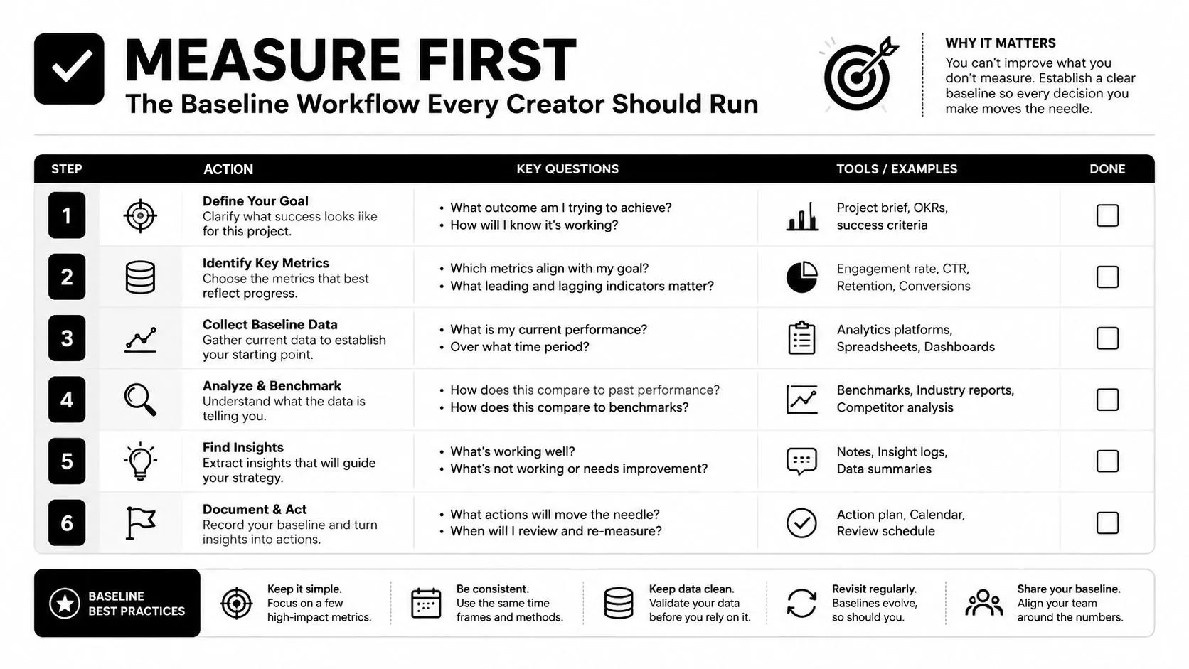
Build a clean baseline
Record these fields before changing creative:
- Current CTR: Save the exact metric and the platform definition behind it.
- Traffic surface: Separate browse, suggested, search, external, inbox, and other relevant placements.
- Audience segment: Note whether the audience is new, returning, active, or broadly targeted.
- Measurement window: Mark the start and end time so you don’t compare unlike periods.
- Downstream metrics: Capture retention, session quality, conversion, revenue per click, or unsubscribes as appropriate.
A result becomes more credible when the sample is large enough to reduce random fluctuation and when the comparison uses a similar audience and traffic mix. For email, send timing and audience composition can overwhelm a subject-line change. For YouTube, a topic spike or a shift from browse to search can make a thumbnail appear better or worse without any creative effect.
Don’t peek every few minutes and declare a winner. Early data is useful for detecting a broken link, misleading packaging, or an obvious failure, but it isn’t a reliable basis for subtle decisions. Use confidence intervals where your platform or testing tool provides them, and account for day-of-week effects, seasonality, and traffic-source changes.
Measurement rule: Log the baseline, isolate the surface, define the window, and choose the success metric before you design the variant.
The most valuable baseline isn’t always the highest historical CTR. It’s a dependable floor for a comparable audience. Once that floor exists, you can test a face, a shorter title, a clearer benefit, or a stronger contrast treatment without guessing what caused the change.
YouTube Thumbnail and Title Tactics That Move Real Numbers
YouTube packaging has three high-impact visual variables: human presence, contrast, and text density. Their value depends on the channel and traffic surface. A face can carry a reaction video because emotion is part of the subject. A tutorial may benefit more from a clear object, result, or before-and-after contrast. Text can clarify a complex topic, but it becomes a liability when viewers must read a sentence to understand the frame.
The thumbnail CTR patterns study cited above puts the face effect at a reported 18 - 32% over neutral or face-free thumbnails, strongest in education, lifestyle, and reaction content and weakest in reviews and tutorials, where an object-led frame carries the story just as well. The same analysis splits text overlays by traffic source: high-contrast text of 3 - 5 words lifted CTR 11 - 22% in search traffic while costing about 4% in browse, which is why a single channel-wide text rule tends to disappoint. The thumbnail best-practices guide from Thumbo AI offers a practical way to translate those principles into channel-specific packaging.
Those patterns point to an operating rule rather than a formula: cut the number of competing elements, keep overlay text short enough to read at a glance, and make the subject separate cleanly from the background. For separation, borrow accessibility targets as design guardrails: at least 4.5:1 between text and the background directly behind it, and 7:1 for the main title where you can, as our guide to thumbnail color and contrast sets out. Those ratios are legibility checks, not promises of a specific CTR. Traffic source, niche, topic urgency, and audience familiarity still shape the result.
Match the variable to the channel
| Channel Type | Face Forward | High Contrast | Text Density | Typical CTR Range |
|---|---|---|---|---|
| Vlog, commentary, reaction | Strong fit when expression carries the hook | Helpful for separating the face from the background | Keep it minimal | Varies by niche and surface |
| Tutorial and how-to | Use when the creator or result adds trust | Often central to showing the outcome | Use short labels | Varies by niche and surface |
| Review and comparison | Useful when emotion or judgment matters | Strong for product separation | Label the comparison clearly | Varies by niche and surface |
| Listicle and explainer | Optional, depending on the topic | Useful for visual hierarchy | Keep the promise compact | Varies by niche and surface |
Pair the visual with a title that adds information rather than repeating it. A face-led thumbnail can support a curiosity gap in the title. A high-contrast product frame can support specificity, a concrete result, or a clear comparison. A clean design can pair with a front-loaded benefit, so the title completes the idea instead of duplicating the words in the image.
Avoid the familiar failures. An exaggerated face that the video doesn’t justify creates expectation debt. A collage with several colors, objects, and text blocks turns into noise on mobile. A title that repeats “I Tried This” when the thumbnail already says it wastes the second packaging asset. Strong packaging creates one coherent question, then gives the viewer a reason to believe the video will answer it.
Search Snippets and Email Subject Lines The Cross-Platform Playbook
Search snippets and email subject lines share a core job, but they operate under different conditions. Both need relevance, specificity, and a clear reason to continue. Searchers are often expressing an existing need, while email recipients are deciding whether your message deserves attention among competing inbox items.
For search, mine Google Search Console queries instead of writing from intuition. Identify the language people already use, then align the page title and meta description with that intent. Put the answer or benefit near the beginning, use a curiosity gap only when the page resolves it, and avoid promising a result the page doesn’t provide.
For email, start with the recipient’s context. A subject line for an onboarding message can point to the next action. A newsletter subject line may need a sharper editorial angle. The preheader should extend the subject rather than repeat it, and the email body must make the promised click feel like the obvious next move.
Same principle, different execution
| Principle | Google Meta Description | Email Subject Line |
|---|---|---|
| Specificity | Name the problem, audience, or answer the page addresses | Signal the message’s immediate relevance to the segment |
| Curiosity gap | Suggest a useful answer without hiding the page’s topic | Create interest without using a misleading tease |
| Front-loaded value | Put the core benefit early in the visible snippet | Place the action, outcome, or timely reason near the beginning |
| Message match | Reflect the query and the page content | Match the subject, preheader, body, and CTA |
| Concision | Remove filler that consumes limited preview space | Cut unnecessary words that compete with the main idea |
Take one underlying idea, such as reducing thumbnail design mistakes, and adapt it rather than copying it. A search description might say, “Learn how to simplify YouTube thumbnails, improve mobile readability, and test packaging without sacrificing audience fit.” An email subject line could be, “Your thumbnail is doing too much.” The search version clarifies scope and value. The email version creates a sharper editorial hook that the body must support.
Audit either format with four questions:
- Does it mirror real intent? Use query or audience language.
- Is the value visible early? Don’t bury the reason to click.
- Does the destination deliver? Remove any promise the page or email can’t fulfill.
- Can you isolate the change? Keep the test focused on one meaningful variable.
A high click rate from a misleading promise isn’t a copy win. It’s a measurement problem waiting to appear in the next stage.
A/B Testing Methods From Manual Swaps to Platform Experiments
Testing methods sit on a spectrum from fast and imperfect to slower and more controlled. A manual YouTube thumbnail swap is easy to ship, but the before-and-after periods may have different audiences. A title-only search test can reveal packaging effects, although ranking position and query mix may change at the same time. An email split test offers cleaner comparison when the audience can be divided fairly.
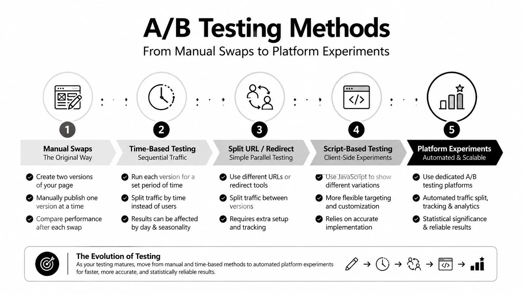
Choose the method by decision risk
A manual swap makes sense when a channel moves quickly, the asset has limited remaining shelf life, or the audience is too small for a platform experiment to produce a useful result. It can still teach you something if you log the exact swap time, traffic source, impressions, and downstream outcomes. Treat it as directional evidence, not laboratory certainty.
Platform-native experiments are more useful when the decision will affect a high-value library or a repeatable channel format. YouTube’s Test & Compare workflow can reduce some of the ambiguity around simultaneous creative comparison, and it is worth knowing what it optimizes: per YouTube’s help, you can compare up to three titles or title-and-thumbnail combinations, and the one with the highest watch time is the version shown to all viewers, not the one with the most clicks. A YouTube thumbnail previewer from Thumbo AI can also help you inspect how candidates read before publication, which is different from proving that one variant wins in live traffic.
For email, split subject lines only when the groups are comparable and the primary outcome is defined in advance. If the goal is qualified site activity, don’t stop at the open or click. If the goal is a purchase, connect the click to the purchase event and watch for list-quality effects.
A 2021 AAAI paper on automatic GIF thumbnail generation ran its model as a pilot across 9,814 videos on a video streaming platform and reported a 37.5% CTR improvement over static image thumbnails. The practical lesson isn’t that every creator should expect that gain, because it came from changing the thumbnail format outright on a platform that serves animated thumbnails, not from swapping one still frame for another. The useful lesson is to compare candidates against a baseline, change one major variable at a time, and validate the result on the same traffic source and content type.
Don’t confuse confidence with convenience
A convincing test needs enough observations, a stable comparison, and a preselected decision rule. If you keep checking until a variant looks favorable, you invite false winners. If traffic changes sharply, annotate the event instead of pretending the test remained clean.
Use this decision framework:
- Low volume, low stakes: Make a manual change and collect directional evidence.
- Stable volume, repeatable format: Use a controlled split or native experiment.
- High stakes or broad rollout: Require downstream validation before scaling.
- Unclear result: Keep the baseline, refine the hypothesis, and test again.
The best test isn’t the most advanced one. It’s the simplest design that can answer the question without hiding important changes in the traffic mix.
When Higher CTR Hurts You The Conversion Quality Trap
A higher CTR can produce a worse business result. A thumbnail may exaggerate the payoff, attract viewers who do not care about the full video, and create a sharper early drop in retention. An email subject line can trigger broad curiosity and bring low-intent visitors, while the original segment generated fewer but more valuable clicks.
Judge the lift beside a quality metric. On YouTube, compare the change with early retention, average viewing behavior, and whether viewers continue into a healthy session. For email, compare clicks with revenue per click, completed actions, unsubscribes, and spam complaints. In search, check whether visitors engage with the page and complete the intended action instead of leaving immediately.
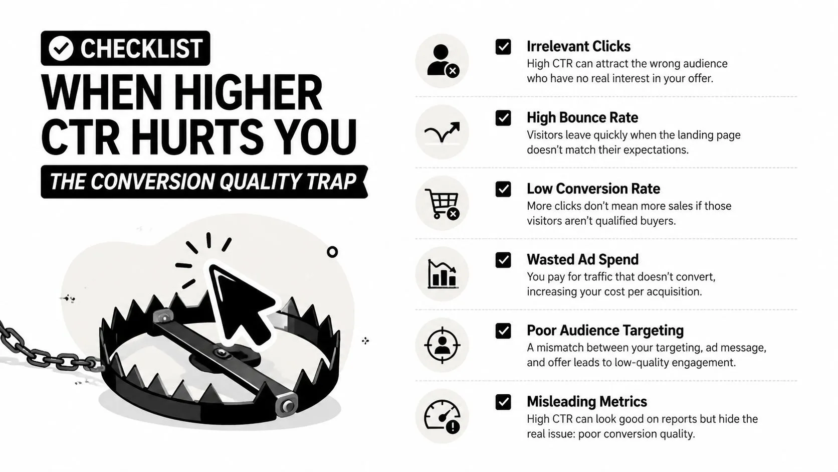
Diagnose the quality of the lift
Ask four questions before rolling out a winner:
- Did the audience change? A new traffic source or broader segment can raise clicks while lowering intent.
- Did the promise change? Stronger curiosity may attract people the content or landing page does not serve.
- Did the next step weaken? Clicks can rise while the destination creates friction or confusion.
- Did the value per visitor fall? Measure the action that matters, not only the visit.
A lift that lowers downstream quality can still reveal a useful problem. The packaging may work while the video opening or landing-page message fails to deliver. Fix that mismatch, then retest. If the variant attracts the wrong audience by design, roll it back and write a narrower promise.
Quality rule: Keep a CTR winner only when the people it attracts behave like the people you want.
An analysis of CTR benchmarks across industries at SEOProfy makes the same point with paid-channel data: for B2B advertisers a LinkedIn CTR of 0.44% can produce better-qualified leads than a Facebook Ads CTR of 0.9%, so the report advises judging social clicks by platform and audience quality rather than by volume alone. That principle protects against click cannibalization, where a change captures attention that would otherwise have gone to a more qualified asset or action.
Your 14-Day CTR Optimization Sprint
A useful sprint has a narrow scope. Don’t redesign your entire channel, rewrite every search result, and rebuild your email program at once. Pick a small group of underperforming assets, establish a baseline, and use each checkpoint to decide whether the next step is earned.
Days 1 through 5
On days one and two, pull YouTube Analytics, Google Search Console, and ESP data. Record CTR by surface or segment, then flag the three weakest assets in each channel. Note the downstream metric that will protect quality, such as retention for video or completed actions for email.
On day three, ship one YouTube thumbnail and title test. Use a single dominant idea, check whether the face and expression fit the content, remove unnecessary elements, and make sure the title extends the thumbnail. Don’t change the video topic, description, and packaging simultaneously.
Days four and five are for search snippets and email subject lines. Write five variations for each selected asset, then group them by hypothesis: stronger specificity, a clearer benefit, a sharper curiosity gap, or better audience match. Choose one change to test rather than selecting the version that merely sounds clever.
Days 6 through 14
Days six and seven are the first gate. Compare variant and baseline impressions, then inspect retention and session quality on YouTube. For email, check clicks alongside unsubscribes and spam signals. If CTR rises but quality falls, pause the rollout and diagnose the promise before continuing.
Days eight through ten repeat the process on the next weakest assets. Days eleven through thirteen can use a platform-native YouTube experiment where the decision matters enough to justify a slower read, followed by a controlled manual subject-line swap for email when the audience and timing are comparable.
Day fourteen is the audit. Lock in the variables that produced qualified clicks, archive losing tests with a short explanation, and queue the next sprint around the clearest unresolved question.
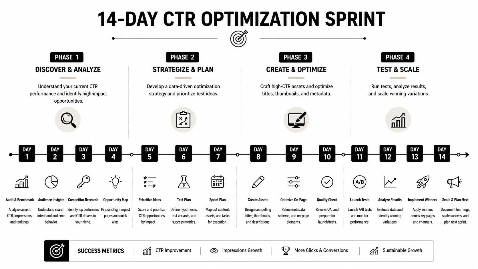
Use three explicit checkpoints:
- Day 3: Confirm the test is live and only the intended variable changed.
- Day 7: Confirm the CTR movement isn’t damaging retention, conversion, or list health.
- Day 14: Decide what to standardize, what to discard, and what to test next.
That workflow turns how to improve click through rate from a collection of design tricks into an operating system. You aren’t chasing a flattering number. You’re building packaging that earns the right click, from the right audience, for the right next step.
Thumbo AI offers an AI thumbnail maker and YouTube thumbnail generator that helps creators build thumbnail concepts quickly, with tools for previewing and testing how designs read before publishing. Use Thumbo AI alongside the baseline and validation workflow above, then judge every candidate by qualified clicks and downstream performance, not appearance alone.