
Image thumbnail size isn’t one number. For YouTube, 1280 × 720 px at 16:9 is the floor rather than the target: the platform recommends uploading at 3840 × 2160, and the file-size cap depends on the device you upload from. Build one high-resolution 16:9 master, then create platform-specific derivatives for different crops, displays, and file-weight limits.
The popular advice to “just upload the largest image possible” misses the part that causes most failures: thumbnails are delivered into different render boxes. A file that looks balanced in YouTube search can lose its text in a portrait feed, appear letterboxed in a link preview, or arrive unnecessarily heavy on a web page. The practical question isn’t only “what size should my thumbnail be?” It’s “which versions must I deliver, and how should each one be prepared?”
Table of Contents
- Why Image Thumbnail Size Is Not One Number
- The Core Dimensions and Aspect Ratios
- Platform-by-Platform Thumbnail Specs
- Choosing the Right File Format
- Resolution, Retina, and Export Settings
- A Reusable Export Checklist
- Common Misconceptions and Final Takeaways
Why Image Thumbnail Size Is Not One Number
A thumbnail is a delivery asset, not a static canvas. YouTube search results, mobile feeds, A/B test variants, email digests, and Open Graph previews all place the same creative inside different containers. Some preserve the original ratio, some crop the edges, and some reduce the image until small text becomes decoration rather than readable information.
YouTube provides a useful foundation. Every uploaded thumbnail is re-served from YouTube’s image CDN as a set of fixed renditions, including 120 × 90 px, 320 × 180 px, and 640 × 480 px files for different display tiers, and channel avatars are requested at sizes such as 88 × 88 px and 240 × 240 px. Those outputs show that thumbnail architecture is built around delivery contexts, not just design preference. The contrast with the early web is the useful part: in a 2008 discussion of typical thumbnail sizes, web developers described thumbnails of 75 × 75 to 200 × 200 px weighing two to four kilobytes each, with the enlarged view topping out near 600 × 600.
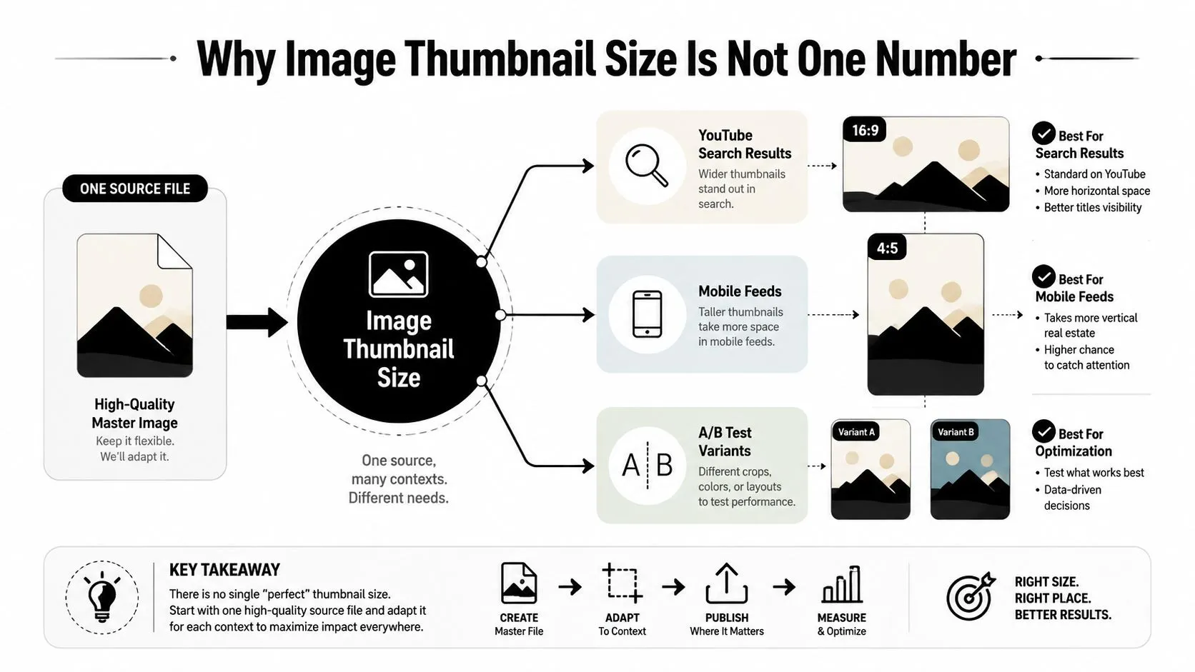
A single 1280 × 720 master may be a sound starting point, but it won’t automatically fit every destination. A mobile feed may favor a taller crop, a link card may trim the top and bottom, and a small search tile may reduce the subject until background details disappear. The source file survives only if the composition was designed with cropping and shrinking in mind.
The three trade-offs that matter
- Dimensions versus file weight: More pixels preserve detail, but they also create more data to compress and deliver.
- Retina clarity versus load time: A denser export can look cleaner on high-density screens, yet an oversized derivative adds unnecessary page weight.
- Spec compliance versus safe-area readability: Meeting a platform’s dimensions doesn’t guarantee that text remains visible after interface cropping.
Practical rule: Create one strong master, then deliver derivatives that match the destination’s aspect ratio, pixel dimensions, and file constraints.
The workflow becomes manageable when you map the master once. Confirm the render box, protect the central subject and title, export the correct crop, and inspect it at the size viewers will see.
The Core Dimensions and Aspect Ratios
Before choosing an export preset, separate four terms that creators often blend together.
Pixels describe the image’s raw grid. A file measuring 1280 × 720 px contains 1280 horizontal pixels and 720 vertical pixels. Aspect ratio describes the relationship between width and height, independent of the file’s absolute dimensions. Divide 1280 by 720 and the shape resolves to 16:9, so the same composition can scale to another 16:9 canvas without changing its proportions.
Resolution can refer to the available pixel detail or to pixel density in a print workflow. For online thumbnails, the pixel dimensions and rendered size usually matter more than a print-oriented pixels-per-inch setting. File weight is the amount of data the browser or platform must process and transfer, and it depends on dimensions, format, compression, transparency, and image complexity.
A square 1080 × 1080 file and a portrait 1080 × 1350 file share the same width but occupy different visual footprints. A 1:1 canvas often suits square cards and profile surfaces, while 4:5 uses more vertical space in mobile feeds. A 16:9 canvas remains the natural shape for YouTube and many link previews.
Read the ratio before the dimensions
| Dimensions (px) | Aspect Ratio | Common Use |
|---|---|---|
| 1280 × 720 | 16:9 | YouTube video thumbnails and landscape previews |
| 1080 × 1080 | 1:1 | Square social posts and compact cards |
| 1080 × 1350 | 4:5 | Portrait-oriented mobile feed graphics |
| 1200 × 630 | Approx. 1.91:1 | Link preview and Open Graph-style cards |
The ratio determines what survives a crop. If the title sits near the top edge of a 16:9 composition, moving to 4:5 can remove it unless the design includes a protected safe area. That’s why resizing should begin with the destination shape, not with a generic “large enough” export. For a hands-on workflow, this thumbnail creation guide provides a useful starting point for building the source composition.
Platform-by-Platform Thumbnail Specs
Different platforms reward different starting assumptions. YouTube asks for a 16:9 custom thumbnail, recommends a resolution of 3840 × 2160 px, and never accepts a width below 640 px. 1280 × 720 px stays the familiar baseline because it is the size of the largest still rendition YouTube serves back. The upload ceiling is not one number either: 2 MB from mobile and 50 MB from desktop (YouTube Help). A large master leaves enough detail for downscaling, but the title still needs to work when the platform displays the asset as a small card.
Instagram needs separate thinking for square and portrait feed placements. A 1:1 composition gives you a compact, balanced card, while a 4:5 composition gives the subject more vertical presence. Don’t force one crop into both roles. Reposition the face, product, or focal object so the crop remains intentional rather than allowing the interface to decide which details disappear.
Facebook link previews and feed posts also behave differently. A wide link card can use a broad composition, while a square feed post demands a tighter hierarchy. X and LinkedIn link cards similarly benefit from a dedicated horizontal crop, especially when the headline occupies a large portion of the visual.
The table below collects the dimensions most commonly published for each surface. Where a platform doesn’t state a single universal maximum, treat the file-weight field as surface-dependent and check the current upload rules before publishing.
| Platform | Dimensions (px) | Aspect Ratio | Max File Size |
|---|---|---|---|
| YouTube custom thumbnail | 3840 × 2160 recommended, 1280 × 720 baseline | 16:9 | 2 MB mobile, 50 MB desktop |
| Instagram square feed | 1080 × 1080 | 1:1 | Surface-dependent |
| Instagram portrait feed | 1080 × 1350 | 4:5 | Surface-dependent |
| Facebook shared link | 1200 × 630 | Approx. 1.91:1 | Surface-dependent |
| Facebook feed post | 1080 × 1080 | 1:1 | Surface-dependent |
| X in-stream card | 1200 × 675 or 800 × 418 | Landscape | Surface-dependent |
| X header | 1500 × 500 | 3:1 | Surface-dependent |
| LinkedIn link share | 1200 × 627 | Landscape | Surface-dependent |
| LinkedIn profile-adjacent image | 400 × 400 | 1:1 | Surface-dependent |
| General Open Graph preview | 1200 × 630 | Approx. 1.91:1 | CMS-dependent |
Social platforms may re-encode uploads, so your carefully chosen JPEG quality won’t always survive unchanged. Keep critical text away from the outer edges, preview every crop, and use a platform-aware video thumbnail size workflow when YouTube is the primary destination.
Choosing the Right File Format
Format selection changes the balance between clarity, transparency, and delivery weight.
JPG is usually the practical choice for photographic thumbnails. Its lossy compression handles faces, backgrounds, gradients, and textured scenes efficiently, which helps a YouTube upload stay inside the 2 MB mobile cap. The weakness appears around small text, sharp diagonals, and repeated recompression. Excessive compression creates blocks and halos that become obvious after the platform processes the file again.
PNG suits graphics with hard edges, flat color, text, logos, or transparency. It preserves those elements cleanly, but it can produce a much heavier file at the same dimensions, particularly when the design contains photographic backgrounds. Use it as a master or when transparency is required, not as an automatic final format for every social upload.
WebP is a strong web choice when you control the CMS, image pipeline, and browser delivery. It can provide efficient files while retaining transparency support, but social platforms may re-encode the upload and remove the advantage. Test the actual delivered asset rather than assuming the original format will remain intact.
GIF makes sense only when animation is part of the requirement. Many thumbnail surfaces display a static frame or ignore animation, so an animated source doesn’t guarantee an animated result.
| Format | Compression | Transparency | Typical Weight at 1280×720 | Best For |
|---|---|---|---|---|
| JPG | Lossy | No | Variable, often efficient for photos | YouTube and photographic social thumbnails |
| PNG | Lossless | Yes | Variable, often heavier for complex imagery | Text-heavy graphics, transparency, archival masters |
| WebP | Lossy or lossless | Yes | Variable, generally efficient for controlled web delivery | CMS thumbnails and responsive web assets |
| GIF | Limited-color animation | Yes, limited | Variable, often inefficient for complex visuals | Simple animated assets where supported |
A dependable production rule is to keep a PNG master for editing and archival use, then export JPG or WebP derivatives according to the destination. The master protects your source quality. The derivative protects the user experience.
Resolution, Retina, and Export Settings
Retina support is a workflow decision, not a decorative upgrade. A thumbnail may be displayed at a smaller logical size while a high-density screen uses more physical pixels to render it. If the source lacks enough detail, text edges and facial features soften even when the layout itself is correct.
Start with the largest logical canvas required by the destination. For YouTube, the 1280 × 720 frame is that logical canvas, and the design should then be prepared for denser displays through larger working variants: 2560 × 1440 at 2x and 3840 × 2160 at 3x, as represented in the production flow below. The 3x export earns its keep twice over, because 3840 × 2160 is also the resolution YouTube recommends uploading.
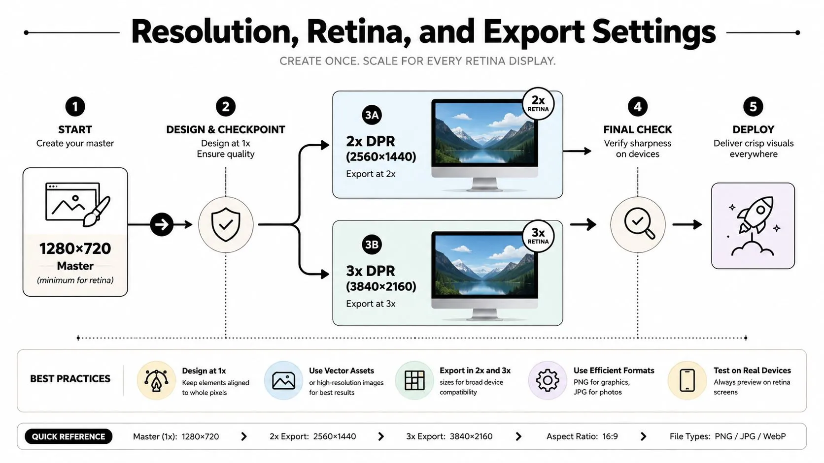
Don’t upscale a small original and expect interpolation to restore missing detail. Enlarging a low-resolution file can make edges smoother, but it can’t recreate the texture and letter definition that were never captured. Design large enough at the start, then downsample carefully for each placement.
Use a controlled export pipeline
- Design at the master canvas: Keep the main composition at the destination’s required ratio.
- Protect the safe area: Place titles and essential faces away from edges likely to be cropped.
- Export in sRGB: Platforms commonly process uploaded images into web delivery profiles, so sRGB remains the safer cross-platform choice.
- Create the derivative: Use JPG for photographic social assets, WebP where your CMS controls delivery, and PNG where transparency or crisp graphic edges justify the weight.
- Inspect the actual render: Check the image at feed size, not only at full zoom.
File weight is part of readability because a technically sharp thumbnail that loads slowly is a poor delivery asset. A 200 KB JPG may look crisp at feed sizes, while a 1.5 MB JPG rarely appears visibly sharper in a small web placement and can impose a heavier loading burden. These figures illustrate the trade-off rather than a universal performance guarantee. The practical target depends on the render size, texture, text density, and platform limit. For resizing and cropping a YouTube master, this guide to resizing without losing quality fits naturally into the derivative stage.
A Reusable Export Checklist
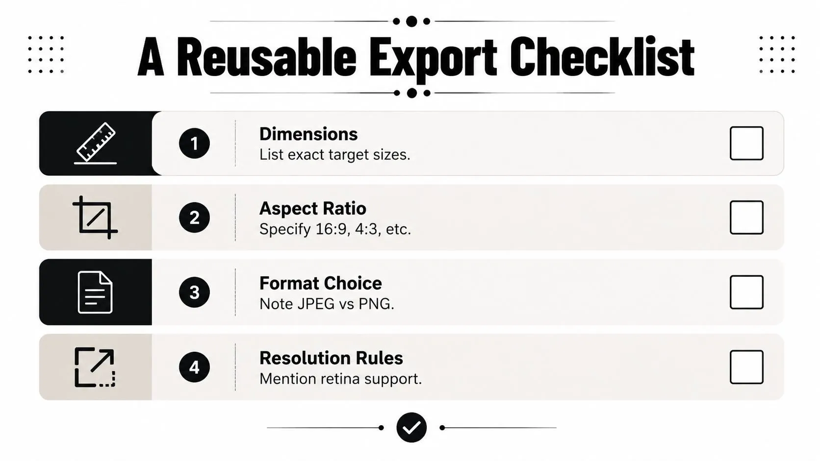
A repeatable checklist prevents the same export mistakes from returning every week. Run it in the order the asset is produced, from composition through final inspection.
Start with the destination
- Confirm the ratio: Identify whether the placement needs 16:9, 1:1, 4:5, or another shape before moving text or subjects.
- Set the pixel target: Use the platform’s recommended dimensions rather than its smallest accepted floor.
- Mark the safe area: Keep headlines, logos, and faces clear of edges that may disappear in interface crops.
The composition should be built for the crop, not merely squeezed into it. If one campaign needs YouTube, Instagram, and a link preview, duplicate the layout and adjust each version deliberately instead of applying a blind resize.
Build and export the source
- Design at the master size: Keep the highest-quality editable version in a format that preserves layers and transparency.
- Avoid upscaling: Begin with enough pixels for the required output. Enlarging a small image won’t restore lost detail.
- Render text at export resolution: Don’t add tiny text to a low-resolution derivative and then enlarge it.
- Embed sRGB: Use a consistent web color profile so the uploaded image doesn’t shift unexpectedly after processing.
Produce the platform files
Export the PNG master first, then generate the final JPG or WebP derivative. For YouTube, export 16:9 at 3840 × 2160 where the artwork carries that much detail, never drop below 640 px wide, and keep the file under 2 MB if you upload from a phone rather than a desktop browser. For other platforms, match the specified dimensions and inspect whether the service re-encodes the upload.
Before publishing, preview the thumbnail at its actual feed or card size on both a standard-density and high-density display. Read the title from a distance. If the message disappears, increasing the canvas won’t solve the problem. Reduce the words, enlarge the type, simplify the background, or reposition the subject.
Common Misconceptions and Final Takeaways
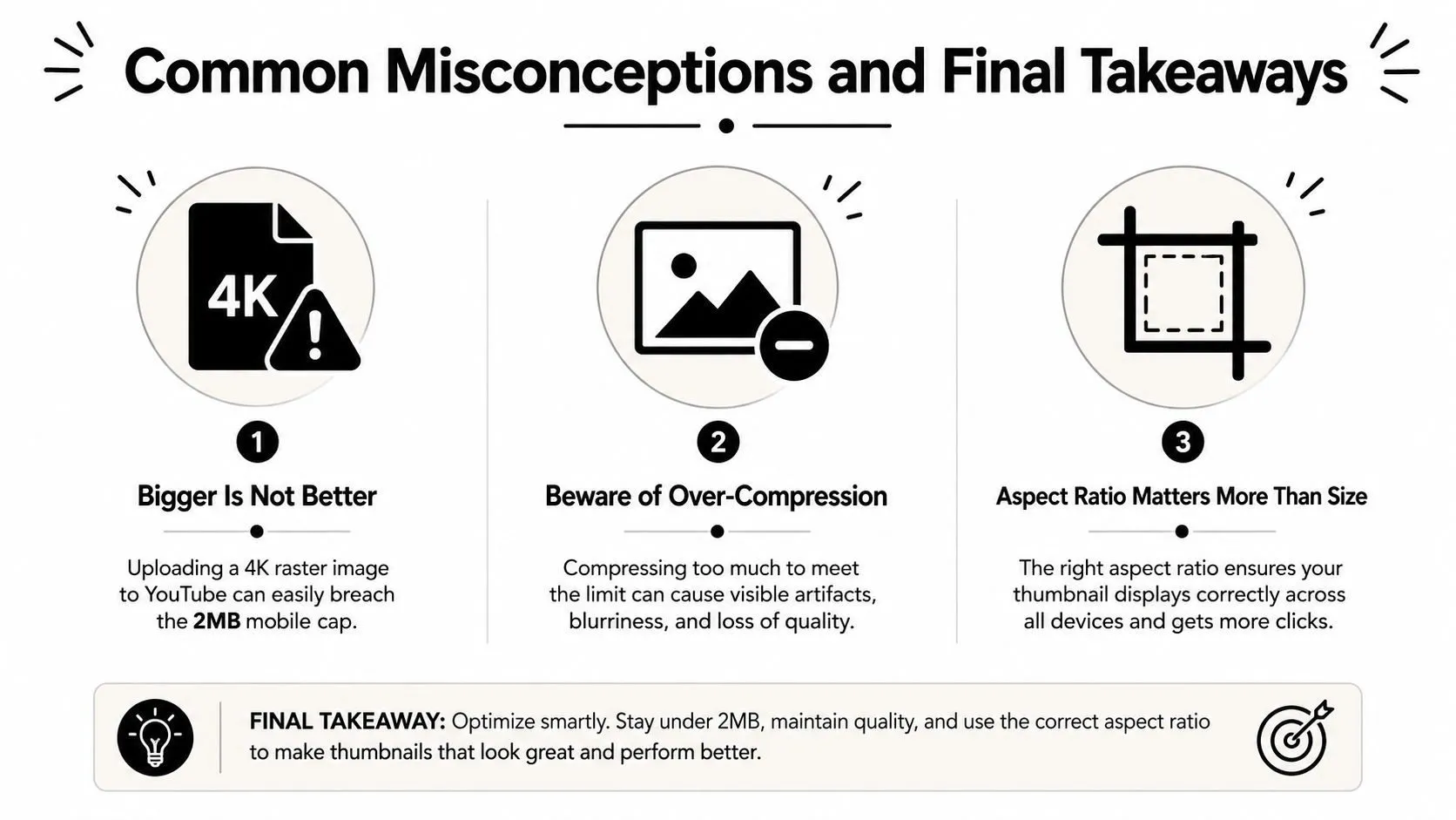
The largest available raster isn’t automatically the best thumbnail, but the pixel count is rarely the reason. YouTube asks for 3840 × 2160, so a 4K export is the recommended upload rather than a mistake. What a 4K export can breach is the 2 MB mobile cap, which is why the same file often uploads cleanly from a desktop browser, where the ceiling is 50 MB. More detail only helps when the destination can display it and the file can arrive without damaging the rest of the page or upload workflow.
The minimum accepted dimension is also a poor target. A platform may accept a small square or narrow image, but acceptance doesn’t mean the asset will remain crisp on a high-density mobile display. Use the minimum as a compatibility floor, then author the image at the larger production dimensions required by the placement.
Aspect ratio is a design decision
You can’t reliably retrofit a 4:5 Instagram composition into a 16:9 YouTube thumbnail after the design is finished. The crop will either remove meaningful content or leave unwanted space. Build the subject and title around each destination’s safe area, then preserve the master for future derivatives.
Final takeaway: The right image thumbnail size is the size that survives the destination’s crop, display density, compression, and file-weight constraint.
Audit older assets for undersized renders, replace legacy web derivatives with WebP where your delivery system supports it, and treat file weight as a readability budget rather than a race toward the smallest possible file. The strongest thumbnails aren’t large. They’re legible, correctly framed, and exported for the surface where viewers will encounter them.
Thumbo AI offers tools for creating YouTube thumbnails and resizing or cropping an image to the exact 1280 × 720 format, which can simplify the master-to-derivative workflow. Visit Thumbo AI to prepare platform-ready thumbnail assets without reinventing the export setup for every upload.