The best thumbnail isn’t the loudest one. More text, brighter colors, extra arrows, and heavy effects can create attention, but they can also make the viewer work too hard to understand the video. A strong thumbnail makes the promise clear at a small preview size, then gives the viewer a reason to care.
The practical question isn’t “How do I make this look exciting?” It’s “What decision should the viewer make after seeing it?” The ten thumbnail ideas below are organized around four decisions: understanding a promise, feeling an emotion, spotting a contrast, or following an action. They fit education, technology, lifestyle, interviews, entertainment, gaming, comparison content, and more.
Judge every concept by four factors: focal point, readable promise, niche fit, and alignment with the video’s actual payoff. YouTube defines thumbnail CTR as the percentage of impressions that turn into clicks. A good thumbnail CTR generally falls between 4% and 10%, with 4% to 6% as the practical middle ground and anything above 7% counting as strong, though the useful range shifts with niche, audience, and traffic source (see what counts as a good click-through rate on YouTube). Thumbo AI can help turn a rough idea into a draft and compare layout variations, but the concept still has to match the video.
Table of Contents
- 1. High-Contrast Bold Text Overlay
- 2. Facial Expression With Emotion
- 3. Question or Mystery Hook Text
- 4. Vibrant Color Blocking and Gradients
- 5. Number or Statistical Highlight
- 6. Comparison Split-Screen Layout
- 7. Celebrity or Recognizable Face Cameo
- 8. Animated Arrows and Directional Elements
- 9. Bold Icon or Emoji Integration
- 10. Action Shot or Moment Capture
- Top 10 YouTube Thumbnail Ideas Comparison
- Turn One Video Into Three Testable Thumbnail Directions
1. High-Contrast Bold Text Overlay
Bold text works when the viewer needs to understand the promise before the image does the explaining. A dark background with white or neon lettering, or a pale background with dark lettering, gives the hook a clear visual home. The design doesn’t need to be complicated. It needs to survive the moment when the thumbnail is reduced to a small card in Search, Home, or Suggested.
A useful mockup for a productivity video would show a creator on one side, a simplified desk or calendar behind them, and the words “STOP WASTING TIME” in a compact block on the opposite side. For technology, “WORTH THE UPGRADE?” can work when the product image supplies the context. The title should add detail rather than repeat the exact wording.
Where the format fits
This is a natural fit for education, business, productivity, commentary, and search-led tutorials. It’s less effective when the subject itself is already visually obvious, such as a cinematic travel moment or a gaming highlight that needs room to breathe.
The main trade-off is clarity versus nuance. More words can explain the video, but small text quickly becomes decoration. Keep the text short, use a restrained color system, and place it away from faces or products. A thin outline can help separate letters from a busy image, but a thick outline, glow, shadow, and gradient together usually make the design feel dated.
Test the layout at the size viewers will encounter it, not only on a large monitor. For typography choices and readable type treatments, see this guide to the best fonts for YouTube thumbnails.
Practical rule: If the text needs to be read twice, rewrite it before you redesign it.
2. Facial Expression With Emotion
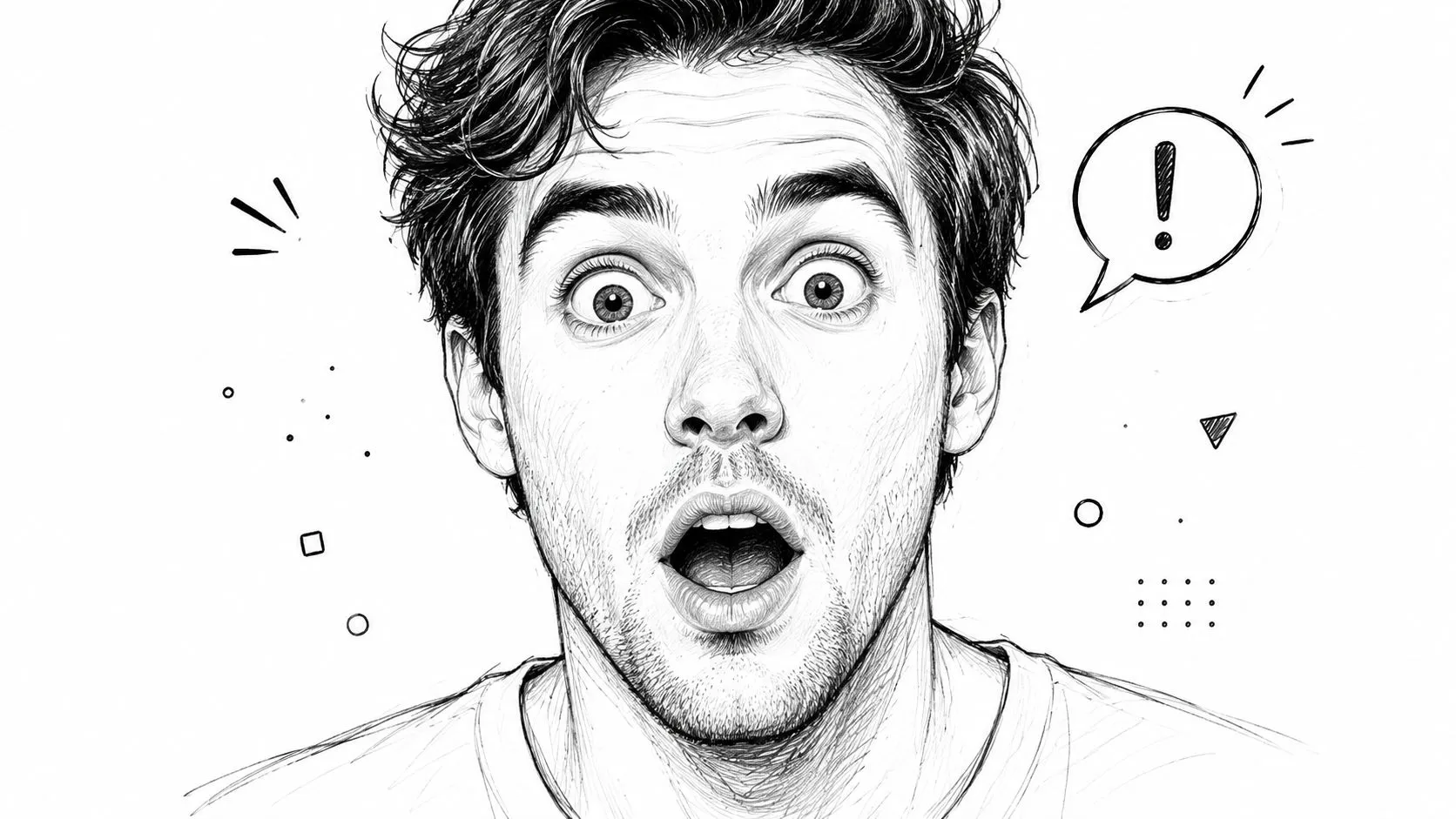
A face helps viewers identify the video’s emotional promise before they process the title. Surprise, relief, confusion, delight, and concern each suggest a different reason to watch. A 2026 analysis of 1,000 thumbnails across 10 niches reported average CTR of 6.8% for thumbnails with a human face versus 4.1% without one, a relative difference of 66%. Treat that finding as directional, not universal. Audience expectations and niche conventions still affect the choice.
For a software tutorial, show the creator looking from the camera toward one interface element, paired with “I FOUND IT”. For a beauty video, a genuine reaction to the finished look can communicate more than a posed smile. Keep the face large enough for the eyes and expression to survive a small card. Use a simple background with enough separation to keep the subject distinct.
Make the emotion believable
The expression must match the video’s actual payoff. A forced open-mouth reaction may suit entertainment, but it can weaken trust on an analytical channel. Focused concern or confident satisfaction usually fits finance, interviews, and professional technology content better.
Select several expressions rather than using the first usable frame. Keep the eyes sharp, use even lighting, and leave the mouth and eyes clear of text. A 2026 CTR patterns study reported that a single dominant face with a clear emotional expression outperformed neutral or no-face thumbnails by 18% - 32%, with the effect strongest in education, lifestyle, and reaction content and weakest in product reviews and tutorials, where object-focused thumbnails also performed well (TubeAnalytics’ thumbnail CTR patterns study). Use the face to signal what viewers will feel or discover, not to manufacture excitement the video cannot deliver.
A thumbnail can support understanding, emotion, contrast, or action. This concept primarily supports emotion, so the mockup should give the face the strongest visual role and let the title provide the specific context. Compare adaptable compositions in these YouTube thumbnail examples.
3. Question or Mystery Hook Text
A question thumbnail supports a viewer who wants an answer, explanation, or verdict. It’s especially useful when the video starts with a problem that the title can’t fully explain. The question should create tension without hiding the subject. “WHY DID IT FAIL?” paired with a clearly recognizable product or situation is stronger than an abstract question floating over a generic background.
For a science channel, a mockup might show an unusual object, one visual clue, and “CAN THIS SURVIVE?” For a creator-economy video, show a blurred dashboard or a declined project brief with “WHAT WENT WRONG?” The video must answer the question directly. If the thumbnail asks about a specific issue but the video spends most of its time elsewhere, the curiosity gap becomes a mismatch.
Curiosity needs a payoff
The best question hooks leave some information unresolved, but they don’t leave the viewer confused. Show enough of the subject to establish context, then withhold the conclusion. A question mark can help organize the frame, although it shouldn’t become a substitute for a meaningful idea.
This format fits education, technology troubleshooting, documentaries, interviews, and investigative commentary. It can fail in straightforward tutorials where viewers want a direct result rather than suspense. In those cases, a clear outcome such as “FIX YOUR AUDIO” may be more useful than “WHY IS IT BAD?”
Avoid vague rhetorical questions that could apply to any video. Name the object, decision, or consequence. The title can provide the exact context while the thumbnail presents the unresolved question.
4. Vibrant Color Blocking and Gradients
Color blocking supports a fast viewer decision: identify the subject and understand its promise. Give the focal object a clean field instead of competing with it. A technology thumbnail might place a laptop on a cool blue panel. A lifestyle video could put a person and one key prop against warm coral or orange. Saturation helps only when it creates separation, not when every color demands attention.
For a smartphone review, mock up two connected panels, with one color behind the screen and another behind the camera module. The split should clarify the comparison between features. For travel content, place the subject against a sunset-toned block and reserve a contrasting color for the destination. Keep the palette consistent across a series, while changing the composition enough to signal each video’s specific promise.
Contrast beats decoration
Gradients can suggest depth, but they often weaken text and blur product edges. Test the thumbnail in light and dark viewing environments. Set the subject clearly brighter or darker than its immediate background, then check the design at feed size. A simple palette usually gives the viewer a faster path to the main idea than a complex gradient.
This approach fits technology, fashion, travel, lifestyle, gaming, and branded series. It can fail when the video depends on a naturalistic image, such as a documentary scene or an accurate product color. Keep skin tones, product finishes, and important details believable. Use color treatment to organize the frame, not to disguise weak imagery.
For guidance on hierarchy, contrast, and visual balance, review these graphic design fundamentals.
5. Number or Statistical Highlight
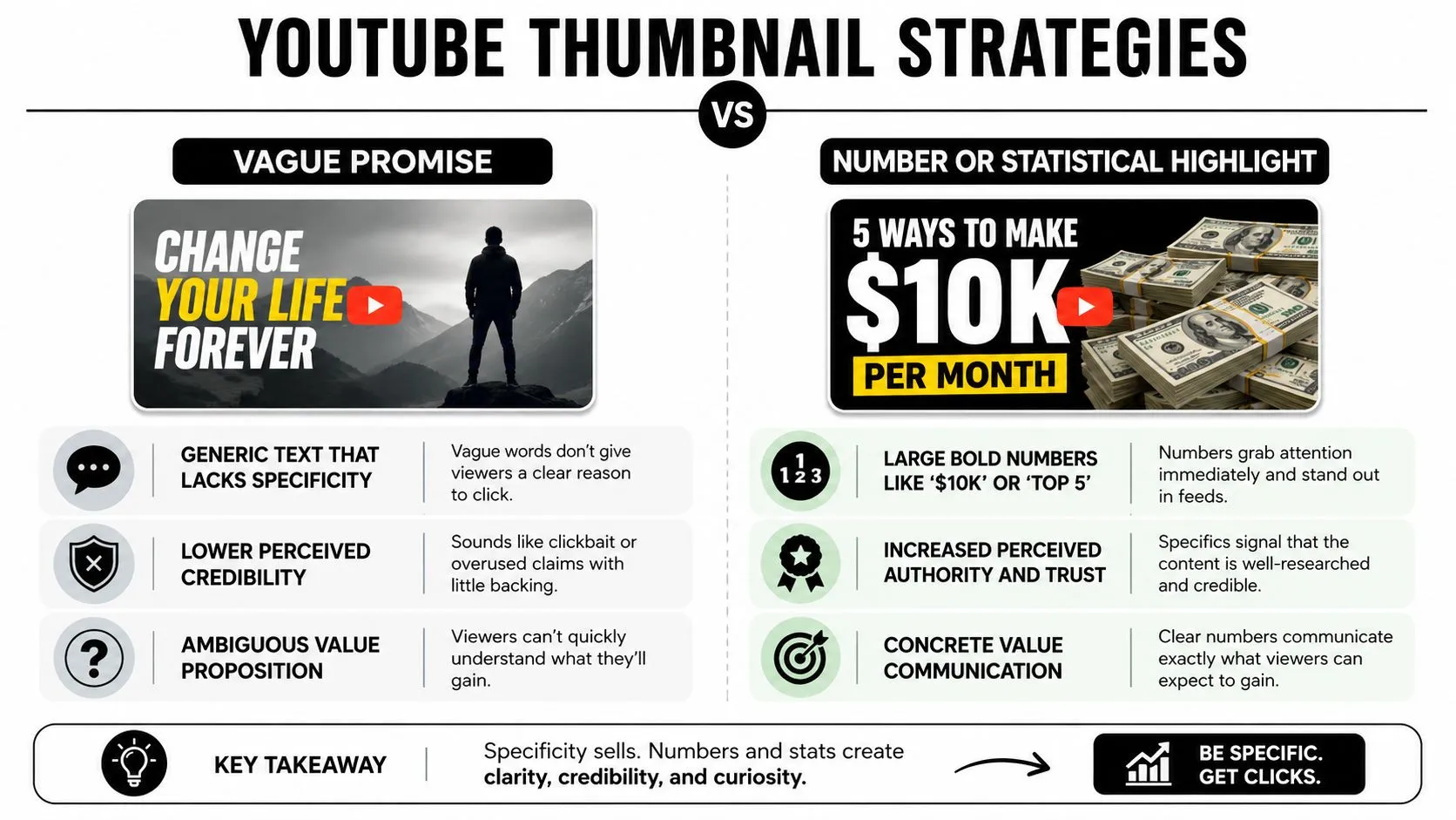
A number gives the viewer a specific object to process. It can represent a result, ranking, duration, cost, quantity, or measurable comparison. That specificity suits education, finance, business, science, sports, history, and self-improvement, where the number is part of the actual value rather than a decorative attention device.
For a video about a budgeting experiment, place the verified result in the largest type, then show the creator beside a simple wallet or spreadsheet visual. For a history video, a date or ranking can anchor the frame. For a software tutorial, a number might represent the number of settings, mistakes, or steps, but only if the video supports that claim.
Trust depends on accuracy
The number has to be real, understandable, and supported by the video. Don’t use a dramatic figure merely because it looks impressive. A vague promise dressed as a statistic may attract initial interest, but it can damage viewer satisfaction when the video doesn’t deliver the implied scale.
Give the number visual priority over supporting text. Use a comparison symbol only when the relationship is obvious, and pair the figure with an image that explains what it measures. A finance thumbnail that shows a large currency figure without context can look like an income promise, while a clearer frame might show “FEES EXPLAINED” beside the relevant account or chart.
The number should remain readable at small size, but there’s no need to crowd it with icons, arrows, and multiple labels. One strong numerical idea is easier to understand than a dashboard of competing figures.
6. Comparison Split-Screen Layout
Split-screen thumbnails support a viewer who wants to spot a difference and follow a verdict. The format works because two subjects can communicate the video’s structure immediately. A technology review might show two phones facing each other, a clean divider between them, and a small “VS” marker. A cooking video could show a homemade version on one side and a restaurant version on the other.
For a fitness or DIY video, the contrast may be before and after. The two sides need to be visually comparable, with similar brightness and scale, or the viewer may read the difference as a photography problem instead of the video’s central idea.
Make the contrast obvious
Use a vertical or diagonal line only when it clarifies the relationship. Assigning different background colors to each side can help, but the colors shouldn’t overpower the objects being compared. Leave enough breathing room around the edges so the important content doesn’t feel cramped in a feed preview.
This format fits product reviews, software comparisons, transformations, experiments, sports analysis, and versus entertainment. It fails when the two sides aren’t meaningfully different. Showing two nearly identical products with a large “VS” creates a promise the video may struggle to fulfill.
The title can explain the criteria, while the thumbnail shows the contestants. Don’t list every category of comparison in the image. Let the viewer see the conflict first.
7. Celebrity or Recognizable Face Cameo
A recognizable guest can identify the video’s social context instantly. Interview channels use this naturally, while collaboration videos can use the guest as the central visual anchor. The format fits podcasts, entertainment, business interviews, creator collaborations, sports, and commentary.
A mockup for an interview with a software founder could show the guest in a large profile or three-quarter portrait, the host in a smaller supporting position, and a compact phrase such as “THE HARD PART”. If the guest isn’t widely known to the target audience, add their name or role. Recognition alone won’t carry the design when the viewer doesn’t know who they’re seeing.
Familiarity needs context
The guest’s face should be sharp, well lit, and large enough to identify. Avoid placing two faces at equal size if the viewer can’t tell who the episode is about. A small topic cue, such as a product, microphone, trophy, or relevant background detail, can connect the person to the conversation without filling the frame.
The main trade-off is borrowed familiarity versus clear value. A famous face can earn attention, but it doesn’t explain why this particular conversation matters. The thumbnail should signal the guest and the unresolved subject, while the title supplies the fuller promise.
This approach is less useful for faceless educational channels or videos where the guest appears only briefly. Don’t feature someone prominently if their appearance isn’t a meaningful part of the video. That mismatch can feel like bait even when the guest technically appears.
8. Animated Arrows and Directional Elements
Arrows tell the viewer where to look. They’re useful when the important relationship in the image isn’t immediately obvious, such as a small setting on a phone, a hidden gaming mechanic, a before-and-after detail, or a movement from problem to solution.
For a technology tutorial, show the creator or device on the left and one highlighted interface element on the right, connected by a single curved arrow. For a gaming video, point toward a concealed item or enemy while keeping the player character visible. The arrow should support the visual story, not become the story.
Direction is useful only with hierarchy
One or two arrows are usually enough. A thick, bright arrow can dominate a small thumbnail and make the composition feel like an old clickbait template. Match its color to the design system, keep it away from faces and text, and use a curved path when the viewer should follow a sequence. A straight arrow works better for a direct target.
This format suits tutorials, gaming, science demonstrations, repair videos, analytics breakdowns, and product features. It’s weak for portraits, interviews, and cinematic travel content where an artificial pointer may cheapen the visual language.
The arrow must point to something worth seeing. If it highlights an ordinary object or a detail the video never explains, it creates visual noise and weakens trust. Use it after identifying the focal point, not as a substitute for one.
9. Bold Icon or Emoji Integration
Icons act as visual shorthand. A timer can suggest speed, a warning symbol can suggest risk, and a mathematical symbol can establish an educational subject before the viewer reads any text. The format is especially useful for science, finance, gaming, productivity, software, educational explainers, and youth-oriented entertainment.
A mockup for a time-management video might place a large timer icon beside the creator and use the short phrase “DO MORE”. A cybersecurity video could use a lock or warning symbol next to a laptop, while a mathematics channel might combine a clean equation mark with a diagram. The icon should clarify the topic, not merely decorate the background.
Symbols carry assumptions
A familiar emoji may feel approachable in a lifestyle or gaming channel but out of place in a serious investigative video. Icons also vary across cultures and platforms, so test whether the symbol communicates the intended idea without additional explanation.
Keep the icon large, simple, and consistent with the channel’s illustration style. Mixing a glossy emoji with a flat editorial illustration can make the thumbnail look assembled from unrelated parts. Use one dominant symbol and a short text cue when the icon alone isn’t precise enough.
The main risk is replacing the subject with a generic category marker. A rocket doesn’t explain what is fast, and a fire emoji doesn’t explain what is valuable. Connect the symbol to a specific object, action, or outcome so the viewer can understand the promise at a glance.
10. Action Shot or Moment Capture
An action shot freezes a moment the viewer wants to understand. It can show a player at the peak of a move, a creator reacting to a reveal, a product being tested under pressure, or a traveler reaching a dramatic location. The viewer sees movement even though the image is static, which makes this concept a natural fit for gaming, sports, challenges, entertainment, travel, experiments, and reaction content.
For a gaming thumbnail, use the frame immediately before a decisive play, then add one clear visual cue that identifies the stakes. For a challenge video, show the participant mid-action with the obstacle still visible. For lifestyle content, choose a real moment rather than a generic pose, especially when the video’s appeal depends on spontaneity.
Freeze the right moment
A dramatic frame can be visually exciting and still fail if nobody understands what’s happening. Add only the context needed to identify the action, such as a target, object, opponent, or outcome. Check that motion blur doesn’t erase the face or central object, and adjust contrast so the subject separates from the background.
The trade-off is energy versus comprehension. A chaotic frame may feel authentic but become unreadable in a crowded feed. Review several moments from the footage and choose the one with the clearest action, not necessarily the most extreme pose.
Use this approach when the video’s payoff is an event. If the video is a calm tutorial or detailed review, a composed product or face-led thumbnail may communicate more accurately than a dramatic freeze-frame.
Top 10 YouTube Thumbnail Ideas Comparison
| Style | Implementation complexity | Resource requirements | Expected outcomes | Ideal use cases | Key advantages |
|---|---|---|---|---|---|
| High-Contrast Bold Text Overlay | Low, simple layout and typography | Low, basic design tools and font choices | Clear promise at feed size; strongest in search-driven traffic | Broad use; thumbnails for mobile-heavy audiences | Immediate readability; strong visual hierarchy |
| Facial Expression with Emotion | Medium, requires intentional shooting | Medium to high, lighting, camera, talent | Consistently above-benchmark CTR in education, lifestyle and reaction content | Tutorials, reactions, commentary, personality-driven content | Emotional connection and attention magnetism |
| Question or Mystery Hook Text | Low, copy-driven design | Low, strong copy plus basic design | Clicks driven by an unresolved question; depends on the video answering it | Explainers, investigative, listicles, wide niches | Triggers a curiosity gap without hiding the subject |
| Vibrant Color Blocking and Gradients | Medium, needs color planning | Low to medium, design skill and palette tools | Better feed visibility; stronger brand recognition | Lifestyle, design, tech, branded series | Makes thumbnails pop; establishes a consistent look |
| Number or Statistical Highlight | Low, layout plus data display | Low, verifiable data and design | Higher perceived credibility when the figure is real and explained | Finance, education, business, listicles | Conveys concrete value and trustworthiness |
| Comparison Split-Screen Layout | Medium, composition plus matching assets | Medium, two quality images and layout work | Very effective for comparison topics; the message reads instantly | Product reviews, before and after, versus videos | Immediately communicates contrast and depth |
| Celebrity or Recognizable Face Cameo | High, coordination and clearances | High, guest access, rights, high-res images | Borrowed reach from an audience that already knows the guest | Interviews, collaborations, guest features | Leverages recognition and social proof |
| Animated Arrows and Directional Elements | Low, add graphic cues | Low, simple graphic assets | Directs the eye to the detail that carries the story | Tutorials, how-to, step highlights | Guides viewer focus; adds an implied motion cue |
| Bold Icon or Emoji Integration | Low, icon selection and placement | Low, icon assets or custom icons | High visual memorability; language-agnostic impact | Educational, international audiences, quick-recognition videos | Communicates the topic without heavy text |
| Action Shot or Moment Capture | High, capture timing and editing | High, quality production, multiple takes | High excitement; works when the video’s payoff is an event | Sports, gaming, vlogs, stunt content | Conveys energy and authenticity |
Turn One Video Into Three Testable Thumbnail Directions
Start with the video’s core promise in one sentence. Is the viewer choosing between two products, looking for an answer, expecting an emotional reaction, or waiting to see an action completed? That decision should determine the thumbnail structure before you choose fonts, colors, or effects.
Choose the concept that communicates that promise fastest. An educational explanation may need a question or a number. A product comparison may need a split screen. A challenge video may need an action frame. A podcast episode may need the guest’s face and a short unresolved statement. Niche fit matters because viewers learn the visual language of a channel over time.
Create a clean first mockup with one focal point, one readable promise, and only the supporting elements needed to connect the two. Then make two controlled variations. Change one meaningful element at a time, such as the facial expression, background color, text wording, or image arrangement. If you change everything at once, you won’t know which decision affected the result.
Evaluate clicks and satisfaction together
CTR matters because it measures how often impressions become clicks. Typical benchmark ranges for established channels fall between 3% and 8% across most niches, with outliers above 10% in heavily optimized channels, per the benchmark summary from TubeAnalytics. Those ranges are directional, not a universal grading scale. Compare a new design with your own historical performance by traffic source, and give it enough exposure to mean something: that study counted only videos with at least 10,000 impressions so its CTR readings would be statistically meaningful.
A higher click rate isn’t automatically a better thumbnail if the design overpromises. Recent creator guidance recommends considering CTR alongside average view duration and post-click signals, because a thumbnail can attract the wrong viewer when its promise is too broad or too dramatic, as discussed by Metapher’s YouTube thumbnail strategy guidance. Keep every claim accurate, and make the opening of the video deliver what the thumbnail suggests.
Don’t combine every technique in one frame. A face, statistic, gradient, three arrows, an emoji, and a split screen may each be defensible alone, but together they compete for attention. Review the design at a small preview size, check the title and thumbnail as a pair, and remove anything that doesn’t improve understanding.
Thumbo AI can help generate thumbnail drafts from a video idea and refine alternative layouts. Use it as a practical production aid, then make the final choice based on your audience, traffic source, niche conventions, and the video’s actual payoff.
Use Thumbo AI to turn your next video idea into thumbnail concepts and refine variations around the clearest focal point, hook, and visual style. Create three controlled directions, review them at preview size, and choose the version that makes the video’s real promise easiest to understand.