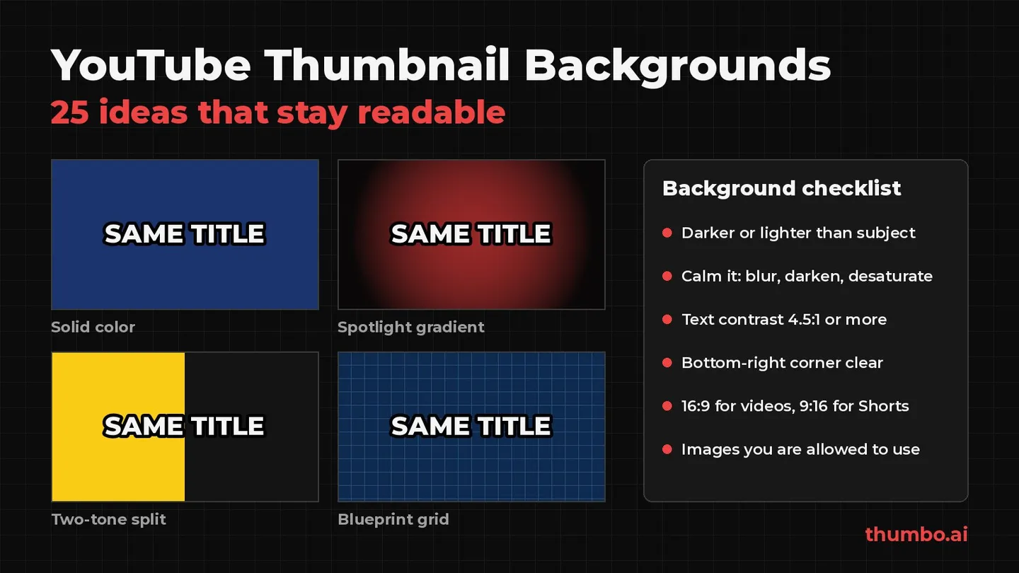
A YouTube thumbnail background has one job: make the subject and the words in front of it easy to see in a small, crowded feed. The best backgrounds are simple, darker or lighter than the subject, and clearly about the video’s topic. A busy photo with text dropped on top fails that test, while a blurred frame from the video, a spotlight gradient or a plain brand color usually passes.
This guide gives 25 background ideas grouped by type, shows which fit which niche, and covers what tool roundups skip: YouTube’s current size limits, readable text, backgrounds you are allowed to use, and how to test one background against another.
Table of Contents
- What a Thumbnail Background Has to Do
- Thumbnail Background Specs at a Glance
- 25 YouTube Thumbnail Background Ideas
- Which Background Fits Your Niche
- How to Keep Text and Faces Readable on Any Background
- Where to Get Backgrounds You Are Allowed to Use
- How to Make a Thumbnail Background Step by Step
- How to Test Two Backgrounds on YouTube
- Common Thumbnail Background Mistakes
- Thumbnail Background Action Plan
- FAQ
What a Thumbnail Background Has to Do
A thumbnail is read in layers. The eye lands on the brightest, highest-contrast shape first, usually a face or an object, then the words, and only then the scene behind them. The background sits at the bottom of that order, and it does three jobs from there:
- Separate. It pushes the subject and text forward by being darker, lighter, calmer or blurrier than they are.
- Signal the topic. A kitchen counter says cooking, a chart says money, a blueprint grid says tech, before anyone reads a word.
- Repeat. A background style used across uploads makes a channel recognizable in a subscriptions feed.
The common failure is a sharp, detailed photo: rich at full size, noise at phone-tile size.
Thumbnail Background Specs at a Glance
Every number below comes from YouTube’s custom thumbnails help page, read on October 14, 2026.
| Spec | Videos | Shorts |
|---|---|---|
| Aspect ratio | 16:9 | 9:16 |
| Recommended resolution | 3840 x 2160 | 2160 x 3840 |
| Minimum | 640 px wide | 640 px tall |
| Formats | JPG or PNG | JPG or PNG |
| File size, phone upload | 2 MB | Not available: custom Shorts thumbnails are added on a computer |
| File size, computer upload | 50 MB | 50 MB |
YouTube says the image “should be as large as possible” because it doubles as the embedded player’s preview image. Starting from a large source also keeps blurs and gradients smooth.
One Shorts detail matters for backgrounds: YouTube notes that “Vertical videos with 16:9 custom thumbnails will be replaced by an auto-generated 4:5 thumbnail” on the home, explore and subscription pages. A Short needs its own vertical background, not a wide one. YouTube also notes that “Custom thumbnails for Shorts are currently only available to add in YouTube Studio on a computer.”
25 YouTube Thumbnail Background Ideas
Solid Colors and Gradients
These are the safest backgrounds: nothing in them competes with the subject.
- 1. Solid brand color. One flat color used on every upload. It suits talking-head, commentary and education channels, and it makes the channel recognizable in a grid. It needs a strong subject, because the background adds no story of its own.
- 2. Two-tone split. The frame divided into two flat colors, one behind each half. It is a natural fit for comparisons and “this vs that” videos, with one option on each side.
- 3. Spotlight gradient. A bright center fading to dark edges, so the subject sits in a pool of light. It is one of the easiest ways to make a cut-out subject look lit rather than pasted.
- 4. Dark vignette. Darkened edges on any background. It pulls the eye toward the middle and gives white text more room to stand out near the corners.
- 5. Duotone photo. A real photo mapped to two colors, usually the channel’s brand colors. The scene still tells the topic, but the limited palette keeps it calm behind the subject.
Photos and Video Frames
Real images tell viewers what the video is about, but they need taming.
- 6. Blurred frame from the video. A frame from the actual footage, blurred until it reads as context, not detail. It is honest, on-topic and free, since the footage is already yours.
- 7. Shallow depth-of-field location shot. A photo of the real location, shot with the subject in focus and the background soft. Doing the blur in camera looks more natural than adding it later.
- 8. Fit with blurred edges. A vertical or square image placed in the middle of a 16:9 frame, with a blurred, zoomed copy of itself filling the sides. It works for phone footage and screenshots that would lose important parts if cropped.
- 9. Desaturated photo, full-color subject. The background turned gray or nearly gray, with the subject left in full color. Color becomes the signal for “look here”.
- 10. Darkened photo with a color overlay. A real scene with a dark or brand-colored layer on top, raised until the title passes a contrast check. It keeps the location and still lets white text read.
Textures and Patterns
Textures add character without adding objects to read.
- 11. Paper or cardboard. Warm and handmade, for crafts, DIY, study and planning videos.
- 12. Chalkboard or whiteboard. Says “lesson” instantly, for education, explainers and how-to content.
- 13. Concrete, brick or wood. A neutral, physical surface for workshop, home improvement and fitness videos. Keep the grain soft so it does not fight the text.
- 14. Grid or blueprint lines. Thin lines on a dark or blue field. A clean fit for tech, software, engineering and planning topics.
- 15. Halftone dots or film grain. A retro texture for music, culture and commentary channels. Keep it subtle, since fine dots can turn into visible noise after compression.
Niche Scenes
A scene that names the niche lets the background carry part of the message.
- 16. Desk and screen setup. A tidy desk, laptop or monitor glow for tech, productivity and business videos.
- 17. Kitchen counter from above. A cutting board, ingredients and a pan, shot from above, for cooking and recipe videos. The finished dish usually belongs in front, not behind.
- 18. Rising or falling chart. An upward or downward line for finance and investing videos. The chart must match what the video actually says, since YouTube’s thumbnail policy treats a thumbnail that misleads viewers as a violation.
- 19. House exterior or bright interior. A front door, a kitchen or a living room for real estate, renovation and home tour videos.
- 20. Gym floor or outdoor trail. For workout, running and fitness videos. Shoot or crop so equipment does not crowd the subject.
- 21. Landscape or street at golden hour. For travel and vlogs. A soft, warm scene behind the host says “trip” without needing a word.
Graphic and Abstract Backgrounds
These add energy, which is useful for announcements and reveals.
- 22. Light rays or color burst. Rays spreading out from behind the subject. Good for reveals, announcements and “I finally did it” moments.
- 23. Neon glow or light strips. Colored light on a dark field for tech, music and nightlife topics. It gives white or brightly colored text strong contrast.
- 24. Before and after split. The left half shows the “before”, the right half the “after”. It fits makeovers, renovations, edits and transformations.
- 25. Seamless studio backdrop. A plain paper sweep or studio wall for interviews, podcasts and product reviews, easy to reshoot the same way every episode.
Which Background Fits Your Niche
| Niche | Backgrounds that fit | Avoid |
|---|---|---|
| Education and explainers | Chalkboard, blueprint grid, solid brand color | Busy stock photos unrelated to the lesson |
| Tech and software | Desk setup, neon glow, blueprint grid | Generic “circuit board” art on every upload |
| Finance and investing | Rising or falling chart, dark spotlight gradient | Charts that promise results the video does not show |
| Cooking | Kitchen counter from above, blurred frame of the dish | Cluttered kitchens with no clear hero dish |
| Fitness | Gym floor, outdoor trail, concrete | Mirrors and crowded gyms behind the subject |
| Real estate | House exterior, bright interior, before and after | Dark, low-quality listing photos |
| Travel and vlogs | Golden hour landscape, blurred frame from the trip | Wide shots where the host becomes a tiny figure |
| Podcasts and interviews | Studio backdrop, two-tone split for guest and host | The full studio with every light and logo visible |
| Faceless channels | Duotone photo, textures, niche scenes | Backgrounds with no clear focal object |
Faceless channels lean on the background most; the faceless YouTube thumbnail ideas page covers layouts without a face.
How to Keep Text and Faces Readable on Any Background
Most background problems are contrast problems. A few checks fix nearly all of them:
- Measure contrast, do not eyeball it. The web accessibility standard, WCAG 2.2, sets a minimum contrast ratio of at least 4.5:1 for normal text and 3:1 for large text, where large means “at least 18 point or 14 point bold”. Thumbnail text is large at full size but tiny in a phone feed, so the 4.5:1 bar is the safer target for a title over its background.
- Add an outline or shadow when the background is busy. A dark stroke or a hard drop shadow separates letters from a photo where the color behind them keeps changing. The free thumbnail font previewer shows a title in 12 fonts with outline, shadow and caps toggles, so you can see which treatment survives.
- Calm the photo, not the text. Blur it, darken it, desaturate it or add a vignette before making the text bigger. A quieter background helps the face too.
- Keep the bottom-right corner empty. YouTube’s duration badge covers that corner in most places a thumbnail appears, so no key text or object should sit there.
- Check it small. Shrink the finished thumbnail to the size of a phone tile. If the subject merges into the background, the background needs more separation.
Color choice is half of contrast. The guide to the best color for YouTube thumbnails goes deeper on which palettes separate well, and YouTube thumbnail text covers how many words a background can carry.
Where to Get Backgrounds You Are Allowed to Use
A background copied from an image search is someone else’s photo. These sources are safer:
| Source | What you can do | Watch out for |
|---|---|---|
| Your own video frames | Anything, it is your footage | Pick a sharp frame before blurring |
| Your own photos | Anything, including the location shot for each video | Shoot a few on location while filming |
| Unsplash | Use free, including commercially, without attribution | Cannot sell the images without significant modification |
| Pexels | Use free, modify, no attribution required | No implied endorsement by people or brands in the image |
| Plain color, gradient or texture you make | Anything | Nothing, this is the lowest-risk option |
| AI-generated scene | Depends on the tool’s terms | Do not copy a real person’s likeness or a brand |
The Unsplash license grants “an irrevocable, nonexclusive, worldwide copyright license” to download, modify and use its images “for free, including for commercial purposes, without permission from or attributing the photographer or Unsplash.” Its two restrictions: “Images cannot be sold without significant modification” and no compiling images “to replicate a similar or competing service.”
The Pexels license says “All photos and videos on Pexels are free to use” and “Attribution is not required.” It also lists what is not allowed, including: “Identifiable people may not appear in a bad light or in a way that is offensive” and “Don’t imply endorsement of your product by people or brands on the imagery.” For thumbnails, the second rule matters most: a recognizable person next to your title can read as an endorsement.
Whatever the source, the background still has to follow YouTube’s thumbnails policy. The list of things a thumbnail may not show includes “Violent imagery that intends to shock or disgust”, “Graphic or disturbing imagery with blood or gore” and “A thumbnail that misleads viewers to think they’re about to view something that’s not in the video.” A dramatic background that has nothing to do with the video falls under that last rule.
How to Make a Thumbnail Background Step by Step
- Pick the type. Choose one of the 25 ideas that fits the video and your niche, ideally one you can repeat across uploads.
- Get the source. Grab a sharp frame from your footage, shoot a location photo, or start a flat color or gradient.
- Fit it to 16:9. The free YouTube thumbnail resizer crops any image to the 1280 x 720 thumbnail size in the browser. Its Fit mode keeps the whole image and fills the empty space with a blurred, zoomed copy of the same image, which is background idea 8 in one click.
- Calm it down. Blur, darken, desaturate or vignette until the subject and text clearly stand out.
- Place the subject. A face or the main object, large, away from the bottom-right corner.
- Add the text. Three to five words in a heavy font, with an outline or shadow if the background is a photo.
- Check the contrast and the small size. Shrink it to a phone-tile size and check that the title still reads.
- Export and compress. JPG at 16:9. If you upload from a phone and the file is over 2 MB, the free image compressor shrinks it under the limit in the browser, without uploading the file.
Building every layer by hand takes time on each upload. Thumbo’s AI thumbnail generator creates the whole 16:9 thumbnail, background included, from the video’s topic and a style, so the background matches the subject and text instead of being pasted behind them.
How to Test Two Backgrounds on YouTube
The only reliable way to know if a new background helps is to test it on real viewers. YouTube Studio has a built-in A/B test for titles and thumbnails: “Creators can test and compare up to 3 different titles and thumbnails.” The details that matter for a background test:
- The winner is picked by watch time, not clicks. At the end of the test, “the title or combination of title and thumbnail with the highest watch time will be shown to all viewers.”
- Make the versions different enough. YouTube warns that “Testing titles and thumbnails that are too similar to each other can cause tests to run for longer.” A spotlight gradient against a blurred location shot is a real test; two shades of the same blue is not.
- Upload full-size images. “If the resolution of any thumbnail is lower than 720p (1280 x 720), all experiment thumbnails will be downscaled to 480p (854 x 480).”
- Know the limits. The feature runs on a computer in YouTube Studio, it is not available for Shorts, and a test “can take a few days or up to 2 weeks to complete”.
Change only the background between versions, or the result cannot tell you what mattered.
Common Thumbnail Background Mistakes
| Mistake | What happens | Fix |
|---|---|---|
| Sharp, detailed photo behind text | Text and face blend into the noise at small sizes | Blur, darken or desaturate the photo |
| Same color as the text | Title disappears | Pick text and background with at least 4.5:1 contrast |
| Image from a search engine | You may not have the rights to use it | Use your frames, your photos or a licensed source |
| Dramatic scene not in the video | Can count as a misleading thumbnail | Use a scene that matches the video |
| Key detail in the bottom-right corner | Covered by the duration badge | Keep that corner empty |
| Wide 16:9 background on a Short | Replaced by an auto 4:5 thumbnail on some pages | Make a vertical 9:16 version |
| New background style on every upload | No recognizable channel look | Pick two or three styles and repeat them |
Thumbnail Background Action Plan
- Pick two or three background styles from this list that fit your niche, and use them consistently.
- Use your own footage or photos first, and Unsplash or Pexels within their licenses when you need stock.
- Calm every photo background with blur, darkening or desaturation before adding text.
- Check the title against the background for 4.5:1 contrast and at phone-tile size.
- Keep the bottom-right corner clear and export at 16:9, or 9:16 for Shorts.
- Test a new background style against your current one with YouTube’s A/B test before switching the whole channel.
FAQ
What is the best background for a YouTube thumbnail?
One that is clearly darker or lighter than the subject, simple enough to read at phone size and related to the video’s topic. A blurred frame from the video, a spotlight gradient or a solid brand color are safe starting points for most channels.
What size should a YouTube thumbnail background be?
16:9, with YouTube recommending 3840 x 2160 and a minimum width of 640 pixels. The standard HD size, 1280 x 720, also works and is easier to keep under the 2 MB phone limit. Shorts thumbnails are 9:16, recommended at 2160 x 3840.
Can I use any image from Google as a thumbnail background?
No. Images in search results belong to their owners. Use your own footage and photos, or a free library with a clear license such as Unsplash or Pexels, and follow the license’s restrictions.
Should a thumbnail background be blurred?
When it is a photo with a lot of detail, usually yes. A blur keeps the scene recognizable while letting the face and text stand out. Solid colors, gradients and calm textures do not need it.
How do I make text readable on a busy background?
Calm the background first with blur, darkening or a vignette, then add a dark outline or drop shadow to the text. Aim for a contrast ratio of at least 4.5:1 between the text and what is directly behind it.