Faceless channels live or die by packaging. A creator who films their face gets recognized in the feed by an expression; a faceless channel gets recognized by its covers - or not at all. There is no host to build familiarity, so the thumbnail carries the entire first impression: the niche, the tone, and the promise of the next twenty minutes. That is not a handicap. Some of the biggest channels on YouTube have never shown a human being.
What replaces the face is a short list of visual anchors that trigger the same stop-the-scroll reflex: a single hero object, a dramatic scene, hands doing something, a silhouette, or type bold enough to be the image itself. Every winning faceless cover you have ever clicked was built from those parts - the difference between channels is only how deliberately they use them.
Below you get the universal techniques first, then concrete formats for the faceless niches that actually work on YouTube - true crime, finance, tech, horror, gaming, music, education and cooking. Steal freely; these are formats, not property.
This page is faceless on purpose. Want the full list, including face-led formats? Browse the companion hub of YouTube thumbnail ideas.
Technique 01 · 6 ideas
Universal faceless thumbnail techniques
These six formats work in any niche because each one gives the eye a single anchor to land on. Master one and you can package almost any video without a face - everything later in this list is one of these six, adapted to a specific channel type.

- Object-as-hero. Pick the one object the video revolves around - the pill bottle, the hard drive, the eviction notice - and light it like a movie prop on a dark, clean background. One object, one light source, nothing competing. At sidebar size, a single lit object out-reads any busy collage.
- POV hands. Show hands doing the thing: pouring, soldering, counting cash, slicing. Hands add a human pulse without an identity, and they aim the viewer’s eye straight at the action. Frame it from the viewer’s own perspective so the click feels like stepping into the scene.
- Silhouette or back of the head. A figure from behind, a shadow against a bright window, a hooded outline on a ridge. You keep human presence and mood while staying anonymous - and a silhouette lets viewers project themselves into the frame, which is exactly what you want them doing.
- Text-led covers. Make three or four words the entire design: huge type, hard contrast, one accent color. This wins when the claim is stronger than any picture - “I was wrong”, “$0 to $10K”, “Banned in 12 countries”. Treat the words as a poster, not a caption.
- 3D and illustrated scenes. An illustrated or rendered scene signals effort and gives you total control: impossible camera angles, exaggerated scale, colors that match your brand every single upload. Animation, explainer and lofi channels run entire libraries on this look without one photograph.
- Dramatic environments. Let a place be the protagonist: an abandoned mall, a container port at dawn, a server hall glowing in the dark. Go wide and cinematic with one strong light condition. Environments promise scope - the feeling that the video will take the viewer somewhere.
Before you design anything, study the faceless channels already winning in your niche - save their covers full-size with the free YouTube thumbnail downloader.
Technique 02 · 4 ideas
Documentary and true-crime thumbnail ideas
True crime and documentary narration are the proof that faceless scales: many of the genre’s biggest channels are a voice, archival footage and ruthless packaging. The covers sell one thing - an unresolved question - and they do it with evidence, places and scale instead of a presenter.

- The evidence object. Put the case’s key artifact alone on black: the cassette tape, the burner phone, the one photograph that never fit the timeline. Add a short label in typewriter-style type. It reads like the cold open of the video, frozen into a single frame.
- The place where it happened. An empty motel corridor, a farmhouse at dusk, police tape across a perfectly normal front door. Ordinary places framed with dread out-click gore every time - and they keep the cover advertiser-safe, which matters in this genre.
- The tiny figure. Shrink a person to a speck inside a vast scene - one traveler under a wall of empty towers, one boat on a black ocean. Scale contrast says “an individual against something enormous”, which is the plot of half the genre. No readable face required.
- The redacted document. A dossier, a map or a headline with key lines blacked out. Redaction is a built-in curiosity gap: viewers click to read what you crossed out. Leave exactly one legible phrase as the hook and hide the rest.
Publishing in this genre every week? There is a dedicated documentary thumbnail maker.
Technique 03 · 3 ideas
Finance and business thumbnail ideas
Finance is one of the best faceless niches on YouTube because the subject matter is already visual - money, charts, cities, logos - and the audience clicks on stakes, not personalities. Your cover needs one number, or one symbol of wealth going up, down, or up in flames.

- Money in motion. Not a static stack of bills - money doing something: burning, shredded, raining, sealed behind vault steel. The verb is the story. “Your savings, on fire” needs no face and no second line of text to be understood at a glance.
- The chart cliff. One line chart with a violent move, drawn huge across the whole frame - the drop, the spike, the flatline. Add the ticker or the year as the only text. Chart-literate viewers read the entire story in a tenth of a second.
- The empire shot. A skyline, a headquarters, a trillion-dollar mega-project at golden hour with one bold claim stamped over it. City-scale imagery signals macro storytelling - the natural cover for “how X got rich” and “why X collapsed” videos.
Charts, one-number covers and newsroom frames, with or without a host, continue on the finance thumbnail maker.
Technique 04 · 3 ideas
Tech and AI thumbnail ideas
Tech viewers click on artifacts: devices, interfaces, logos, robots. The niche’s biggest faceless channels cover product wars and AI news with nothing but hardware and iconography - which means generated covers fit natively here. The subject was never going to pose for a photo anyway.

- Logo battle. Stage the competition as objects: one app icon crowned and glowing while its rivals lie cracked in the rubble. Verdict imagery - winner and losers readable in one glance - is the fastest way to package comparison and “X just killed Y” videos.
- The ominous device. Light a phone, a chip or a robot hand like a thriller villain: dark background, one cold rim light, framed slightly too close. It carries privacy stories, teardown exposés and “what this thing actually does” videos better than any shocked face.
- The automated room. An office of glowing monitors with nobody in the chairs, a warehouse of robots moving in formation, a data center humming at night. Human-free spaces are the visual shorthand for automation stories - the absence of people is the message.
Product hero shots, versus verdicts and AI-news scenes are broken down on the tech thumbnail maker.
Technique 05 · 4 ideas
Horror and scary-story thumbnail ideas
Horror narration channels are almost all faceless - and their covers prove no genre needs a face less. Fear works through implication: what the thumbnail almost shows beats anything it could show outright. Keep the palette muted, break one detail, and leave enough darkness for the viewer’s imagination to do the work.
- The wrong family photo. A perfectly normal snapshot with one detail broken - an extra reflection, a figure in the window, a shadow pointing the wrong way. Viewers zoom in, doubt themselves, and click to settle the argument with their own eyes.
- The door left open. A hallway, a basement stair, a closet door open exactly a hand’s width into pure black. Negative space is the monster here. It also leaves clean room for a small, quiet title treatment - loud fonts break the spell.
- The camcorder frame. REC dot, timestamp, battery icon, a grainy night-vision green cast. Found-footage framing signals “this really happened” for analog horror, backrooms and caught-on-camera stories - the interface is the atmosphere.
- The object that should not be there. A child’s toy in the middle of a forest trail, a rotary phone in a sealed room, a chair facing a wall. This is object-as-hero tuned for dread: the object is mundane, the placement is impossible, and the caption stays out of its way.
More formats for scary content - including horror gaming - live on the horror thumbnail maker.
Technique 06 · 3 ideas
Faceless gaming thumbnail ideas
Plenty of huge gaming channels never show a face - lore explainers, ranking channels, no-commentary showcases. Your character, the map and the loot do the talking; the craft is staging them like a poster instead of pasting in a raw screenshot.
- The loot shrine. The item the video is about - the sword, the car, the one-in-a-million drop - floating on a dark background under god rays. Treat virtual items like museum pieces and collectors click reflexively; rarity deserves lighting.
- Back of the character. Your avatar seen from behind, facing down the boss, the storm, the unexplored map. It is the gaming version of the silhouette: presence and stakes with zero identity - and it matches how the player actually experiences the game.
- The map secret. A zoomed map fragment with one location circled in red, coordinates half-visible at the edge. It carries secrets, lore spots and “they hid this in plain sight” videos - a map is a promise of specific, copyable knowledge.
Face-led gaming formats (reactions, versus splits) are covered separately on the gaming thumbnail maker.
Technique 07 · 3 ideas
Music and lofi thumbnail ideas
Lofi streams, ambient mixes and sample-history channels are faceless by design, and their covers behave like album art: the image sets the mood before the first note plays. Consistency beats novelty here - the same illustrated world, upload after upload, becomes the brand.
- The scene loop. An illustrated room at night: desk lamp, rain on the window, a cat asleep on the amp. This is lofi’s native language - design your own room, palette and recurring props so every upload is recognizably yours from across the feed.
- Type as texture. For mixes and genre deep-dives, make the genre name the artwork: oversized type with gradient or grain, no photo at all. It reads like a record sleeve, scales down perfectly, and sidesteps the “what image even fits a playlist” problem.
- The instrument portrait. One instrument shot like a person: a worn Stratocaster on a stand in stage haze, a drum machine under neon. Gear carries era and story on its own - no musician required, no licensing headache either.
Covers for artists, mixes and music stories have their own page - the music thumbnail maker.
Technique 08 · 3 ideas
Education and explainer thumbnail ideas
Explainer channels turned facelessness into a superpower: diagrams, maps and visual metaphors carry more information than any face could. The best education thumbnails compress the whole lesson into one image the viewer almost understands - the click closes the gap.
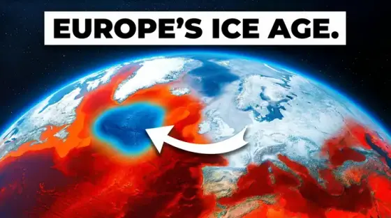
- The annotated planet. Take the biggest possible view - a globe, a continent, a cross-section of the crust - and add one arrow or highlight pointing at the anomaly. “Something is wrong right here” is an irresistible setup for an explainer.
- The visual equation. Two or three icons and an arrow: virus plus airport, then a world map turning red. If a viewer can almost read your causal chain in one second, they click to have it confirmed. Keep every icon flat and bold so it survives the scale-down.
- The impossible cutaway. Slice open the thing you are explaining - the volcano, the aircraft carrier, the human knee - in clean textbook 3D. Cutaways signal density: this video contains actual answers, not ten minutes of padding around one fact.
Teaching on camera too? Face-led lesson formats are on the education thumbnail maker.
Technique 09 · 3 ideas
Cooking thumbnail ideas without a face
Food might be the easiest niche to go faceless: the dish is the star and appetite is the click. Overhead-and-hands framing built entire channel empires without a single face on camera. Your cover has one job - make one plate look inevitable.
- Hands over the board. POV hands at the decisive moment: the cheese pull, the sear, the first slice releasing steam. Motion plus food is the strongest appetite trigger a thumbnail can carry - freeze the exact frame where gravity is still working.
- The cross-section. Cut the finished dish and shoot the inside: the layers of a lasagna, the blushing center of a steak, the molten core of a fondant. A cross-section reads as proof the recipe works - the outside can lie, the inside cannot.
- The ingredient lineup. Lay the three to five ingredients on one side and the finished dish on the other. It is a promise of simplicity - “this, into this” - and it doubles as the recipe’s entire pitch for viewers deciding whether to attempt it tonight.
Recipe, restaurant and food-challenge formats continue on the cooking thumbnail maker.
Shipping the cover
However you build it, the upload spec is the same: 1280×720, 16:9, under 2 MB. If you assemble a cover by hand, crop it to the exact size with the free YouTube thumbnail resizer and squeeze it under the upload limit with the 2 MB compressor - both run in your browser, no account needed. Every free utility and niche maker lives on the free tools page.