You finish a solid upload, then stare at the description box and type the same thing you typed last time, a quick intro, a link dump, maybe a sponsor line if you remember it. That habit feels efficient, but it usually leaves the YouTube video description doing none of the jobs that matter.
A description has to help YouTube understand the video, give a viewer a reason to keep watching, send that viewer to the next action you want, and stay clean enough to survive policy review. YouTube’s own guidance says descriptions should be unique, and it recommends using the Research tab or Keyword Planner to find popular keywords and synonyms, which is a good reminder that the box is not dead space, it’s working metadata. The opening lines matter most because mobile users see only the start before the cut, so the first sentence is doing real work long before they hit “more” YouTube’s description guidance.
If you want the mechanics behind how descriptions interact with search and watch surfaces, the broader ranking system matters too. The cleanest way to think about it is through the full discovery path, which is why a description should fit the way YouTube already surfaces text across the platform, not fight it. How the YouTube algorithm works is the right context here, because description text doesn’t exist in isolation.
Table of Contents
- Why Your YouTube Video Description Still Matters in 2026
- The Description Structure That Holds Up Every Time
- Where Keywords Actually Belong and Where They Don’t
- Timestamps and Chapters as Quiet SEO
- Description Templates for Shorts, Tutorials, and Sponsored Videos
- CTAs, Links, and Sponsor Disclosures Without the Spammy Feel
- Your Reusable Description Checklist Before You Hit Publish
Why Your YouTube Video Description Still Matters in 2026
A creator can have a strong thumbnail, a sharp title, and a video that holds attention, then lose the description to a copied intro and three random links. That wastes one of the few places where the platform and the viewer read the same text for different reasons.
The four jobs it has to do
First, it helps YouTube classify the video. Second, it gives a viewer a fast summary while they decide whether to keep watching. Third, it points that viewer to the next step, whether that is another video, a newsletter, a product, or a resource. Fourth, it carries sponsor disclosure, compliance language, and link context without forcing that clutter into the video itself.
That is why the description should not turn into a link graveyard. A messy block of sponsor copy, generic greetings, and repeated keywords makes scanning harder and gives people an easy reason to leave. YouTube’s guidance also warns against reusing near-duplicate descriptions across uploads, because unique descriptions are easier to find in search and fit the platform’s own advice YouTube’s description guidance.
Practical rule: If the first two lines would not work as a short summary on their own, the description is probably doing too little for discovery and too much for clutter.
Those four jobs pull in different directions, which is why one generic paragraph rarely covers them. Search needs topic signals, the watch page needs a fast summary, the next click needs a clean handoff, and the sponsor line needs to stay legible instead of buried. A creator who separates those jobs instead of packing them into one generic paragraph usually ends up with a description that feels more intentional and gives the viewer less friction before the next action.
The Description Structure That Holds Up Every Time
A reliable YouTube video description follows the same spine whether the upload is a tutorial, a commentary piece, a Short, or a sponsored segment. The order matters because YouTube and viewers both skim from the top down, and the opening lines carry the most visibility on mobile.
Start with the keyword and the promise
Put the primary keyword in the first sentence, then add a compact summary in the next three to five sentences. That opening should read like a mini synopsis, not a sales pitch. It is the fastest way to tell the viewer what they are about to get, while keeping the text readable when only the first lines are visible before truncation.
A good opening also does different work depending on the format. A long-form tutorial needs enough context to rank and retain, while a Short usually needs a tighter summary because the viewer already knows the clip is fast and self-contained. Sponsored videos need the same clarity, plus disclosure language that does not bury the point of the segment.
Put useful context next
After the summary, add the block that directly helps the viewer. For long-form uploads, that usually means timestamps, a short resource list, and any must-see links. For lighter uploads, the resource block can be much smaller. The logic stays the same, keep the useful material close to the top and the promotional material lower down.
Use this section to support the next viewer decision. A timestamp line helps someone jump to the exact part they want. A resource link helps a tutorial feel complete. A sponsor note helps the viewer understand why a product is mentioned without making the description feel like a pitch deck.
Close with the action you want
The bottom of the description should contain one clear CTA, not a pile of competing asks. If the goal is watch time, send viewers to the next video. If the goal is list growth, point them to the form. If the goal is a product click, make that link obvious and leave the rest of the text clean.
YouTube allows up to 5,000 characters in the description field, but that ceiling does not mean the box should be used like a full article. Boston University’s YouTube SEO guide puts a workable floor under it instead: aim for at least 250 words and use your keyword 2 to 4 times, which is usually enough to add context without drifting into stuffing BU SEO best practices.
Where Keywords Actually Belong and Where They Don’t
Keyword placement is where most descriptions get ugly. People either avoid the phrase entirely and hope YouTube figures it out, or they repeat the same term until the paragraph reads like an old SEO checklist.
A simple placement rule
Use the primary keyword once in the first sentence. Use the secondary keyword once in the summary. After that, rely on natural variations and plain-English phrasing. That keeps the description readable while still giving the platform enough context to understand the topic.
A description should sound like a concise synopsis, not a tag block. The reason is simple, viewers can tell when text was written for a crawler instead of a person, and the same habit that annoys viewers also makes the copy harder to scan on mobile. The same BU guide is specific about where the keyword goes: inside the first 25 words, or the first two sentences, rather than sprinkled through every paragraph.
Before and after
Weak version:
“youtube video description tips, youtube video description, best youtube video description tips for youtube video description growth. Learn youtube video description best practices in this youtube video description guide.”
Better version:
“This YouTube video description gives your upload a clearer topic signal, a stronger opening summary, and a cleaner path to the next click. It works best when the first sentence names the topic, the next lines explain the value, and the rest of the copy supports the viewer instead of repeating the same phrase.”
The second version is readable, specific, and easier to trust. It still includes the core phrase, but it doesn’t force it into every sentence. That matters because the description is part of the viewer’s first impression, not just a hidden metadata field.
Duplicate descriptions are the other common mistake. Reusing near-identical copy across uploads saves time in the moment, but it gives every new video the same weak framing. If the topic shifts, the wording should shift too, even if you keep the same basic structure.
Timestamps and Chapters as Quiet SEO
Timestamps do more than help impatient viewers jump around. They create short, keyword-rich labels that organize the video for humans and give YouTube more text to work with on the watch page.
Use chapter labels like headings
The cleanest format is a timestamp followed by a short label, starting with 0:00 for the intro and then moving through the main topics in order. Chapters only switch on when the list follows those rules, so the first entry has to be 00:00, there have to be at least three entries in ascending order, and each segment has to run at least 10 seconds BU SEO best practices. The labels should be specific enough to describe the segment, but short enough to scan fast. A generic label like “Part 1” doesn’t help anyone, while a label that names the topic gives the viewer a better clue about what’s inside.
For longer videos, timestamps add navigability and can surface as useful section labels. For short clips, especially Shorts, which run up to three minutes, they are usually unnecessary clutter. If the viewer can’t realistically skip around, don’t force chapter formatting into a format that doesn’t need it.
| Weak label | Strong label | Why it works |
|---|---|---|
| Intro | 0:00 What this video covers | Says what the opening actually does |
| Section 1 | 1:42 Keyword placement rules | Names the topic in plain language |
| Tips | 4:10 Description structure | Gives the viewer a real reason to jump there |
A good chapter list reads like the outline of the video itself. That’s useful because it helps the description become a navigational surface, not just a paragraph under the player. If the upload is long enough to benefit from chapters, the labels should feel like micro-headings, not filler.
Description Templates for Shorts, Tutorials, and Sponsored Videos
A YouTube video description should change with the format. Shorts need speed, tutorials need structure, and sponsored uploads need disclosure discipline. Treating them the same is how creators end up with descriptions that are either too thin or too noisy.
Shorts
For Shorts, keep the description tight. Lead with the topic, add a small number of relevant hashtags, and use one clear CTA if there’s a real next step. The goal is to support quick discovery without burying the hook under extra text. Short-form guidance tends to favor lean formatting, since the video itself is already doing most of the work.
Tutorials and long-form videos
Longer tutorials need more context. Use the opening lines to frame the lesson, then add timestamps, resources, and any supporting links that help a viewer implement what they just learned. This is also where the description can reinforce the video’s structure, especially if the chapters match the main steps or problem-solving sequence.
Sponsored uploads
Sponsored videos have a different job again. The description needs disclosure language, the sponsor link or tracking link, and enough context that the viewer understands the relationship without feeling manipulated. The cleanest version keeps the disclosure visible and brief, then moves the noisier promotional language into a pinned comment if needed.
Keep the description lean when the sponsor wants three calls to action. The more crowded the block gets, the more it starts to read like an ad instead of a recommendation.
A strong internal rule is to reuse the structure, not the wording. Keep the layout patterns that work, but rewrite the opening line and CTA so each upload reflects its own intent. That keeps the channel from looking automated and helps you avoid the stale, duplicated feel that sinks so many otherwise good videos.
Internal resources can also help separate short-form from long-form planning. How to create a YouTube Short is useful if you’re deciding how much context a Short really needs versus a tutorial.
CTAs, Links, and Sponsor Disclosures Without the Spammy Feel
The bottom of the description is a conversion surface, not a dumping ground. If you treat it like a brochure, viewers stop trusting it. If you treat it like a clean handoff, the CTA feels like a natural next step.
The three CTAs that actually belong there
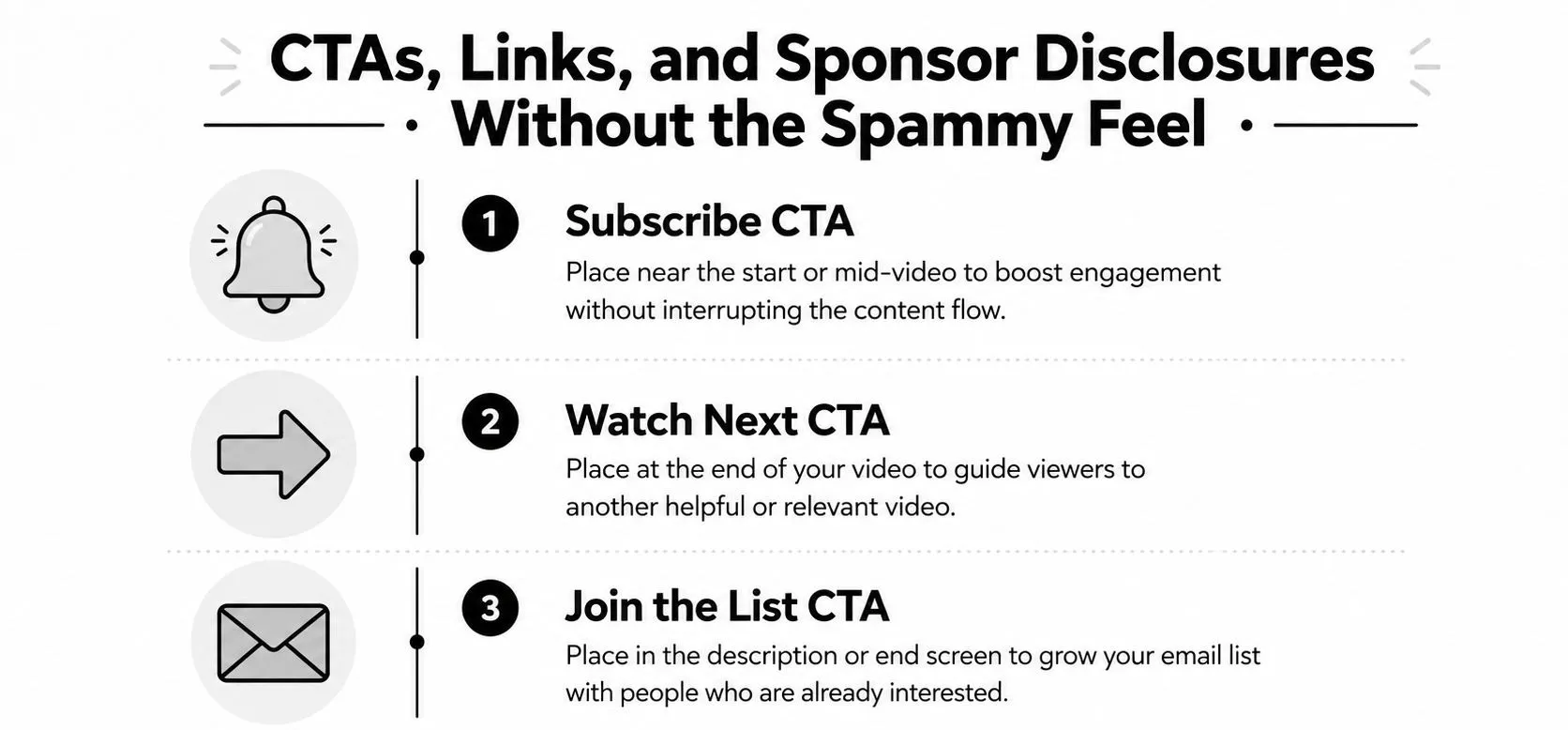
Use subscribe when the channel itself is the product. Use watch next when you want to build session time. Use join the list when you want to move attention off-platform. Those are the only three calls to action that usually need a permanent place in the description, and even then, only one should lead.
Affiliate links belong close to the relevant mention, not buried under five unrelated links. If the viewer has to hunt, they won’t. Sponsor disclosures should be plain and visible, because hiding them at the bottom defeats the point and can make the whole description feel evasive.
Pinned comments are useful for the noisy extras. If you need to post a discount code, a second affiliate link, or a longer promotional note, move it there and keep the description itself readable. That handoff keeps the main text cleaner and reduces the sense that every line is competing for attention.
For creators focused on growth, the CTA should fit the channel strategy. A strong description supports subscriptions, but it also supports trust. Gaining YouTube subscribers becomes easier when the viewer can see a clear path forward instead of a cluttered block of links and sales language.
Your Reusable Description Checklist Before You Hit Publish
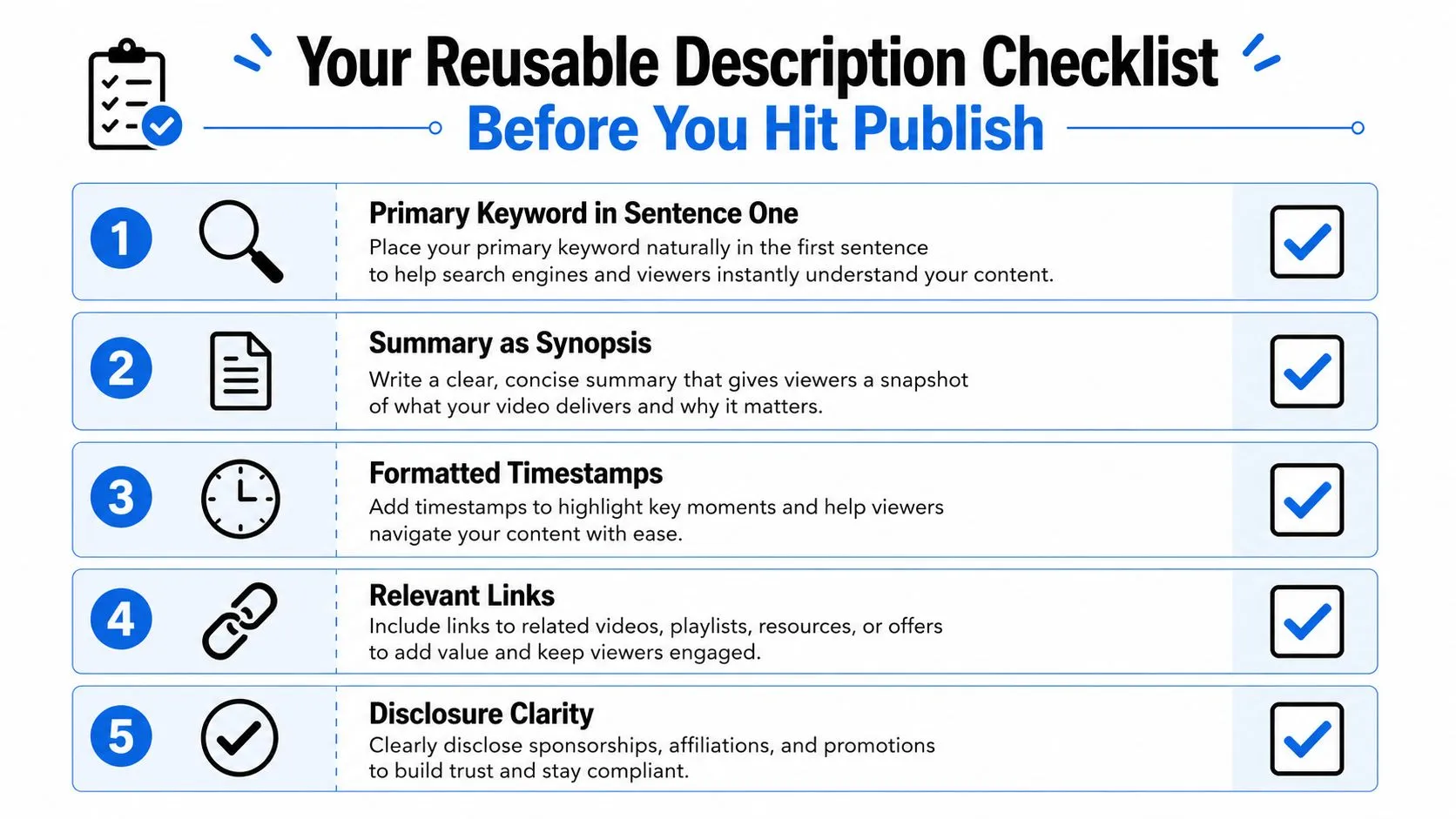
Before you publish, check five things. The primary keyword is in sentence one, the summary reads like a real synopsis, timestamps are formatted correctly if the video needs them, links are relevant and tracked, and disclosures are visible where they should be. If the CTA doesn’t match the video’s actual goal, rewrite it.
The best habit is simple: keep a running doc of the description you used and the result that upload produced. After a while, patterns show up fast, and you stop guessing which wording helps the video and which wording just fills space.
A sharp YouTube video description works best next to packaging that earns the click in the first place. Thumbo AI generates YouTube-ready thumbnails from a plain description or a reference image, so the visual side of the upload takes minutes instead of an evening. Write the description once it is clear what the video is promising, and the two will pull in the same direction.