You’ve got a Roblox experience that plays well, the screenshots look clean in Studio, and yet the page still gets that annoying pattern, plenty of impressions, not enough clicks. That usually means the build isn’t the problem. The thumbnail is.
A Roblox thumbnail has to do two jobs at once. On Roblox, it has to sell the experience inside a 1920×1080 publishing workflow with measurable thumbnail performance fields like Impressions, Qualified Plays, Average Playtime, Qualified Play Through Rate, and Winning Segment from Roblox’s Creator Hub thumbnail analytics documentation. On YouTube, it has to survive a different feed, where the thumbnail is judged as a click asset before anyone gives your video a chance. If you’re serious about how to make a Roblox thumbnail, you’re really building two related images, one for Roblox discovery and one for YouTube CTR, and they need different instincts even when they share the same source art.
Table of Contents
- Why Your Roblox Thumbnail Is the First Conversion Test
- Setting Up Roblox Studio and the UGC Thumbnail Tool
- Designing the Image for One Clear Focal Point
- Generating Thumbnails Faster With AI Tools Like Thumbo AI
- Compositing, Text, and Color in Your Photo Editor
- Export Settings and How to Test What Works
- Putting It All Together for Both Roblox and YouTube
Why Your Roblox Thumbnail Is the First Conversion Test
A lot of creators ship a strong game, then paste a random screenshot onto the page and wonder why the numbers stall. That’s backwards. The first thing players judge is the image, and Roblox now treats that judgment as part of a measurable optimization loop, not just decoration, because the platform’s thumbnail workflow ties choices to fields like Winning Segment and Qualified Play Through Rate Roblox Creator Hub thumbnail publishing docs.
The thumbnail is where the page starts earning its keep
The old mental model was simple. Build the game, publish the icon, hope it works. The current reality is harsher and more useful. Roblox’s docs explicitly frame thumbnail choice as an optimization problem, where the Winning Segment is the thumbnail with the highest play-through rate during personalization Roblox Creator Hub thumbnail publishing docs. That means your image isn’t just art, it’s a conversion test.
The same logic applies to YouTube. If your Roblox experience also lives as a video, the thumbnail has to earn the click in a crowded feed, which is why CTR-focused guides like this one on what counts as a good YouTube click-through rate matter even when you’re only thinking about a game page. The image gets judged before the description, before the title, and long before someone plays.
Practical rule: if the thumbnail can’t explain the experience in one glance, it’s not finished.
Two specs, two audiences, one source scene
For Roblox gallery work, the practical baseline is 16:9 at 1920×1080, with supported formats of .jpg, .gif, .png, .tga, or .bmp, in Roblox’s own documentation Roblox Creator Hub thumbnail publishing docs. For YouTube, 1280×720 is the floor rather than the target: it is the minimum resolution, the width must never drop below 640 pixels, and the recommended resolution was raised to 3840×2160 in March 2026, as the YouTube thumbnail size spec sets out. You don’t need two completely separate concepts, but you do need two crops, two contrast decisions, and two levels of text aggression.
That’s where most creators lose time. They make one render, then force it into every slot. The better approach is to think of the Roblox page as the conversion step that proves the concept, and the YouTube thumbnail as the attention step that expands it. Same universe, different job.
Setting Up Roblox Studio and the UGC Thumbnail Tool
Which tool you open depends on what you are capturing, and Roblox documents the two paths separately. For a Marketplace accessory, install the Custom Thumbnail Tool plugin, select the Accessory in the Explorer window, then launch the UGC Thumbnail Tool from the Plugins tab. That workflow is built around adjusting the camera before you click Accept, and the controls are the ones that matter in real capture work, W/A/S/D to pan, right-click to rotate, middle-click to pan, and Shift for fine adjustment custom thumbnail workflow. For an experience thumbnail, the documented route is Studio’s free camera mode: start a solo playtest, press Left Shift + P, then move with W/A/S/D, use Q/E for down and up, hold Shift to change camera speed, and drag with the right mouse button to look around Roblox Creator Hub thumbnail publishing docs.
Lock the camera before you think about styling
A thumbnail falls apart fast if the frame is lazy. Start by making the subject large enough that the silhouette reads right away, because feed-size images punish weak framing. Roblox community guidance recommends lowering the camera field of view from the default 75 to roughly 25 to 40 for that zoomed, dramatic look, which helps the subject hold up under compression and scroll speed Roblox community thumbnail guidance.
That narrower view pulls the player closer to the subject and cuts dead space out of the frame. It also gives you more control once you add text or overlays in an editor.
Use the template like a production file, not a sketch
Roblox’s documentation says an experience thumbnail should be 16:9 and ideally 1920×1080 so it displays in high resolution across the Roblox site and app, with supported formats of .jpg, .gif, .png, .tga, or .bmp Roblox Creator Hub thumbnail publishing docs. Treat that file as the master, and get the ratio right at the source, because anything uploaded at another aspect ratio is stretched to 16:9 rather than letterboxed. Start with the full canvas, not a tiny crop that gets stretched later, because softness shows up quickly once the image is compressed.
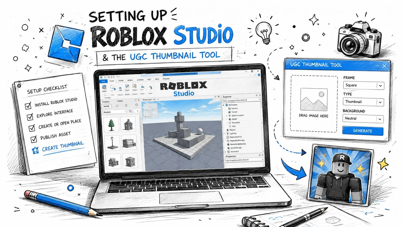
The export stage matters before you leave Studio, because the file still needs to behave in a photo editor and load cleanly afterward. Keep the camera movement deliberate, save a clean render, and resist the urge to fix weak framing with heavy effects. The raw frame should already do most of the work, and the rest is polish.
For the layout side, graphic design fundamentals for thumbnails matter here because spacing, contrast, and hierarchy decide whether the capture survives Roblox’s preview grid and YouTube’s smaller feed crop.
Designing the Image for One Clear Focal Point
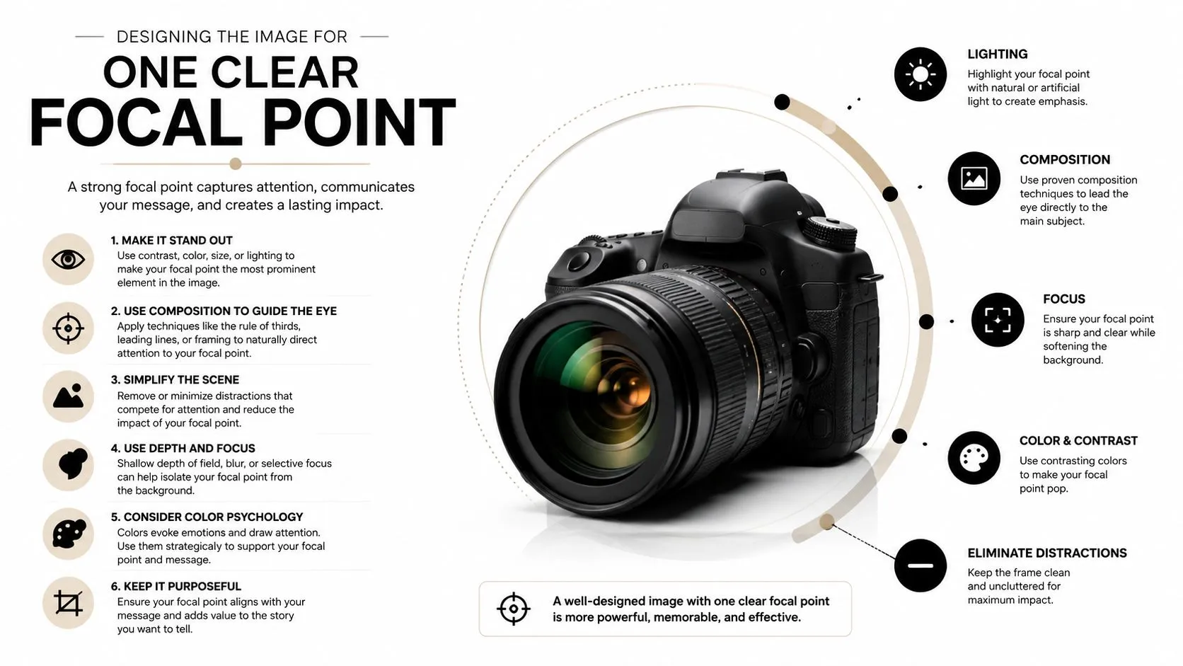
Most thumbnails fail because they try to say three things at once. A good Roblox thumbnail usually says one thing very loudly. That means one subject, one action, one simplified background, and a frame that still makes sense when the image is small enough to sit in a feed beside everything else.
Build around the subject, not the scene
A centered avatar mid-emote, a vehicle cutting through a clean arena, or a horror character standing in an almost empty corridor all work because the viewer knows where to look. The scene can be rich, but the message has to be simple. Roblox community guidance also recommends strong lighting and shadows to separate the character from the background, which helps the silhouette survive at small sizes Roblox community thumbnail guidance. A rim light or a hard outline is the usual way to get that separation.
Clutter is expensive. Every extra prop competes with the click. If the player can’t identify the emotional hook in a split second, the frame is doing too much and saying too little.
Check readability where players actually see it
Designing at full size is fine, but you need a sanity check at around 200 pixels wide because that’s much closer to the size people encounter in feeds. Text that looks bold at desktop size can disappear once it gets compressed, and subject detail that feels dramatic at 100 percent can turn into noise in the wild. That’s why community guidance keeps emphasizing large, high-contrast text and one clear action Roblox community thumbnail guidance.
A thumbnail doesn’t need more detail. It needs more separation.
For a cleaner foundation, it helps to treat composition like graphic design, not just game capture. If you want a refresher on that side of the craft, the internal guide on graphic design fundamentals is useful because the same visual hierarchy rules apply here, subject first, background second, typography last. When those three layers fight, the thumbnail loses.
Generating Thumbnails Faster With AI Tools Like Thumbo AI
Not every thumbnail needs to start as a manual render. If you want a faster first draft, an AI thumbnail generator can turn a description into a usable image quickly. Thumbo’s Roblox thumbnail maker works from plain English, so you say what happens in the video or the experience, and you can upload a screenshot of your avatar or your game as a reference image so the generated cover keeps the outfit, hair and colors you already use. That kind of workflow is useful when the bottleneck is ideation, not execution.
Use AI for speed, then polish the result by hand
The smart way to use AI is as a draft engine, not a replacement for judgment. A prompt that names the subject, the action, the mood, and the game genre usually gives you a stronger starting point than a generic “cool Roblox thumbnail” request. If you want the result to feel on-brand, describe the exact avatar type, environment, and emotional tone you want, because vague prompts tend to produce the same glossy, forgettable 3D look.
That matters more for Roblox than for generic content, because players can smell low effort fast. A good AI draft gives you composition options and color ideas, while the manual pass cleans up the edges, sharpens the focal point, and makes the image feel tied to an actual game instead of a template.
Choose the tool by the job, not by the hype
The manual Studio route still wins when you need precise control over pose, lighting, and framing. AI wins when you need options fast and don’t want to spend an hour iterating inside Studio. The trade-off is control versus speed. If the thumbnail must match a very specific in-game scene, hand-building it is safer. If you’re testing visual directions, AI gets you to a reviewable draft much faster.
For creators who want more examples of prompt-driven generation, the internal walkthrough on AI thumbnail makers is relevant because it reflects the same production logic. Start broad, tighten the prompt, and then edit ruthlessly. The first image is rarely the finished one.
Compositing, Text, and Color in Your Photo Editor
The thumbnail stops looking like a render and starts looking like a click asset. Bring the Studio capture or AI draft into Photoshop, Canva, or PixelLab, then layer in a background, add a short text hook, and adjust the color treatment so the game genre reads instantly. A thumbnail for a tycoon game shouldn’t feel like a horror thumbnail, and vice versa.
Keep the text short and the contrast aggressive
The practical rule is 2 to 4 words of bold text, not a paragraph. Long text dies in feeds. Large text with strong contrast survives. If the words need to explain the whole game design, the thumbnail is already too busy.
Text also has to sit inside the image, not fight the subject. Put the words where they reinforce the visual story, then add a subtle outline or drop shadow so they stay readable when the thumbnail shrinks. Keep essential text and elements out of the bottom of the frame, because Roblox can cover that strip with metadata like the player count Roblox Creator Hub thumbnail publishing docs. The subject should stay brighter than the background, and the whole frame should feel organized around a single idea.
Match color to genre without turning everything neon
Color is usually where thumbnails either gain energy or become muddy. Saturated neons work well for many tycoon and high-energy builds. Desaturated blues fit horror. Warm golds can suit simulator-style images. The trick is not to fill the frame with every bright color you have. Use a small palette and let one hue dominate.
A simple legibility check helps here:
- Text clarity: the headline still reads at small size.
- Subject separation: the avatar or object pops from the background.
- Color count: no more than three major colors are fighting for attention.
- Shadow control: outlines or drop shadows support the subject instead of looking pasted on.
That’s the final pass where a decent image becomes a thumbnail that holds up in a crowded feed.
Export Settings and How to Test What Works
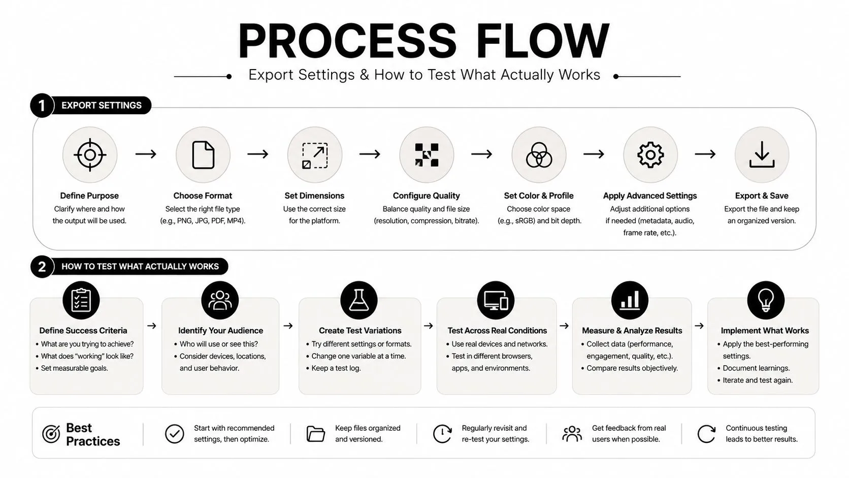
Export settings are the part many creators rush through, then blame the thumbnail when performance stays flat. For Roblox gallery use, the practical baseline is 16:9 at 1920×1080, and Roblox’s own upload instructions tell you to keep those images under 3 MB Roblox Creator Hub thumbnail publishing docs. On format, Roblox accepts .jpg, .gif, .png, .tga, or .bmp, while Roblox-facing workflow guidance prefers PNG for crisp edges and text and treats JPEG as acceptable.
Export for speed, then test for response
YouTube’s thumbnail feed rewards instant recognition, so the same scene usually needs a second pass before it performs there. Build one version for Roblox’s gallery view and a tighter version for YouTube, because the first one can stay cleaner and more product-like, while the second needs harder contrast and more aggressive text.
The mistake is treating the first export as final. Roblox’s own setup instructions have you activate 2 to 5 thumbnails for personalization rather than locking onto one concept too early Roblox Creator Hub thumbnail publishing docs. Treat every thumbnail as a hypothesis: ship it, watch the qualified play through rate in the Creator Dashboard, then iterate. That turns thumbnail work into a testable process, not a debate about taste.
Read the numbers that matter
Roblox’s analytics fields show what the image is supposed to move, Impressions, Qualified Plays, Average Playtime, Qualified Play Through Rate, and Winning Segment Roblox Creator Hub thumbnail publishing docs. If the image gets impressions but the play-through stays soft, the thumbnail is overselling the idea or underselling the hook. Resist the urge to crown one winner and delete the rest: personalization only runs while 2 or more thumbnails are active, and Roblox’s guidance is to keep several live so the algorithm can adapt as tastes shift. The documented payoff during testing averaged a +8.5% lift in qualified play through rate, reaching +50% for some games.
A typical qualified play through rate sits at around 2% to 2.4%, with top games in a genre reaching roughly 3.6%. Treat those as rough benchmarks, not promises, and use them as a reminder that small visual choices can materially affect whether the page converts.
Putting It All Together for Both Roblox and YouTube
The cleanest workflow is simple. Build one strong scene, export a 1920×1080 Roblox-ready version, then reshape the same idea into a 16:9 YouTube thumbnail with stronger contrast and more aggressive text, exporting at 3840×2160 now that 1280×720 is only the floor. Roblox wants a page asset that survives the gallery grid. YouTube wants a click asset that wins attention fast.
Ship variants, not opinions
Creators get attached to the version they personally like. The feed doesn’t care. A better habit is to design 3 variants and leave them all active, because Roblox’s own recommendation is to keep multiple thumbnails running instead of picking a single winner. Pull one too early and you can lose the impressions it would have earned later. That way you’re not debating taste, you’re comparing response.
The loop is boring in the best way. Make the images, check the response, and test fresh candidates with each major game or content update rather than pruning down to a single favorite in between. Roblox already gives you the right metrics to judge the result, so use them instead of guessing.
Treat the thumbnail as part of the game, not the afterthought
A thumbnail isn’t a decorative file at the end of the upload process. It’s part of the product. The image sets expectation, frames the experience, and decides whether the player gives the game a chance in the first place.
If you want a faster way to produce and compare Roblox thumbnail concepts without rebuilding every draft from scratch, Thumbo AI can generate Roblox-style covers from a description or your own screenshot and help you move from idea to testable image quickly. Use it as a production shortcut, then finish the thumbnail with the same judgment you’d use on any other publishing asset.