A thumbnail can sit at 4.1% CTR without a face and 6.8% with one, according to a 2026 analysis of 1,000 YouTube thumbnails. That gap reframes the job. A thumbnail isn’t a decorative poster for your video. It’s a small impression-to-click conversion system competing for attention on mobile, desktop, and television feeds.
The strongest designs communicate a clear promise before the viewer has time to study the title. They use hierarchy, contrast, emotional or subject relevance, and text that survives a tiny display. But clicks aren’t the only outcome worth optimizing in 2026. YouTube’s native testing workflow now emphasizes watch time, so a thumbnail that earns curiosity clicks but creates immediate disappointment can underperform a more honest design.
Table of Contents
- Why Thumbnails Decide Your Video’s Fate
- The Core Visual Elements of Every Winning Thumbnail
- Faces and Emotions That Command the Click
- Writing Thumbnail Text That Reads on a Phone
- Matching Thumbnail Style to Your Niche and Surface
- Testing Thumbnails Beyond Click-Through Rate
- The Pre-Publish Thumbnail Checklist
- Putting It All Together for Your Next Video
Why Thumbnails Decide Your Video’s Fate
YouTube defines click-through rate as clicks divided by impressions, and a breakdown of average YouTube CTR reports that half of all channels and videos land between 2% and 10% CTR, citing YouTube’s own documentation. Our own CTR benchmarks treat 4% to 6% as the practical middle range. That range turns thumbnail design into a measurable conversion problem. Every impression is an opportunity, and the thumbnail determines whether the viewer understands the video quickly enough to consider the click.
A thumbnail has to work in two hostile environments. On a mobile browse surface, the image becomes small enough that fine detail disappears and text competes with neighboring tiles. On a large television feed, the image may look sharp, but the viewer is still scanning from a distance. 4K resolution gives the file more detail, but it doesn’t make viewers move closer to the screen.
Practical rule: Design at full resolution, judge at delivery size.
YouTube counts an impression only when the thumbnail is shown for more than one second and at least 50% of it is visible on screen, and impressions-based CTR uses clicks divided by those impressions, as set out in YouTube’s impressions guidance. That first visual read matters because viewers don’t inspect every tile equally. They scan for a recognizable subject, a relevant promise, and enough contrast to separate one option from the next.
Use this benchmark as a diagnostic rather than a universal target:
| Impressions | Low CTR | Average CTR | Strong CTR | Views from +1% lift |
|---|---|---|---|---|
| 1,000 | 2% | 4% to 6% | 8% to 10% | 10 additional views |
| 10,000 | 2% | 4% to 6% | 8% to 10% | 100 additional views |
| 100,000 | 2% | 4% to 6% | 8% to 10% | 1,000 additional views |
| 1,000,000 | 2% | 4% to 6% | 8% to 10% | 10,000 additional views |
The arithmetic in the final column is a direct illustration of a one-percentage-point lift, not a performance guarantee. The important point is that a modest conversion improvement scales with distribution. A thumbnail that earns more qualified clicks gives YouTube more evidence about who responds to the video, while a vague or misleading design can waste the same exposure.
Build each thumbnail around seven connected decisions: focal point, face or subject, contrast, color, text, branding, and testing. None works in isolation. A dramatic face without topic relevance attracts empty clicks. Clear text without contrast vanishes in the feed. A recognizable brand cue without a strong promise becomes visual decoration.
The Core Visual Elements of Every Winning Thumbnail
A good thumbnail performs six jobs almost simultaneously. It identifies the subject, creates an emotional or informational cue, separates that cue from the platform background, directs attention with color, adds only essential text, and helps returning viewers recognize the channel.
Build a hierarchy, not a collection of parts
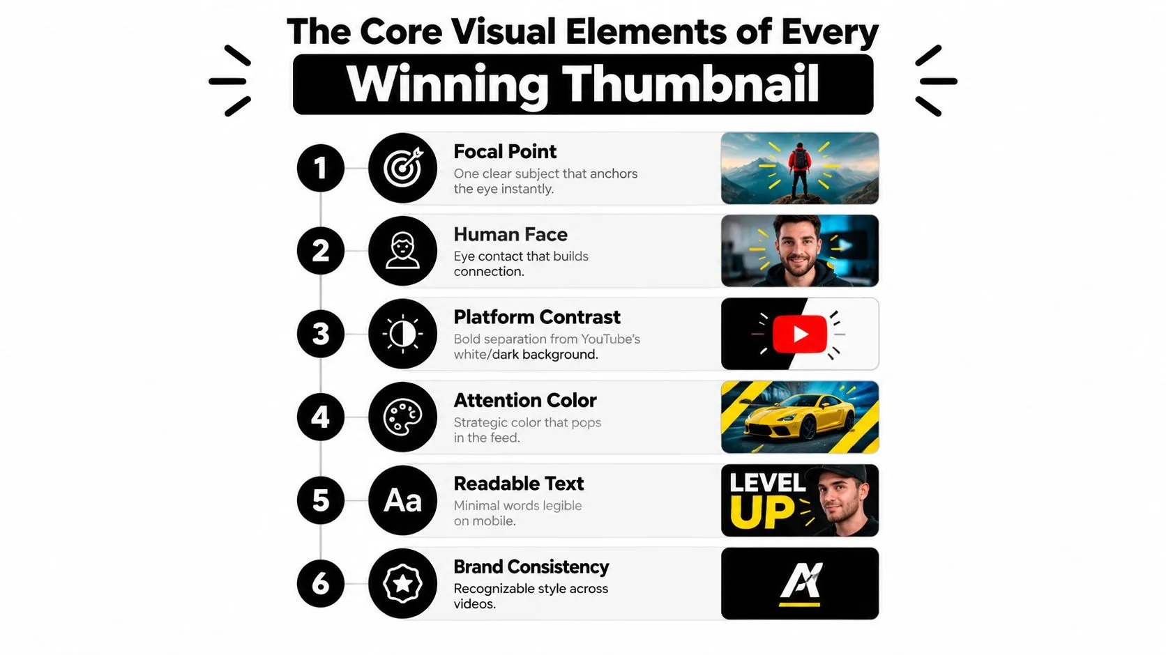
Start with one dominant subject. That subject might be a face, product, screen, object, or before-and-after contrast. If two elements compete for first place, shrink the secondary element, lower its contrast, or remove it.
A face can anchor the composition when the video depends on personality or reaction. In practice, make the face large enough for the eyes and expression to remain legible after reduction. Don’t treat the face as a required decoration. A software tutorial may need a recognizable interface or result instead.
Contrast creates separation from YouTube’s changing white and dark surfaces. Place the main subject against a background with a clearly different brightness and texture. Fine gradients, subtle shadows, and low-contrast patterns often look polished in an editor but turn into visual mush on a television feed.
Color should earn its place. Use a restrained palette, then reserve the brightest accent for the action, emotion, or outcome you want viewers to notice first. Saturated backgrounds can help attention, but indiscriminate saturation makes every element shout at once.
Keep the brand cue subordinate
Brand consistency helps viewers recognize a channel, but a logo shouldn’t overpower the subject. A recurring color band, framing treatment, or typeface can provide continuity without stealing the click cue.
For practical layout fundamentals, use this graphic design fundamentals guide as a reference point. The same principles apply here, but thumbnails impose a harsher constraint: every decision has to survive compression, motion, and small display sizes.
Design test: Blur the thumbnail slightly. If you can still identify the subject, emotional direction, and broad topic, the hierarchy is doing its job.
Faces and Emotions That Command the Click
Face-led thumbnails work because viewers can recognize human expression quickly. The 2026 analysis of 1,000 YouTube thumbnails found an average 6.8% CTR for thumbnails with a human face, compared with 4.1% without a face, a 66% relative difference. Its highest-performing cluster combined an intense but legible expression, a tight face crop, a solid dark or high-contrast background, and short text naming a specific outcome.
The useful lesson isn’t “put a face on everything.” It’s that relevance and emotional clarity help viewers understand why the image belongs with the video. That same analysis found the face advantage depends on expression quality rather than on face presence alone, and that it ran strongest in gaming, beauty, and personal development and weakest in cooking and tech reviews. A loud face that has nothing to do with the video may attract attention but fail to create a qualified click.
Engineer the expression
A readable expression has structure. Raised brows can signal surprise, a furrowed brow can suggest concern, and an open mouth can communicate revelation or shock. Direct eye contact makes the subject feel connected to the viewer, while sideward gaze can direct attention toward an object, headline, or result.
Lighting matters as much as the pose. Separate the eyes, nose, and cheekbones from the background with directional light or tonal editing. Don’t rely on tiny changes in the mouth that disappear when the thumbnail is reduced. If the emotion only works when the image is viewed as a large portrait, it won’t carry the feed.

Match the face to the format
Lifestyle, vlog, and commentary channels often benefit from expressive creator faces because the personality is part of the value proposition. Tutorials, screen recordings, ASMR, and product demonstrations may perform better with an object, interface, or physical result as the main focal point. The correct choice depends on what viewers need to recognize first.
For an AI-generated or directed expression, specify the cues instead of asking for “an engaging face.” A useful prompt might request: one close-up subject, raised brow, open mouth suggesting surprise, direct eye contact, clearly separated eyes and cheekbones, strong directional lighting, uncluttered background, expression readable at small thumbnail size. Then compare the generated result with the actual video promise. Emotional intensity can win the glance, but topic relevance earns the right click.
Writing Thumbnail Text That Reads on a Phone
Thumbnail text is a compressed headline, not a miniature article. At small size, viewers should understand the phrase without stopping to decode it. Start with three to five familiar words, then remove any word that repeats the title or explains what the image already shows.
The best text adds a second layer of information. If the title names the problem, the thumbnail can show the consequence. If the image shows a failed result, the text can create the question. Avoid turning the canvas into a subtitle block. Sentences, disclaimers, labels, and multiple punctuation marks consume attention without improving recognition.
Make the reading path obvious
Place the visual focal point first, then guide the eye toward the text or outcome. Use one heavy sans-serif family and keep the treatment consistent. High contrast, a solid text panel, or a controlled stroke usually preserves legibility better than a soft drop shadow.
Preview the file at roughly 200 pixels wide on an actual phone. If the phrase takes more than a second to parse, shorten it. Mixed case is often easier to scan than a wall of uppercase letters, especially when several words have similar shapes.
Avoid placing important information at the edges. Interface elements and duration badges can obscure peripheral details, so keep the essential subject and wording within a safe central area. The image should still communicate the video’s broad promise if the text becomes unreadable.
Let the niche decide how much text earns space
Education and business thumbnails can benefit from explicit wording because search viewers often want a defined answer. Entertainment, gaming, and reaction thumbnails may need more room for a face, character, object, or visual conflict. Research summarized in TubeAnalytics’ 2026 thumbnail patterns study reports that three to five words of high-contrast text outperformed text-free thumbnails in search-driven categories while dense text and full sentences underperformed in browse and suggested-video contexts, and that number-forward concepts can work particularly well in education and how-to content.
Use YouTube thumbnail text guidance to refine the wording, but judge the final result against the actual feed. A phrase that looks elegant at full size may become a gray strip on mobile.
Matching Thumbnail Style to Your Niche and Surface
A universal thumbnail formula fails because viewers arrive with different intent. Someone searching for a spreadsheet tutorial wants immediate topic confirmation. Someone browsing entertainment recommendations may respond first to emotional contrast, a recognizable person, or an unresolved visual event.
Search rewards explicit recognition
Search-led education and product reviews need a clear subject. Show the software, object, transformation, or outcome the viewer expects to find. Before-and-after compositions, precise labels, and visible results can reduce uncertainty without requiring exaggerated emotion.
Product-review packaging has a similar job. Make the product unmistakable, show the relevant feature or condition, and let the text promise an outcome rather than repeat the product name. A viewer should know whether the video evaluates, compares, tests, or repairs the object.
Browse-led entertainment works differently. A reaction face, recognizable character, unusual crop, or strong silhouette can create a visual question before the title is read. The image should still reflect the video, but it can prioritize emotional novelty over detailed explanation.
Treat the surface as part of the brief
Short-form content needs an immediate concept because viewers often encounter it in fast-moving feeds. Use a large subject, remove fine detail, and avoid wording that depends on a desktop-sized canvas. Long-form videos can carry more context, particularly on television, but distance still punishes subtlety.
The research summary in TubeAnalytics’ thumbnail research highlights differences by niche, format, and surface. That means you should test within your own audience rather than copy a creator from an unrelated category.
Use four checks before publishing:
- Mobile check: Reduce the design to roughly 200 pixels wide and confirm that the subject and promise remain clear.
- TV check: View it from across the room and look for a strong silhouette, readable contrast, and one obvious focal point.
- Intent check: For search, prioritize topic alignment. For browse, prioritize emotional contrast and visual curiosity.
- Format check: Simplify Shorts packaging more aggressively than long-form packaging.
The strongest thumbnail isn’t the one that follows the loudest trend. It’s the one that matches the viewer’s reason for being on that surface.
Testing Thumbnails Beyond Click-Through Rate
A high CTR can hide a weak viewer experience. YouTube’s native A/B test for titles and thumbnails shifts attention toward overall watch time, which changes the question from “Which thumbnail gets clicked?” to “Which thumbnail gets clicked by viewers who stay?”
A curiosity-heavy image may create a strong initial response while disappointing people who expected something else. Those viewers can leave quickly, reducing the value of the click and weakening the package’s downstream performance. The honest thumbnail often wins with a smaller but better-qualified audience.
Set up a clean comparison
Hold the major conditions steady: title, topic, audience, publishing context, and distribution. Change one meaningful variable at a time, such as face versus object, a short phrase versus no text, warm versus cool color treatment, or a tight crop versus a wider composition.
Use YouTube’s testing workflow where available - it runs in YouTube Studio on desktop and is not offered for Shorts. It decides the winner on watch time rather than clicks, so read the result as a watch-time outcome instead of treating CTR as the only score. Don’t stop a test merely because one version leads early. Pause for a serious technical, accuracy, or brand problem, not ordinary uncertainty during the comparison.
| Metric | What It Measures | Why It Matters |
|---|---|---|
| CTR | The share of impressions that become clicks | Shows how effectively the package earns attention |
| Average view duration | How long viewers watch on average | Reveals whether the click led to sustained viewing |
| Average percentage viewed | The portion of the video watched | Helps compare retention across videos of different lengths |
| Watch-time share | The contribution of the version to viewing time | Aligns testing with qualified attention rather than curiosity alone |
Keep a simple testing log. Record the thumbnail difference, impressions, CTR, average view duration, average percentage viewed, and the topic. After several uploads, patterns become more useful than any isolated result. For a practical way to inspect a design in a realistic feed, use a YouTube thumbnail previewer before the upload.
A thumbnail succeeds when it makes the right viewer curious and the video fulfills the promise quickly.
The Pre-Publish Thumbnail Checklist
A repeatable checklist prevents avoidable failures. Run the technical review before you judge style, because a beautiful concept won’t help if the file exports incorrectly or loses its subject during compression.
Confirm the file
YouTube recommends a 3840 by 2160 pixel thumbnail at a 16:9 aspect ratio, with a minimum width of 640 pixels and JPG or PNG format. The upload ceiling depends on the device: 2 MB from mobile, 50 MB from desktop. The familiar 1280 by 720 canvas is the practical floor rather than the target. Check the current upload requirements inside YouTube Studio before publishing, since platform specifications can change.
Then inspect the design in the environments where viewers will encounter it:
- Reduce it to mobile size. Preview the image at roughly 200 pixels wide on a phone.
- Count the words. Keep the essential wording short, ideally no more than three words when the image can carry the concept.
- Check the focal point. Confirm that the face, product, screen, or object still registers immediately.
- Run a contrast test. Squint at the image or convert it to grayscale. The subject should remain separate from the background.
- Inspect the edges. Keep critical text and facial features away from interface-sensitive areas.
- View it from a distance. Test on a television or monitor from across the room.
- Compare the title. The thumbnail should add information, not duplicate the title.
Protect recognition without adding clutter
Choose one recurring brand cue, such as a color band, logo position, font family, or framing style. Keep it subordinate to the subject. If viewers notice the logo before they understand the video, the branding has become an obstacle.
Queue two meaningful variants before publishing. Review the early report after a consistent observation window, comparing CTR with average view duration rather than celebrating the first visible lead. A checklist won’t replace judgment, but it gives every upload the same quality floor.
Putting It All Together for Your Next Video
What makes a good thumbnail for YouTube is the coordination of two targets: earning the click and earning the watch. Faces, contrast, color, text, and composition influence the first decision, while relevance and honesty determine whether the viewer feels the click was worthwhile.
Use this decision framework:
- Focal point: Can a viewer identify one subject immediately?
- Emotion or object: Does the main element match the video’s value?
- Contrast: Does the subject separate from both light and dark feeds?
- Text: Can the wording be understood quickly on a phone?
- Context: Does the design fit search, browse, Shorts, or long-form viewing?
- Promise: Does the thumbnail accurately prepare the viewer for the opening?
- Test: Can you compare two variants while changing one major variable?
An educational search thumbnail may need explicit topic clarity and a visible result. A gaming browse thumbnail may give more space to a character, reaction, or visual conflict. Neither is automatically superior. The weighting changes with viewer intent and delivery surface.
For your next upload, write the title first, then create two thumbnail variants. Change one variable, such as the crop, expression, text, or background contrast. Preview both on mobile and from a television viewing distance, run YouTube’s test, and review CTR alongside retention and average view duration. Thumbo AI can accelerate the generation step by creating thumbnail variants from a video idea and style direction.
Thumbo AI creates ready-to-publish YouTube thumbnail variants from a typed video idea and selected style pack, with free tools for resizing, cropping, and compressing an image under YouTube’s upload limit. Visit Thumbo AI to turn your next thumbnail concept into testable variations before you publish.